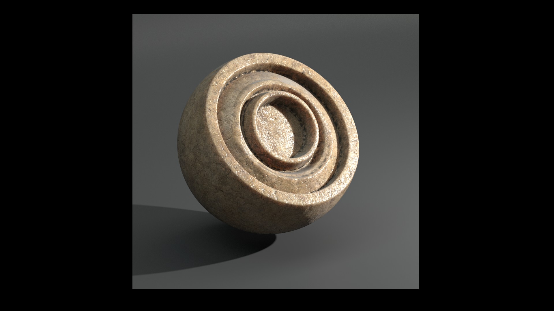
a test to the bone shader !
please give me some feedback 
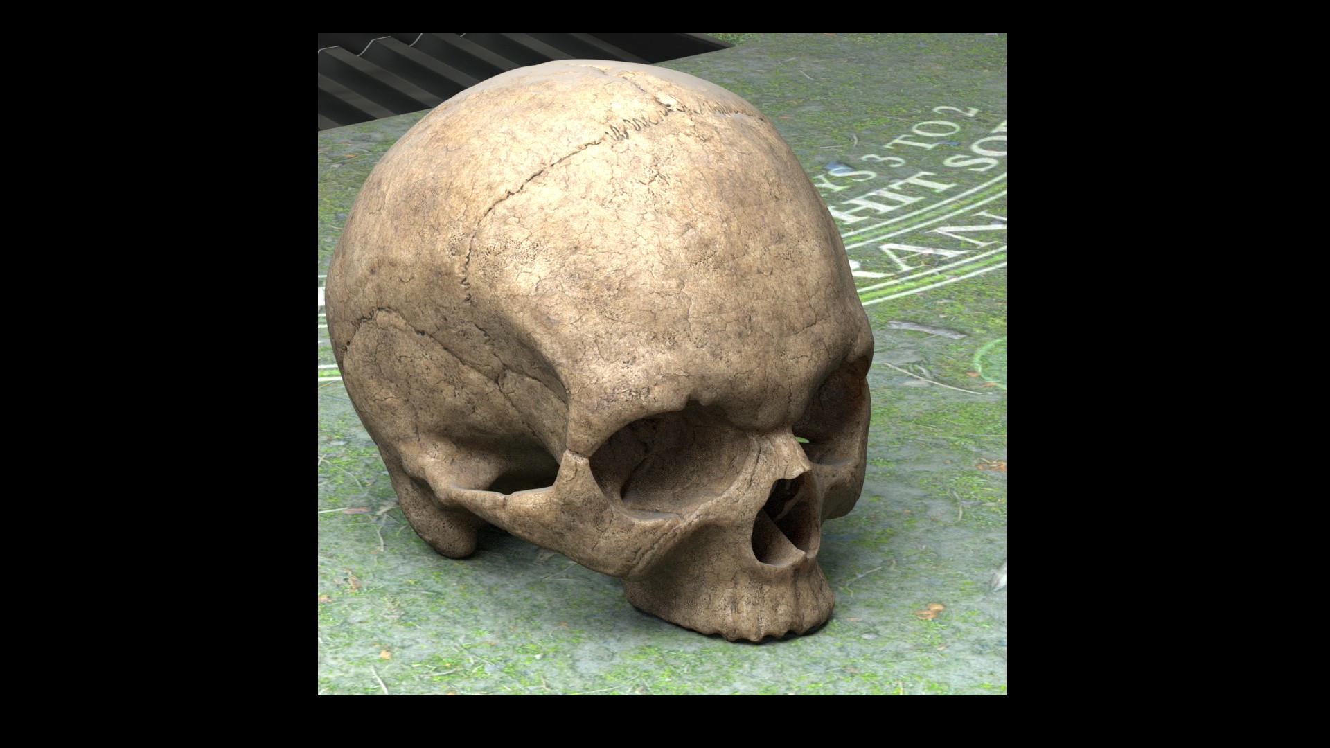
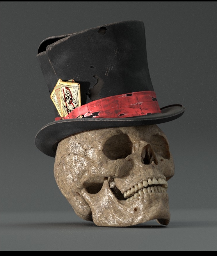
Hey!!! that is very nice!!! just a little to dark? the dry bone is more like yellow, and is smoother.
Hey thank u !
i v gone heavy with the dirt layer i think !
i will adjust it once the compo and lighting established !
here is another render with less dirt .
see u around ![]()
Attachments
thanks for the info! you never learn enough 
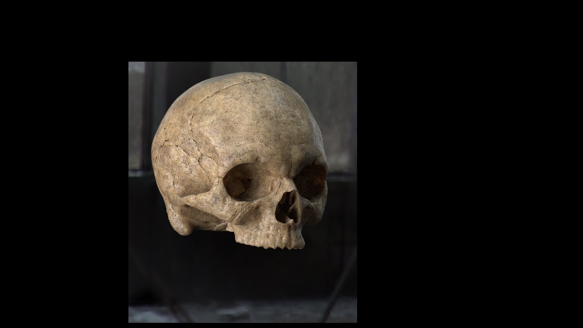
your project has come a great way. i love the hat materials. the skull looks too shiny and too dark to me. also it seems to have a somewhat old surface with lots of small damages (seems be a bump map), but the borders of the shapes are crisp and clean… but then, i dont know enough about skulls anyway.
Well this is pretty darn cool!! love it and I like the shading.
Maybe for the final render try and up the contrast/ have greater darkness in the shadows.
I’m looking forward to seeing the result:)
malhomsi, which Blender version are you using? I’ve been experimenting with Adaptive Subsurf & micropolygon displacement in 2.78rc2, and it may help you get more detailed surface displacement on the edges of your forms (which Doris mentioned). That’s pretty important for close-ups of highly weathered surfaces like ol’ Mr. Lucky. BTW your old bone shader is primo, excellent for the character I think. Bones that have been buried a long time are much more likely to be discolored and highly etched on the surface than those from relatively dry tombs, sarcophagi, etc., places where they are less exposed to harsh weathering.
looking good!!! looking really really good!
@ doris : thank u very much for the feedback ,i’m still working on the skull material!
@jim trim:thank u for the kind words!
@chipmasque: i’m still working with 2.77 , adaptive subsurf seems very promessing ! i’ll move to 2.78 soon enough i think 
and thank u for the feedback , it is very handfull !
@Tonatiuh : thank u it means a lot for me !
see u around friends
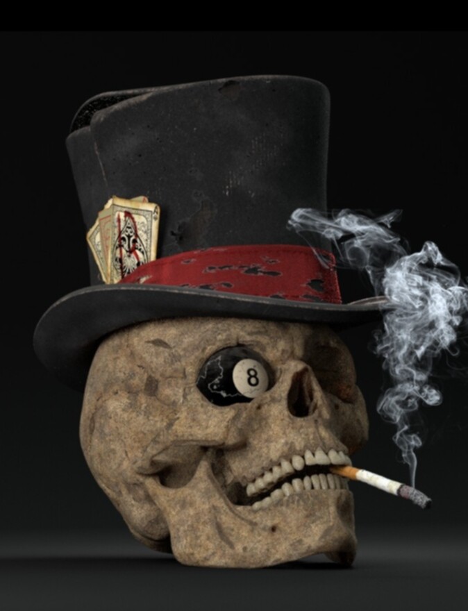
Not that’s an anti-smoking image! Just kidding, he’s looking very bad, er, good, er, bad, which is good.
Now I’m confused. :rolleyes:
Nice! the light is really nice, The smoke is superb! I miss some more of a dense atmosphere, like an old bar fill with smoking people.
I like. Macbeths poker teacher?
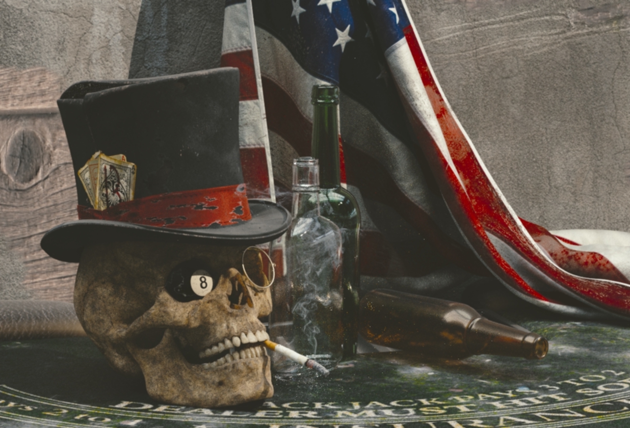
Well well well, that is pretty awesome!!!
but the bottles are all empty!!! put something on them!! And I think the wood wall is too big of a texture, can you make it smaller?
hey ! thank u ![]() it is just a compo test , the bottle and the backround r just place holders for now ! i have to add the old radio , the poker chips and the dice yet !
it is just a compo test , the bottle and the backround r just place holders for now ! i have to add the old radio , the poker chips and the dice yet !
see u around ![]()
the funny part ! a didnt want to put a lot of detail here, i dont think that it is going to be seen !
Attachments
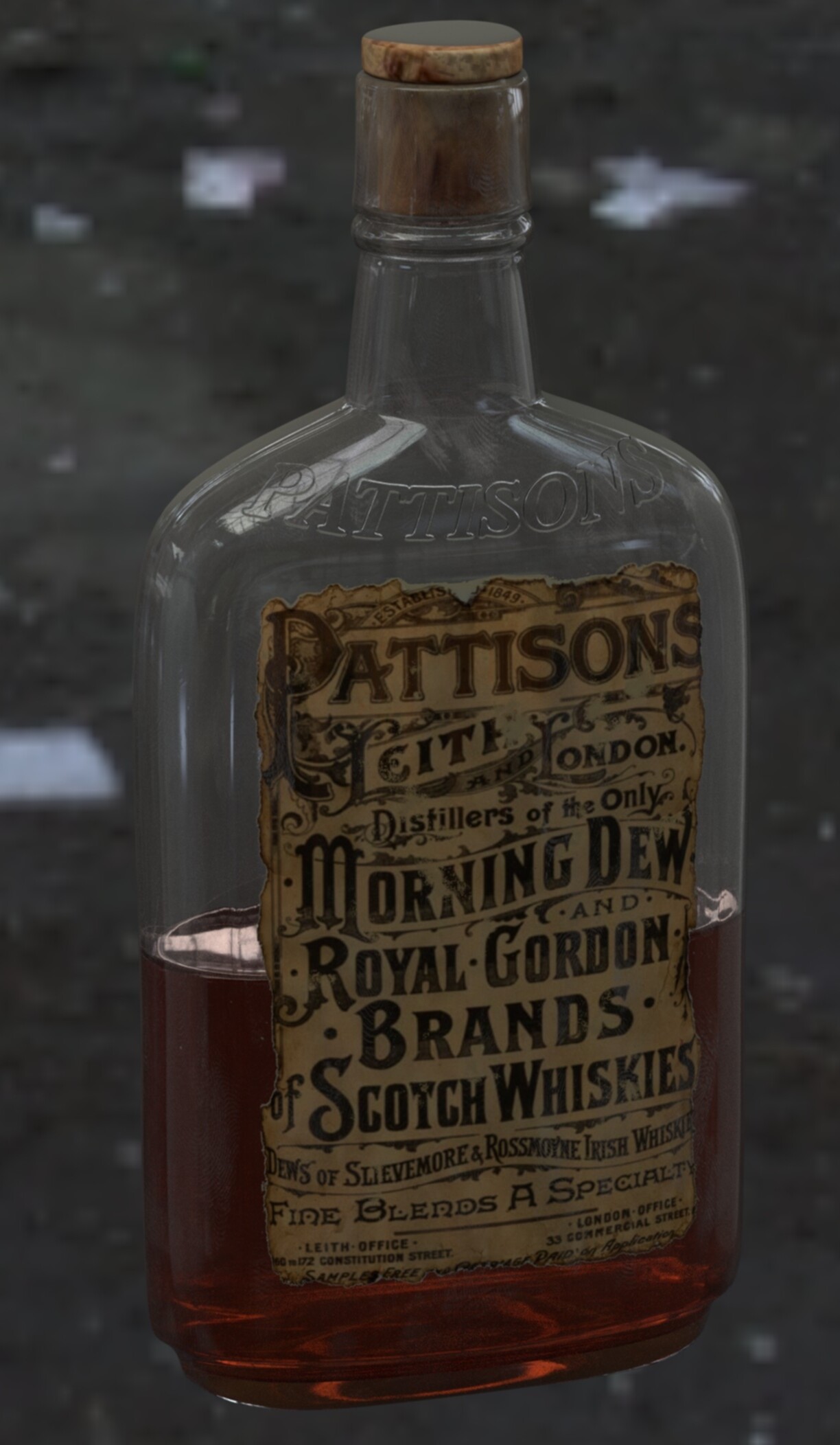
I like your attitude, malhomsi, you do renders others would be happy to do as an entire project and use them for incidental props. That label is classic, is it an historical source?
wow, that bottle is superb!! Chipmasque has a good point there, your props are entire projects!