Add work on multiple sites. Makes it easier to run into (^^,).
Glad it helps. The tree generator only works on Blender 2.49 (it’s a script in a *.blend), but you can save the generated tree and and append to 2.6 and up. It can do more than the current internal (add-on) tree generator. It can do those really old distorted-type trees like the older weeping willows and complex bushes and stuff like that as well as the more simple stuff, but I’m sure you’ll figure it out!
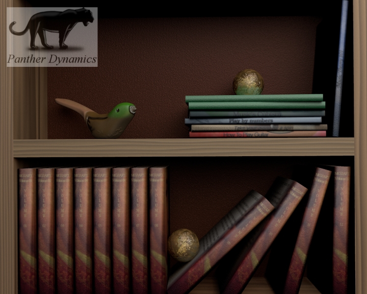
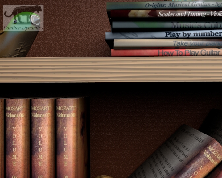
Here’s the progress on the books so far. I’ve added a bit more detail, since the smooth shading acted weird on the spine of the book with the UV on. I also added a bit of an indent, because I know typical reference books have and almost delimiting dent between the spine, front and back of the book. So this is a test also of what happens if you duplicate an object that already has a UV active:
The portrait is public domain (ZERO infringing, yey!!), that’s why I used it. I won’t say I’m his biggest fan, but he was the first one I thought of that there may be a massive reference library on, so here it is, lol. The books that looks strangely white are copied materials from these two, before UV’ing the whole thing, so they will be replaced entirely, because they are flattened cubes with smart texturing on. The newer books are also very cube-ish, but have a much better appearance with smoothing.
Thanx!
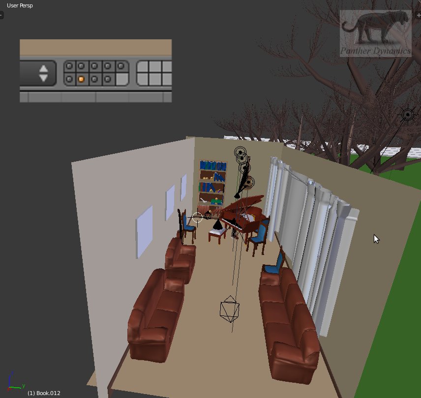
Yes it is. I organized everything on different layers so the render will go faster and navigation becomes easier. Here’s how the bottom two shelves look so far:
As you can imagine there’s still a looong way to go with the books, but it’s fun making up wacky titles like: Play by numbers, Take Your Piano For A Spin, etc.
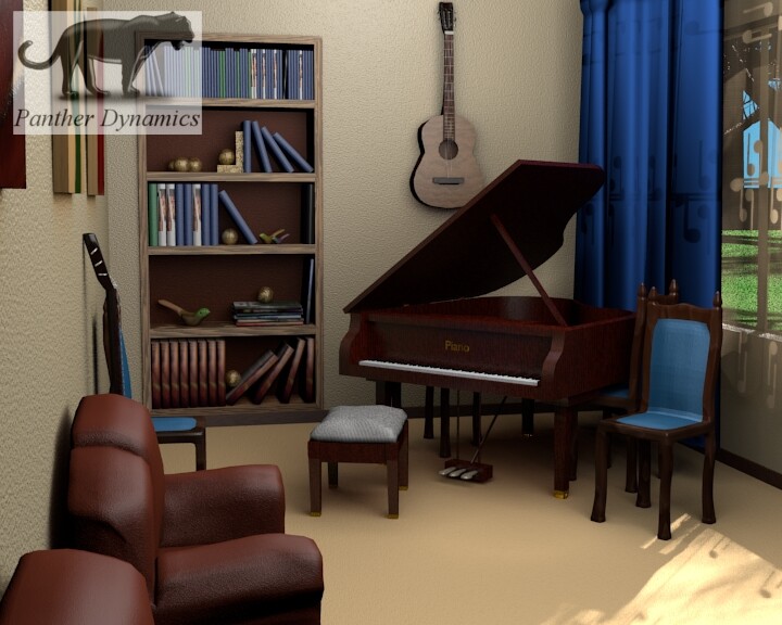
This is how it looks in 3DView with all the layers active (focus on the room obviously). Some things are hidden, like the ceiling, because you can’t work in such an enclosed space, especially not orthographically.
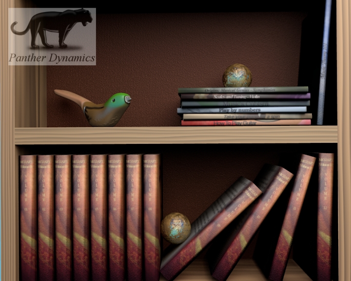
Your books look gorgeous! But the titles on the sides of the books look a bit too big: they don’t seem to fit. Also, improve the textures on the shelf: It makes the scene less realistic.
Thank you! I’m glad you like them! The cubes just don’t get it, lol.
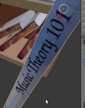
The titles aren’t too big for the size of book (usually hobby and craft books’ titles are this size), but they do need to vary more in size I’ll agree (some maybe smaller, but not a have to). They are extreme rounded because of smoothing. This is what they look like in 3DView with flattened shading
From Above
The title from the side (ample space above and below text)
I did have a problem with specularity whiting out some of the titles, but I also didn’t want to sit with none, because then it’s only color and black (won’t look good either). Some books have an extreme matte finish that does do that, but not all of 'em (mostly the older books and ones that have to stand up to wear and tear; they have an almost cloth-like hard cover).
Played around with that and added a soft mirror to some.
I know what you mean about the shelf textures (looked at 'em with a frown too, lol). Our kitchen cabinets have an almost grain within a grain (looking almost like scratches from how it was cut). Added that too (subtle, but there).
Also, I adjusted the books’ specularity to reduce that ‘group of duplicates look’; in other words, made everyone a little different.
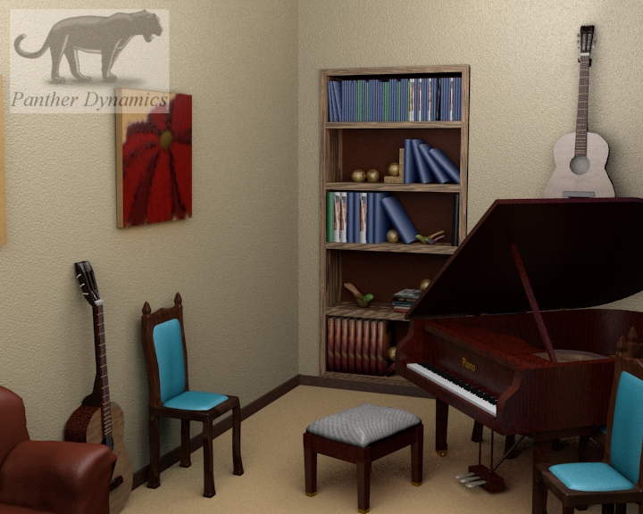
This is a render with everything for the scene so far constructed active.
I wanted that super smooth shading I had earlier so I did a special render with all the lamps active for this scene at 20 samples (took what I think is about 2-3 hours). No nodes as of yet.
A lot has gone into this and it’s not finished yet. The bookshelf being the biggest item on the list and then later compositing. The back curtain also needs fixing (too transparent).
Thank you all for the great feedback and crits!!
A big thank you to all the viewers of this thread as well!
Increase the sofas’ poly count, they’re way too low poly for such a scene. Same for the cushion on the stool.
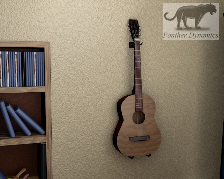
And, where’re the guitars hanging on? They seem to float in the air…
you should make a guitar stand for the guitar that is against the wall. especially if it’s a good guitar, because setting it up against the wall like that is likely to get it knocked over.
@Apptux: Totally agree on both (the chairs and the couches). I have thought about adding some sort of bracket for the guitar, even if it is just two cylinders coming out of the wall. It does look like it was glued to the wall, lol. @Modron: I have thought about that, but I don’t use a stand for my own. It leans against my bookshelf; out of the way so it doesn’t get knocked over or stand in the way. @yg3D: Thank you for the positive feedback! You rock! They do? I’ll play with size a bit more then. Thanx!
@Apptux: I follows the basic idea of the image you posted, but made it a bit more wide (this would probably be used for an electric, but I could be wrong since this isn’t to scale, lol. Anyway, here’s what the bracket (think that’s what you’d call it) looks like with the guitar:
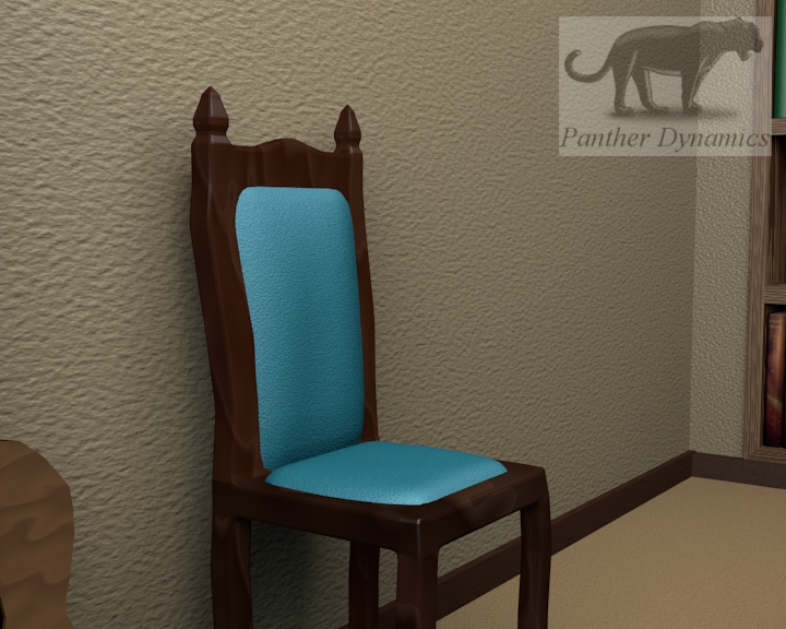
I also fixed the cushions on the chairs. I shaved down the older versions a bit and modeled and parented a new set to the chairs. Now it looks much better. This is what it looks like now:
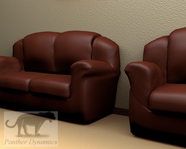
I also worked a bit on the couches. They had on a subdivision too many, that made the sides behind the arm rest look like a mountain range, so I removed that from all the couches. I worked on the two seater and the single for more detail and they do look better to me and even softer, but still not quite there I’ll say, but I still feel compelled to work on the three seater and work more on the other two (just really don’t want to, lol). This is what they look like so far:
Looking great marius, dunno how you got to this level of internal modelling but its sure something to brag about
and for the tree gen ive decided to use it to make some little foliage for my car showroom.
i love how youve got the books, when you upload these to your website you will have to do a close up of the book shelf to show you potential customers the level of detail you put in
When the render of the couches finished, I noticed the wall texture was stretched, so I fixed that too:
As you can see in the above post, I need to still give the couches some shoes, lol. So I’ll get to that sometime too.
I like the higher poly versions of the couches. They look really soft and comfy and used! I won’t say that they look like super real, but I like them.
@yg3D: I enlarged the couches a bit and they do look a bit better bigger (just remember that there’s a level difference between chairs and couches. Chairs tend to be about a foot (guessing) higher.
great xD
thank you, it’ll be alright, but nothing to compared to this scene
wow, alot of work on the books, how long did it take to do all these so far?
So far, uhm… Don’t know exactly, but I think it took two or three days (test rendering and posting included).
It’s UV a book of a certain, get the cover to display right then use that as the template for the others.
Steps: UV 1, duplicate object, create new cover, replace previous texture.