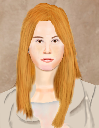
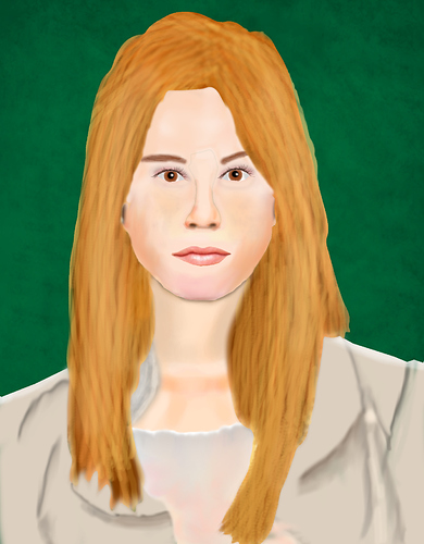
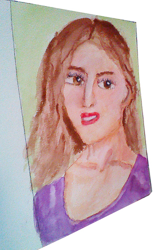
My Digital Painting. This I used as a study to figure out how to get skin tone. Its still being worked on. Note the Background is the same as the photo. I have not done that part yet.
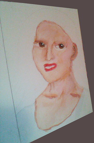
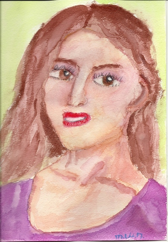
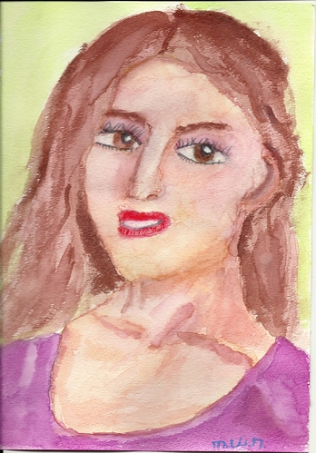
Here is a WaterColor I am working on. Its also a study in skin tone but with a different Medium. It is still not finished obviously. I have learned a few things some I know the solution others I am not sure. If you know please share. The problems I had were one. When doing the eyes I had paint from the eye lids seeped down into the eye. Also the Pupil also seeped into the iris. Also Sometimes when applying the paint it seemed fine but then would spread out more then I wanted. To me it sounds like maybe I am over saturating the brush but not sure. I am not a Water color Expert by any means. So any tips or tricks would be helpful.
I don’t know much about water colors, but they are hard to control. Most of the fine water colorists I’ve seen learned how to use the bleeding and fading and seeping to their advantage in the painting. Others simply used the water color as if it were markers, putting on a stroke of color then going off to have a smoke while that stroke dried. (Actually that is a bit of an exaggeration: but they would paint color patches that did not touch anywhere, and would let the painting dry, so they had ten or fifteen sessions to paint one watercolor.)
In your first piece, the eyes seem too close together, or perhaps they are too small. But you do have a lot of nice subtle shading on the skin tone.
Orinoco The Eyes seem to close together because the skin tone kept seeping into the whites of the eyes. Thanks for the facts but I found even with the Pupil where I did that the day before. Then the next day I did the Iris the colored part of the eye and yet I still had the Pupil seeping in. So Pupil had a day to dry then did Iris and still seeping happened. Do you think I had to much water on my brush? I have used the seeping and bleeding for blending. Though I still have a lot to learn. Orinoco again thanks and do you have any other ideas? Or tutorials that go over specifically the way to avoid bleeding and other such things? Or how to use them to my advantage?
Like I said, I don’t really know that much about water colors. I took one class years ago, but my main focus was drawing, oil painting and sculpture. Then I got into digital art.
I meant the eyes on your Digital Painting, the first post. Actually the size of the watercolored eyes is ok, even though the shape is a little off.
All I remember from my water color days was doing a grey study of stainless steel and chrome pots and pans, and a sepia painting of a paper shopping bag. Such fun!
Are you using watercolor paper? pre-soaked and stretched?
@softwarespecial, look for masking fluid wherever you buy your art supplies. It is a clear liquid that you brush over areas that you want the watercolor to avoid, and it dries kind of rubbery so that it can be removed later. You can mask off areas that you want to stay white, or you can mask areas that have already been painted to keep the color from getting muddy from color bleeding. Good luck with the watercolor studies – it’s a medium that requires lots of courage and patience! I’m only courageous enough to use watercolor pencils.
Here’s a tutorial in which the artist uses masking fluid. http://www.watercolorpainting.com/watercolorpainting/masking2.htm
By the way, the lips on your digital painting’s subject are impressively executed. Nice work!
Orinoco first thanks second I am using Water color paper. Then in reference to the eyes. Here is a link to the Reference I used for the Digital painting http://www.bravofact.com/wp-content/uploads/2013/04/Juliette-Gosselin.jpg Then let me know if you still think they are too small or to close together. The Digital painting I used the reference and marked out where everything is and size. The Watercolor I more free handed it. Before I always had a problem with proportion when freehand drawing. Yet the watercolor seems to be better. Cool.
Tyto alba Thanks for the masking fluid tip. I knew of it but never thought about using it on already painted areas didn’t know you could remove it. Saw the tutorial and it seems with the right tool you can. That is definitely an option. Thanks for the compliment on the Digital painting. Thanks and any more ideas are also most welcome. As are cookies and cakes and icecream and brownies.
P.S. Speaking digital on average how many hours do the tablet pen tips last? I know it can very but what should I look for to know when it needs to be switched out? I have not done much with digital tell recently and am still not sure what a used tip will feel like. I know it will be harder so it does not rub down which will scratch the tablet if I don’t switch it out.
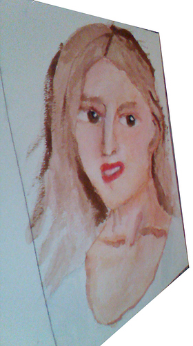
Here is the WaterColor with more stuff done. Some water dripped on the nose area and I didn’t notice it. So the nose has gotten a little warped. Still it was only a study so its not a bad thing if it isn’t quite right. I defintly have learned a lot from it. Still I hate it when things get messed up even if its a study.
One of the lessons I learned while studying oil painting, which I think applies pretty much to any visual art, is there comes a time during a painting when you stop painting the model and start painting the canvas.
I took the liberty of downloading your girl and moving her eyes apart slightly in Gimp. Put this one in the same folder as the original, and flip between them with an image viewer or preview. Regardless of how well or poorly either image matches the exact dimensions of the original reference photograph (your model), which of the two paintings looks better?
Painting is an inherently subjective process, and painting faces especially turns on very tiny variations in line or color or proportion. That’s why it is so facinating and so frustrating. Since we are not cameras, those tiny and not so tiny variations between what we see and what we paint add up, and in the end we must be concerned with creating a painting that can hold its own, and not whether we can answer critics with arguements about what our model looked like.
Orinoco As the saying Goes you are preaching to the choir. Though as this was a Study I tried to get it as close to the original image as I could. Though to go on about what you said I think learning to paint something as real as you can is a tool good to learn but only as a tool. What is the point to make something that looks like a photo when I could just take a photo and manipulate it. If I wanted me in space or some monster in space I can do that with Photoshop and a 3D object or other. A Painting should have some art feel it should be more then just an image on a page but a feeling or emotion or a glimpse into the artist. Also I was watching a video of a woman painting while teaching a class. She said those painters who painted so long ago we don’t know what the actual subjects look like. All we get is the painting so if the painting doesn’t work it was pointless. In other words exactly what you said about the Painting holding its own. Thanks. I will keep in mind the focus on the painting working and not as much on the likeness.
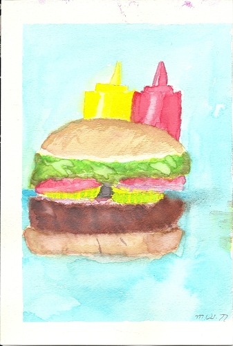
A Piece I did in WaterColor for my friend who owns a Restaurant. http://chubbysneighborhoodcafe.com/index.php
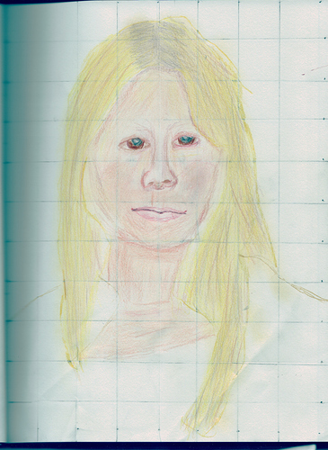
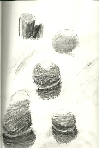
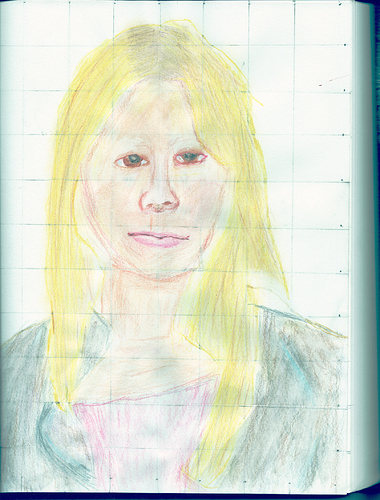
More artwork. The Sphere shading one is just a shading practice. Two things I was never very good at back in my High School days was Shading and Skin tone. Also I was not to good at proportions but I didn’t really see that fact tell later. It was always the case I just didn’t recognize it. I am posting the sphere one because I do like the example note how flat a sphere can look even if the shading is blended. It doesn’t have great tones like mid dark and such but even if it did it would still look flat if the shading is just straight across. The Colored Pencil is a study on two things skin tone and Proportions. Its not perfect as is expected from a study. Still I am learning. More to learn yet. Always more to learn.
I always have found watercolor to be difficult to master. I started out with acrylics because some of my favorite artists did amazing things with them. However, once I watched some videos by the late Helen Van Wyk, I finally tried oils and fell in love with the control they gave me. I’m not a fast painter, nor am I a particularly good drawer. Oils allowed me to take my time and push paint around on the canvas. I could also do preliminary ‘sketching’ in acrylics to figure out my composition and lighting, and then I would be able to start applying colors in oil over my dried acrylics. Alternatively, one can work out a drawing first using graphite or charcoal and then spray fixative on that, followed by a couple of coats of clear acrylic gesso. Then paint with oils. This was a method I learned from a book by James Gurney. With oils (and to a lesser extent with acrylics) you have an ‘undo’ feature in that you can always scrape off parts of the image before it dries if you decide something isn’t turning out how you like. Or you can let it dry and just paint over it. Either way, in my opinion it is far easier than watercolors.
These days i’m also trying to get into digital painting. I just bought an Intuos Pro tablet which is awesome. I like the variety of nibs that the pen can use; some feel more like drawing on paper than others. I really wanted to use Krita on my Windows computer. It’s just not there yet. After trying the demo to Corel Painter, I fell in love. I hated spending that kind of money on a program, but I do believe it’s really worth it for the features. There’s just nothing that really compares to Painter, not even Art Rage or Sketchbook Pro.
daveleitz Thanks I started off with acrylics and agree if you mess up you can paint over it. On that note which have you found is harder Acrylics or Oils? I am the type that likes to learn in all areas opening my horizon for even more things to be able to do. So I learn all I can. Thanks.
Here is more of the Colored Pencil Study skin test and proportions. This is all I will do with it. I think it was a success. It taught me what I needed to know. I am sure there is more to learn but I will learn as I go.
You need to be good at proportions to draw or paint convincing human faces. Our brains are wired to notice details in human faces. So you need to work on proportions, and drawing grids on photographs is not a good way to learn. It is an old production shortcut.
Get yourself a sketchbook, some graphite pencils (2b, 4b and 6b is a nice selection) a plastic eraser and a stump. Go haunt your friend’s restuarant waiting room, or your favorite bar, or a local park. Offer to sketch portraits. In between portraits, sketch furniture, architectural details, park benches, whatever. Analyse each sketch and decide on what you want to improve next. Keep at it until you stop thinking about what you are sketching and just let your eye connect to your hand. Might take months.
Right now, you are stuck drawing symbols rather than things you see. You need to convince your brain to let you do art without its getting in your way.
