It’s a nice start, but there are some things about it that are too CG.
I see that you have avoided the sharp corners, but have failed to see that it’s very rare that two things are exactly the same size (i.e. you have duplicated and not varied very slightly).
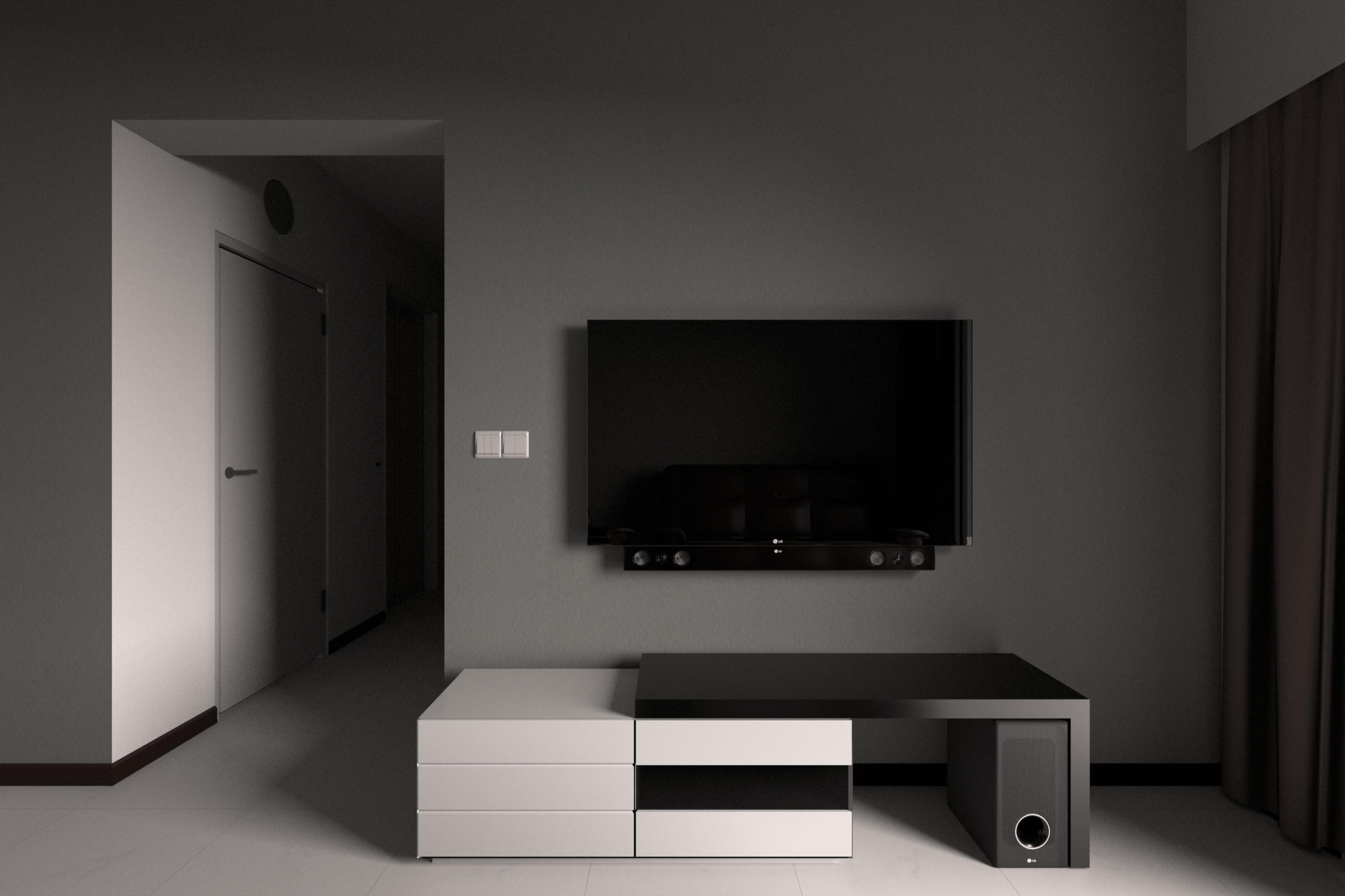
There’s also a very de-saturated look to everything. Black is rarely black (or even 0,0,0). and white is rarely white (or 255,255,255). There is always going to be something out of sync in the RGB channels. Even if you are going for a B/W render, you need that 255,255,245 or whatever to get the shading right.
EDIT: Oh, and what’s that weird oval shadow in the hall?
Taking some advice, and looking at the lighting again, lighting seems sterile so I redid the render with lighting closer to day lighting, which changes the final color balance of the furniture as well. At the same time I also re-textured the walls using textures that I made from my actual wall, giving it a subtle effect compared to the previous render.
Textures look like a great change. Is the floors reflective nature now more accurate to your own in the new version?
Just like Roken mentioned. I feel that models seem too uniformed. There is always some fault in uniformity even with modular building. Of course you don’t have to be 100% accurate with these sets.
With my background in computer aided drafting. I was needed to measure things as accurately as possible. I found that most things were produced has multiple faults. Where you may have an excellent perfectly measured blueprint of the project, item, or concept. Your final that was made from the production line may not be as precise.
In practice try taking a wooden ruler and follow edges of your drawers or anything. You don’t have to mark anything but just notice what is not fully aligned. Especially if you have a leveler to really see what might be not completely level. You don’t really need the leveler but if you do have one it would be handy to try out.
I really like this image! Especially the simplicity and the dark shades of it. The only think I would probably change is the focal lenght - I would use a little bit longer lens and move the camera a bit to the back to retain the same composition…