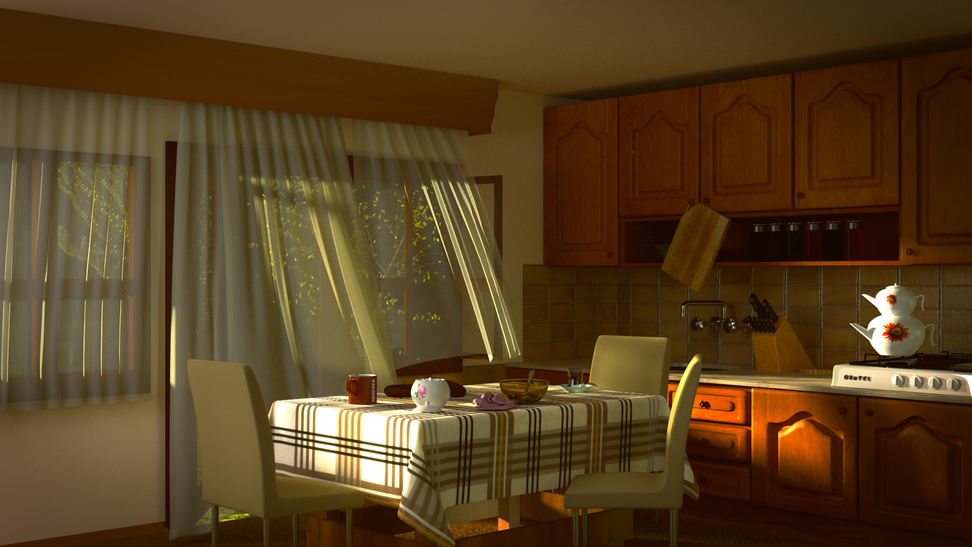
I’m really new to 3D modeling like 6-8 weeks has passed. And this is my first project. As a beginner I inspired my own kitchen :D. I still have too many ideas to improve this one. But trying to work on 3D modeling as a hobby is really hard.
Thank for critiques in advance 
Out of curiosity, which render engine did you use?
All made in Blender 2.69, 1600 samples. Rendered with Cycles in 7 hours (Unfortunately CPU render because of amd card.).
A couple textures from cgtextures.
Still too much noise, especially on ceiling and side walls.
I think about placing some more objects like a toaster, coffee maker and especially a man standing in front of the door looking outside to dramatize a little but can’t model a human yet 
Hey Okan. Here are my thoughts. Over all this is a really nice render. The modeling is well done and the composition is good. A couple of crits. I think the inset on the cabinet doors is too deep. Cabinet doors are not generally as thick as yours seem to be. I may be wrong about this but it seems to me that the cutting board is too heavy for the cabinet door knob to support it. The chair legs could be angled a bit. The last crit is just because I’m confused. Is there a box on the floor under the table that is surrounding the legs? If so, I’m wondering why.
It’s a very homey scene, very warm and inviting. I like the way the light hits the sheer curtains. The only thing that sticks out is that teapot on the stove, it’s a little too bright white.
First, thank you guys for crits.
I broke one of those knobs for that reason then fixed it anyway but still using on that ![]() For cabient doors you are right, those a bit thick. /noted
For cabient doors you are right, those a bit thick. /noted
The last crit is just because I’m confused. Is there a box on the floor under the table that is surrounding the legs? If so, I’m wondering why.
They were supposed to be supports for legs but ill work more for those.
The only thing that sticks out is that teapot on the stove, it’s a little too bright white
I’ll work more on those.
I think you could eliminate the leg supports altogether. The legs are sturdy enough with out spanners.
I like it;) but I would turn down the saturation of the colors and I would add some background behind the tree. You can aslo try to make the size of the shadow smaller.