That “almost” word is the main problem. As far as I know it’s still not possible for addons to add custom properties editor tab or custom editor, so everyone just kitchen-sinks it into the addon panel.
You mean the
![]()
2 Likes
Well… I think this Freudian slip pretty much speaks for it all 
1 Like
I agree to an extent - my case for the last operator panel was that it should really be global (ie shown in a unique place), since the last operator can really originate from any editor. Right now having it in the lower left corner of most editors (NLA and others don’t!) feels like a bandaid : it overlaps the editor’s content, and depending on the size of that editor it doesn’t even show in full (graph editors and dopesheets sometimes are made thin and can’t really accomodate it vertically).
The next best solution to me is the one you mentionel, ie putting it in the sidebar, maybe in its own tab.
edit actually, trying it out to write this post led me to discover a weird quirk with the last operator panel : when you invoke it from an editor different from the one where you did the last operation, -for instance moving keyframes in the graph editor and then hitting F9 in the 3DView- will not update whatever’s being modified.
1 Like
So one more snack break one more time to think.
this time I’m just seeing if another layout may increase the chance of a better readability at a lower cost of coding.
See if you agree.
This is all in mind using available interface. I don’t know if there is a need to implement a new design to the 3D-view to incorporate an “addon-on dump” panel.

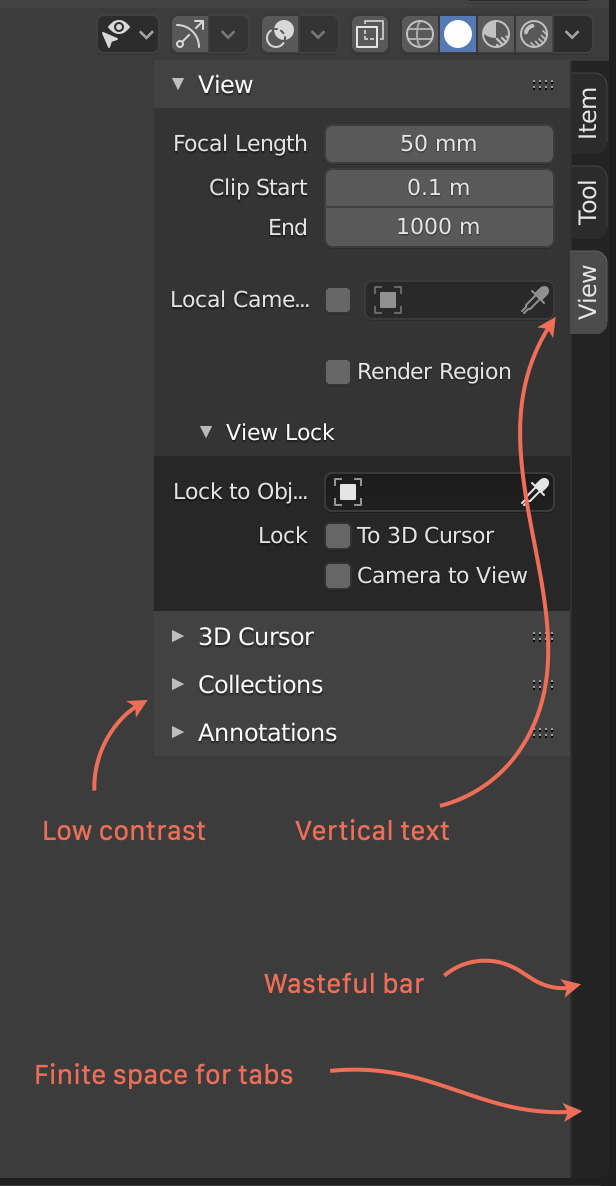
My biggest gripes with the sidebar are these:
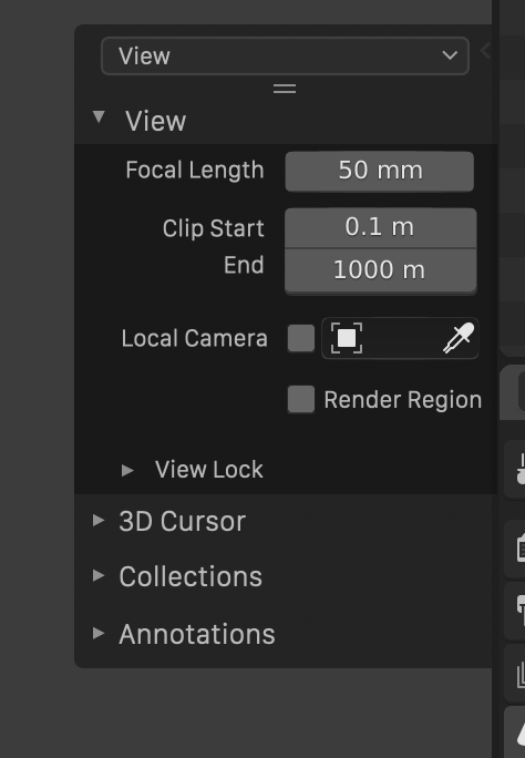
My take is this:
- No vertical text
- No bar extending all the way
- No longer bound by the height of the view
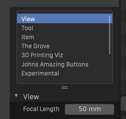
The menu at the top could be expanded into a list by dragging the handles below, if you want ability to quickly jump between sections:
19 Likes
No plan on making it customizable by drag&drop ? as in, take a panel from somewhere and duplicate it in the sidebar ? I would love to see a proper deep rethinking of that space… make it into a proper shelf, a “custom favourites” menu on steroids if you will, have a very basic UI maker in there to create/rename/delete panels and tabs a space that would house favourites, custom scripts from the text editor (à la Maya shelf) or even instance entire interface sections in there (say you want the cycles sampling properties at hand… you wouldn’t have to go and write an addon just to show the relevant properties -plus it would be dynamic : whatever changes in that panel from Blender version to Blender version would get shown in the sidebar as well).
This, and your mockup removes yet another chunk of vertical space from the bar…  we have horizontal space, let’s use it ! (unless you guys tilt your monitors 90°?) The tab bar can simply be overlaid on top of the 3DView and end when there are no more tabs to show, just like the sidebar itself currently works… that’s it, problem solved. And we get to keep both one-click access to different tabs and our precious vertical space.
@kirloi I like the horizontal tabs, but it’s true that not many will fit and we’ll have to scroll very often. That’s exactly the reason why properties tabs were changed to be vertical in the first place, as a matter of fact. And icons, while being pretty and compact, are going to be too many to remember what’s what. Properties are fine because there are only a few to remember but I reckon if every addon has its own icon… heh, who knows ? But I think I’d reach my shape recognition limits quickly.
1 Like
The ability to dock windows and panels anywhere in the interface, is what would solve all those UI issues…
3 Likes
Well, probably not all of them. It would leave the “fixing” to the user in a way. But I believe some customization is in order.
1 Like
You’re thinking of another Software, this is not how Blender works & it’s almost impossible with it’s paradigms.
Basically this, but I’d just round all the corners, give it a offset margin of a few pixels from the edge, similar to the tool palette on the other side and remove the tiny(almost invisible) arrow in favor of a x for closing. When closed draw a button of 1 (interface) element size by 1 element size with a + in it.
Basically @William mockup just needs + and - buttons to add more slots and a way to add elements(addons or any panel from say the properties editor?) to that sidebar slot, should basically cover it. Default sidebar items/slots shouldn’t be removable, though.
Also buttons for reordering, though if I’m not mistaken there is some ongoing work on enabling drag and drop for these kind of lists possibly?
edit: could even have the option to instance menus as 2.7x sidepanel style buttons for operators in there down the line?
@John4 Well, he is not wrong that it would solve these problems, via a paradigm shift.
Then how would that be? because to me that sounds like a huge paradigm shift that the Devs won’t be keen to go through.
What if we go a little more extreme with this?
We could free up the view-port with something like this
2 Likes
I was about to tell you I prefered the icons from the first option from @kirloi but opening the list is great for having every “tab” visible all the time.
I also agree with @Hadriscus on turning it into a quick favorites on steroids, we need some place in the interface to have visible buttons on the interface without coding (Like my addon Select panel) Shameless plug, althought is a free addon.
I don’t know, they might have plans for that perhaps? But I do recon that, yes it is a task large enough that if they do in fact have some plans towards that it is likely way down the line.
Good point! That’s what I’ve had in mind for a long time.
A dropdown list/scrollable list would scale much better.
1 Like
Which of course you can already. In Blender you can dice up the window however you want, putting editors in any configuration - and with forthcoming improvements you can also use floating windows on top.
@William: Yeah indeed, but what would be cool if quite some more ui panels would (also) be available as editors. Like the 3DViewport sidepanel.
And the configuration setup of the editor alignments could be made more powerful without changing the basic mechanism at all.
It would also be cool if the headers of the editors could serve as dragstart for a simple mode to change the editortype of the dragtarget area to that. No visual drag of the whole window, just a changing cursor that you are copying or moving editor settings.
This simple dragmethod could even be expanded easily into asking for a split of the targetarea or collapse of the sourcearea, to achieve copies or moves of editor areas.
1 Like
Yeah, but that’s not it…
I was thinking about full dock/undock support, and that inlcludes everything, menus/toolbars/panels etc… even drag and drop buttons and props anywhere in the UI…  Of course a tabbed interface support would be needed for that… Also it should be possible for an addon to open on it’s own window…