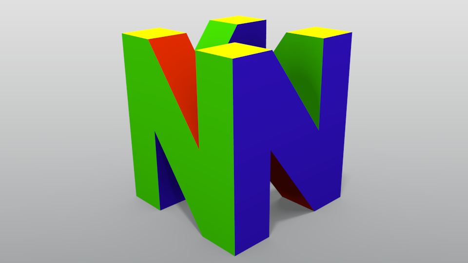
I think the lighting could be better- some areas seem either too dark or washed out. I’ve tried messing with the lighting setup and the materials, but this was the best I could get.
@Star Wars: Thanks! Sadly, the model is actually has 48 faces. Oh well. Also, the colors were actually really hard to get right- I had to look up a lot of videos of the spinning logo to make sure all of the faces were the right colors.
@DDD: Both AO and environmental lighting are on, but are set to a low level because they usually tend to wash out the image. I’ll try tweaking the settings a bit to get more contrast.