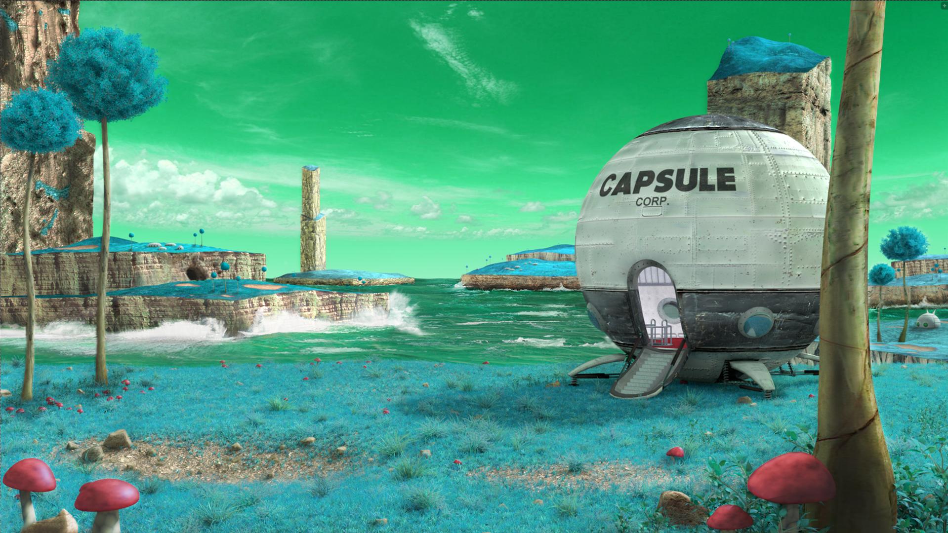
Welcome to Namek… a little 3D tribute to a place of my childhood.
(click on the pic for a sharp res)

Gotta thank Andrew Price for the Cliff tutorial, Gleb Alexandrov for the lighting tuts, and Reynante Martinez for the blender tips… those guys rock!
Welcome to Namek… a little 3D tribute to a place of my childhood.
(click on the pic for a sharp res)
Gotta thank Andrew Price for the Cliff tutorial, Gleb Alexandrov for the lighting tuts, and Reynante Martinez for the blender tips… those guys rock!
To make this project… First I set up the general idea and composition:
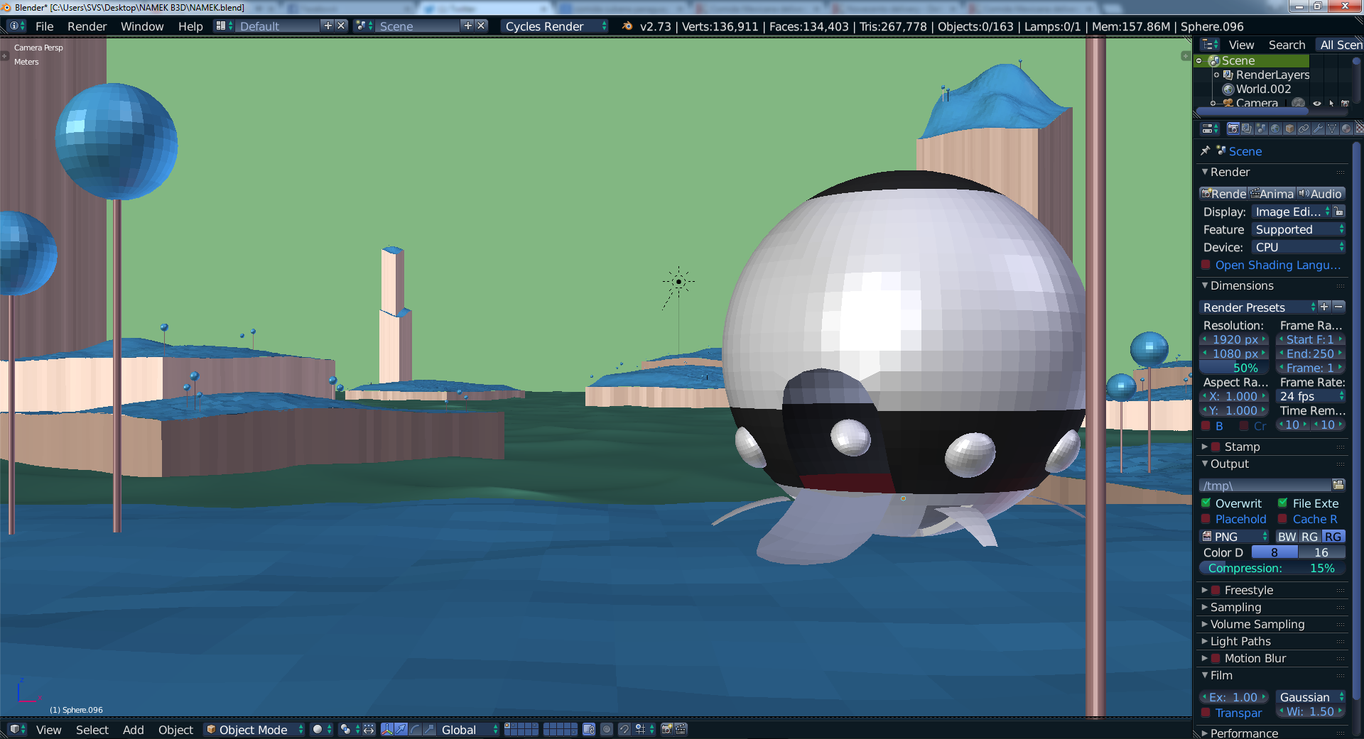
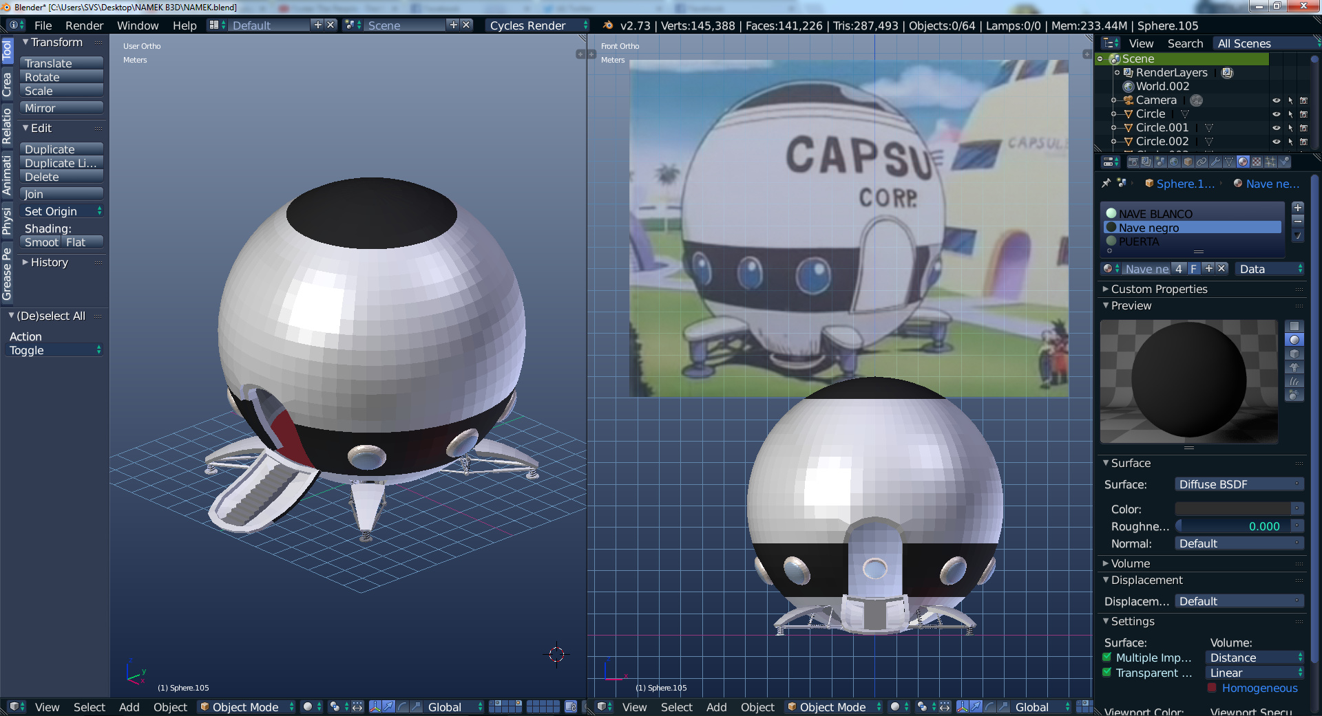
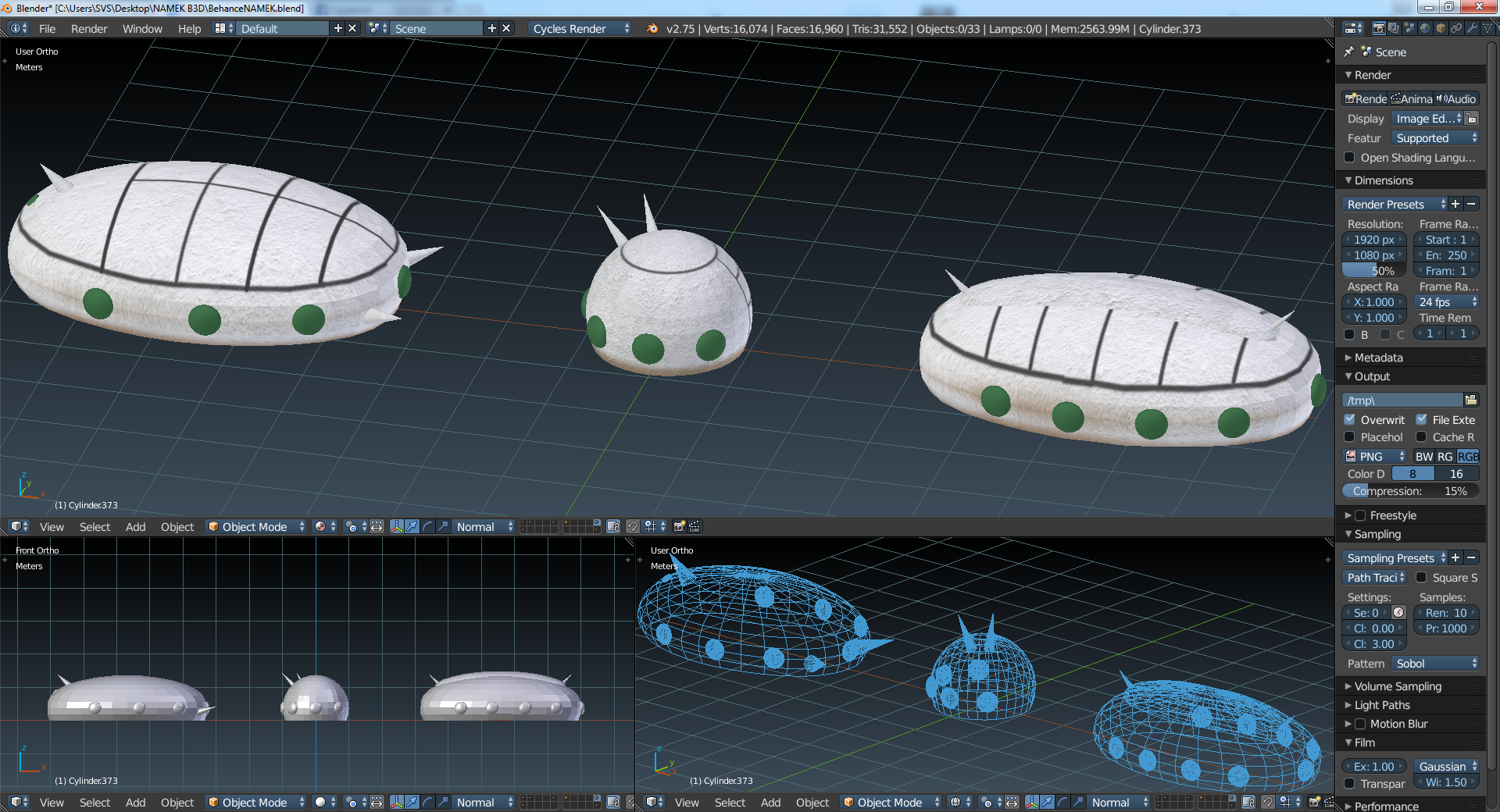
The improved Goku’s ship…
Lets add some textures and test the grass!
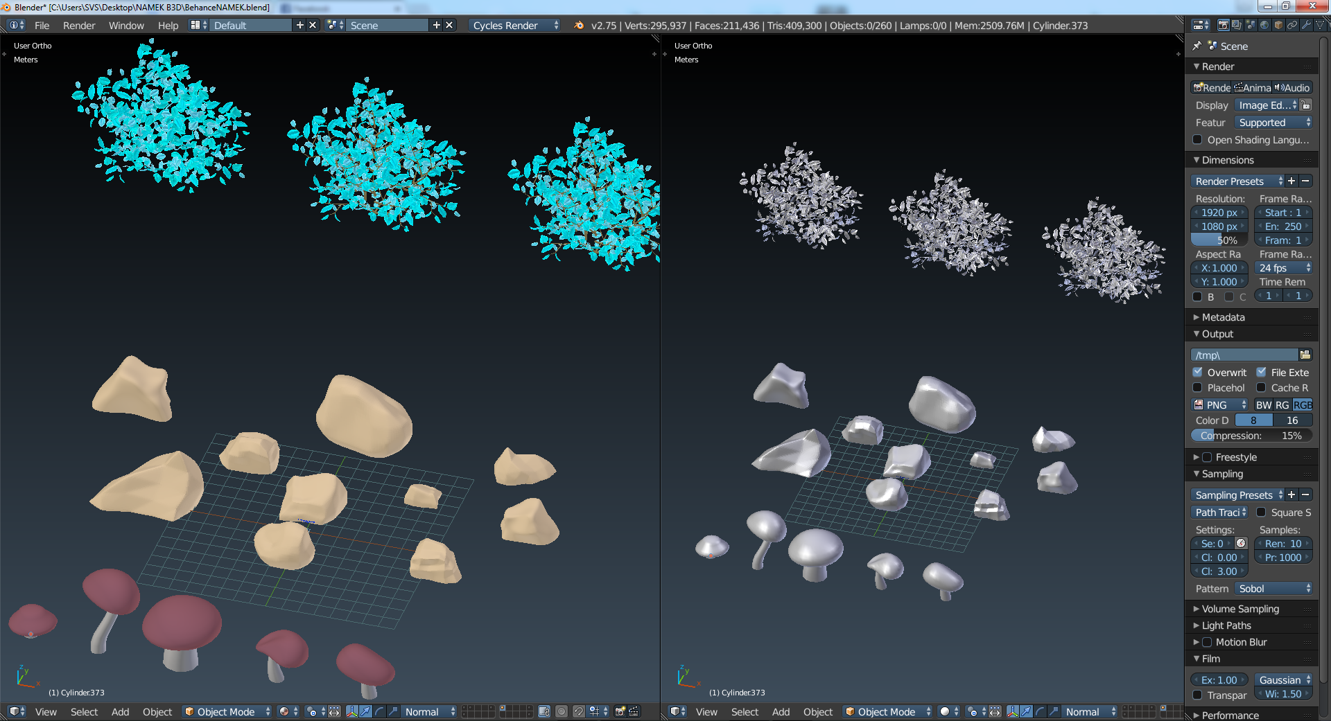
The focus on the grass and trees…
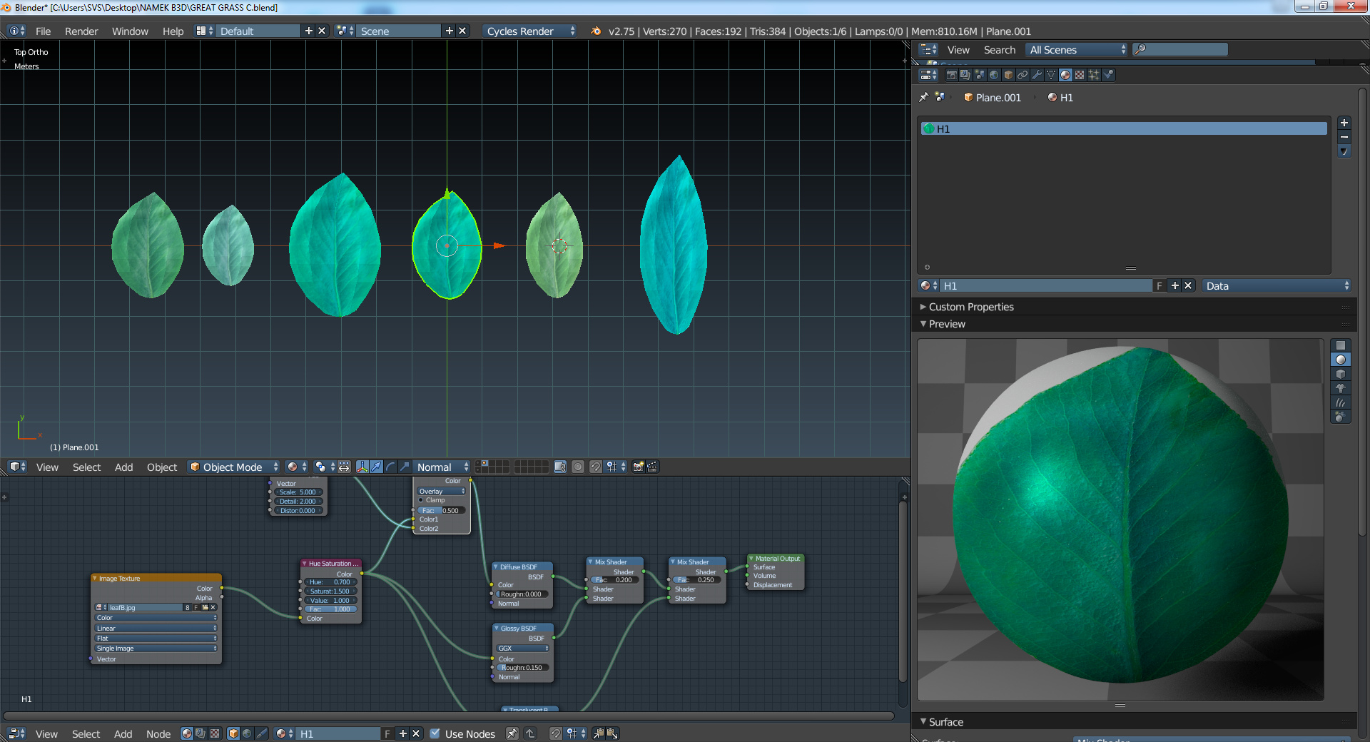
then making some leafs…
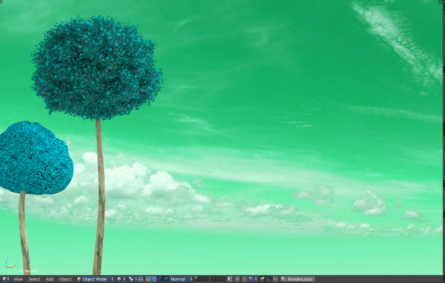
Now… a lot better trees with the particle system
Well done, congrats!
Very cute and very fanciful. I think you satisfied your childhood yearnings quite nicely.
One hint though, if you’re going to be making continual improvements, then it may have not been quite ready for the Finished Projects forum.
Great!
I think the rock behind the spaceship somehow ruins the composition, the position of the spaceship itself it’s a bitt off (in my opinion), maybe too much on the right. The tree, partially hiding the ship is also disturbing somehow and there are a lot of composition tangents i believe (the two trees on the left, one touches the right edge of the canvas, the foreground mushrooms and the tree on the right are just like they rest on the bottom of the canvas. All these issues flatten the image in my opinion.
My advices are: just widen a little bit the angle of view so that those elements don’t touch the canvas borders, add some rim light or fresnel reflection to the ship to separate the silhouette fro the BG, remove that rock or move it in another, more convenient place, add some depth fog to the BG and darken just a little bit the foreground elements, also try to move the ship slightly to the left.
very good environment and concept, i like it, good job.
-although the capsule being the focus and the 1st element that catches the eyes, but it is not as good as the awesome environment, i suggest to detail the capsule more or change it so it is better than the env. and you’ll have a stunning scene.
-the texture of tree closest to the camera is a bit low and lacks better bump.
Very very nice.
I love it.
Nitpick on a great environment image: The image needs to be sharper. It feels like I need glasses.
Very nice style! Coll composition & palette. But on my opinion - too blurry.
My eyes try to adjust to this blurry effect. Strange but I like it.
Thank you all for your great feedback… taking notes for future projects. 
I know! Add mist! It will add depth to you work.
Damm girl thats looks awesome
I like it. you nailed it. Good Work
put the link up
Hi mate!,
Awesome job with Namek.
If you agree, I was interested into have this job in a higher resolution to print it and place it into one of the walls of my room.
Of course give you a tip would be more than appropiate.
Please contact me at your earliest convenience.
Thank you!