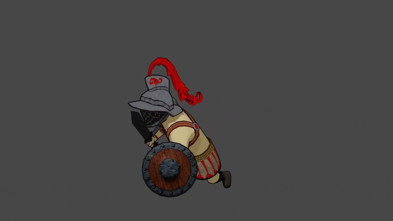
I’m working on a project for college where i’m going for a cell shadded Sheep Raider low poly kind of visual (which i love btw). This is the first character i’m finishing. Is it good? Is it portfolio ready? What can be improved?
Welcome to BA
This is not my field but It looks very nice imho.
Maybe the foots are a little bit too small and boots need some detail, just my two cents.
Yeah, I went for a huge arms, tiny legs type of cartoonish strong character, but the boots do lack texture, as well as the sword. I was intending to work on it if needed, guess I will do ![]()
Thanks for the feedback.
Hello and welcome !
What do you mean by that ? Are you planning to get hired as a CG artist ?
On the overall it’s good, but like with everything there is always room for improvement.
I’d look at setting a clear rule for textures/materials, what I mean by that is that your character belong to a particular style and this style is driven by rules.
However, the shield, helmet and shirt doesn’t follow exactly the same rules.
The shield look heavily textured, something nearly realistic ( as opposed to stylized) with soft shadows . But the shirt in the meantime show nearly any texture, it’s basically a cell shaded material. with a sharp shadow.
And the helmet is kind in the middle texture wise and show no shadows at all.
You could say that this is your style, each object got a different way of being shaded and textured, but in that case it’s not exaggerated enough so it look assumed.
Having more strict rules will help your character to feel more grounded and part of a particular universe !
It’s also possible to balance out the colors a bit better but that’s not what strike me the most !
Have fun !
Everything looks fine to me. If I were to nitpick something, I’d say the jumps look a little too floaty, and should be sped up a bit, but that’s just a tiny concern.
Yeah, I have struggled with the shield texture for a bit, guess I will downgrade its resolution to see if it fits better with the rest. But I guess its about the style really, because the character and the props have a very consistent texel density.
The “shirt” is actually no shirt at all, it’s just skin. He has nipples and everything lol, but they are not quite visible from this angle… which is the same case for the helm shadows. The light hits the helmet almost straight on from this angle, so its shadows are also mostly hidden. All objects have the same shading. But I do think I could improve the lighting.
Thanks for the feedback ![]()
I used royalty-free animations to be honest, I mostly adjusted them to fit the cartoonish proportions of the character and the transitions between them in the NLA.
I could work on them i little bit more.
Thanks for the reply ![]()
