Hello all! I’ve been trying to buckle down and finish at least one full character for a few weeks now. The problem being, of the characters I wanted to finish I might have chosen the one with the most difficult materials. This “Inkubus” I had envisioned having green highlights in all the correct contour areas, which would generally be areas that would be in shadow.
This was my first attempt to show about what I meant for this kind of coloration.
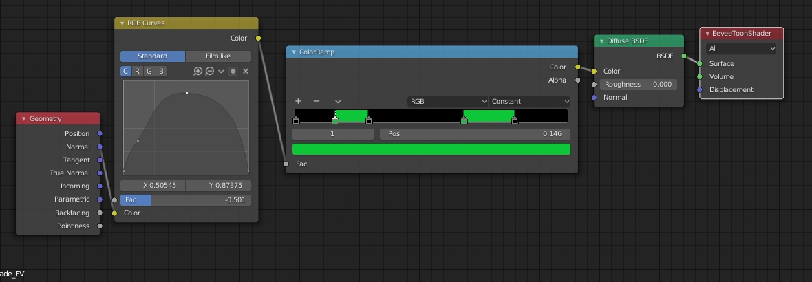
I found a shadow catcher fakeout with Evee that kinda helps with this, by making the shadows green, but did not quite create the look I wanted. Right now this is what I’m using, and how it looks.
Would I be better off doing some kind of specific normal based shading, like the guilty gear thing? I want this character to be very stylized but not necessarily in a cell shaded way, just pushing the “unreal” look with the all black surface with green shadows/contours.
OR should I just try and finish some other character because these materials + the fact that I’d really like to make the flame areas move/be wispy is just wayy too much complication for a first finished project to sell? (As an adoptable, mind you, but I’m so close to finishing the retopology which is eating away at me.)
Any advice on how better to create this effect or help in letting me put it aside for now and work on something else would be fantastic, thank you.
Think about what you’re actually doing with your current material. You’re outputting some weird average of your world space normal into a color ramp? Your normal will change with animation (and look at that guy, you plan to animate, right?) All you have to do is rotate him a bit and your texture will stop doing what you want.
If you want, as you say, literally shadows, you can do that in Eevee-- just run diffuse bsdf into a shader-to-RGB color. (Just remember that if you then use that to color the shadows and run it back into a diffuse, you’re pretty much guaranteeing that your green areas will be underlighted, leading to reduced vibrancy, like you have in your current render.)
But when I look at your concept, what I see is something less based on shadows and more based on the dot product of normal and incoming vectors, which is something you can shove into a color ramp instead if you want.
One of the big differences between your concept art and your model is that the concept shows a lot more surface detail. You’ve sculpted some but not all of that detail, and it shows. Any effect based on normal would benefit from normal or bump mapping some of this detail into your model, but effects based on shadow are going to get very very little benefit from normal mapped detail.
Thank you so much, this has a lot of what I looking to find out. The whole thing with the normal object position was me, desperately trying to figure out how to at least visualize what I wanted while working. Not based on any like, practical knowledge.(basically I messed around and said this will do for now)
here,
Blockquote But when I look at your concept, what I see is something less based on shadows and more based on the dot product of normal and incoming vectors, which is something you can shove into a color ramp instead if you want.
THIS, this sounds like what I need. I didn’t have the vocabulary yet to figure out how to ask for it though! You are definitely right that the concept has a lot more details, but as I was sculpting this went through a few phases, and I decided to go more stylized with the shapes because the amount of muscles/ect in the concepts I did were not really visually appealing as I was making them. Too much of a good thing, as it were. But it is very good to know about the normal mapped detail, thank you!
Although now I am having a heck of a time looking up how to do stuff with these dot product of normals you are talking about.