I used blender to create two different covers for one of my novels. I have to choose one of them, but I’m not sure which of the two would work best to grab potential readers’ attention. Please look at the two images below and send me either a public or private response. I’d be most grateful for anyone’s help. Thanks.
I like the image for cover B, but I don’t like the titles font, nor it’s yellow color. And, while you didn’t ask, I really don’t like the title, either. Too abstract. It’s not the sort of title that would prompt me to read the cover blurb. Have you talked to your editor about it? (And it is way too small to read on the spine, unless the book is only 1/8 inch thick…)
FYI, the font on both are the same. The difference is Version B is all caps. I can easily switch between capped or not. As for the color of the font, I chose yellow because it makes a good contrast from the background colors. Also the color yellow has a tone that suggests caution, while tying in the plastic quarantine ribbon. What color do you suggest? A bright green could work for Version A, matching it with the germs. For version B, with all the blue and white in the image, I can’t use either blue or white. The green will not work because it is a color that represents life and isn’t appropriate to the tone of the image nor the book itself. Red may work for tone, but I’m concerned that red would be too dark and have too little contrast. Also, as for Orinoco’s comment about the spine, I selected the largest font size I could use for the actual spine thickness. Lastly, The novel name is perfectly suited for the story I wrote. No matter what I chose to title it, the reality is that some people will like it, and others will not. It is all personal preferences, and I have to stick with it because it is geared to attract the attention of my target audience. I do appreciate everyone’s input and thier constructive criticism. With all the votes I;m getting from different sources, right now the votes are split approximately 50/50. This is going to be a very difficult decision. The more input I get, the more info I have to make the final decision. I thank you all for your input.
The novel name is perfectly suited for the story I wrote.
While I am sure that is true, it’s also true that the title on the cover is your one to five word sales pitch. It is the only chance you get to make a first impression. If those words don’t make a potential reader pick the book up off the shelf, it doesn’t matter whether they would have liked it or not.
I prefer the first cover. In both cases, however, I think the biggest detractor is the typography. I don’t think yellow is such a bad choice for the title in general, but it definitely works less in the second cover than in the first. It does evoke caution or danger and, against black, yellow is attention grabbing and legible. It’s also worth considering that primary yellow has a tendency to read as cheap/low-budget to consumers. You could also switch out the yellow with white.
Is the title typeface squashed or stretched in any way? It seems to be at first glance, but that could just be because the title typeface proportions are so much different than those of your serif body text. Speaking of the body text, the column could use a bit of finessing. You might want to try justifying the text, making it the same width as your title, or turning off hyphenation. On the second cover, your title shouldn’t be broken into two lines. I’d lower the type size and make sure the break between your title and the first paragraph is the same height as the break between the first and second paragraphs.
Because you have to go with a smaller type size on the spine, for legibility reasons I recommend using all caps and increasing the letter spacing a hair.
This is just a style manual note, but the title of your book should be italicized when referred to in your body text (i.e. “Brutal Adaptation examines the implications of letting fear…”).
Time ago i needed to create some book covers for personal use and i took some ideas from http://bookcoverarchive.com/randomize ,maybe can help.
I personally prefer version A.
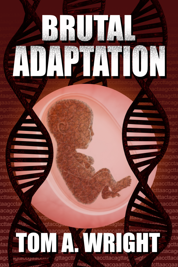
This is an old post, and I’ve changed my cover to something I like even better. Figured since I was here for something else, I’d take a moment and share it.