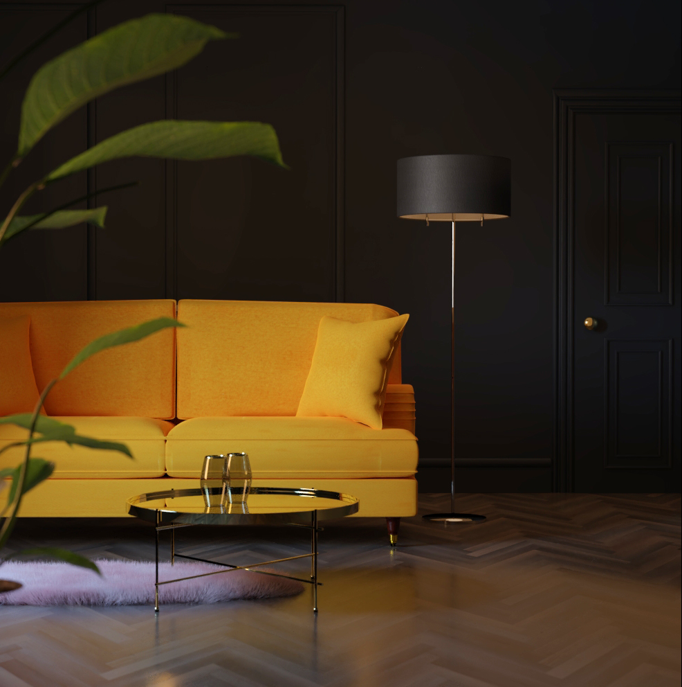
I’ve rendered this low res so I can get some feedback before I continue. I know the sofa needs work such as wrinkles and less square.
What do you think overall? in terms of composition and lighting and anything else I need to work on other than the sofa? Do you thin the lighting overall is too blue and needs to be warmer? (in reference to the light hitting the rug, as the rug is actually a blush pink colour)
I’m not super experienced with Blender, so take what I say with a grain of salt. I think the second image looks much better, and I can definitely feel the velvet vibe that you’re going for in the couch. I don’t know how you could improve it but it looks like it’s on the right track to me.
The main thing that I found kind of odd is the lighting. I don’t exactly know how you could best improve it, but the lamp light looks very weak and doesn’t add much light to the scene except to the side of the couch. You can’t really see any light even directly underneath it, and for some reason that just kind of looks a little strange to me. I don’t know if it’s because the lighting from your lamp just kind of gets swallowed up because the rest of the scene is so well-lit, or because there is something about the reflection that’s off. I feel like wood normally isn’t quite that glossy or reflective, so maybe if you toned down the reflectiveness a little bit it could also work better.
The last thing that stands out to me is the glass table. It looks to me like it’s too thick for those thin metal legs; it appears topheavy. Other than that I think it’s very chic and I love how fluffy the rug looks. Hope I was able to help! Please remember this is just my perspective and I might be wrong about what works and what doesn’t.
I really like the simple concept. The orange tone on the first image seems more eyecatching for me , though you can clearly see modelling progress on the second one.
I would definitely try some little composition tweaks, but overall it looks like a cool render.
Maybe think of something detailed as a focal point for this - like a cat sitting on the sofa or something bringing a bit of a story or life into this render. Now it seems a little catalogue like. Lacking personality (though I really love the color scheme)
I think this could boost it a notch higher.