In-between all the updates I have been doing over the past few months… I have been playing around with some new shader packs. There are a couple of packs I have purchased on Blender market… I will not list them as it might violate some terms here… but these two packs have been so very valuable in my projects. These are 90% of my textures in my scenes (or at lease some version of them as I tend to modify them as I need).
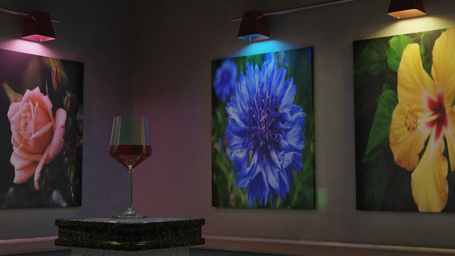
Ok, that said… here is a scene I just labeled Gallery for production. The lighting is simple. One spot over the glass, 1 area light in front of each painting, and one emission light over each painting.
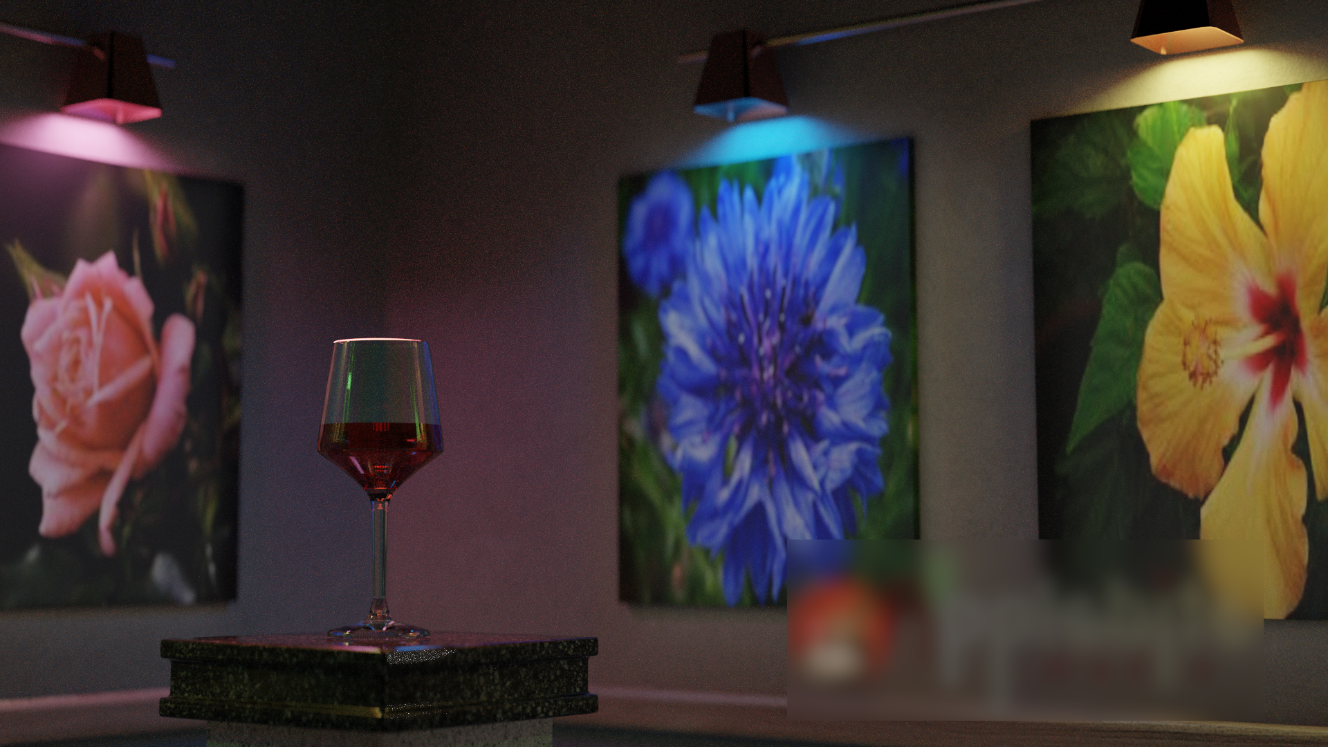
Thanks kim. I know the technical with rendering. Thinking more artistic… I have been playing with camera blur, adjusting the intensities of the emission lights to get a little more depth.
I will try HDRI and see if I Can find one that helps
To me, the lack of realism here is due to a few things:
Are the paintings low-resolution? They look a bit pixellated to me.
The scene looks a bit unusual and surreal. It’s not unrealistic, but how often would you expect to see an empty room with a single wine glass on a pedestal in real life? The scene is a bit bare, with minimalistic walls, lamps and paintings, this gives a slight surreal feeling.
The lack of camera effects. A real photo would have some camera-related imperfections (depth of field, bloom, lens distortion/dispersion, vignette, film grain) and you need to have a subtle amount of those if you want the full look of a photo.
The wine glass is big and in the foreground, but looks strangely dark and hard to see compared with the paintings. This doesn’t seem to me like something a photographer would do. Maybe if there was a spotlight shining at it sideways to add a bit more reflections on it?
I think the term photo realistic would be more appropriate as I am wanting to be a little more artistic with the content. The images are low quality, basically google grabs as it related to the emission lighting I was using. I was almost thinking of adding a toonish effect to them, make them more like paintings than photos.
I was going to reply, and then aborted, but here I am again. Is the spot above the glass directly above? Think about off-setting a bit. Rarely in life is lighting perfectly centred.
I am glad you did reply. Your comment made me realize that I accidentally selected the wrong file. The spot over the glass was the clue… that should look like this.
The above image is missing the light ring around the rim. And yes, it is slightly off as not to make the entire rim glow. I forgot I changed some lighting when I added a watermark mesh. This one also has a little depth of field added as well.