Did the devs think it was a good idea to replace the (admittedly confusing) UI of Blender, that people have been using for AGES, and flip it on its head while keeping it just as confusing, meaning now everyone has to relearn with the same learning curve as the first time. So I just downloaded the newest build of 2.8 because I heard that there was UI and Eevee overhaul. I am greeted with a too-bright default theme, and rounded corners which to me look very ugly. The object tab has been rotated 90 degrees, and to add salt to the wound, the material and object tabs are not in the same order as in 2.8 and are split up into tabs. There is no easy way to switch render engines at the top, as that has been removed, and rather then a drop-down menu there are tabs at the top. I decided to get into actually learning the new UI, but then, when I tried to search up bridge edge loops with space, guess what happened?
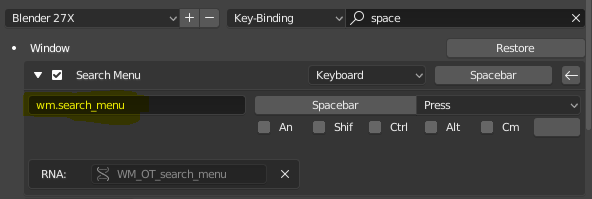
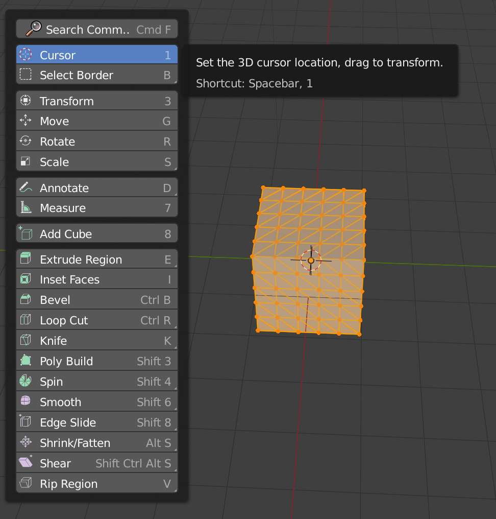
THEY REMOVED THE SPACE COMMAND. THIS WAS THE MOST USEFUL COMMAND IN ALL OF BLENDER, AND THEY REMOVED IT, AND ADDED THIS WEIRD TOOLBAR THING.
Also, the tabs on the left side have been completely removed, hope you didnt like one-click smooth shading or easy brush controls! The select controls are at the top of the screen, because if something works, change it! also the size of the select controls is like half of normal, and they are now monochrome, making it FAR harder to spot and change instantly. But apparently, extrude and a bunch of other functions did need colors that look like pastel.
Oh also, compositing mode no longer has a small image/uv view, because why would you want to see the image you are changing? Yet scripting needs a 3d view and image view, while compositing does not. Thats smart. What a genius move. /s
Render settings are now all over the place, where previously they were more condensed, which is, of course, a good idea, as now your user can do the same thing using THREE tabs instead of just one from before.
Oh, and the screen area at the bottom where there previously was the selection controls, the magnet controls, etc, has now been occupied by the INCREDIBLY USEFUL AND NOT AT ALL STUPID AND UNNECESSARY tool tips. Thank you, blender, for alerting me that I can right click to select. I didn’t know that. Its not like its the first thing I learned while using blender. Oh, and, just to REALLY be annoying, there is a bar at the top which VERY helpfully allows me to control the rotation of my 3d cursor, which is a feature I use ALL THE TIME (i have never once used that feature in 2.79 and i doubt i will in 2.8, so why is it given the same priority as switching from object to edit mode?)
The compositing menu, then:
It took me FAR to long to figure out how to switch from compositing the image to compositing materials. LET ME GIVE YOU A HINT:
YOU HAVE TO GO TO ANOTHER TAB. SERIOUSLY. YOU CANT EDIT THE IMAGE AND THE MATERIALS IN THE SAME TAB: YOU HAVE TO GO TO ANOTHER ONE CALLED SHADING.
The add and node keys are at the top, not the bottom. This is annoying and there is NO REASON to make this change. Seriously, no reason. It doesnt have improved ergonomics or ui, the only thing that change does is trip up older users. I am still PISSED the space menu is gone. SERIOUSLY. That thing was a life-saver in 2.79, and now its just not there. Why would it be gone? Did some intern just delete it and no-one noticed?
“Yeah, thats not important, the new UI is SOOOO streamlined no one will EVER want to search for a tool.”
Seriously, thats half the reason I dont just pirate maya or max: I love that space feature, it is so useful.
The other reason was that the old UI was easy, CLEARLY differntiated in seperate tabs, and infinitely customizable.
Oh and, whenever I drag something into the displacement node in the material editor, it thinks its a displacement modifier, not a bump map. IF I WANTED A DISPLACEMENT MODIFIER I WOULD USE ONE!
And get this: there is no way to make non-displacement the default. You are stuck tabbing down to settings to change the displacement settings.
And one last thing I want to get in: The fact that most of the UI is at the TOP instead of the bottom, and the fact that the object settings are now vertical, is espiecally annoying as someone who has an ultrawide monitor.
I will commend the new features of blender 2.8: They are VERY powerful, and Eevee is a blast to use and very helpful once you figure out how to use it and assuming you can look past the AWFUL new ui, especially in materials. The adaptive subsurface+displacement is very cool, and would be even cooler IF IT WASNT TURNED ON BY DEFAULT forcing you to turn it off. The new matcap looks really cool, and eevee and Cycles run beautifully on my new RTX 2070 (after I installed new cuda drivers). This new UI is just crap, i hate to say it. Its such a shame that the amazing features and software of 2.8 have to get ruined by a poor UI that was likely designed by an intern.
I wish I could just change one setting that makes the UI be identical to 2.79, but with the added features of 2.8. I don’t think that would be too hard to implement (corrrect me if i am wrong).
If I am just stupid and “dont get it”, please tell me, but to me this UI feels like a step back.
 There are already many bugs open