I put up my first architectural render a couple of weeks ago (staircase scene) and I really appreciate the feed back and comments made by everyone. I’m learning a lot from the critique process and hope you can have a look at my most recent attempt. It’s a simple enough New York style dining area.
Everything was modelled by myself except a few models I borrowed from blendswap & Blender Guru;
Cast Iron Radiator - Wig42
Vase - Tadine
Books - Blender Guru
Grass in Vase - Blender Guru
I think the chair legs might look a bit ‘off’. I designed them myself and I’m not sure if the legs would just collapse if you sat down. Besides that would you consider it to be portfolio material or does it need more work?
Let me know what you think…thanks in advance.
Eoghan
P.S. I wasn’t sure to just add this to my previous thread or start a new one…
A few things stand out to me right away. Mainly, the window and sunlight. The sun light is a bit too over-exposed and the window pane itself is dark and doesn’t convey that the light is passing through the window. It actually tricks the eye to think the light is coming from the left of the window. How did you set-up the glass? CHeck out some real-life images of sunlight passing through glass, you will see the difference.
Secondly, the rest of the room is under exposed. Not sure how much photography knowledge you have, but this scene could benefit from imitating HDR photography. Balancing exposure so that everything is well exposed.
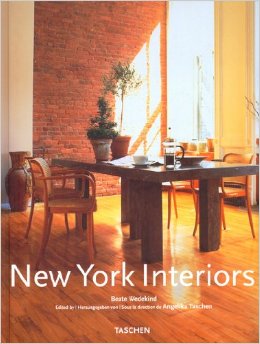
My photography knowledge is as basic as it gets. I agree with you about the room exposure, I may have fiddled around with the compositor too heavily. Looking at the window now I see where you’re coming from, I used the window generator script and I got the scene reference from the cover of ‘New York Interiors’ by Beate Wedekind. The sunlight exposure is pretty intense on the cover so that’s where I got it from. But yes the window doesn’t look 100%
I think the light on the wall is too soft, maybe turn the lamp size down a bit?
It seams like the scene needs more light from the bounce off the wall and floor, as you can see in the reference photo the wall to the right of the window is illuminated quite a lot from the light bouncing back off the floor.
The wall around the bright spot seams a little dark close too the bright spot and a little light toward the edge of the brick wall, the brightness is too uniform, there should be more of a gradient from the bright spot to the edge of the wall.
Also the reflections on the window seam blurry, the reflections should be sharp.
A dirt texture mixing diffuse into the window would make it look nicer, windows always have a little dust of dirt.
The other posters have given you some good advice. This is a nice scene overall, you can tell you have put a good amount of effort into it. I guess what is throwing me off more than anything is the front chair legs. Perhaps the camera distortion is exaggerating things but they look a little odd to me in the design.
The Brick texture in the back is distracting. The super dark grout is attracting my eye to the essentially blank wall, as opposed to the focal point of the piece, which I assume is the chairs. When there are high contrast areas in an image they attract the eye. You can either get rid of that dark grout, or use it to attract the eye to that wall. What also attracts the eye is lines on the image, your light casting on the wall is creating some lines itself.
If you look at your reference you can see there’s a big plant in the middle of the table. There’s actually a lot of compositional elements in that picture that direct the viewers eye to the potplants on the table, as opposed to the chairs. Here’s the simplest compositional trick I can offer for this image: See that shadow line in the middle of the light projection on the wall? Move the sun so that line is pointing directly at whatever you want the focus of this image to be. Here’s another one: use that green cloth to add color contrast. Right now with it on the side of the image it’s not really bringing much to the piece, but I feel like if you put it on the table so it was hanging a little off the side it would shift the attention of the image. Have the aforementioned shadowline pointing at the green cloth for extra compositional cheaty-ness.
Also yes those chair legs are ridiculous. Leave the rear legs as they are but make the front legs straight. That should shift the center of balance back to where it should be. And add some more detail to that table, it’s just five cubes right now.