Now that you moved the UV Editor icon, you replaced it with a different icon @V3. What is this for?

Now that you moved the UV Editor icon, you replaced it with a different icon @V3. What is this for?
This is a monochrome clone of an icon from the 2.5, that was used in UV/Image Editor, but this very function (can’t recall its name) is not present in 2.8 anymore. Some time ago I suggested to use this pictogram for the UV Editor, but in the meantime I’ve found that the current UV Map icon is visually too strong (the V22 from before 21-12-2018 update) so a new proposal was made (the V22 - 21-12-2018 updade). Since the previous UV Map icon is with no use and it shares the shape with new UV Map, it seems that it fits the UV Editor better then well. I’d save the V3 icon for some future use within the UV Editor. I bet it will find an appropriate function sooner than later.
Not the William-against-the-whole-world thing again.  The floppy’s proponents gave their arguments, but have been blatantly ignored or countered with non-arguments.
Please. Just. Use. The. Floppy. Icon.
Keep talking, but I think that this matter requires a special commission and at least two subcommittees. Then things will get the right pace.
What is the icon where the UV Editor icon used to be?
The release log proclaims:
Yes I saw that, but where the UV icon used to be (V3) there is now a different icon. That’s the one I’m asking about.
It’s for the UV Map data:
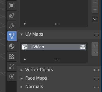
I still don’t get it. Isn’t that what this is for? This is GROUP_UVS (what you call UV Map):
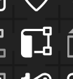
I’m talking about this icon, where the UV Editor icon used to be (V3). What is this for:

You added this icon, but I can’t see an explanation of what it’s for.
?
The V3 icon is there since a long time. It has no use at the moment. It seems it was an editor’s icon in post 2.5 era.
Ok, I’ve got a patch for the new icons ready. We should be able to include them shortly.
I also made a patch for more themable icon colors, but have a few more technical issues to fix there.
![]()
Except that there is absolutely nothing wrong or misleading about the standard save icon. Blender, until we live in your saving-less utopia, currently writes data to a PHYSICAL DISC. Icons, like words, do have meaning. And this icon literally means SAVE TO A PHYSICAL DISC, which is exactly what’s happening. If your argument is that it’s not saving to an actual 3 1/2 inch floppy then I’m afraid you don’t really understand the purpose of icons.
Honestly, the justifications you’re using for your decision are not very strong. I think at this point it’d actually be preferable to just have no icon at all.
Really sad to have to argue over something so self-evident to everyone else. It’s like colored wireframes all over again. I was really hoping with 2.8 Blender was finally getting past this kind of thing.
The problem here is that Lightroom operates on some files, and writes only changes made by you into another file and that files with changes are extremely small. Inside Lightroom is very limited number of things that you can do and they can be easily represented on very small files. File with hundreds of steps in edit history takes few MB on your hard drive. With 3d software, or software like photoshop is quite different. You create a file from scratch and each file can be like few GB. Storing the whole history would make you whole disk full just for one project. That’s why I can’t see save functionality gone in such software in near future.
Hey wasn’t the 2.8 tagline “Make Blender ready for the next decade”? So, are sure working will be so different in the next years, all around the world?
very well, now with the consent of J & W (they hold the token after all) we could carry on and bikeshed elsewhere… what about the ‘delete’ icon? LoL
Well, I guess I’ll replace the Check Mark the Save icon with a Floppy the Save.
I also have one more reason for this - different from the generally accepted meaning of the floppy icon. This reason is the picotgam’s form, which is perfect for our needs. The silhouette of this icon is absolutely simple and compact and the detail is modest but clear and unobtrusive. There is no visual noise. Least but not last, the symbol does not consist of several smaller elements - it is uniform and widely recognizable at a glance. These are the real reasons for the great popularity of a floppy disk as the depiction of saving electronic data. And that’s why I’m going to use it, despite the unwillingness of @William.
Although I am only able to give one “heart” to your comment, please know that I pressed the button many times…
