ah i see,thanks for clarification
All these new color icons are an improvement.
But the new shader ball icon doesn’t do it for me.
The old 2.7 shader ball doesn’t match well with the other new icons, so that one can’t be use.
I was wandering, could a “Toon looking” shader ball be used for it. That would only require two or three colors so it would match pretty well wtih the other icons.
Apology, for i didn’t find UI specific thread, so my last couple of proposals for UI before the lockdown:
If it can be made:
- join “Bottom Info Line” back with Info editor?
- add Top & Bottom options for Property editor Tabs.
eg
![]()
![]()
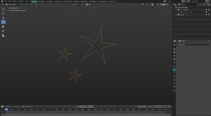
Can you change the particle icon to little stars like older versions.
Would the modifire icon look better just with the outline of the wrench.
Is it possible to blur the icon border 1 px more or 2 hmm.
Now do that with a 14x14 pixel grid
Really great work on icons.
speaking of icons, do we know if the new build with getting rid of the blender icon in the upper left and changing it into a blender menu is there to stay? I kinda liked that icon.

With UI freeze upon us I’m like -

Aw, what?! The icon was WAY better than the text menu. 
Takes up less space and looks better.
Man, some of these decisions are real head-scratchers…
yep… I feel like one of those first-world-problems-memes, but visually I’m not a fan of having the words blender and render in the same row. Also that icon was pretty neat.
I guess I could deal with the gizmo icon looking like a cupids bow and the new active selection being toothpaste-green, but I’d miss that lil’ guy up there for sure.
dumbdumbdumdumb… me no like. It´s a bit like the windowsbutton going back to the “start”-button.
How long do you think it took to remove the icon and replace it with a word? I do prefer the icon though…
The icon was changed to a menu first.
It housed blender preferences, quit and a few other things, and threw literally everyone off. No-one could find the preferences option in the menus anymore, because no-one ever thought the icon was a menu.
So they removed the icon and made it look like a menu, so the things in the menu are find-able.
I was confused for about 10 seconds, used my less than Vulcan logic skills and found the settings under the icon. Meh, I can get used to it.
Perhaps do things the way Windows 7 did the start menu. The Blender logo in the center of a nice big round button (with part of it protruding out of the region it’s in).
Maybe have the proper colored logo as well so no one can miss where the important app-wide settings are 
I agree, I saw people getting confused on twitter about the move, and it kinda makes sense to not have those settings in file or edit. It might just be a case of reading the manual though.
However, I’m using the file menu constantly, and would prefer that being the first menu item. The blender icon was at least small so it didn’t take that much space visually. Also, it looked cool.
it’s a bit problematic though, having two “blender logos/names” on top of each other is redundant it could be named prefs or removed completely and here is way.
- both save start up file and Quit should be in the File menu, the first you are making a default startup file and second is a standard in most windows apps.
2.“Splash screen, about and support blender” are not really preferences and should go to help menu maybe group them in “About pop-up window” there.
3.preferences should go back to Edit since that’s also standard in Windows. - that leaves load factory settings and install application templates…i suggest to keep them there but change it to this icon
 , which i believe to be universal that show it’s clickable & includes multiple options and doesn’t take space or makes blender weird.
I’d honestly just remove the menu and put it all back into the file/edit/help menus where it’s common practice to do so.
it’s pretty much exactly what i am saying, except i am making a small compromise that makes sense for all OS users.


