A heart is my second favourite then. I love (sic!) simple shapes.
Ok that will probably work.
Regarding the most literally communicative, I still think the safe is the best option - it locks away your data so it won’t get purged.
But if it’s too difficult to make a safe icon this small, we could use the heart.
Then maybe a crossed / broken heart for orphaned data?
would a lock work?
Haha, that’s funny. I guess. It’s a bit silly, but maybe that’s ok too 
A lock could also work, yes. Although we use a lock icon many different places already in Blender to mean a wide veriety of things. I feel like the lock is probably overused.
Nah a lock would imply that the value becomes uneditable. I still really like the poof icon tbh ^^
Yep, but a bit of silliness won’t hurt. Will it?
A poof is nice, but have to try to draw it, because it looks like quite detailed bit to me.
what about a suitcase?
You mix up two arguments here:
- “floppy disk” icon should not be used for a “Save” function. Just no! It is so common, ubiquitous, agreed upon and understood everywhere. Sure, it is archaic and its original literal meaning is no longer transparent today, but its concept association is rock solid.
- “floppy disk” icon should not be used for blender’s “Fake User” function. Here I agree (at least partly), because the blender-specific concept of ‘fake users’ is not exactly the same as the general concept of ‘saving’ a file. There are parallels, but probably more discrepancies between both that warrant separate icons. I think a heart is not so bad for this. Anything is better than the old “F” icon…
I still vote floppy disk. I think it communicates clearest what that button is used for. People younger than 30 may never have used a floppy disk, but that icon means save the same way the thumbs up universally means ‘like.’ We “dial” and “hang-up” phones, press “radio buttons” and “rewind” without understanding the origins of them. I just found out a couple weeks ago the origins of the word “ok”—but I’ve always known what it meant.
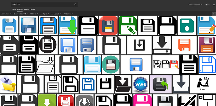
Search for save icon:
How about this?


Just ten years ago (I might have been 17 at the time), I used a floppy every time I tried a new distro on my computer, because I needed those damned SATA drivers which were not included in any Linux or Windows install at the time. I am familiar with those bitches. Now, through continued usage, the floppy disk symbol is de facto associated with ‘save’ even though it depicts an antiquated device. Which is fine to me - plenty of examples in nature, the camera with two film rolls being a prime one. What matters is that it conveys meaning, if it does so then comma, line return, let’s move on. No ?
Concerning the fake user thingy, I agree with William that two very similar icons living in the same space are defo too confusing, think about it : in the image editor header, there is the picon icon and the fake user icon. They have verry different meanings, so I’d say it is best to have a different icon for fake user, as long as we still have this -admittedly- broken system.
The heart seems good to me, the safe also. Probably not the pin.
So I’m updating the icon definitions in Blender’s source code. What are these icons again?

And these - what are they for?

From top left:
- NODE_INSERT_OFF
- NODE_INSERT_ON
- Node Editor - Snapping Node to X, Node Y, Node X / Y
- Node Editor - Snapping Node to Y
- Node Editor - Snapping Node to X and Y
- Volume File
- 3D/Scene File (Alembic, Collada, …)
As for the NODE_INSERT icons - shouldn’t the arrow have a shaft or be a filled polygon? What do You think?
“The Safe - something still bothers me and does not suit me in this idea…
To be honest, a floppy disk is more appealing to me.”
I think it’s that a safe is a massive thing and a piece of saved data that isn’t attached to an object is really small.
Safety pin?
Disc icon is absolutely fine. It’s the save icon everyone uses.
It’s a bit pun.
When you save a file the use of the word “save” is like “i’ll save that for later” not “I’ll save him from drowning”.
A book or drawer would be a better save image.
A poof icon (icon for the absence of something) :

I think that can work at 14 pixels square.
Heart icon for keeping data actually works: I love this data - I want to keep it!
