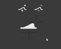
I don’t understand how this represents warp…  I can’t see past the human figure doing the plank in the first one.
1 Like
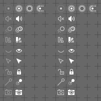
Most of the icons with two (or more) possible states, are designed so that these states are distinguishable regardless of the darkening of the icon. Darkening is to serve only to emphasize the difference of state. At present, the change of the opaqueness of the icon is realized through the parameters of the drawn object and it looks like the assumed value is exaggerated.
Here’s comparison - current state (with some minor tweaks, based on users feedback + new Proportional Editing OFF state icon) on the left VS. improved contrast on the right:
3 Likes
Nice one. This should make the states clearer.
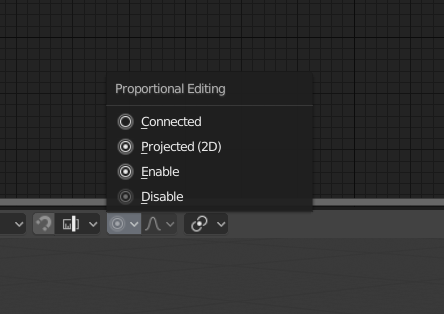
Another thing that will help is if we simply make the proportional editing always a toggle button, rather than a menu in Edit Mode. This is not an icon thing and requires some refactoring.
3 Likes
These do look better. I was talking about what’s in today’s build.
I still think a splash of color visible in your peripheral vision would be nicer while you’re working.
2 Likes
BTW @William - the set contains individual icon for Projected (2D) Proportional editing. See my mockup above. The pictogram is already in the icon sheet.
1 Like
It’s just an attempt at visual representation of what Warp modifier does:
2 Likes
Oh, there was already a proposal for Warp? Can you point out the message of that proposal?
First off, I really like the new icons! In most places, they are a clear improvement. Seeing stuff like the new Incremental Snap icon in 2.8 is great, it just makes me happy. I do see that’s there’s quite a bit of discussion on colors. So, here’s a bit of a mockup!
When multiple icons are shown close to each other, having them all be pure white can be a bit confusing.
However, colors should not be random. Colors should have meanings. In Blender, Orange is used to show selected objects, selected vertices and so on. So, Orange could be used as a symbol for things that only affect the “Selected object”.
I’m not great with colors, but here’s my 2 cents, a screenshot of 2.8 as it currently is, and a quick edit to show my take on what it would look like if icons had more color.
Other colors in the current 2.8 UI are:
Black         Background, Overlays,
White         Neutral color
Blue          Selected tool, or Z axis
Green         Editing tools, Mesh data, or Y axis; Animated property
Yellow        Keyframe on selected object or property on current frame

Orange        Selected object, active object
Red           X axis, (material data and lamp data in Outliner)
Green is seen in the Tool Shelf icons when you’re in Edit Mode. It is also used in the outliner for Mesh data and Armature data.
However, Red is used in the outliner for Material and Lamp data. I don’t know what the logic is, there.
Deletion icons and/or destructive tools should be red, but I haven’t seen any icons for them yet.
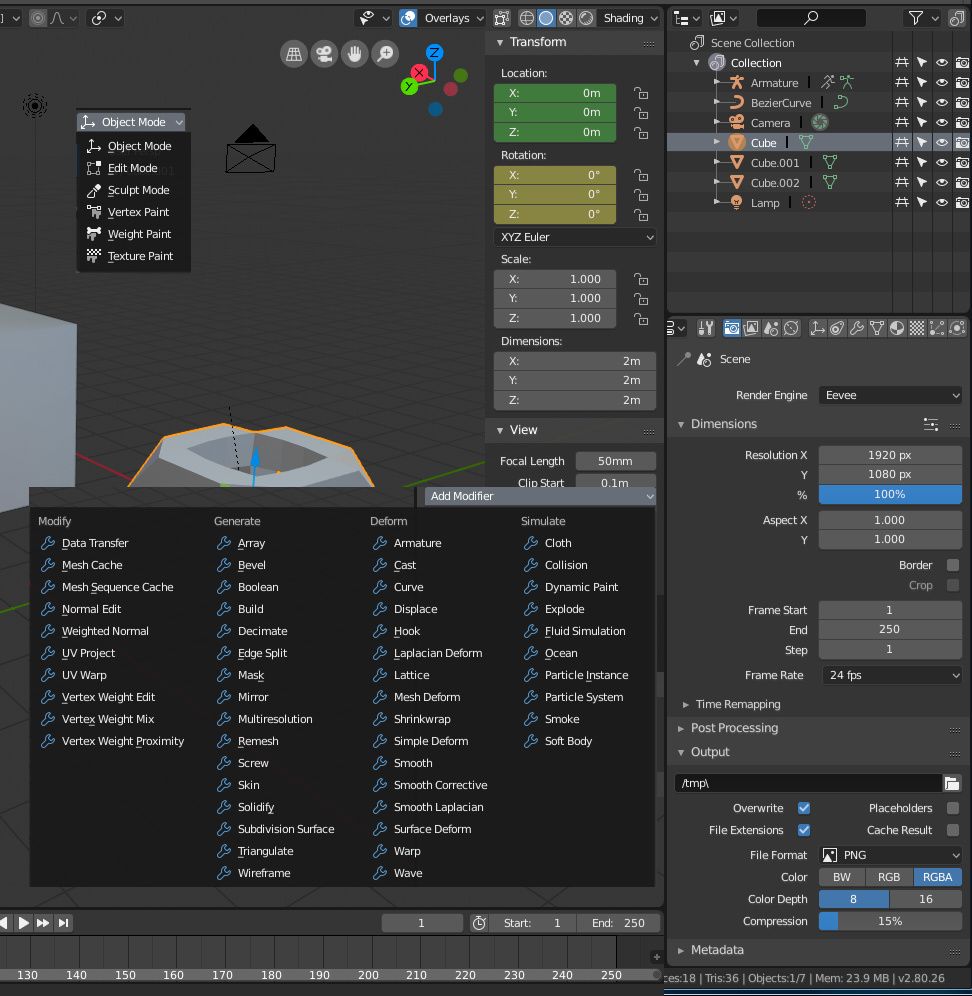
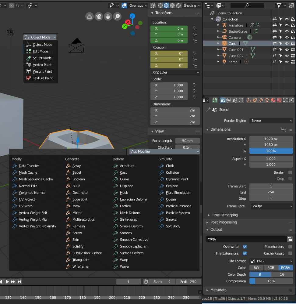
Modes are Object, Edit, Pose and Sculpt (changing the mesh, curve or bone data), Vertex and Weight paint (changing object data), and Texture paint.
Modifiers are divided into four categories: Modify, Generate, Deform and Simulate.
Tabs in the properties panel can be divided into several categories: Tools, Global settings, Object Data, Object-specific settings, Shared data (materials, textures), and… whatever Constraints, Modifiers, Particle Systems and Simulations go under. These could be divided in a few different ways.
First off, Tool Settings should be green, because it is the tab used to get more options when editing things. It isn’t only used in edit and sculpt modes, but it’s very useful for them.
Object Data at the very least should be orange, since that’s also Orange in the outliner. For visual grouping, let’s just make all the first four icons in there orange.
Materials are red, for whatever reason, so maybe the icon for materials and textures could be red too.
If more colors can be considered, then maybe some sort of hot pink / magenta would be useful for all that weird 3D stuff like simulations, or normal map editing, or that sort of stuff.

Of course, things do get a bit trickier when you have selected something (blue highlight) and the icon itself has colors.
3 Likes
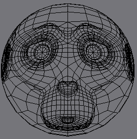
Slightly silly idea for cast modifier icon, a deformed Suzanne
This is kind of the other end of the spectrum. I myself think this is more overwhelming than the monoicons. I think once the modifiers get their respective icons, having them blue is sufficient. I did like the idea with icons having a small splash of a unified accent color, seen in one of the many mockups above.
I wanted to try and add color in the beginning but I didn’t even bother the next day. I am eager to see what Brecht does with colorcoding. Bigger margins in the property panel will help a lot as well. I trust that all will be good with slight modifications of the current state.
To be honest, I’m not happy with all of the changes I made myself. It is a bit ugly in some places. Designing proper icons is hard!
Coloring the different modes isn’t necessary since there’s only so many of them, but if more are added later, it might start to become a bit overwhelming. And having custom icons for all the modifiers will help there a lot, so color codes there might be unnecessary as well.
However, the icons of the Properties window could use a splash of color. There’s so many of them, they’re right next to each other, and telling which one you have selected can be a bit of a challenge.
There’s two reasons I went for the single fill color. The first reason is simple - it might be (should be) possible to color them in code. This would make them customizable (perhaps not at Beta release, but eventually), and would ensure that there’s no need for any extra work when doing icons. The second is that my vision is actually pretty bad, especially on one my right eye. I can model without my glasses just fine, I can read numbers and read text without any problem, but when the shapes are all grouped together tightly, I have trouble recognizing them - especially if they happen to be on the right side of the screen.
Having just a bit of an additional cue would be enough for me to tell the icons apart on the Properties window. At the moment, I can’t tell the current icons apart! I couldn’t really tell most of the 2.79 icons apart with my worse eye, either, but the landmarks of the big orange cube (Object tab) and the big red-shiny sphere (Materials tab) were enough of a key for me to tell which tab I have selected.
There are other ways to solve this problem, of course, like dividing the icons into smaller groups. 2.8 has already made this much less of an issue by dividing the tabs into three distinct groups, so whatever happens with the icons, it might be an improvement already.
Dividing larger groups into smaller ones is the most effective way to organize complex systems. The human brain has the ability to recognize patterns composed of up to 5 elements - no need to count, the brain knows that a composition consists of three, four, five elements. Larger numbers of elements are systematized by mentally grouping them into sets of up to 5 elements. Look at the dice - 1, 2, 3, 4, 5 dots are seen as specific shapes, but 6 dots are distinguished as two groups of three dots… More complex systems are ordered by the brain in a similar way - by searching for patterns. Reference points in the form of accents, appropriately designed breaks, negative spaces, etc., help the brain in this process.
So, compositions with more elements need to be divided into every third, fourth or fifth element. I do not see the need to introduce colour in icon lists containing less than five pictograms. In larger lists, the colour could appear every 4 ~ 5 icons, creating reference points. Coloring two icons in the Properties Editor tabs will do more good than dyeing everything.
This can also be achieved through visual underlines other than colour - more aggressive forms, fillings - that is what I am trying to implement in my icons. Colour can help, but the whole is supposed to work without it.
Speaking of this, Modifiers list do not need colour coding, but wise tweaked list organisation (alphabetical grouping exagerrated by empty spaces between each letter’s group is one of possible approaches).
5 Likes
Thank you!
If just a bit of splash is enough, then something like this should be enough. (Unfortunately, it seems like the images are a bit distorted on the preview here.)
Hehe. Well, two with similar idea should mean that the symbol is correctly representing the thing 
I like your Cast modifier icon too. @jendrzych, why not use it?
Perhaps for those icons that consist of several figures, as color code could be colored that figure that is supposed to have the modifier.
I did one more experiment using the Microsoft/Newer Autodesk styles, where parts of the icons are tinted by the main accent color of a given theme:

I think it helps with the issue of the icons blending with the text, making them pop a bit more. But at the same time, it’d require someone to go through and create another sheet of masks for tinted icon elements.
28 Likes
I quite like that solution.
1 Like
I love it! Color is joy
7 Likes
It helps the icons stand out from the text, but I’m not sure it helps distinguish between icons a ton - you have a sea of two colours rather than a sea of white now. Everything is still the same colour.
my eyes are too tired right now to do it properly, but I was doing a simplistic test earlier. pick an icon (amongst others), look away, then look back and stare at a location near to the icon. without changing your focus, try and land your mouse on the icon by discerning it apart from the other icons.
It really helps tell you what you really see at-a-glance. Because of the contrast, the editor menu isn’t too bad, but the properties tabs seem like they’ll take more than accenting them all with the same colour.
3 Likes