More teasing:
-
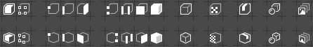
new overlay icon proposals:

-
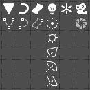
common photo camera and movie camera icons:

-
pictograms for: Render Image, Render Animation and Stereo 3D:

-
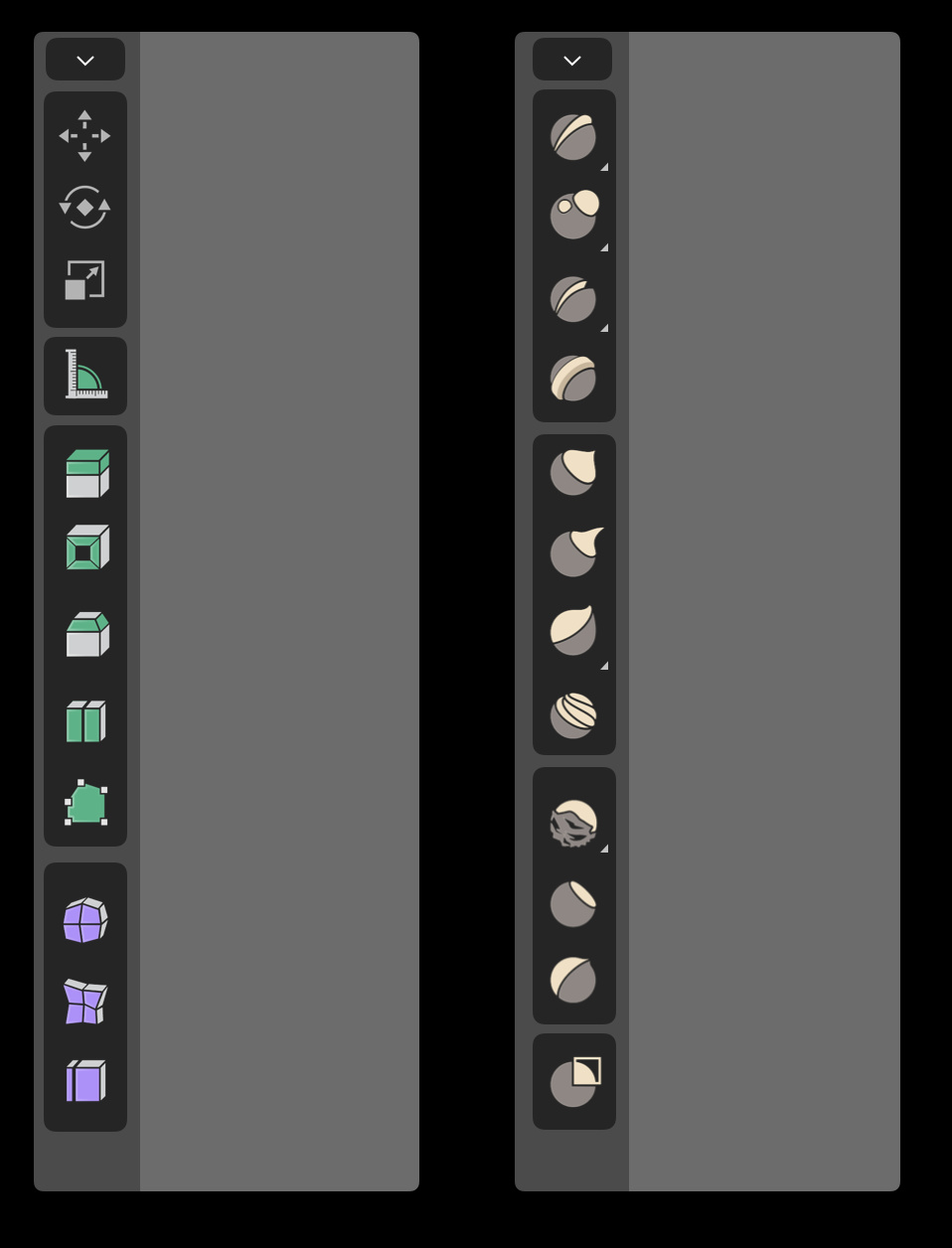
tweaked and refined Objects and their Object Data icons for Outliner (no Armature yet):
More teasing:
new overlay icon proposals:
![]()
common photo camera and movie camera icons:
![]()
pictograms for: Render Image, Render Animation and Stereo 3D:
![]()
tweaked and refined Objects and their Object Data icons for Outliner (no Armature yet):
A breifcace or a drawer maybe? ![]()
Or just a simple cardboard box? Taped… ![]()
Beautiful once again. One question: Do the Blender devs in the Netherlands know that you’re doing this, and have they signaled to you that your icons will be used in 2.8? Now that I’ve seen your icons, it’s either them or nothing for me personally.
I got in touch with Pablo Vazquez and William Reynish, so they’re aware of my gimpy attempts.
Regarding Overlay icons - flat grid is used in another icon ( ![]() - Absolute Grid Snap).
- Absolute Grid Snap).
3D glasses are consistent in style with the rest of the icon set - symbolic and schematic rather than perspective correct.
The Brush and Grease Pencil icons:
![]()
Now it’s time to take a break and comeback to real life work. Neglecting source of incomes is a bad habit…
The box looks nicer and simpler imo
Monoicon support all the way! 
could you make a small test for me (i don’t know the right color palette for it)?
try to make the black border on the icon in a lighter shade than the background.
Could You elaborate more, cause I don’t get it - a black border in a lighter shade than the background?
I actually prefer very colorful icons…and am far less concerned what ‘everyone else’ is doing…
the debate is purely what you like more…not of colors are more quickly recognized vs monochrome…because it is a plain fact that they ARE faster…
so, it is all a matter of preference. I prefer color…but not like the single color for all modifiers…they require different colors…and also not the C4D style…all I see is green, orange, white and black…
anyway…said my peace.
That’s what makes it so awesome! The world needs more stylized jellyfish icons!
There is a saturation slider for icons already, Shouldn’t that cover most users needs?
Indeed. I think Pablo even mentioned in a video that the main reason the icons are being made monochromatic is so they can be colored/themed by the user. Hopefully, this will include having colors for different categories of tools and functions.
“They” are working on new Tools icons.
…and when I thought this couldn’t get any better.
Why not match the style?
With fills all will become 16x16 pix blotches. Going linear is a must. Maybe - if I ever finish UI icons - in the future, I’ll play with Tools? Ho knows.
Tools icons are fine, but I’d use lines instead white filled polygons. This way, main part of a pictogram (the most informative part) would become more clean cut.
Would love to get in touch with the designer - already made a call on blender.chat/channel/UI.
The issue is that the 2 styles are way too different to live in the same application… 
And yes, those 16x16 would benefit from an increase in size… They are too small now… 
Standard practice is to design the smallest icons first and interpolate the style to bigger pictograms tpo maintain consistency. Those tiny bits have hell of limitations, thus gettin’ in touch with Tools icons designer is so important.