I suppose no one ever actually thought about that one… oh, wait, they did! You would have to make icons for every addon that gets it´s own tab. It´s just not practical. Text is a a logical compromise, and you get used to recognizing the text without turning your head, just like with an icon.
You would have to make icons for every addon that gets it´s own tab. It´s just not practical.
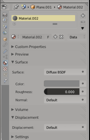
It is practical. And the pure icons above the properties in the properties window shows that it even already gets used nowadays. There is simply no reason why this shouldn’t work at the tool shelf while it already works in the properties window.
The official tools already have such an icon. And making an icon for addons could be the job of the addons developers. No icon in the plugin could be covered by a standard icon.
and you get used to recognizing the text without turning your head, just like with an icon.
Why make it text if the text isn’t read anyway? ![]()

Even holds true for the properties Window. For toolbars, if a new addon needs an icon there are plenty to choose from, or a default can be assigned.
I hate icons, they are always a bit rubbish… Icons only would be terrible…
Zeffi, Icons are evil… i look at your mockup and cringe with disapointment.
the text is fine.
small icons + text would be a compromise but as others have pointed out what happens with addons?
One mans meat is another’s poison and you can’t please all of teh people all of teh time…
I like the new tabs.
In an ideal world you could switch between Icon, Icon+Text and pure Text … Dreams ![]()
small icons + text would be a compromise but as others have pointed out what happens with addons?
well …
No icon in the plugin could be covered by a standard icon.
The nice thing about having the toolbar written in Python is that I can go in and take out space wasting cruft and add in buttons for operators that I use. Icons … :no: Cute but at that size by the time I have figured it out I have could have read the label many times over…
Let’s be honest, when you take some icons that were in a horizontal row and place them in a vertical column all you are saying is that you want more top to bottom room at the expense of side to side room. Nothing else.
Yes, and then you have to maintain your own branch of the UI scripts if you do that. Unless such changes can be put into an addon which overrides the UI (which is not impossible AFAIK, but not trivial), it’s not worth the effort.
Just a question:
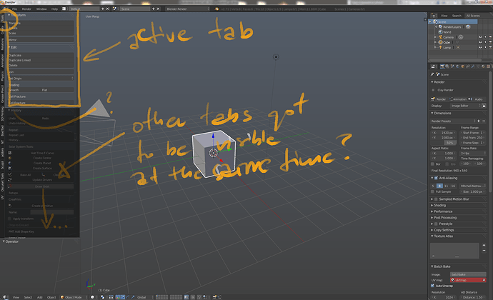
Is this really necessary to have-after activating specific tab-have all the rest visible also?
I mean-eg. TOOLS active, its features on top BUT all other features from other tabs visible and rolled out as well, i have to ‘compress’ them down each time to avoid visual mess.
I still firmly believe that horizontal icons make most sense and horizontal text is the worst way to seperate by tabs there is.
Reasons:
Icons ARE easier to read than text. We read words as icons in our brains (Not letter by letter), and it’s better to use a simpler icon than a more complex icon made out of letters.
Icons take far less space.
Horizontal Icons don’t occupy horizontal space, which blender has a lack of.
Horizontal icons are consistent with the properties editor.
@Michael_W
I accept your argument. Lots of this is personal. Your hatred for icons is on par my my utter disdain for vertical text, not for the people who implemented it.
@DruBan
I made that screenshot before I realized it was possible to scroll the Properties panel icons left to right so keeping the x-width of the panel unchanged while editing. But the premise still stands. If you can do vertical text, they can be replaced by icons and that can be optional.
I’m partial to the search feature if the shortcut escapes me. I rarely see these menus.
Anything is better then vertical text. drop down, pop out, icons, proper text. Hidden with short cuts, Just not vertical.
Can we put “Recalculate” and “Flip Direction” back with “Delete”, “Merge”,and “Remove Doubles”? Kind of go hand in hand, I think  I know the shortcuts, but sometimes it’s easier just to go click a button(and not an entirely different tab)
Something is wrong with your Blender or your addons. When in the Tool tab, panels from other tabs shouldn’t be visible. Check if you have everything (Blender + addons) up to date.
These functions have nothing in common. One group deals with deleting stuff, the other with shading/normals.
Really? You have some funky geometry, so you hit “Remove Doubles” to see if that corrects it, but then it doesn’t, so naturally you want to try “Recalculate” next, now you are in a new tab. Technically, you are correct, but what if my funky geometry problem was caused by Doubles? That’s a normals problem to me at least. Not to mention, they used to be together, now it’s changed:
EDIT: To be more clear, it’s a geometry problem, but it’s all related
I agree with Vicky.
While i use mostly key shortcut for modelling and avoid the interface, i agree with Vicky completely
When you use Blender for modelling, you use “remove double” then follow up by a “recalculate normals” often because removing doubles a lot of time will impact the normals of the whole mesh and not often the correct way.
So certainly when you’re modelling and using key shortcuts to speed things up you don’t notice, but if you use the interface buttons, it’s really not optimal at all to have to change tabs for those 2 functions that actually come together so often.
The goal of the tabs system shouldn’t be about saying how much of a great logical paragdim the interface is using, it should all be about usability.
A workaround would be to have a “mesh cleanup” button that would remove double then recalculate normals on the selection (and F6 would allow you to set the remove double distance and the normals direction), so you wouldn’t have to switch between tabs if paradigm is more important for the UI team than actual usability.
Tabs were intended to reduce the amount of scrolling and to help to organize panels rather than putting them all together in a single neverending tool shelf.
You can access alot of operators from the ‘W’, ‘CTRL’ + ‘V’ / ‘E’ / ‘F’ menus. I read that pie menus are on their way.
By the way, if you are so keen to speed up your workflow by clicking every button as fast as possible there is no alternative to learning and optimizing your hotkeys.
hi, there’s lot’s of fun here!
I’ve been away for a while, tabs were a big surprise. I don’t love or hate them, they exist so I work with them to suit myself.
Tabs code is in c & difficult even for devs i think.
It would be possible to add icons, maybe even a switch, but not easy.
As for adding icons for addons, currently they are not supported in bl_info or tabs.
If there was one main issue I have with tabs it’s the create tab, It’s panel is named Add Primitive. It should be named Add Object. A Camera & A Lamp are Objects, Not Primitives. (slight refrain from outright yelling)
I’ve done quite a few experiments so far with tabs & toolshelf & come up with some fixes for my likes. The one way to ‘fix’ the Tabs is to create an addon that in turn creates a context sensitive tab “Toolbox” then fill the “Toolbox” with the current entire tabs menu items & add in the ones that are needed by more advanced users. This way, you only need to select one addon, press one tab & your in. This however is not without problems with, panels, menu’s, buttons & defaults always an issue with users. When I wrote the dynamic spacebar menu, many of these same issues arose. how far do you go? how much that’s already easily accessible from blender ui do you copy? simply to have in another place… a middle ground is hard, but not unreachable.
One thing on my to do, is to fix the addons that currently incorrectly use tabs. mostly context stuff. adding poll functions is easy & they are fixable. , as soon as I find time, I’ll update many addons, to fix some issues, which includes, right addons in right tabs in right context. This will prevent many errors that I currently am aware of. For Release addons, consistent integration into current tabs is a goal, for Contrib addons it’s quite easy to create a new tab in py using bl_category = “Addons” & use this consistently for addons that experimental & don’t fit into the usual tabs or menu’s. Addons like add mesh, don’t need to use tabs, others that embed themselves in the w key menu & similar, need not use tabs either. so there’s lots positive to do with addons.
As for Tabs & creating a one tab, one menu solution via an addon to emulate & restore much of the previous functionality with some enhancements, It’s completely do-able.

