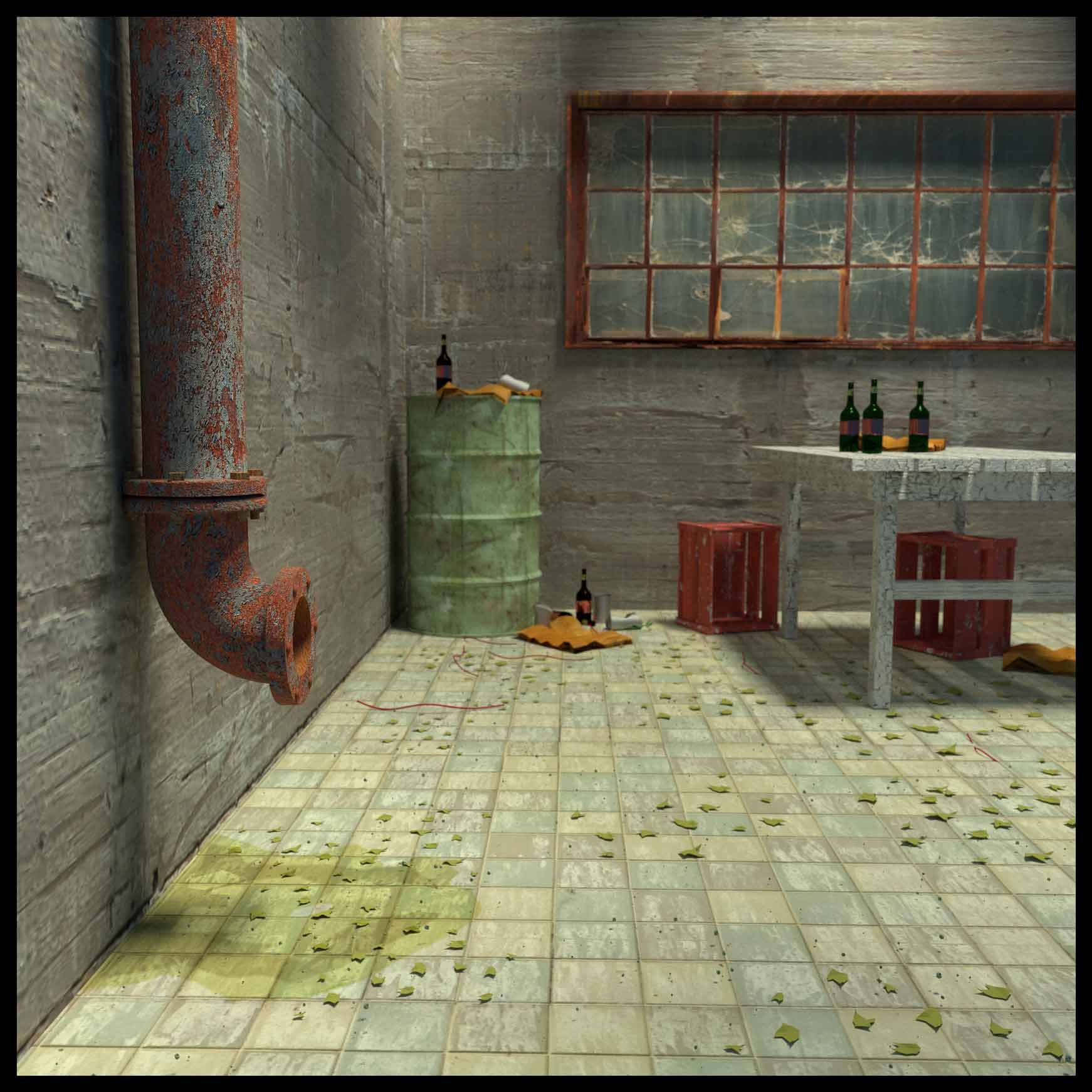
This is my first try at a non-tutorial project.
Blender, Rendered in “Cycles”, thanks to cgtextures.
I want to add in a dusty atmosphere with sun light streaks but I’m having trouble setting up the nodes, any suggestions would help.
thanks
This is my first try at a non-tutorial project.
Blender, Rendered in “Cycles”, thanks to cgtextures.
I want to add in a dusty atmosphere with sun light streaks but I’m having trouble setting up the nodes, any suggestions would help.
thanks
Nice image, not sure on the white texture for the table though. Dusty atmosphere, volumentrics I think are not possible using cycles yet. You could always render the volumetrics in Blender internal render and composite over the top.
Thanks, might try a different table color.
Try this one http://blendernerd.com/breakfast-hall-series/
Well done till now, nice modelling. try to improve it. 
Yeah, should probably go with a brown color for the table. White makes it look too clean.
I’m having a little bit of visual difficulty with that left wall, particularly on the right edge of that pipe, which is somehow trying to flatten itself into the wall and blow the 3D illusion. I’m also seeing the underside of the facing board beneath the tabletop trying to vanish into the back wall. I’m also seeing what seems to be too-wide-angle-lens distortion going on, making the joint between the left and rear walls feel somehow “dicey.” Maybe the texture on those walls is a bit too big. A few more props in this area would remove these objections.
The scattering of chips on that floor really seems to make the floor work. Nice exposure on those crates under the table. Really, this shot is working quite well. :yes:
I’m really not so sure about that; in fact, I don’t agree.
A work-table in an old factory is not going to be fancifully decorated, so you need to choose one color for the thing (probably white…) that is going to work well both on the brightly illuminated surface and the underside. (Not that you couldn’t cheat the shot in this magickal work of CG, but that’s extra work.) Off-white (slightly bluish) is a good, neutral color that’s going to give you those edge-defining shadows around the bottles, and they’re going to be a good indicator of the color of the ambient and/or sun light.
The top of the table is not quite blown-out white; definitely zone 6 but not 7, and the texturing keeps it cleanly separate from that wall without “cutting off the eye” from those crates. In other words, there are a lot of things right now that (IMHO) are working well right now in that area which you really don’t want to dink-with with a color change.
Me, I’d be carefully considering my options for a few more props. What they could be, what size they ought to be, what color/tex to make them, where to put them. Not an obvious answer. Many choices.
thanks for the input. I’ll shift the texture on the side wall to get the corner better, also mess with the texture of the chips on the floor so they don’t all look the same. Not sure about the table color, made it a dirty white but it started to blend into the back wall. Thanks
something appears ‘off’ with the perspective rule
the crates, the drum and the window frame are not helping because so strictly rectilinear and perpindicular to horizontal