Please give us your feedback, criticisms and suggestions.
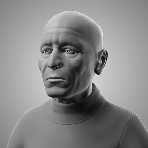
That is an awesome sculpt. Looks like somebody I know! haha
Proportions look good.
One bit of feedback I would give is that the earlobes look older than the lower face! What I mean by this is that the earlobes are quite low and make him appear to be an older man. Judging by the wrinkles on the brow and the crows feet, I assume that this is your intention. But from below the nose, he looks to be a middle aged man. Generally, as people age, their lips begin to thin. I think you could add a little detail around the mouth to make him look a bit older.
Apart from that, it’s a really nice, detailed model. Great stuff.
- slightly push in the forehead above the browline, especially the center part.
- make temple more pronounced
- Chin can be less wide and better shaped.
- The shirt appears to be a turtleneck, but is loose and floating. Try tightening it.
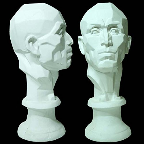
Take a look at these head planes, these can guide you and also help explain what I’m saying. A bonus that they kind look similar too.

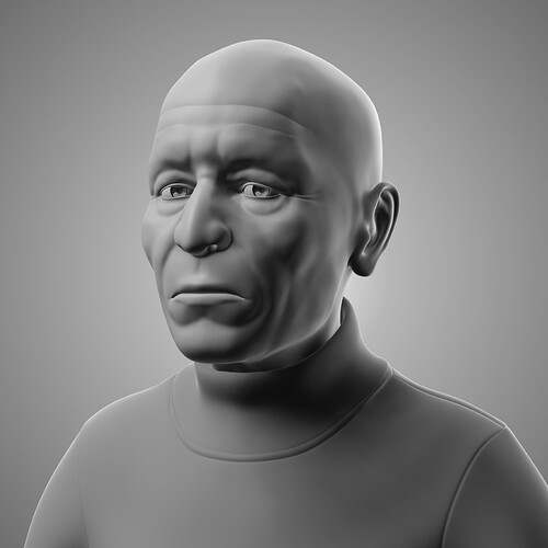
Looking great! I like the changes so far. Some more comments:
-
You might want to tighten the turtle neck’s base. If you want it loose and sliding at the bottom, some folds could help improve the image.
-
I forgot to ask, are you using a reference image? If so, please post it so comments can be more objective. One of the best advice I can give is to use reference. Gather as much reference as possible, and choose a main one. Choose a reference for wrinkles, eyes, lips, clothing, for everything. One mistake I did when I was starting out was to disregard that. This is a common beginner mistake and what happens is we access our brain thinking we know how it looks like but the info is actually incomplete and/or incorrect. As an example, most people know in their heads how mickey mouse looks like, can imagine mickey in their heads clearly, but can’t draw him properly without reference. And Mickey is simple, imagine something complex like humans. This is why sometimes the output looks strange but you can’t pinpoint why. So, use reference as much as possible. Eventually with experience and a billion references, your head’s library gets bigger, and you’ll be able to get proper info even with little to no reference. Even pros use references despite the massive library in their heads.
-
Another advantage of using reference and posting it is we’ll be able to distinguish between (1) lack of reference/info (2) bad or not ideal reference (3) lacking in observation skills or (4) lacking in the technical translation. If we can pinpoint which area is weakest, we’ll have a better understanding on how to improve.
-
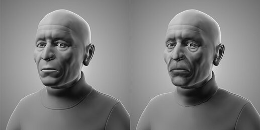
Without references, I have no way to know the age or ethnicity of the subject. Speaking generally, some changes I think can be done are (1) the eyelids-- older people see to have less fat in that area. It also tends to droop lower. (2) The eyebags droop too, and sometimes layer. (3) In cheeks, specifically the nasolabial folds, it becomes more prominent, reason being is our skin loses elasticity as we grow older, so our faces and fats tend to droop, and wrinkles are on full display (4) The mouth. It kind of looks like he’s pouting a bit. If this is an old guy, you can also push in his mouth. Older people look like their lips are pulling into their mouth, likely due to the loss of teeth, and again, the sagging skin/fat… Also, corners of the mouth have a recess (5) nose – if you look at the head planes, there’s usually a flat area at the center and the tip. Here’s a quick paintover, not the best quality but pinpoints stuff:

Don’t copy my paintover, but rather use it to see where it can be improved, and refer to the references you’ve gathered. -
Rendering–what are you using to render? It looks like there are no cast shadows. Shadows can greatly improve the quality of your work because it adds depth and looks more realistic.


