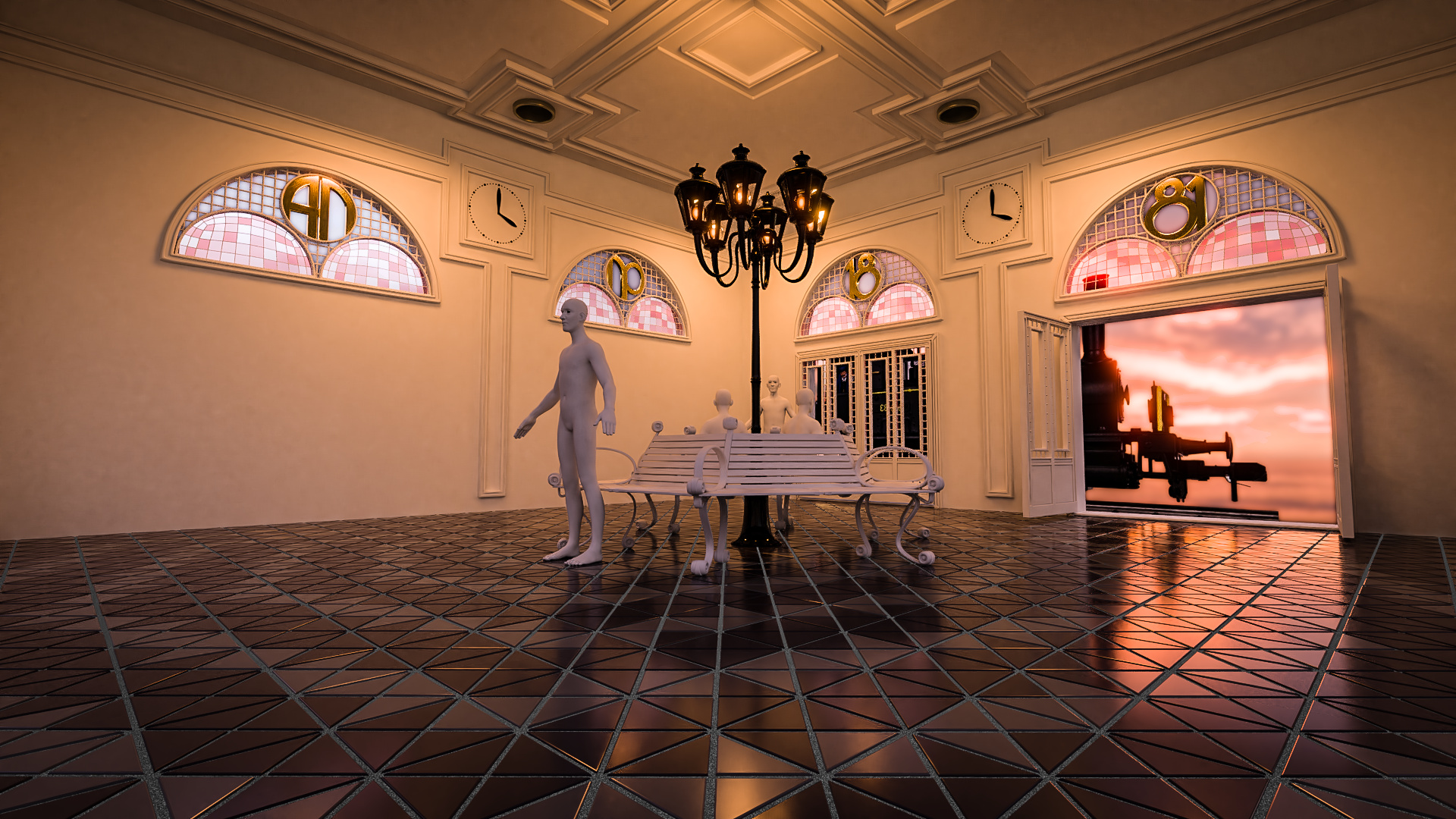
Currently I’m busy modeling a old station waiting room. As you can see I’m all over the place (modeling/lighting/composing). I really like it so far, so I figured I opened a WIP topic. Love to get some input from you guys along the way.
I like the overall look of the room and the style, but there are some things which have me a bit confused - what’s with the letters and numbers in the windows? Anno 1881? The style seems a bit too modern for the year 1881, but the real issue is that it took me quite a while to guess that that was what you might be going for, and I’m still not sure. The window to the left of the door just seems a bit off to me, perhaps because it’s divided into fourths giving it an aspect ration that doesn’t well with the design, and/or perhaps the train behind it makes it look less like a window and like something hung on the wall instead. I find the lamppost to look rather odd in the room. I think it’s because the ceiling is too low, throwing off the scale, and the fact that it looks like it belongs outside while the room doesn’t appear at all to be trying to give the feeling of being outside.
Anyway, that’s just my reaction to what was presented. Depending on the story you’re trying to tell with the model, some of my criticism may be invalid.
I am aiming for a neoclassical interior, however, it doesnt have to be that accurate considering the possibility of later modernization. The window to the left are also doors. Not sure if I want them opened or closed yet. The train in the bg is just a placeholder for now.
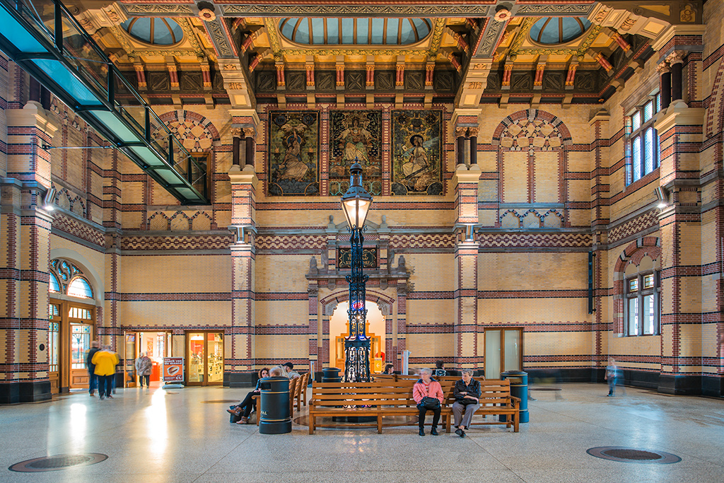
I borrowed the lamppost idea from a reference pic of a waiting room in Groningen, The Netherlands;
OK, neoclassical would fit in perfectly with the year 1881, if that’s still the era you’re going for. One of the most often overlooked aspects of neoclassical design though is actually the most important - proportions. A lot of people assume it’s shapes, ornamentation, and symmetry that define the classical style, but if you have ever seen a neoclassical design that just doesn’t look quite right, the reason is usually because it is misproportioned. Compare the proportions of the elements in the photo from Groningen and compare them to your model. Different classical orders actually call for different proportions, but the so called “Golden Ratio” (approximately 1:1.4) is usually fine. That ratio is all over the photo of Groningen, actually - the main doorway in the center, the three pictures above it, the false windows to the upper right, the entire area between the two main columns of the wall, etc.
Regarding the ceiling height, it appears to be appropriate for the size of the room, or at least for what appears to be the size of the room. What is shown in your model looks to about 1/4 the size of the Groningen station. Typically, for rooms with more people, the higher the ceiling will be, so if there will not be a large crowd, a overly high ceiling would be a waste of resources (and also, out of proportion with the area of the room).
ty so much for your input, again. Learned a lot. Now I know this project needs complete recalibration to make any sense. First I’ll do some reading on ‘Golden Ratio’ aspect. Thanks for pointing that out to me.