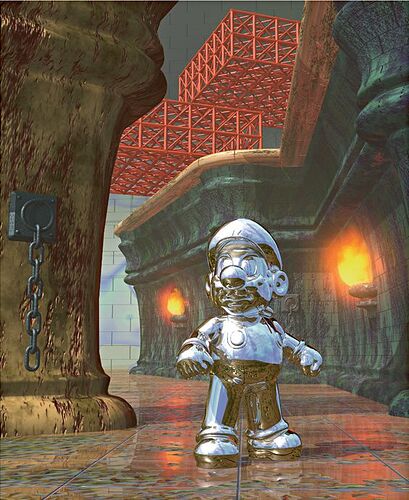
Hello! I am currently developing my own video game that is a couple of years off and I am trying to emulate renders from the 90’s and 2000’s like from these two images. Would any of you know how to recreate the look from these images in blender?
Hey there! Which Mario is this one?
My favorite ever is Super Mario 64 
I can recreate any look! … Explaining how to do it it’s stuff for a complete book do 
This is a render for Super Mario 64, but ofcourse the model you see here isn’t specifically from the game but made to promote it. I don’t have much to go on except for the fact that it came from around the time that the game came out. And I am just trying to replicate this retro look like the lighting and the texture.
Got it!
Ok, so the basic idea is that on the old days they didn’t had today resources in pretty much any field. So if you want to make a similar look you’ll need to private yourself of a lot of things that today exist.
I happened to be a teenager by the time Super Mario 64 came out, so I was already alive back then, I already was in love by 3D graphics and followed trough closely the jump from 2D to 3D! 
I would say that you mostly start with diffuse colors and then you tile on top a few procedural noise and tile textures. You use them mostly to Bump. but in same cases also to give the diffuse color more randomness!
For example the green wall seems to have:
- A diffuse color shader with correct spectacular and roughness (use the principled shader on Blender);
- A tiles map (for Bump);
- A grunge map (most likely some kind of noise with transparent areas, for extra color and bump);
Fire can be made with particles or an animated painted texture.
Now, back then there wasn’t path tracers, Open GL 3.3, Ambient Occlusion, Bloom or anything like that fancy  So make sure to don’t rely on the new blender features. Blender 2.01, my first blender would be ideal for this project, but you can emulate it yet today, just have care to don’t over do it.
The rest is the Nintendo guys art direction that defined the size of things (all seems came out from a toy you see), the style and the cuteness  Also a very important thing to have in mind.
Thank you!
Hi, I’m a big fan of Super Mario 64. That image looks like it was made with POV ray or some raytracing program. Something about this image is that there is only really one directional light and it casts hard shadows. Also, objects don’t have a lot of self shadowing (look at that chain on the left).
You can use Eevee to get quick, hard shadows and limit self shadowing.
There is a lot of ambient light in that image. Turn up the strength on the world color to 3 or more. There is a mist/fog effect that starts fairly close to the camera and looks to be a linear mist.
As rogper was saying: there are a lot of random noise textures as part of the diffuse and/or a slight bump. They are obviously trying to show off the shiny metallic material on Mario in this image and how the whole environment is reflected.
