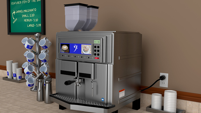
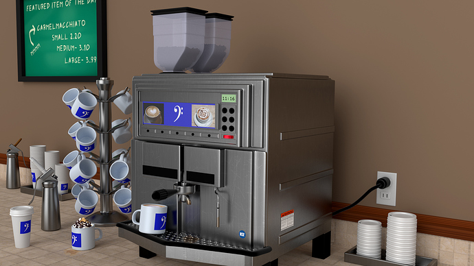
Well I started just modeling a coffee machine… then it kind of went from there. I did 2 versions, not sure which one I like the best. In one of the versions I did composite coffee stains and placed the liquids in cups with PS. Just didn’t have the patience for a
fluid sim. Rendered in cycles. Thanks for taking a look.
nice work harleynut97 … I have only two comments
- the machine looks great but it needs a dirt map
- the blue label is two saturated and very clean
Good job … btw I like the 2nd one
Thanks for the comments Muhamed. I agree on the points you made, but I wanted to clarify something… dirt maps seem to be used as a generic term sometimes. Were you refering to ambient occlusion or scratches and such added to the stainless steel material? I tried to add some scratches, but after doing so you really couldn’t see them well enough based on the camera angle and distance from the camera, so I will have to mess with it some more. But thank you for taking time to comment. - Carl
Hmm, I agree. Did you try plugging the scratch map into the displacement output? I would also put a glass / plastic cover over that blue label. I also think the wall could use a bit of bump. Maybe a small voroni could do it. Finally, chalk boards always have a bit of dust still on them from the previous drawing / message, and the actual writing tends to have a bit more patchy colour.
I disagree about the wall, it looks fine the way it is for a clean coffee counter. the chalkboard is right though, even new ones aren’t that clean.
Haven’t had much time the last couple days to mess with this anymore. I will end up adding some more eraser marks, there are a couple on the chalkboard, but based on suggestions I’ll add some more.
I do have a question on adding the voroni texture to the wall… I have the scale correct, currently it is going into the displace node socket but it is too strong. When using procedural textures like this in cycles… what is the best way to “blend it in” to the exisiting diffuse color on the wall. Essentially I would like to to reduce the overall opacity of the veroni texture or like in Photoshop terms use a blending mode of some type.
Wow it look great! Nice job
OK, well I incorporated most of the changes people suggested, and I feel they did in fact add to a better overall image. Hope you’ll look at the larger image to better see the changes. Added a very subtle vironi texture to the wall, added scratches to the metal on the machine, reduced the contrast and tweaked the chalk and added more smudges to the chalkboard. In PS, the coffee and coffee stains were added, I did bring down the overall brightness of the scene and made a change to one of the cups…felt like making one a mocha with some whipped cream. So again thank you to everyone who commented and I always welcome additional comments, but I’m calling this done now.
Excellent job.


