So while I was doing another Blender project, somehow out of the blue one friend of mine linked our room chat companions to a youtube video with music from The Strokes. It happened that the video featured the cover and I told him “Hey the music is cool - the cover is odd though”, and he said “why don’t you make this cover with Blender? it could be awesome” and I was like “Yeah sure, why not? Practice is practice”, and so I halted the other project (which is already driving me nuts) and tried to emulate said cover but using 3D objects from Blender 
The cover in question is this one:
And my final testing result is this one:
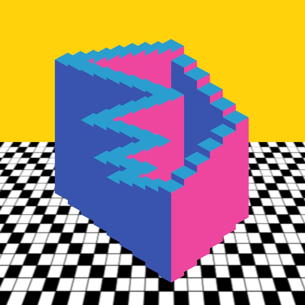
I do believe it can be improved, like adding a little more of texture to the boxes’ faces so they look like stroked by a marker, to “color” the edges to make them to pop up a little bit (like in the cover), and to create a better ground surface (the surface was a plane which I applied “Perspective” with Photoshop, but somehow ended too pixelated and ugly to the eye). Also maybe I could add some shading to the boxes (actually they are rendered as “shadeless” because I wanted to keep the cartoony saturated colors but, they are too plain…).
Any ideas to try to improve this render? How do you see it as my first take at an optical effect in 3D? :eek:
PS: Added the Blend file so you cand experiment too! (and laugh at my layout…)
Attachments
angles2.blend (691 KB)
