Small & simple project, but I like it.
Flower 1:…1920 by 1080… :http://i.littlepix.co.cc/722419.png
Flower 2:…1200 by 900… :http://i.littlepix.co.cc/929341.png
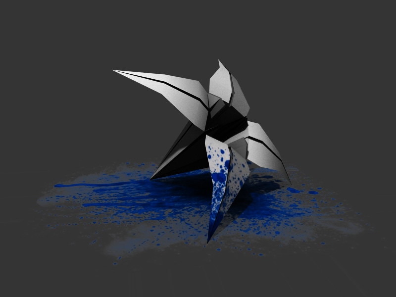
Splash:…1920 by 1080… :http://i.littlepix.co.cc/384713.png
PLS leave a comment 
Small & simple project, but I like it.
Flower 1:…1920 by 1080… :http://i.littlepix.co.cc/722419.png
Flower 2:…1200 by 900… :http://i.littlepix.co.cc/929341.png
Splash:…1920 by 1080… :http://i.littlepix.co.cc/384713.png
PLS leave a comment
I like the paint splatter and the way it effects the origami, but I just don’t see the point of it.
I don’t mean that as an insult or that you’ve wasted your time, I just mean that from a viewer’s perspective there’s no emotional impact or practical application, so it’s hard to know what I’m supposed to feel when looking at it.
Overall it’s a nice attempt and one that is different from the usual renders here, but I think choosing a better concept from the start would be more profitable in the future.
Just my 2 cents.
Thanks for your comment Andrew :). I understand what you mean and I think you are right… except for one thing… I didn’t tried to do something meaningful or with emotional impact… I was designing a logo for a game I’m designing with a friend, yes that simple :D.
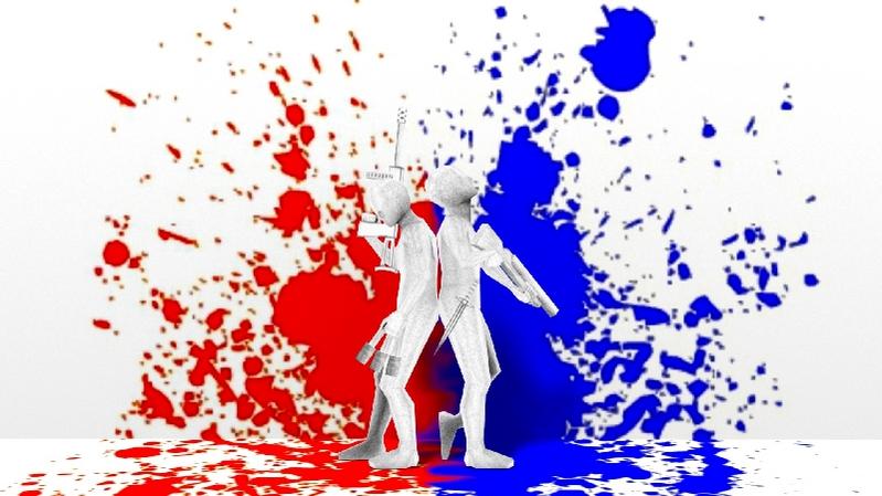
I made a new “Splash” screen (lol :D)
See first post for a wallpaper.
Happy modeling
The paint splash on the first flower is excellent! The flower itself needs subsurfing.
The splash screen is quite well done…just needs a few tweaks. The white characters’ heads blend in with the white background making it hard to see them. Maybe try a different background colour.
Happy Blending
–Robo
I think it’s supposed to look like that. It’s folded out of paper.
Agreed. But if you look closely you can plainly see the individual polygons of the mesh. Subsurfing + extra edgeloops (to make the folds sharp) would clear this up and push the render towards realism.
Thank you for the criticism  I’ll remember that.
