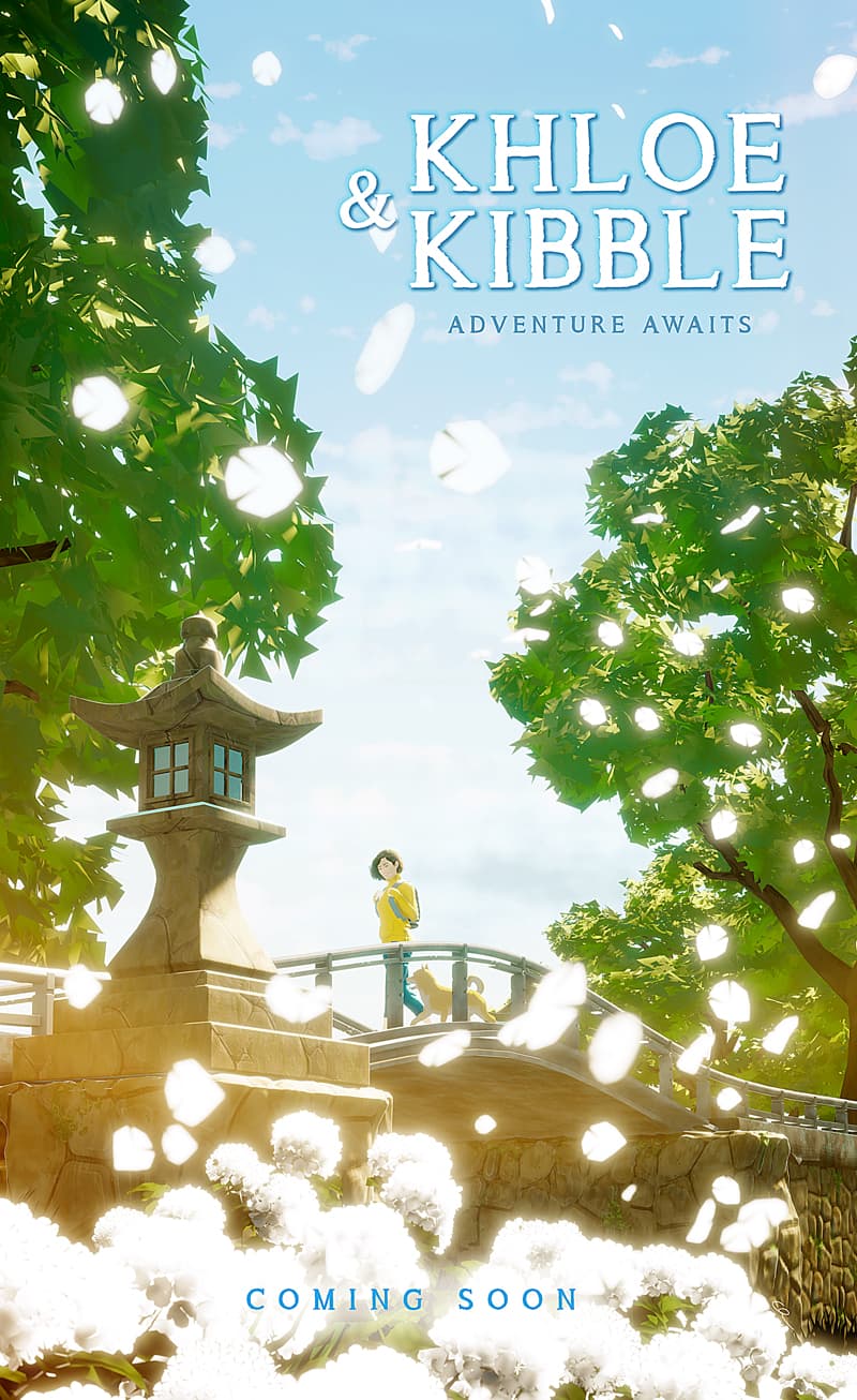
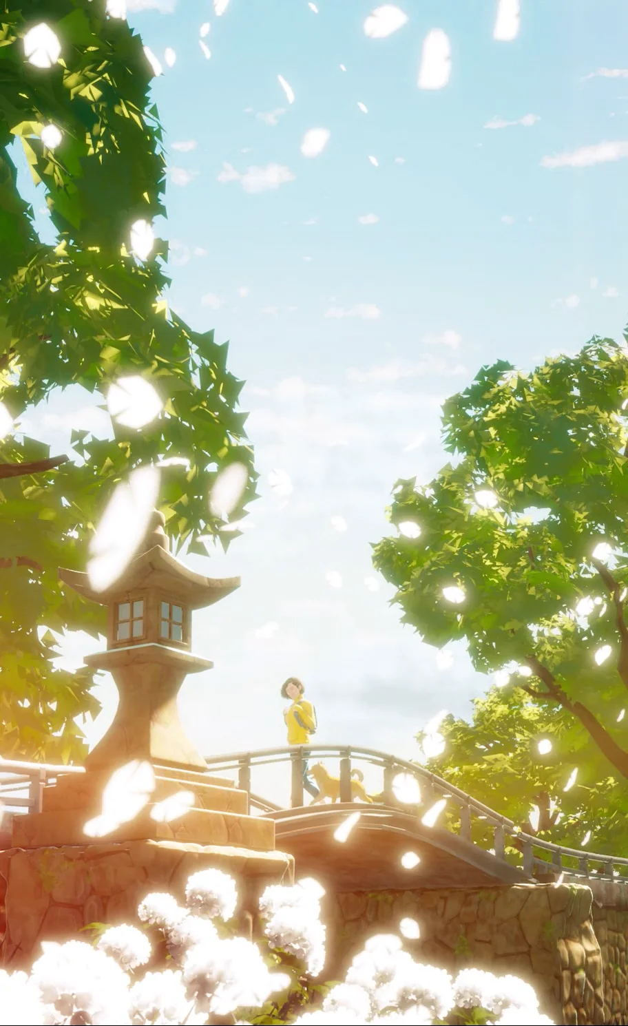
I love the movie poster the best. The bright particles are nice. I feel the characters getting lost and overwhelmed by the background in the first. It brings out some feelings of pre-3d disney, and they had some techniques to bring the characters out of the environment, but I don’t really have any ideas right now. The environment is the awesome part of it. In fact the 1st image I think, without context, would be just as nice solely environment.
I found space for the characters in the foreground
BTW huge respect for original IP, or is this an existing story?
Also you can hopefully get the 1st vimeo to embed:
The function of the first shot is not about introducing the characters but rather about telling the story of them traveling to a new place. It’s an establishing shot. We would have gotten to know the characters before this shot during a sequence where they were most likely getting ready for the journey. After this shot we cut to a reverse to reveal the city they are going to.
The movie poster version is more about the characters hence the change in camera focal length although, in all honesty…they are still a bit too small for this movie poster to ever get through the approval process but I still liked it.
Thanks for the reply. Yes, I think if we have already been introduced to the characters then seeing them in a new environment makes sense. I think that was just my impression because it was like being introduced and I was trying to get a feel for the characters.

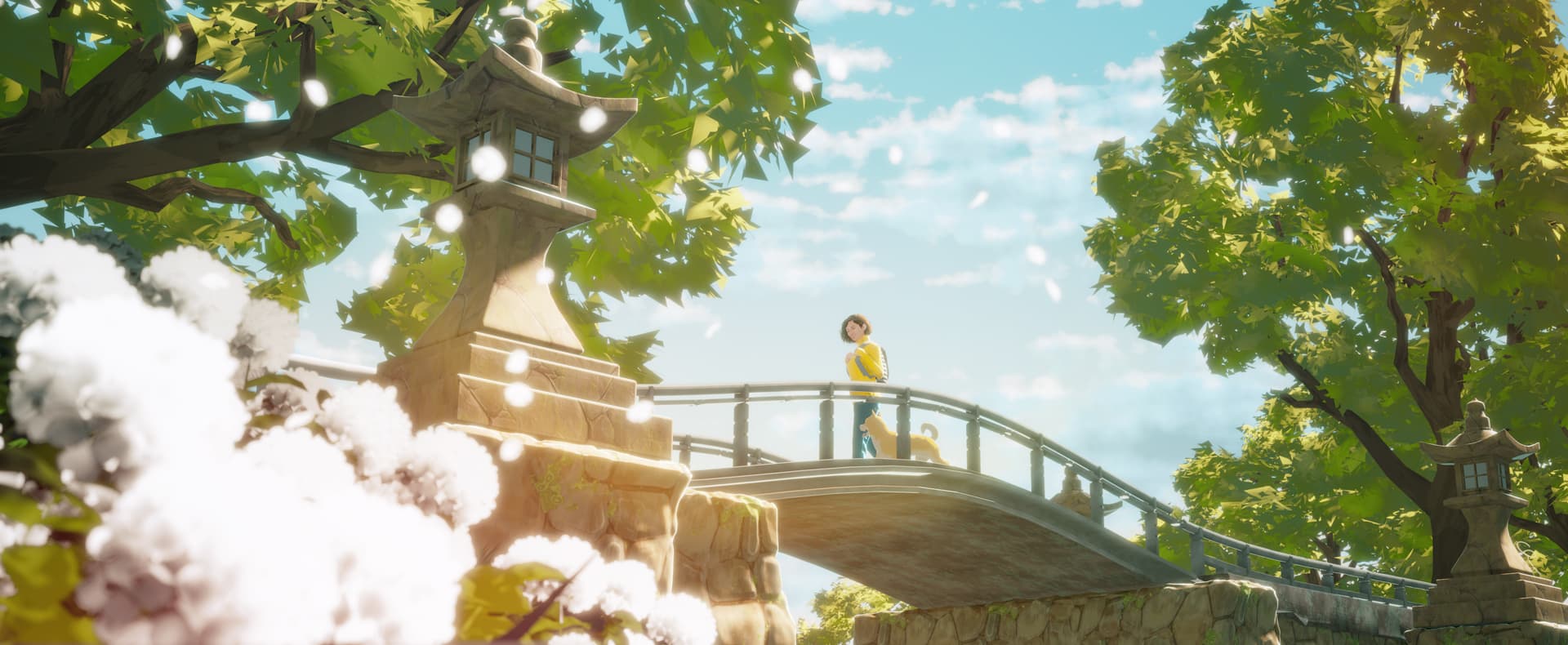
 :
: