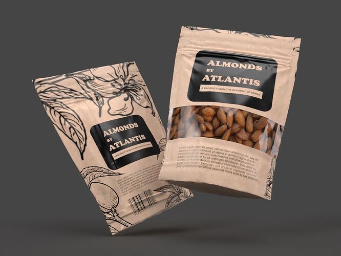
Almonds packaging design and visualization. The two packs represent opposite sides of one pack. It took me around 3 hours to model, texture, light, and render. Created in blender 2.92 and rendered in cycles. Texture design on Inkscape. You can check out more renders here https://atlantis-studios.net/animators-in-kenya/#art
5 Likes
Transparent plastic could use some creases
bun looks really good, nice job with “zipper” parts 
Thank you for the review.
Very good visualization.
No, the plastic would not be “creased.” You want the depiction of the package to be perfect. As was done here. “The Almighty Product™” must be shown in the very best possible way … better than it could ever look in real life. (Just like photographing a lady – “she must be beautiful.”)
That is an eye opener. Thanks for the advice.
