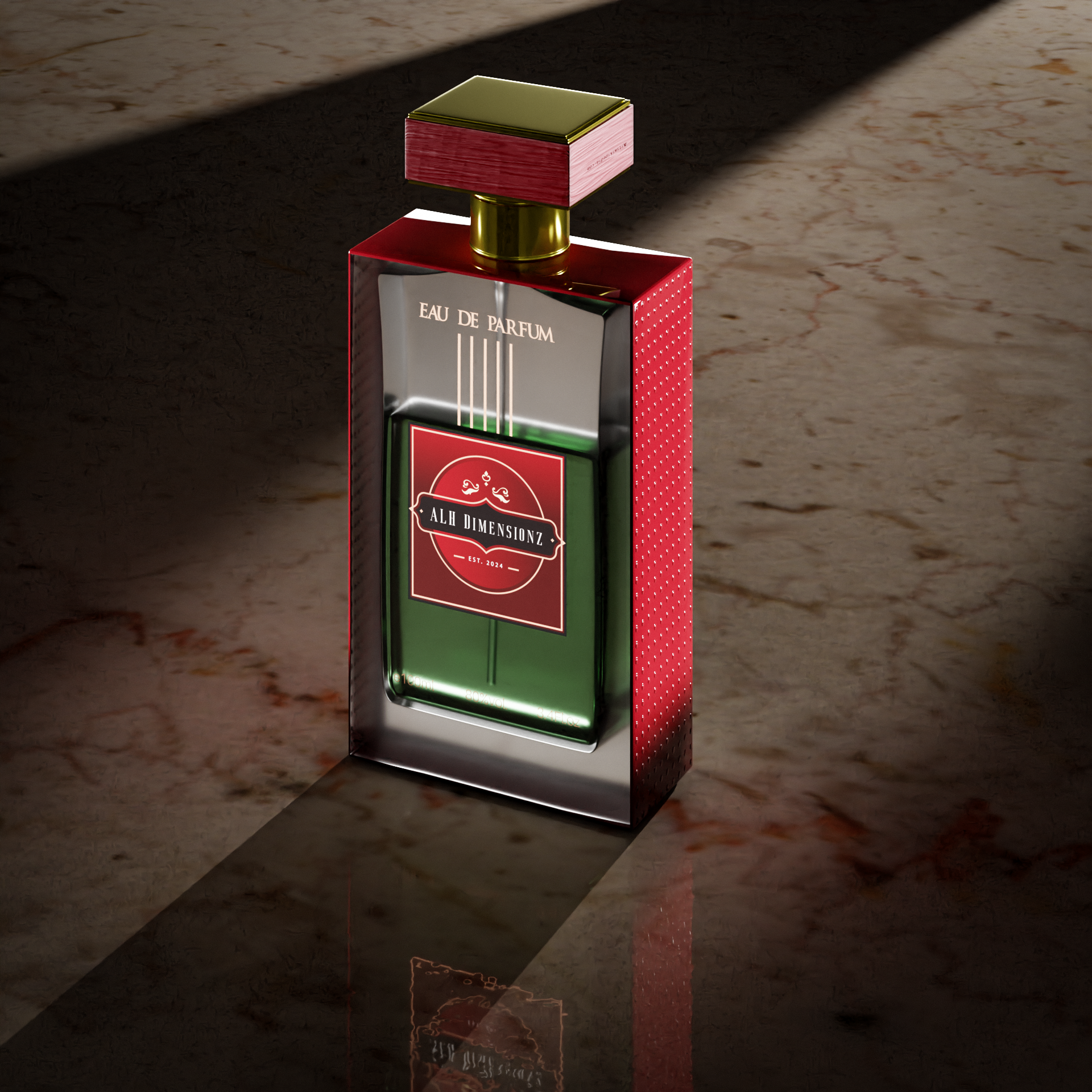
Hello blender community, thank you for checking my post. My name is sabeeh and I am 23 years old. I had started using blender 5 or 6 months ago. I saw a product render on internet and I was really inspired to create something like that. This is how my blender journey started. I now create product renders in blender and my source of learning is youtube.
This is the first time I am posting my work on a platform. I am looking for critical feedback about my renders so I can improve myself. Thank you once again.
This is the sign that the noise wasn’t cleared well enough for the denoiser to do its job. There were gaps in the noise pattern that the denoiser can’t compensate for.
This can be solved by:
Increasing the min samples. If you leave it at 0, Cycles picks a value for you, which might not be good for your scene. Try 64, you will need a certain amount of min samples for your reflective ground.
Lowering the noise treshold. This is the main quality setting, lower treshold = higher quality (less noise tolerated in the image).
You have definitely (!!) paid very close attention to the details of the “Almighty Product,” and upon a very creative way of presenting it. Which might very well match the creative decisions that a “real [digital …] photographer” might have taken. The very-necessary front lighting is good, as is the transparency, while the back(ground) lighting" is allowed to take focus. The choice of materials for the “surface,” and the lighting of the same, is, I think, very good.
What “draws my eye” is the right side of the bottle. Those “dots” are actually a very(!) creative idea, but “the edges” are hard. It looks like you “beveled” the stopper of the bottle, and some of the edges of the bottle, but I think that "softening this" should call for more work.
However: one of the “important-to-me” ideas of this general composition – speaking as a “non-digital photographer,” is that the AlmightyProduct™ is “very hard,” while the background is “very soft.”
To these ends, it’s really up to you how “hard” you want the shadow cast by the product to finally be.
Thank you so much. Your comments mean a lot to me, I actually made this looking at an actual product I had. The dots were created using a normal map as I didn’t know how to make them while modeling.
Yes, I see that the edges are really sharp and need to be smooth. Talking about composition, the subject being very hard and background very soft. Is this good for composition or not? I am sorry for lack of understanding.
Thanks a lot once again.