Hi my name is Adam.
I am working on a six month illustration project. I am making weekly illustrations based on my favorite movies (and sometime anime). The structure of this project comes from the struthless alphabet superset youtube thing. The main goal is to actually work on making the sorts of pictures I want to make, rather than endlessly grinding tutorials and studies.
The secondary goal is to get better at documenting and sharing my art practice. I do post my finished work on social media sites, but those sites dont really feel like the place to write about the nitty gritty details of what I am learning about in blender. What goes where though is something I am figuring out.
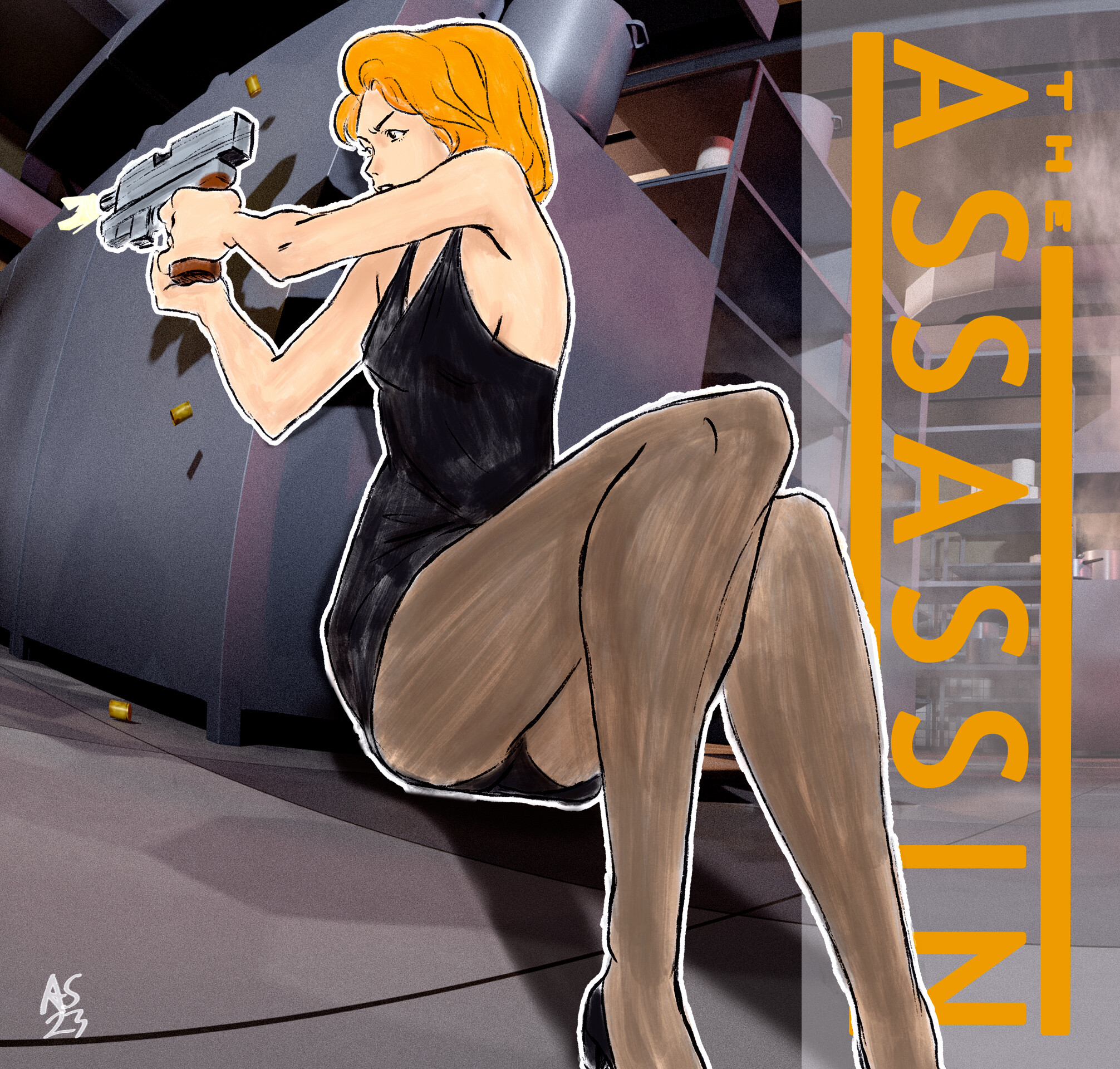
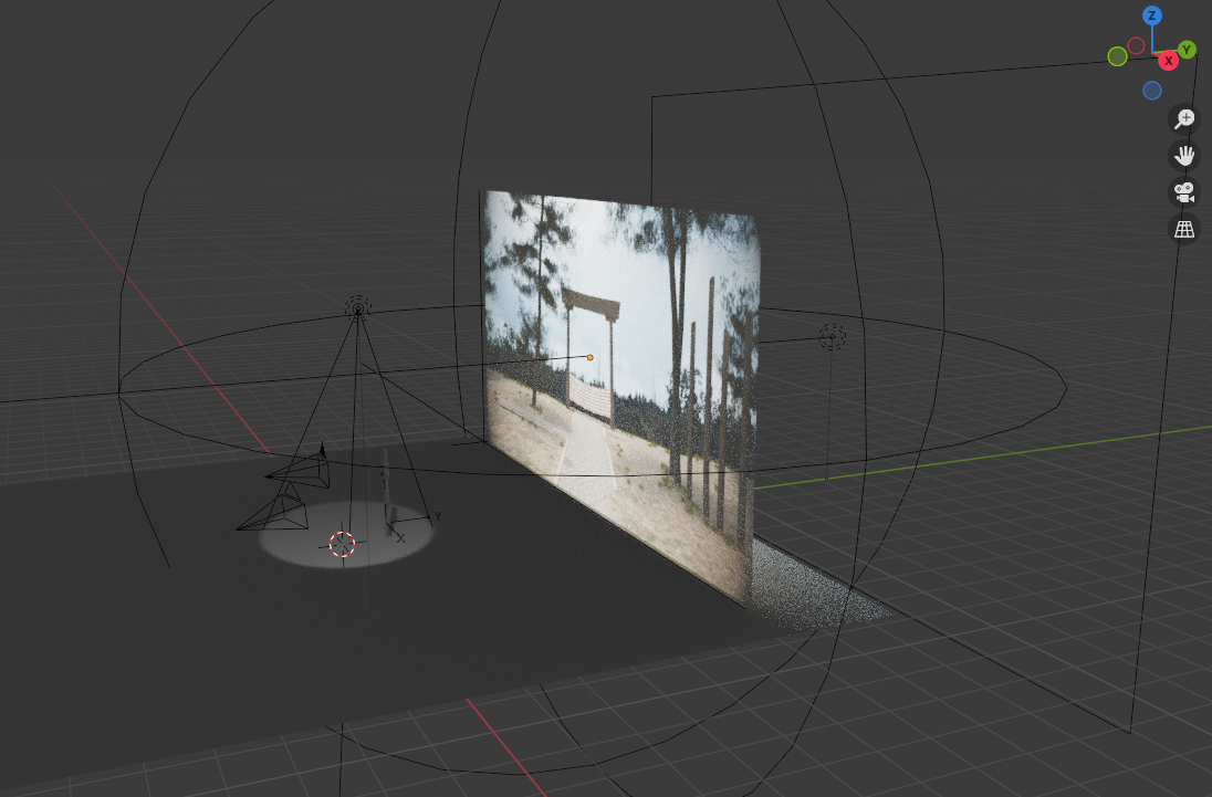
I have been trying to develop a project of the right scale and complexity for a while and became enamored with the notion of 3d backgrounds with 2d subjects.
I havent quite figured out how to convey what I am aiming for. I have a lot to figure out still, how to really use blender for one, but also the final balance between the 2d and 3d elements. I want to play with lights and camera angles and typography and depth and visual complexity. So yeah lots to experiment with.
I’m going to start this thread with a bit of a review of the past moth and a half. In the future I’ll try posting the finished piece in the finished artwork section and update this thread as I go.
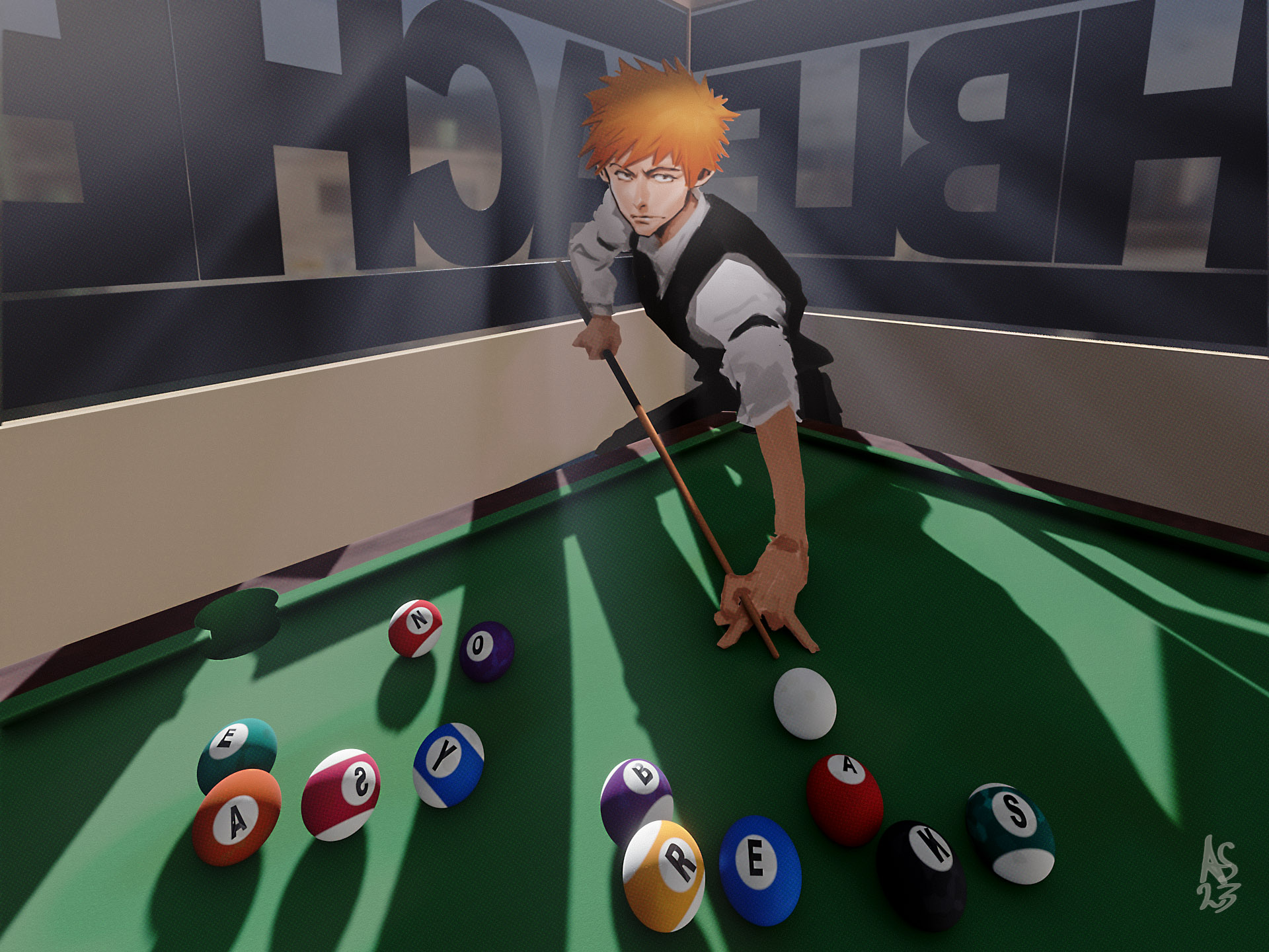
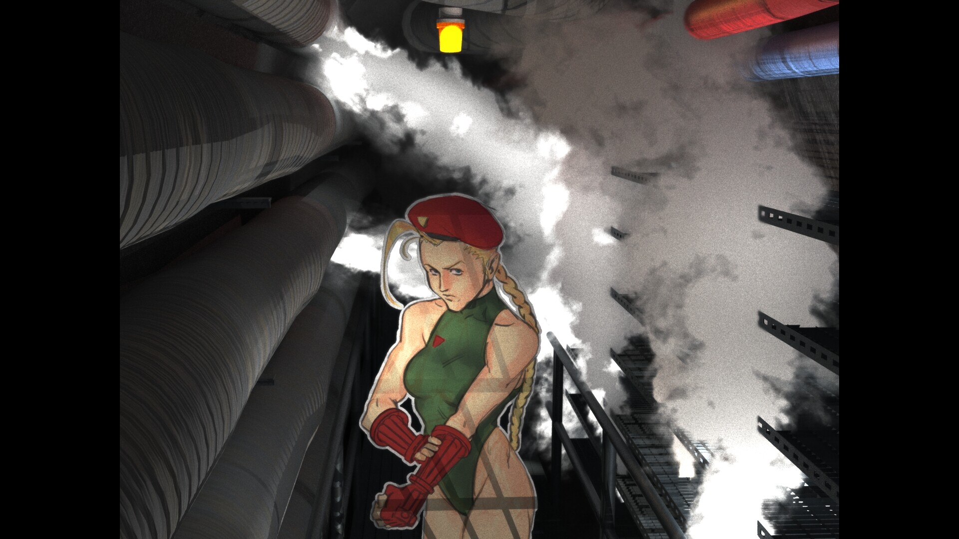
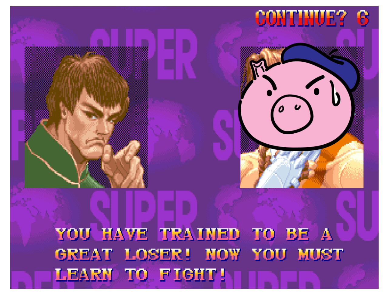
The pictures I made so far, several proof of concept pieces with a capcom theme and then 4 pictures for the alphabet project.
So far I am enjoying splitting up the various stages of the production. I think it is getting me over some mental barriers I was previously dealing with when trying to make finished work. When I have all the different plates in my compositing file it dosent feel like I can noodle things as endlessly as it would if it was a 2d painting.
I didnt expect materials to be as big a part of my 3d work as it has been. I have been making heavy use of the vorinoi node to add colour variation and add a bit of a extra life to things.
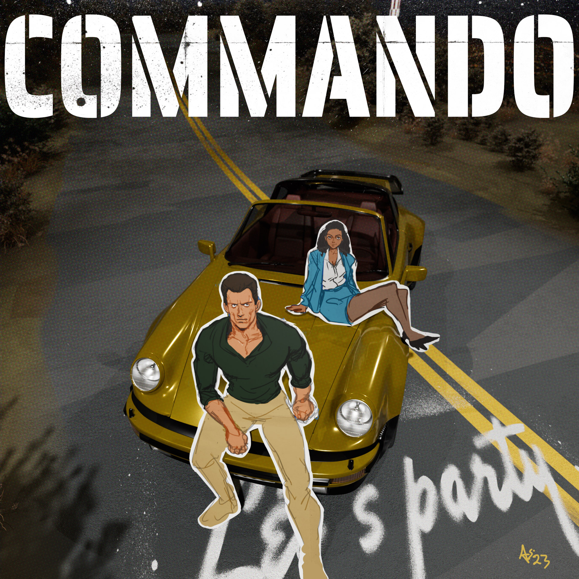
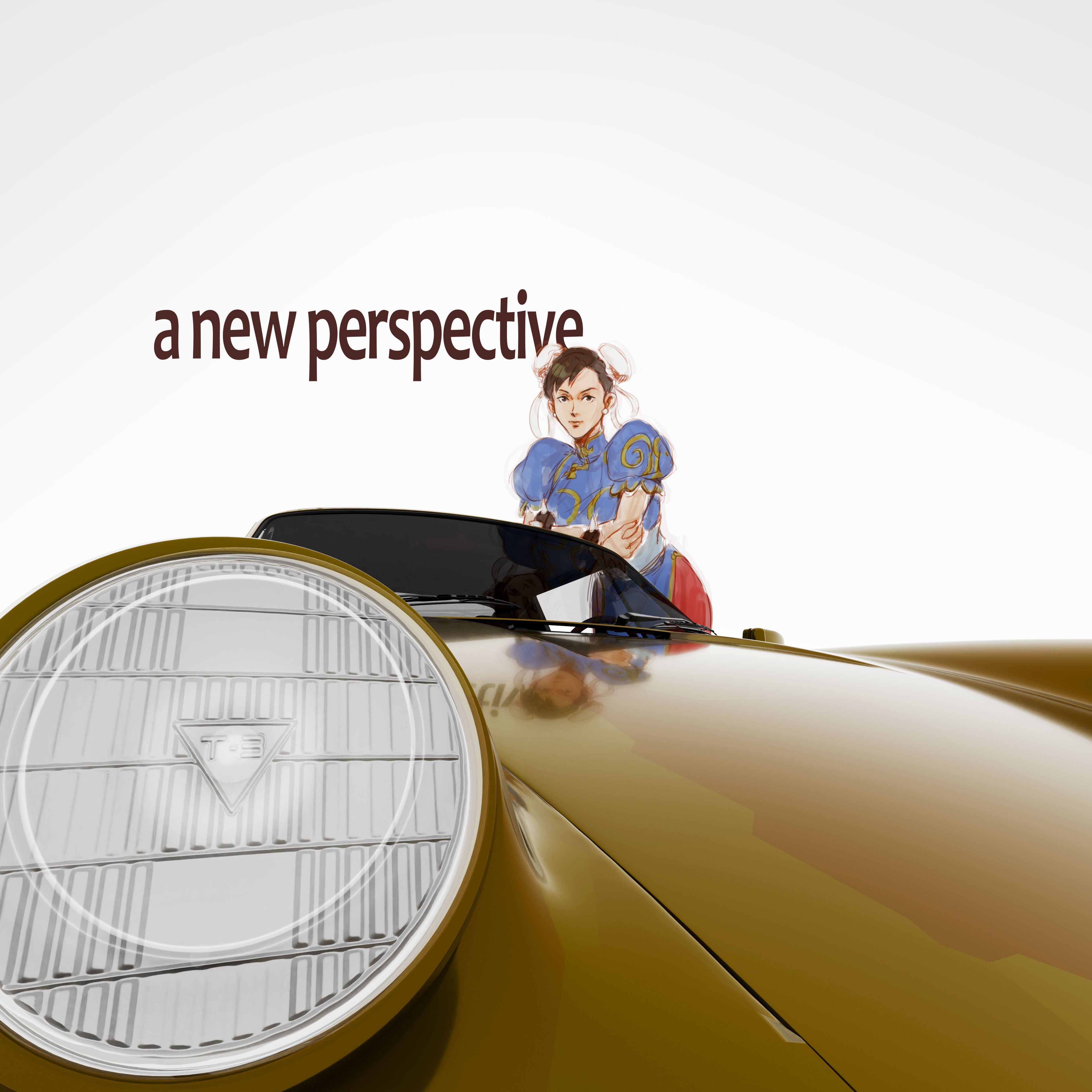
The porche model in the commando picture is by Zifir3d on blendermarket, the plants are from a free pack by maxtree.org and the city lights are a photo by bennitalent on unsplash.
Compositing wise I am all over the place. I never have a goal in mind and just start add adjustment layers and effects in photoshop and hope for the best. the clarity of my goal is an area I can improve on a lot. Right now though I just want to keep making pictures and figure it out as I go.
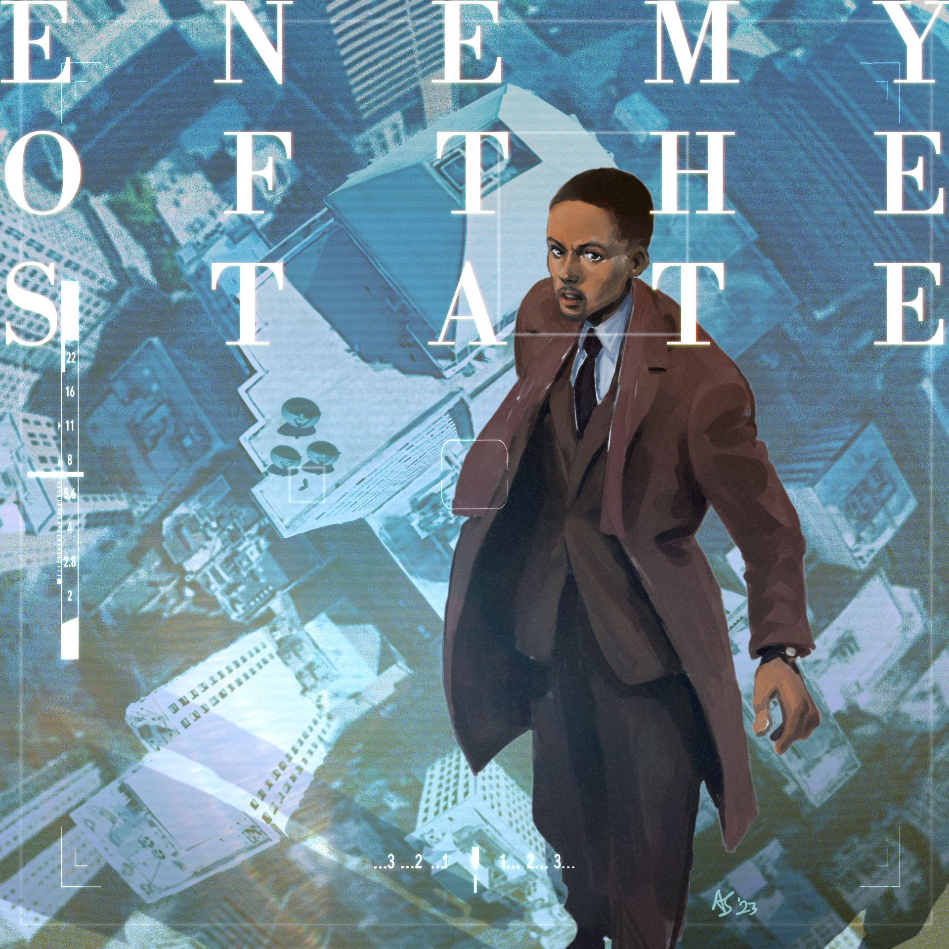
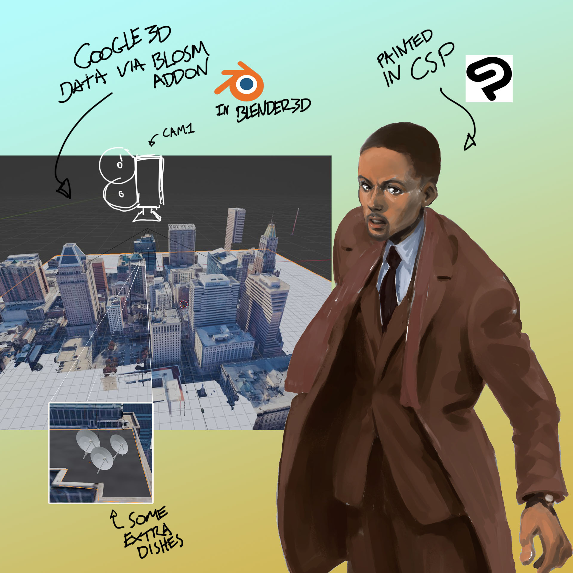
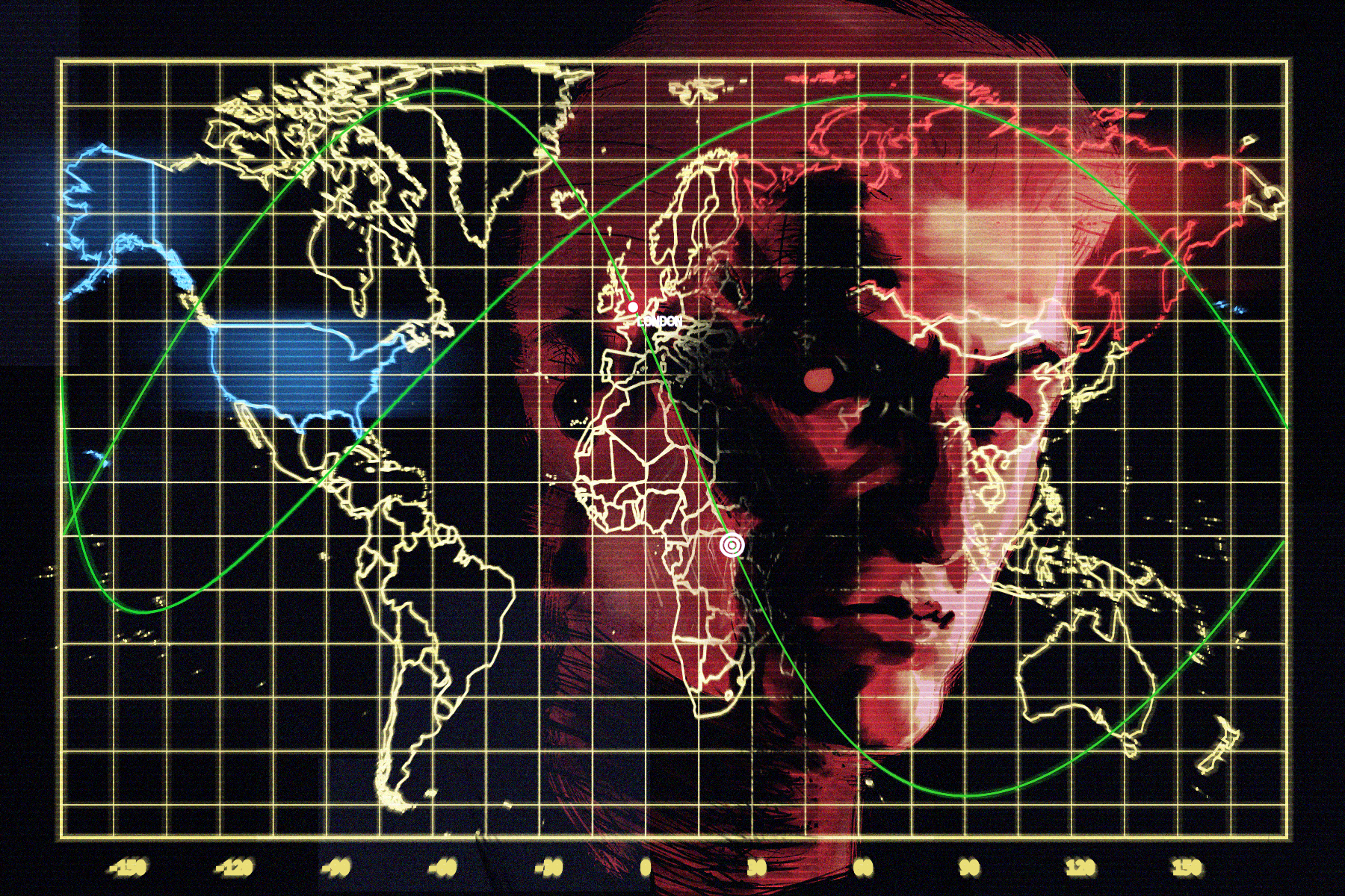
The building in the background is imported from google maps. I wanted to have the pentagon, but that and a big chunk of washington is just a flat plane’’’
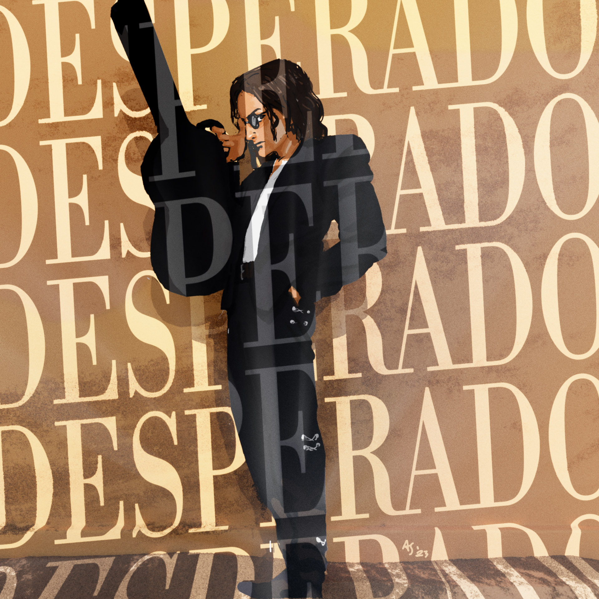
I’m not quite happy with this one. I did better than the original British poster though, so there is that at least.
Painting: I’ve been painting photo studies in the morning, so its been on my mind to render things out. I didnt get anywhere near a likeness, but thats fine. Right now I am more concerned with working my way towards some kind of stylisation… this isnt it though’’’
I used the Blosom addon to import some google data. I wanted the pentagon or some washington landmark, but theres no 3d data there’’’ Instead this is the building where Will talks to Hackman on the roof. I added some dishes and painted a little figure in comp.
The composite is done with my normal method of stacking effects on one after the other. I used a mist pass from blender in the lens blur filter which worked pretty well. Camera viewfinder and lens flare overlay are from texturelabs.org
Overall I think I approached this too literally. I think I should think along a ‘vibes’ type line, like a shot from a magazine editorial rather than an ad for the movie.
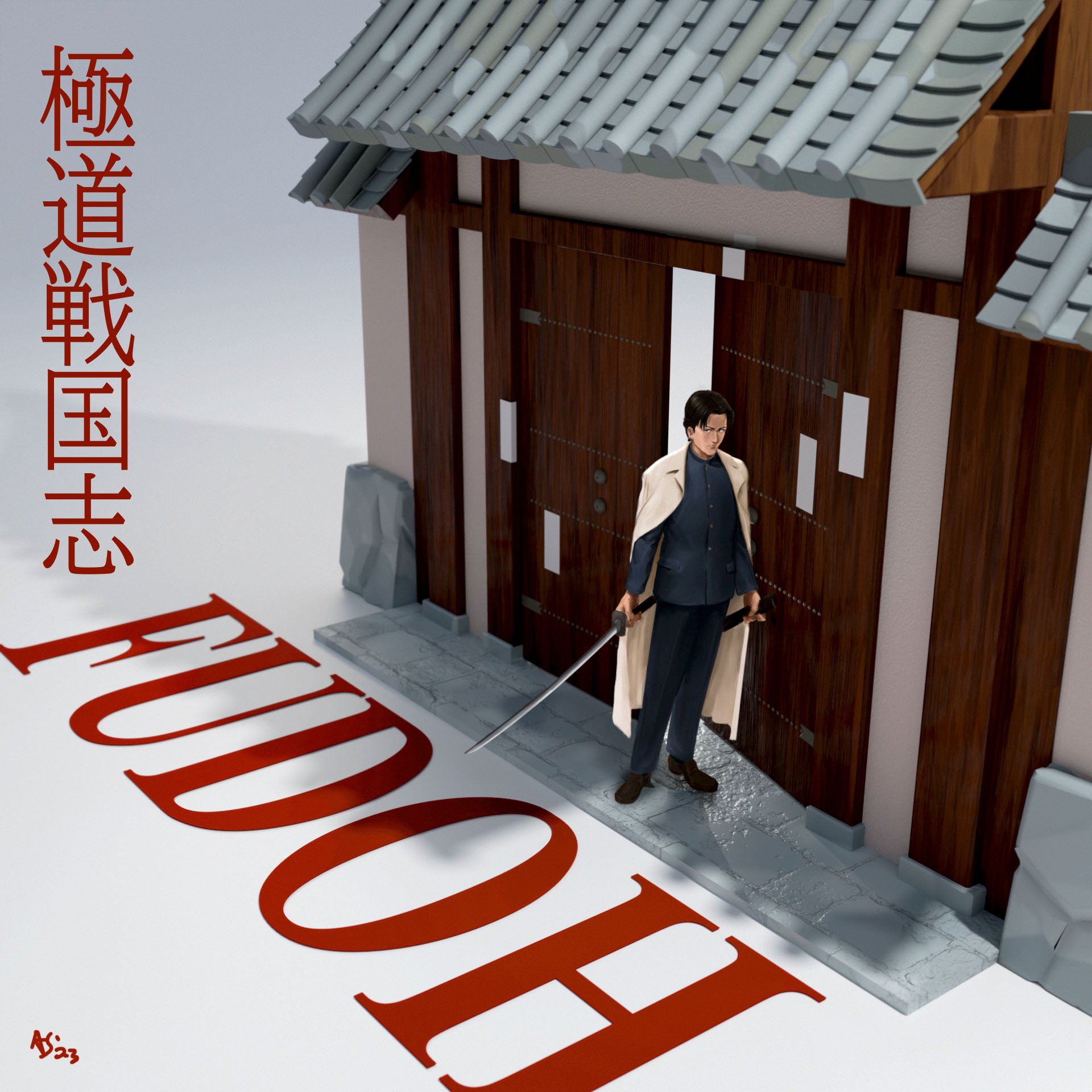
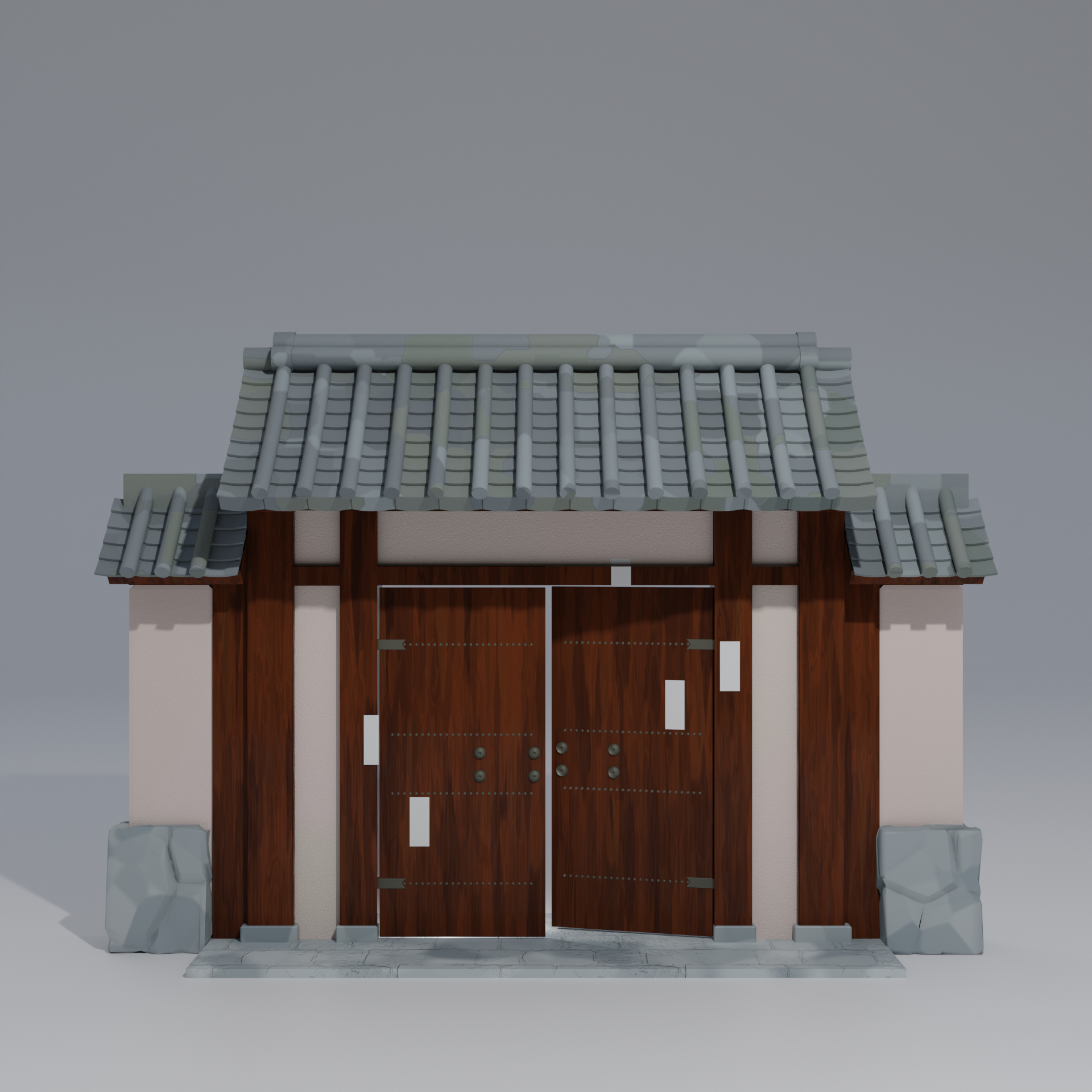
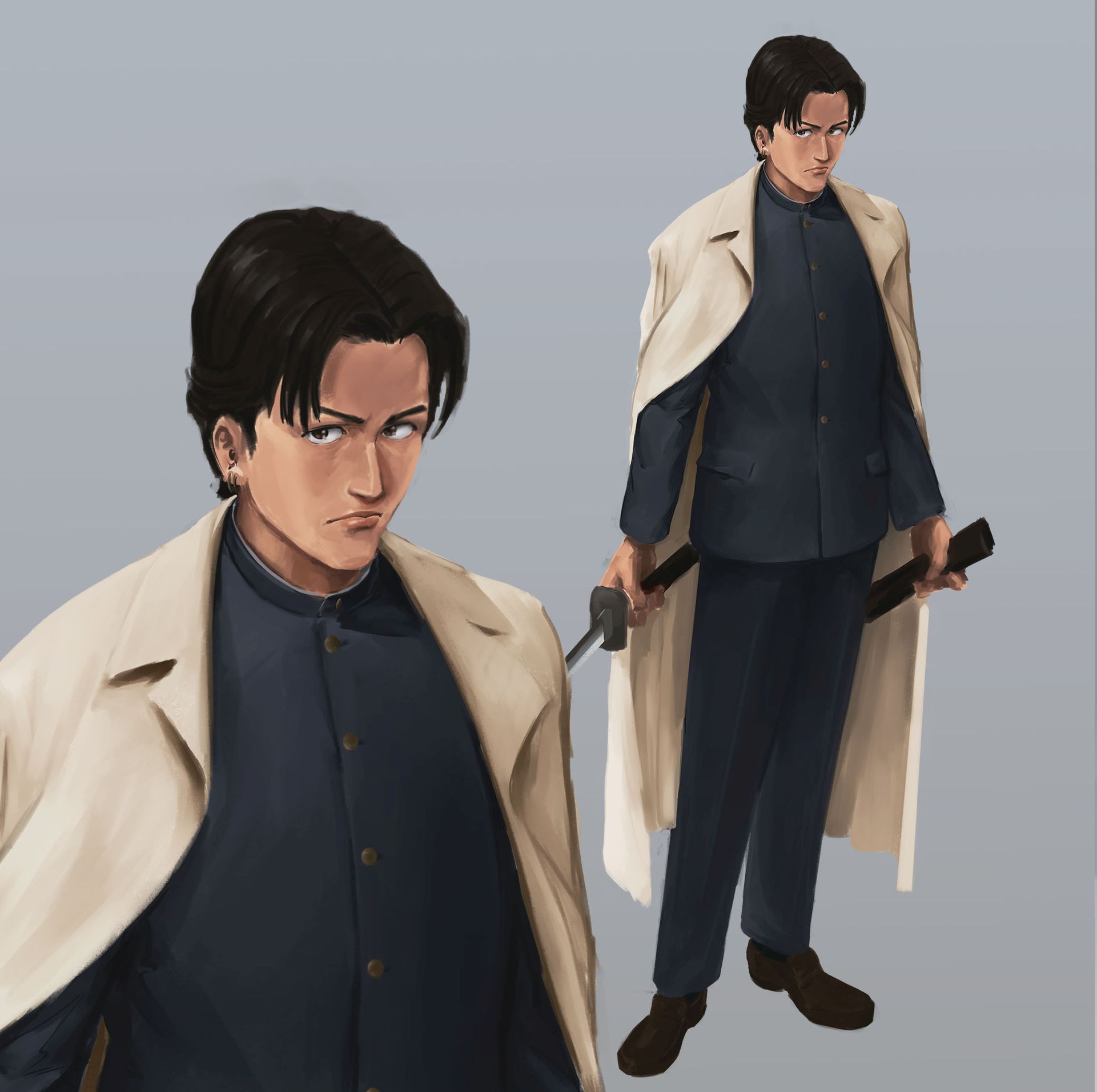
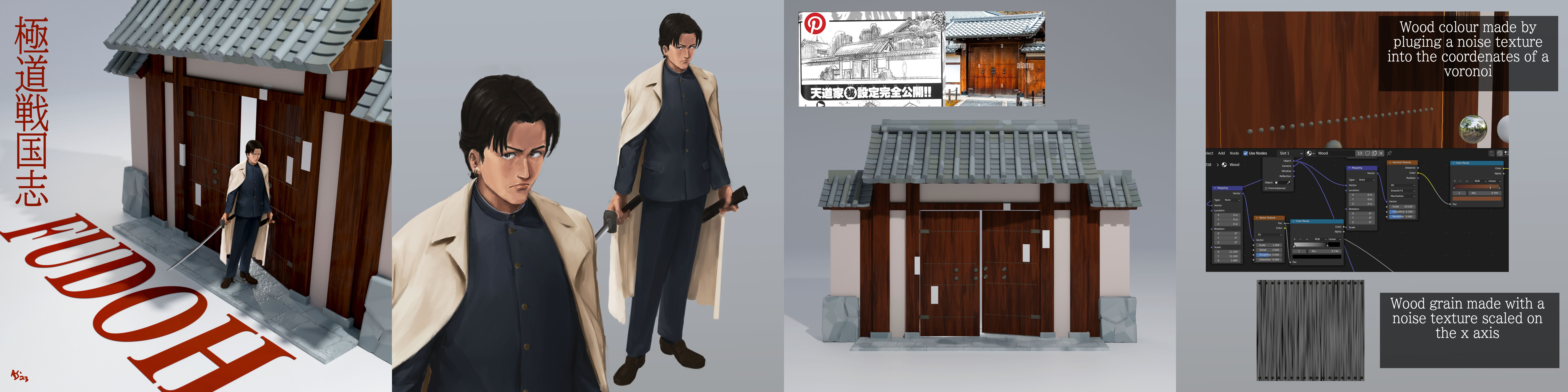
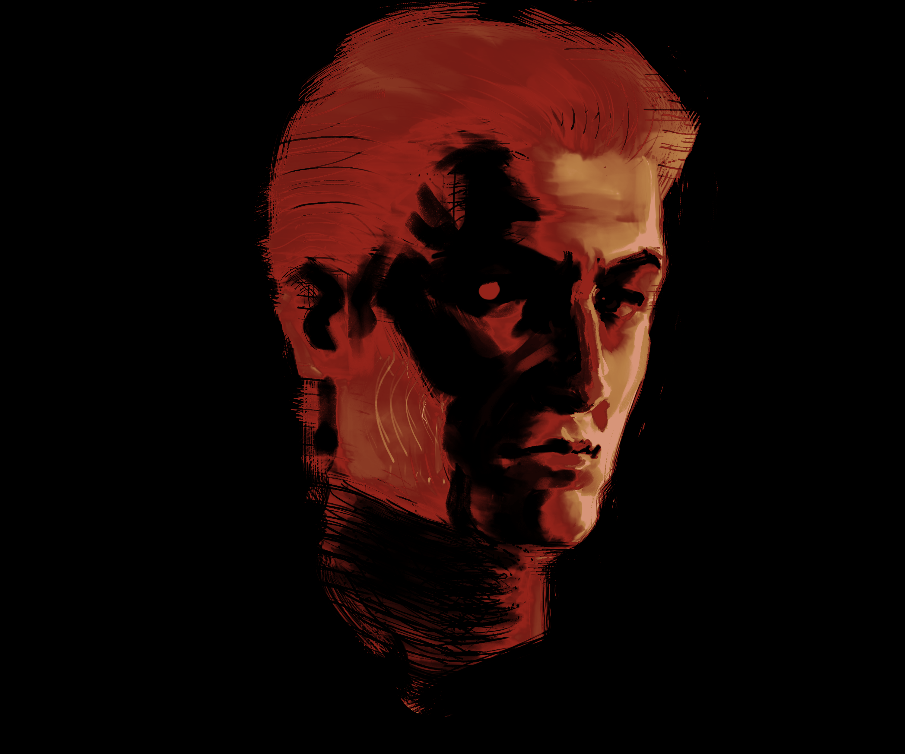
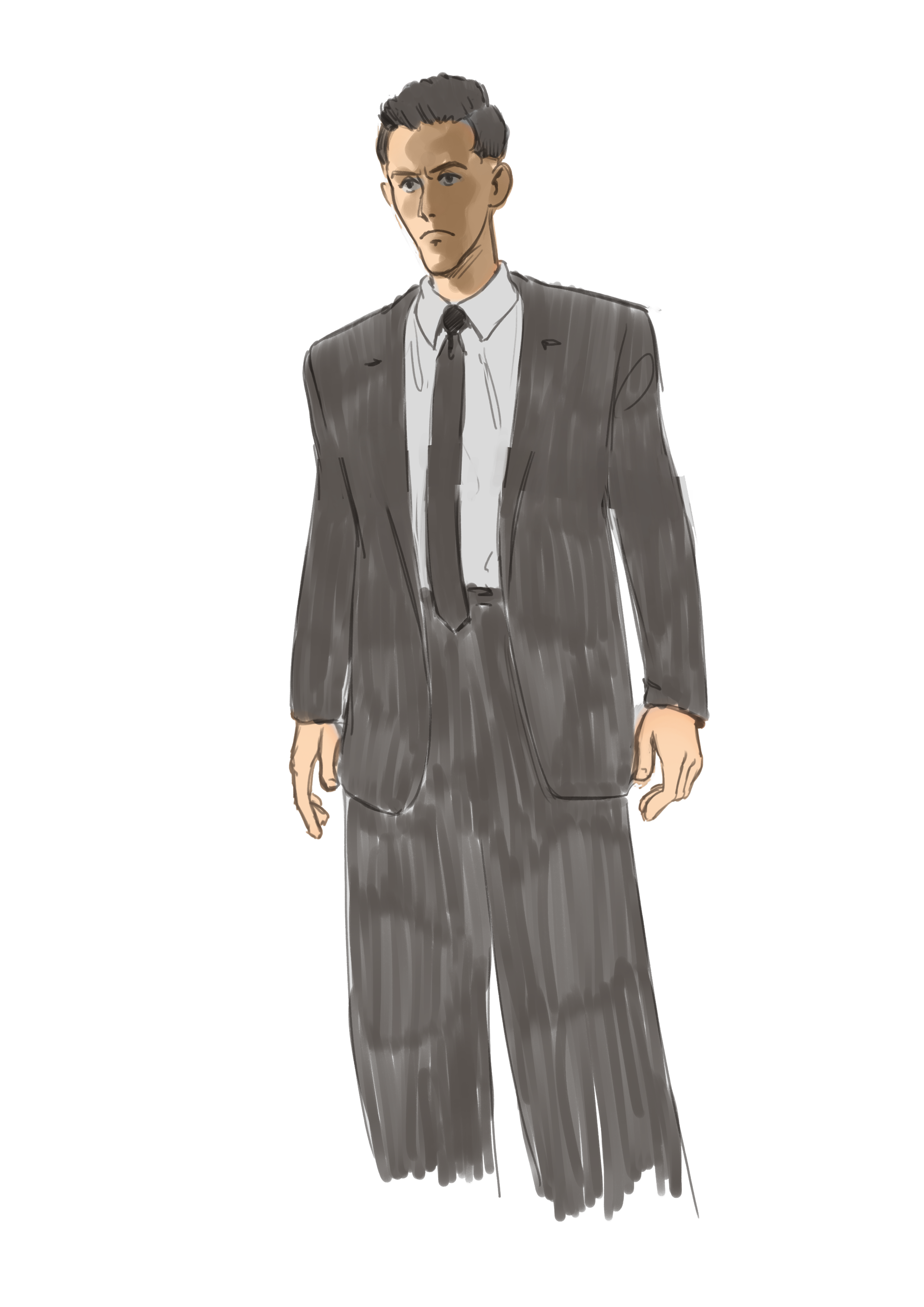
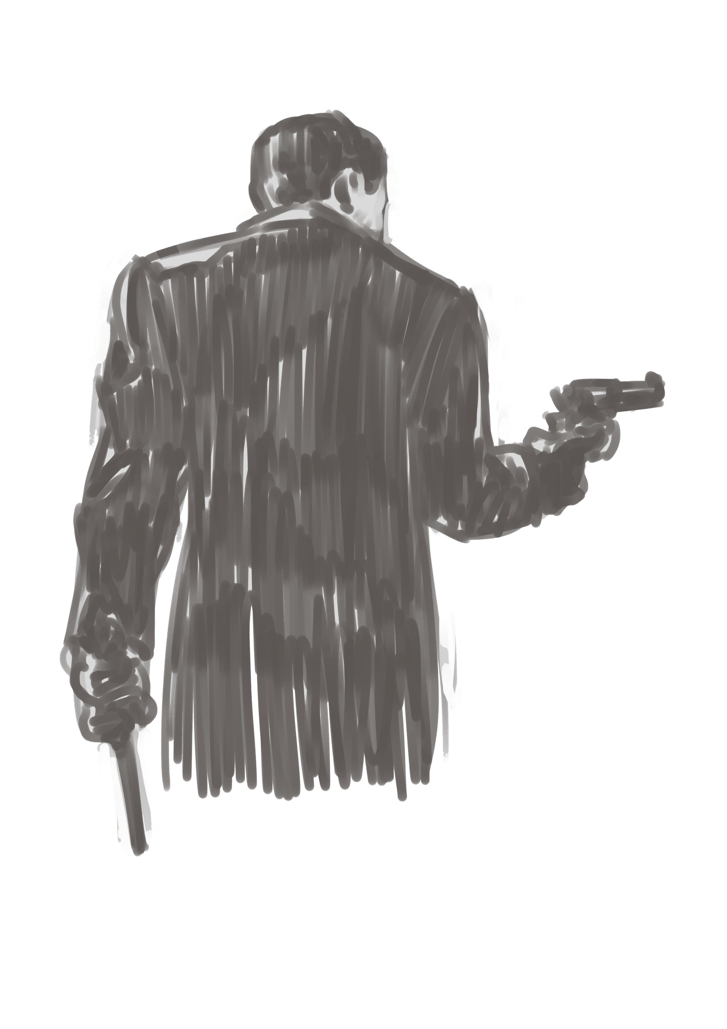
F is for Fudoh: the next generation. Fudoh was my introduction to Takashi Miike. It is, in a word, lurid. Young Fudoh carves a bloody path of revenge through his fathers yakuza gang.
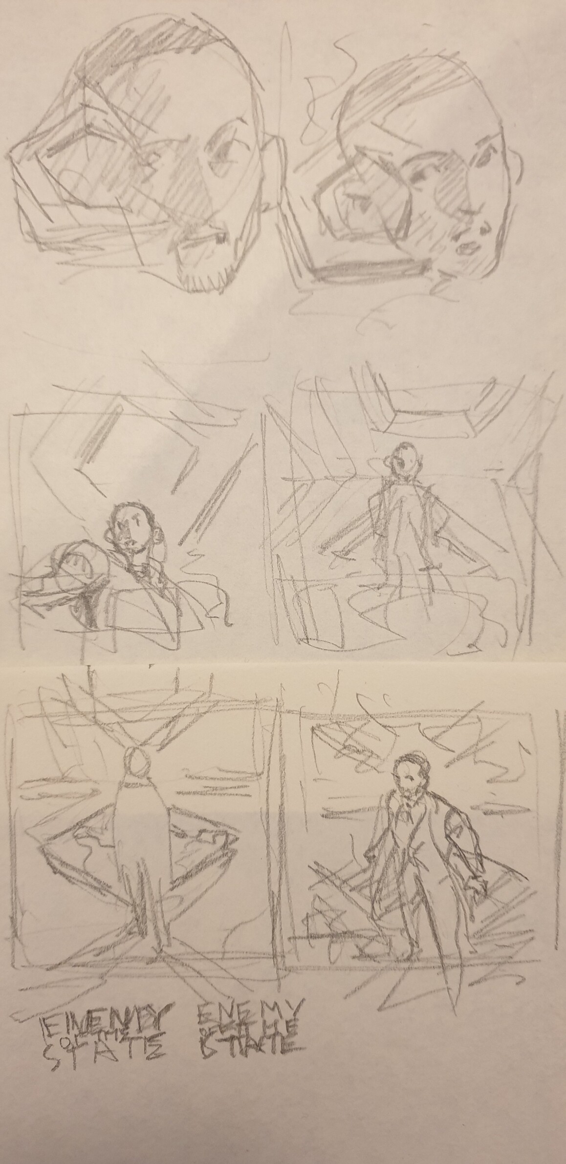
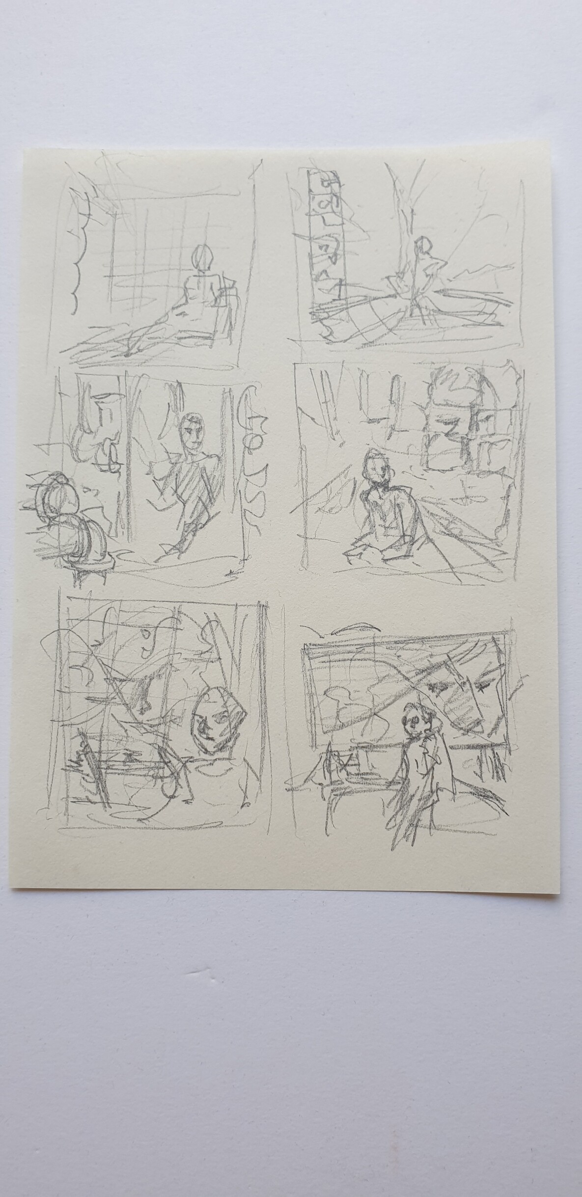
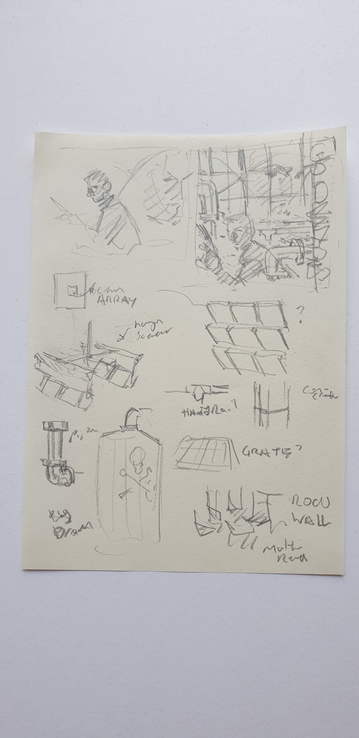
I had in mind a sort of magazine shoot on a soundstage with some big text, it's a motif I think I will return again. The actual arrangement was tough to figure out on paper. I couldn't quite make my mind up about the composition. I was changinmy mind all the way up to the final render.
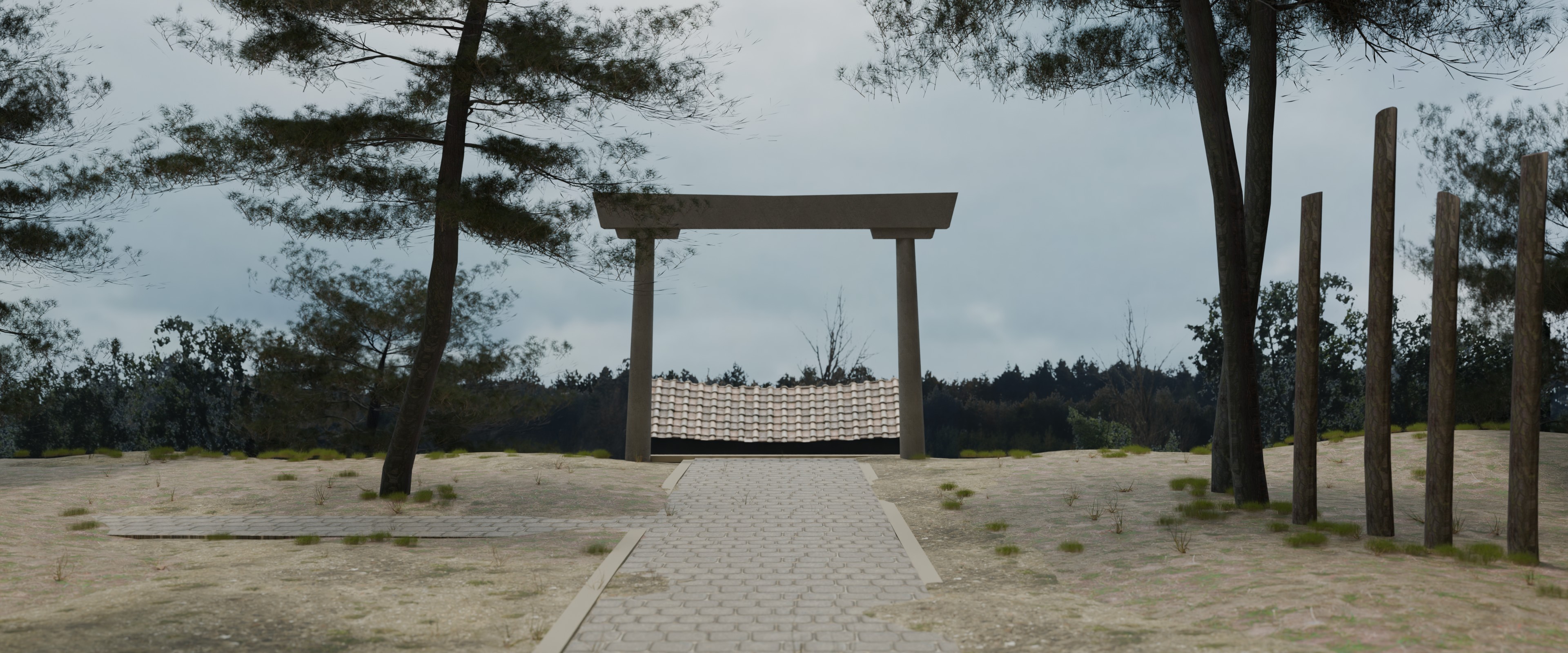
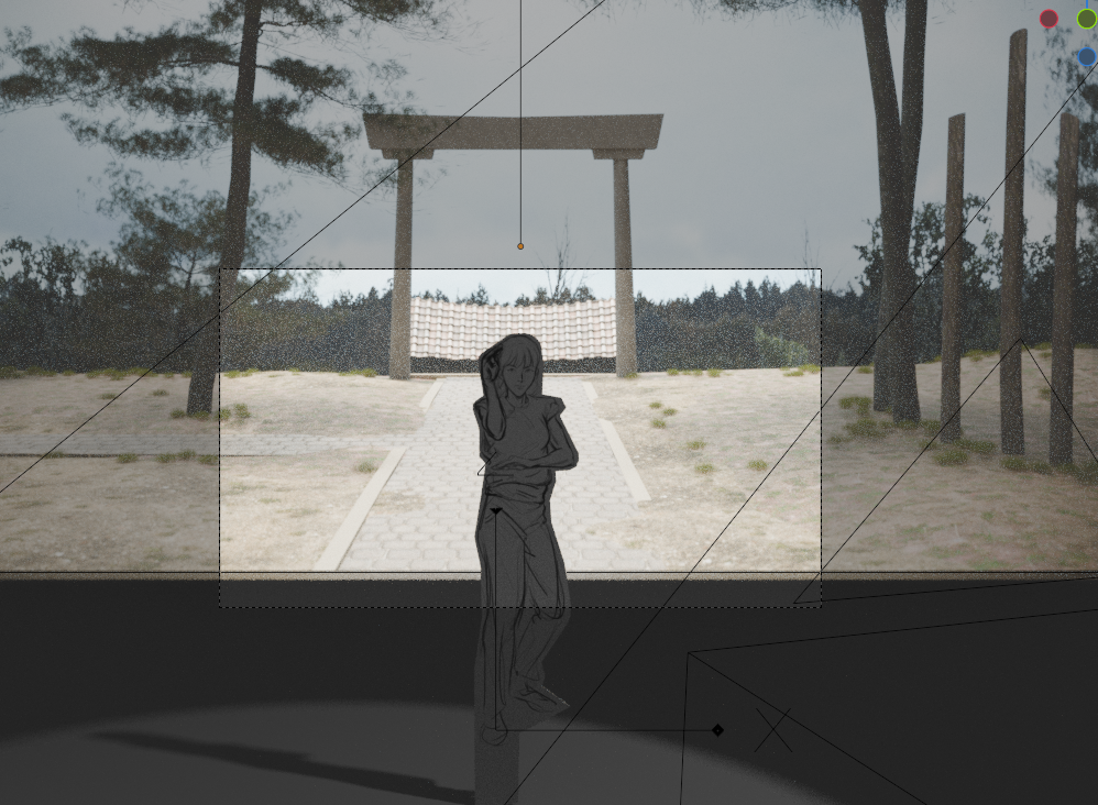
I made the mistake of starting before I had much reference. The overall arrangement is based on a diagram of a traditional house gate off pinterest. I then added some details based on details from more appropriate temple sources.
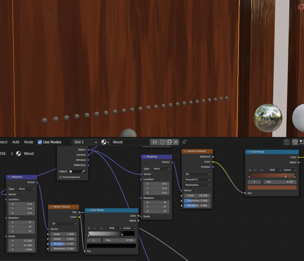
The highlight of the model is the procedural wood material I accidentally made by plugging a noise texture into the scale coordinates of a voronoi. I tried a few techniques to make the tile landing but in the end used a material from polyhaven.
The painting went well enough, I think I made some details too small for the size that it will be viewed at. I’m back in my feelings about stylization’’’ I want to find the answer through work though. since even if I find the perfect inspiration, I have to be able to think through and solve the problems in front of me. Painting clothes continues to be a struggle. I think I need to tackle it in grayscale first maybe.
Comp-
I kept the composite quite simple. I added a little lens distortion and a lens blur using the mist pass.
I decided to change my schedule from weekly to fortnightly. I need the time to fail and still be able to recover. I should probably still aim to post weekly.
I’m trying to be more professional on socials etc so I made a carousel for instagram. I want to make project vlogs as well but I keep chickening out’’’
Not specifically a scene from the film but a frame with the right kind of visual noise :sweat_smile:
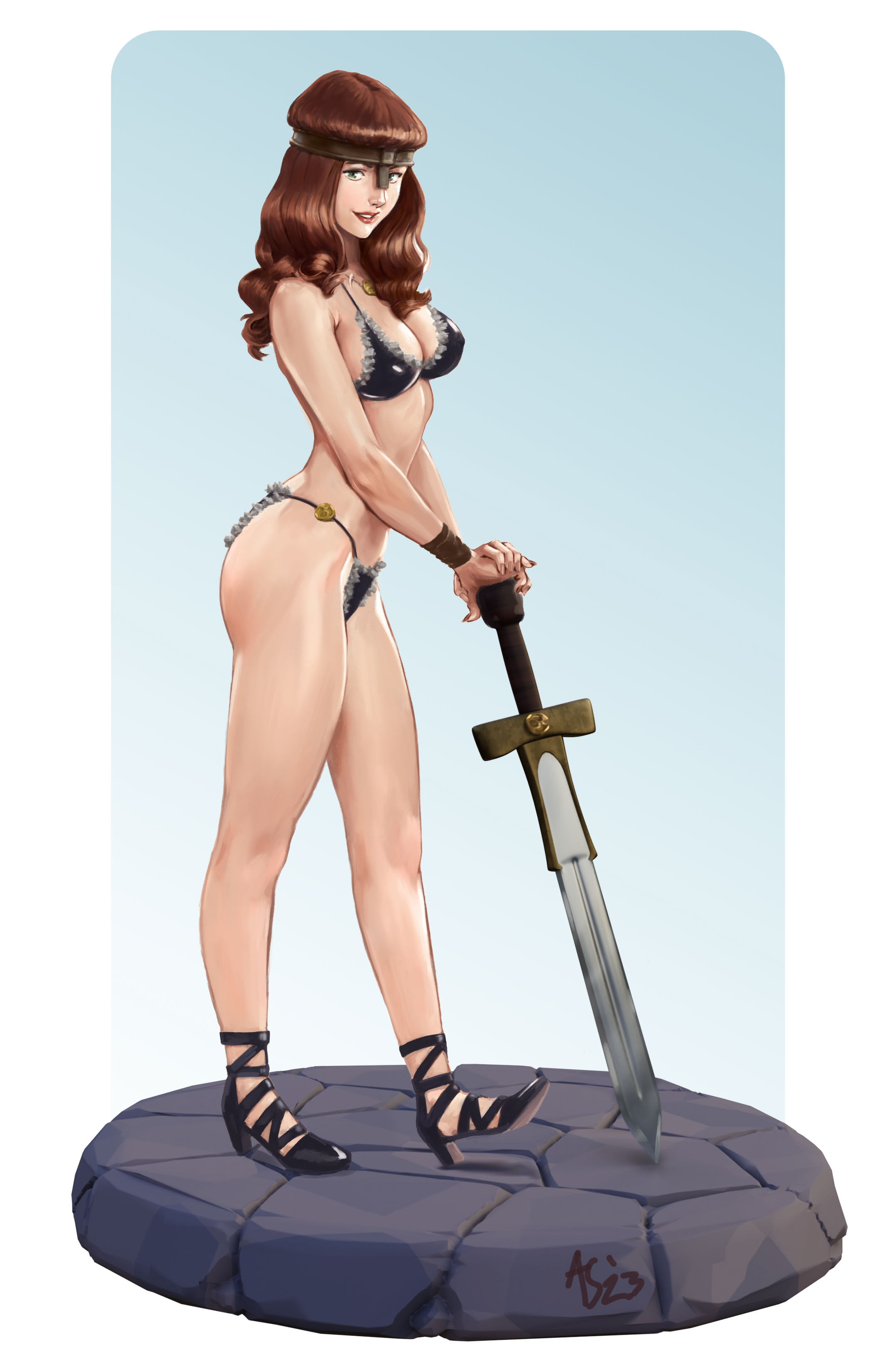
I also did a Conan themed bikini girl pinup illustration using blender to make the sword and base.
I have been thinking about trying to get commission and wanted to see if I could still do this kind of rendered thing without pulling out all my hair.
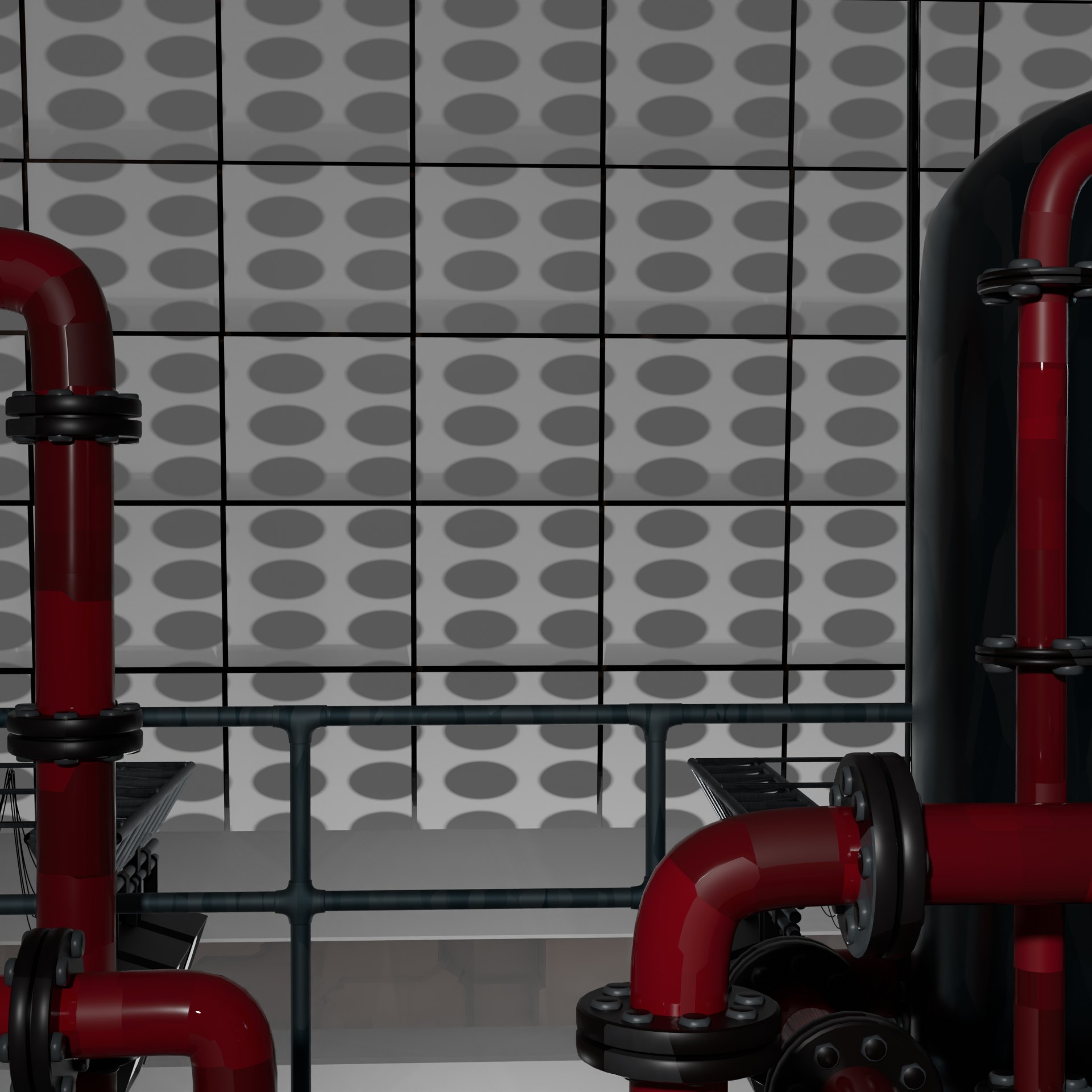
The N64 game looms large in my memory of this one. The movie its self is a bit chaotic, so it is fitting that the image I made be a bit chaotic also😀 Last time I aimed for a magazine shoot vibe, I think this week is more like tv show stage dressing. The background was done in Blender of course, geometry nodes pipes from Ray Wakui.
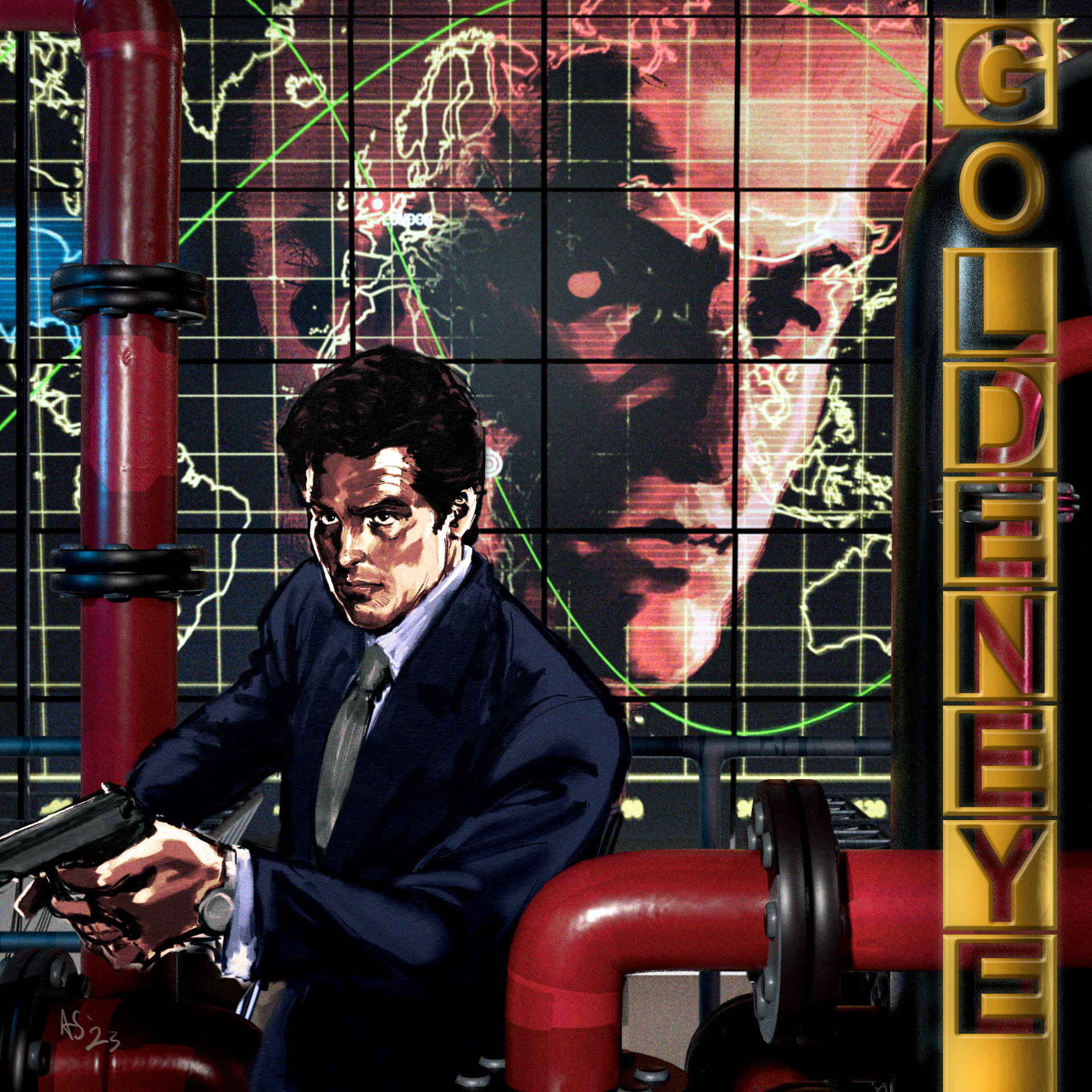
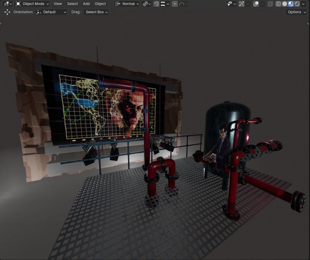
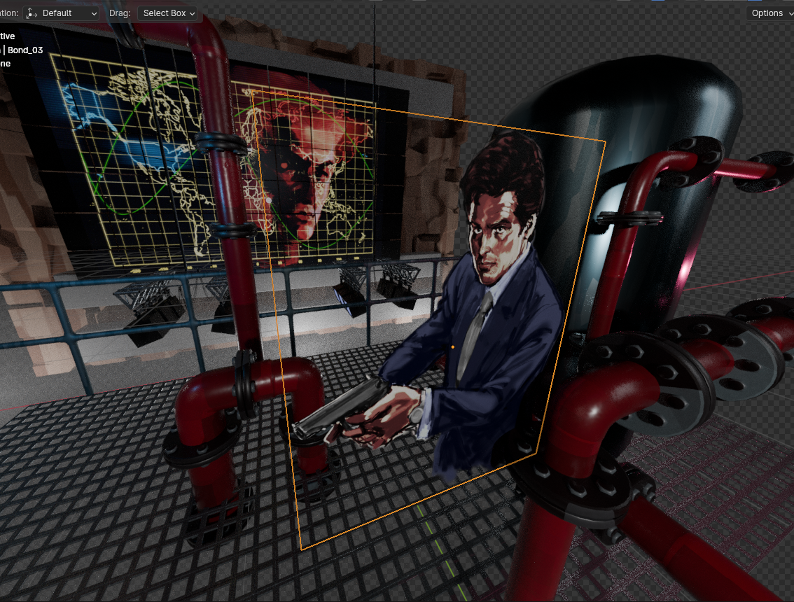
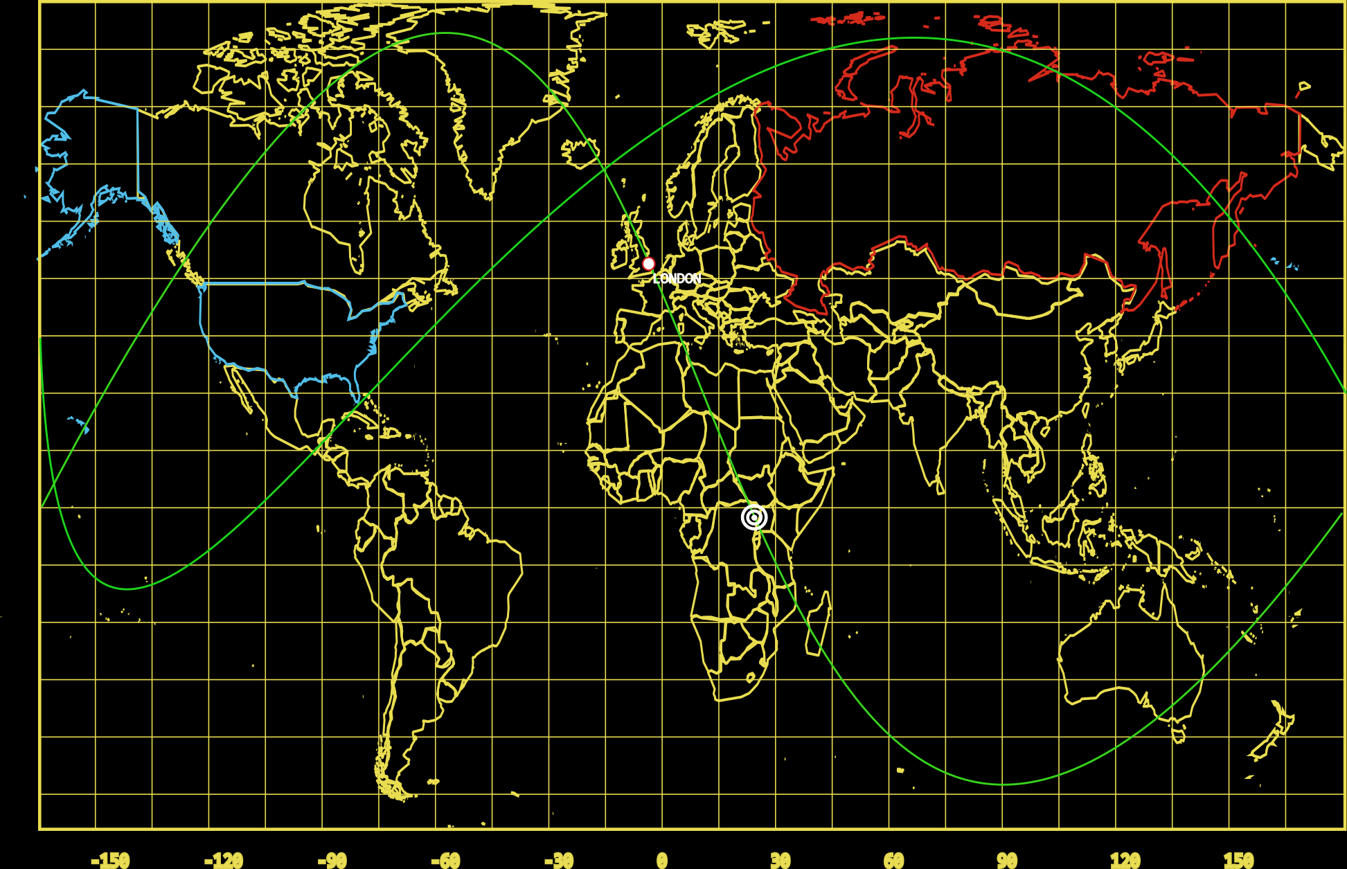
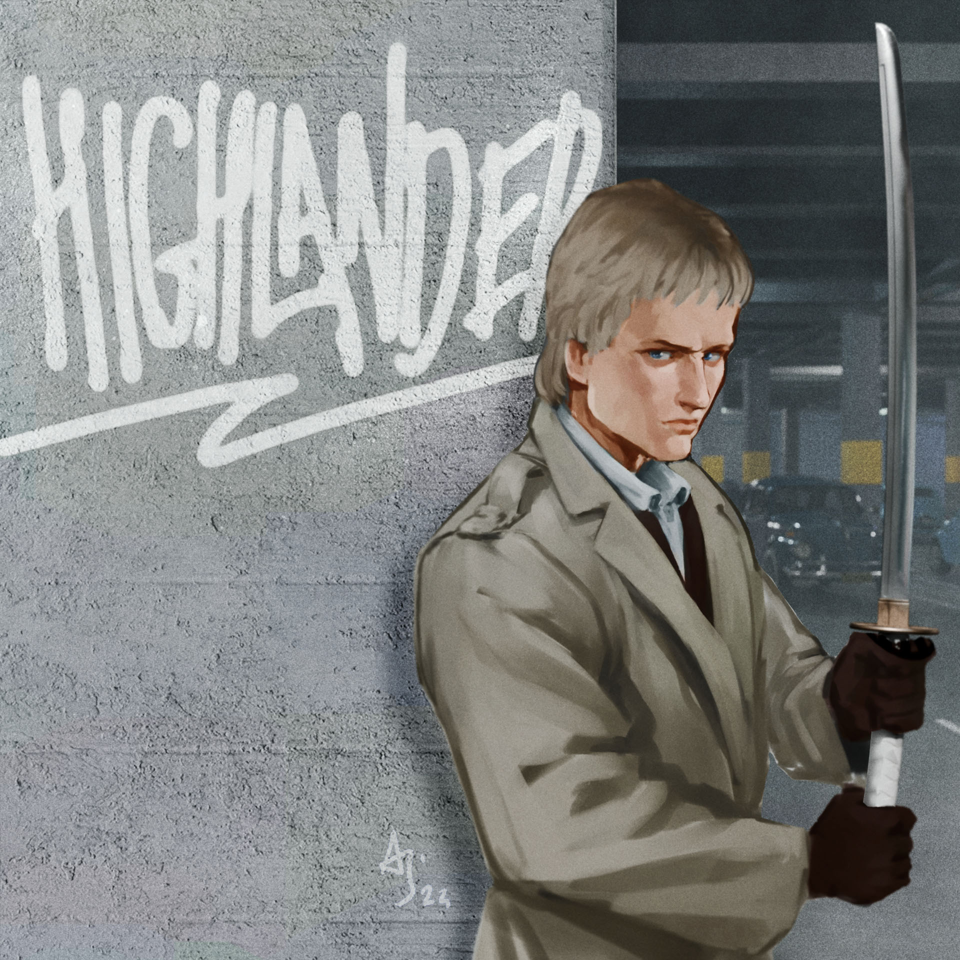
H is for Highlander.
I’m not dead, I was just studying for the JLPT. I worked on this off and on through my test prep, which meant I refused to get proper reference, which meant I repainted this 6 times’’’ I used Blenderkit for the first time, most of the models and materials are from there.
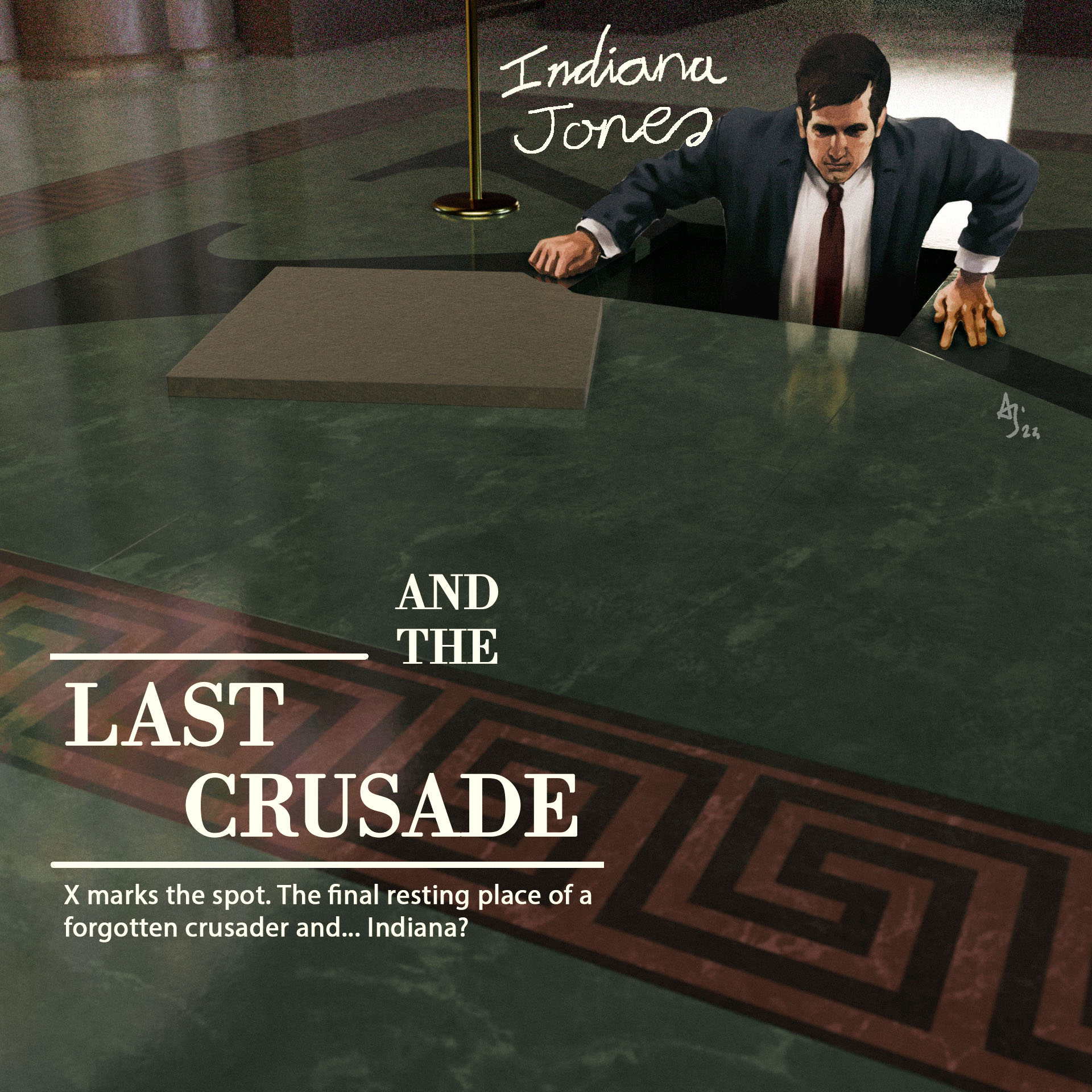
I realised I was late getting started on this and decided to just go with the first Idea I could come up with, because that never causes problems. Many problems later I am done. The concept is inspired by magazine illustration from the 40's and 50's.
I’m going to change things up for the next few letters. I will try doing more direct studies of film screenshots. I think this will let me focus on the technical aspects on the process for a little while. I also want to figure out how to add some kind of motion to this series in the new year.
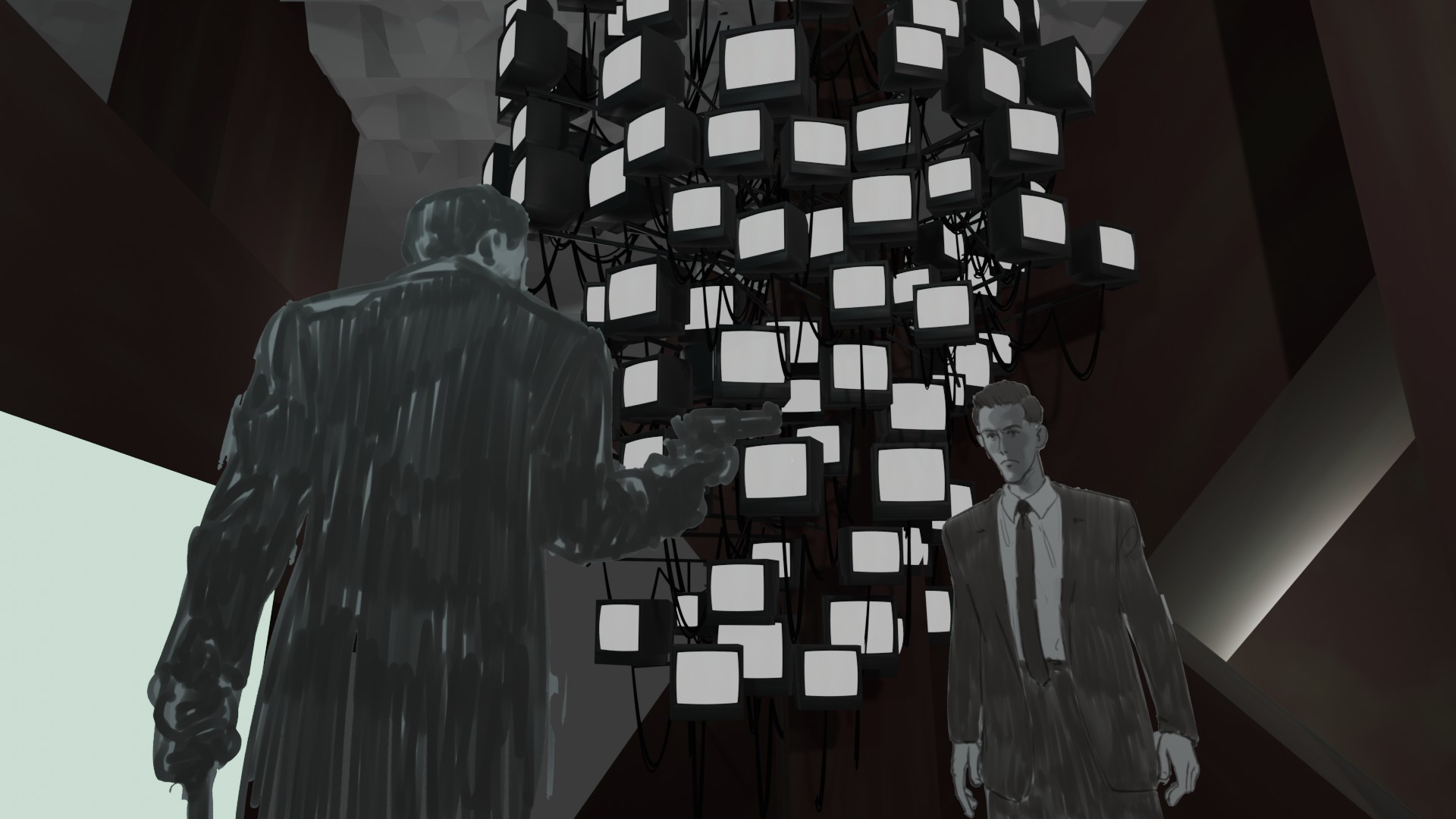
J is for Johnny mnemonic.
This is the first abandoned letter of the project Posting it as is, for completions sake.
The pace of a project really affects how I feel about it, and I just dont feel like forcing my way through this one.
this is more or less what I am hoping to do for the next few letters, screenshot studies with some kind on animation, flashing lights or what ever.
But more faster and less bad
[https://youtu.be/ZFA8cLy3PKE](https://youtu.be/ZFA8cLy3PKE)
I went nuts with the 2d steam elements after watching a bunch of Ian Hubert tutorials
First time trying to composite and grade with davinici, took a lot of googling but I think it will be worth it.
I am still alive, I had some short term work at a festival and felt too lazy to post anything.
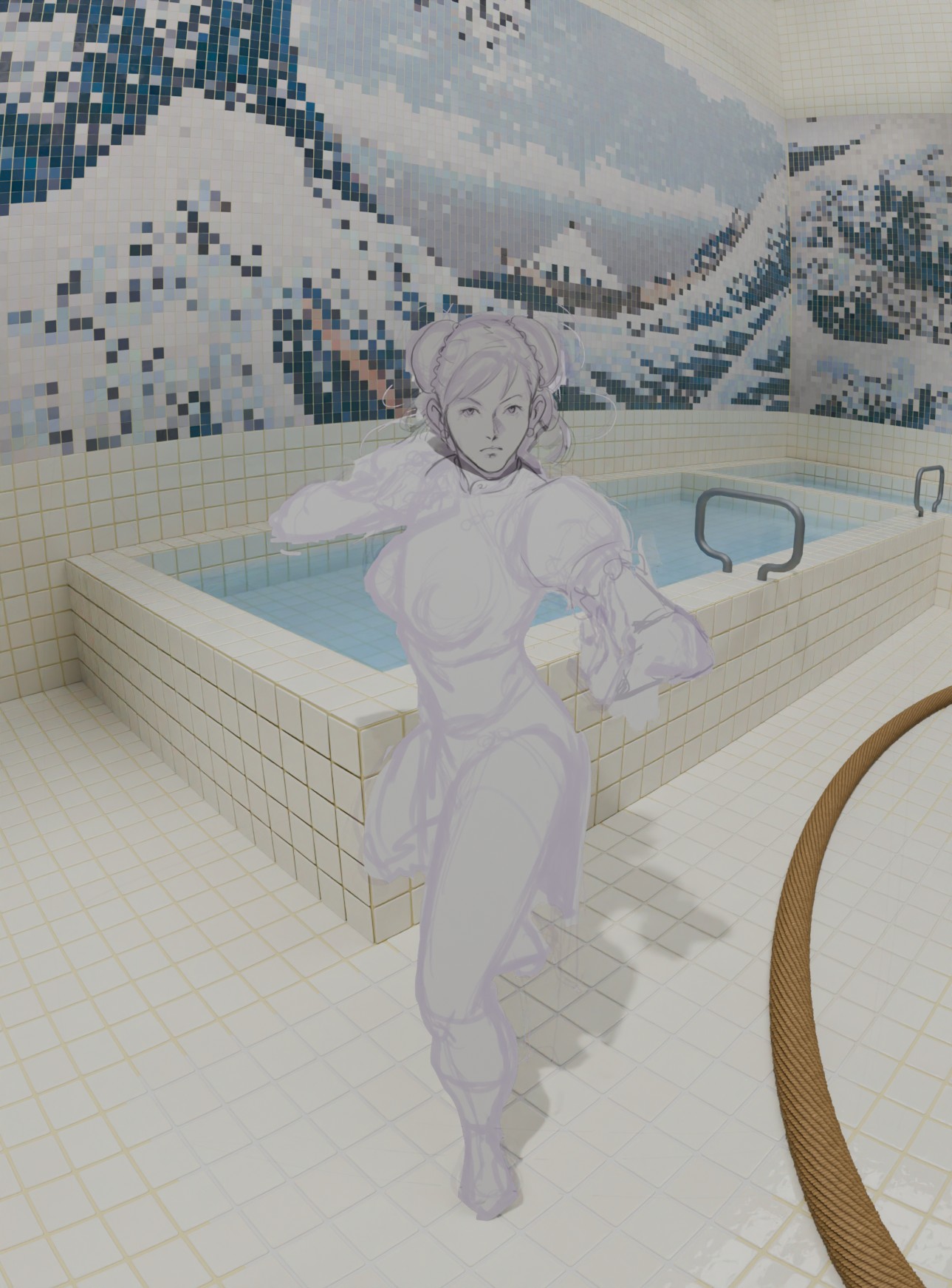
this WiPs are from February
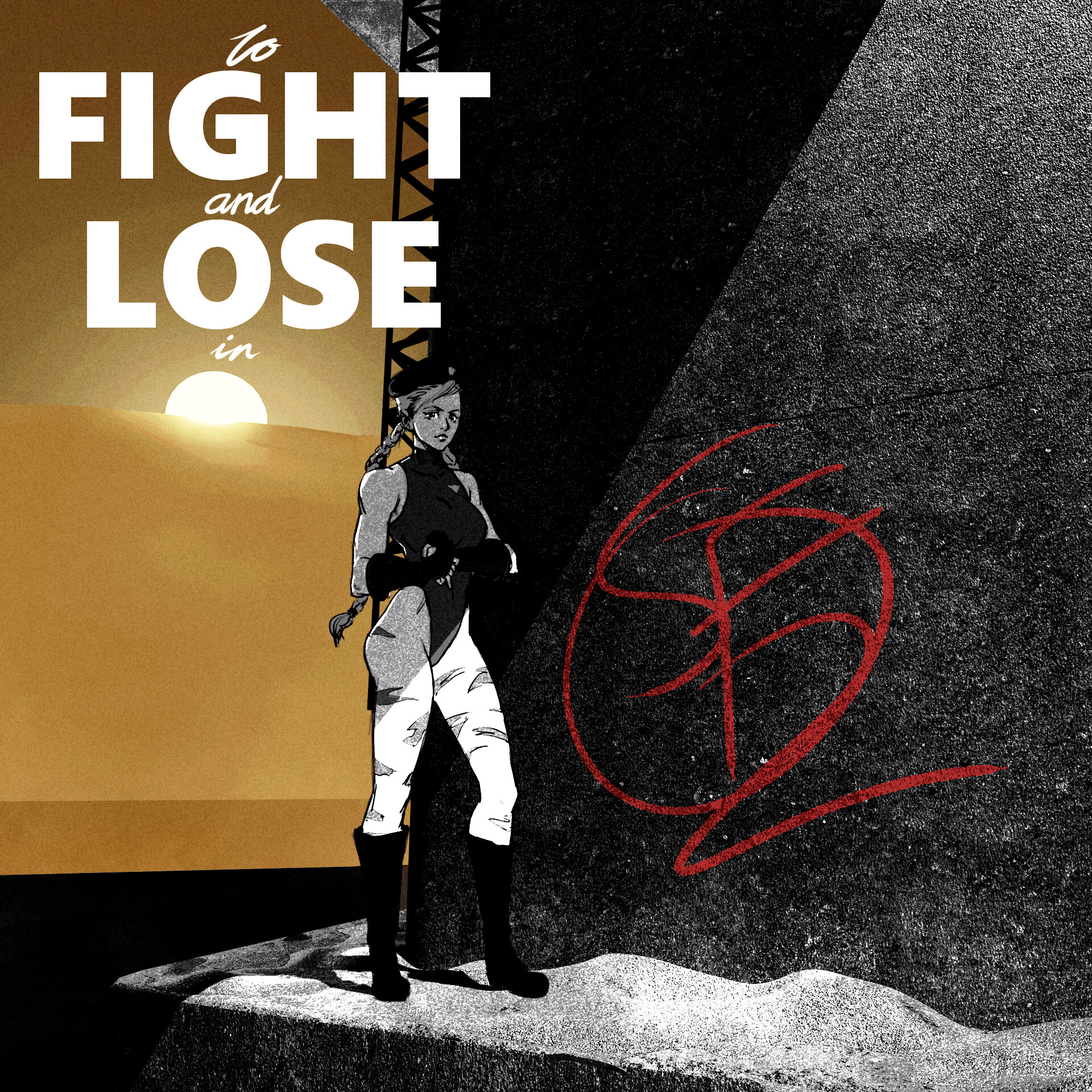
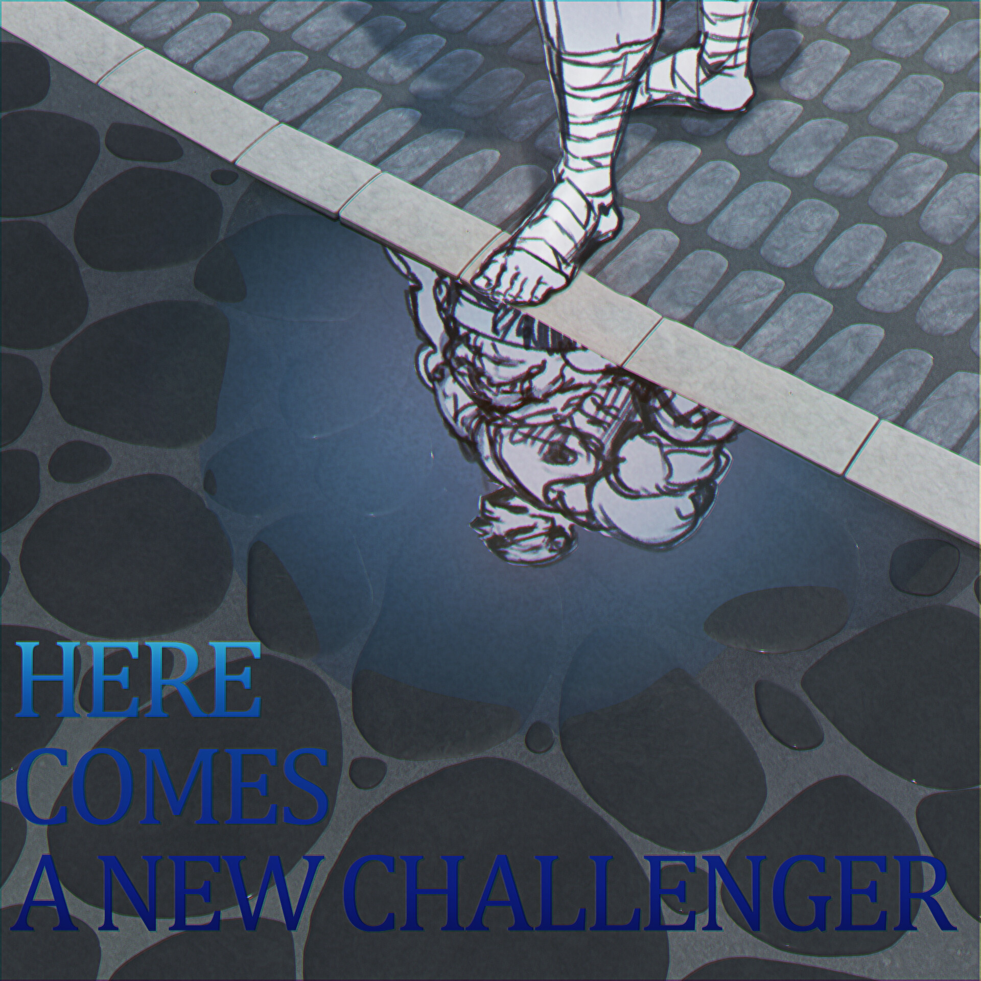
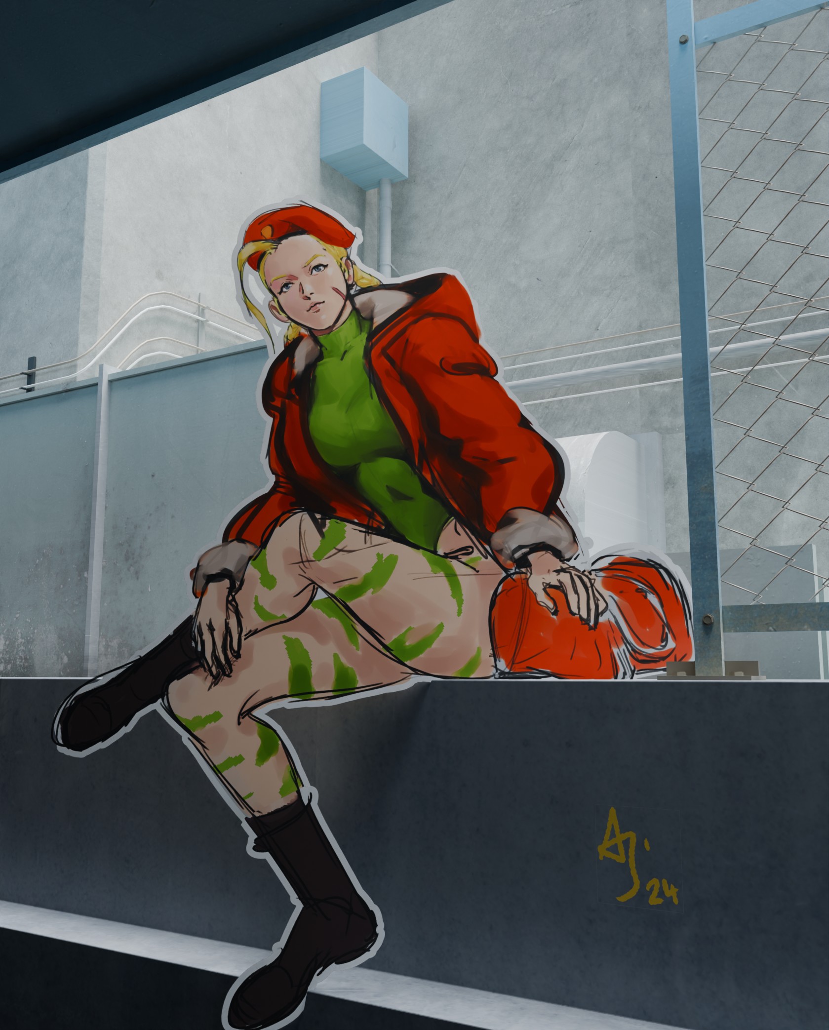
this Chunli pinup was supposed to be based on a classic SF2 illustration.
it suffers from a bad habit of thinking “i’ll just do this quickly I dont need any ref or planing” and then it takes long enough that I feel like the lack of ref and planning really undercuts the piece’‘’
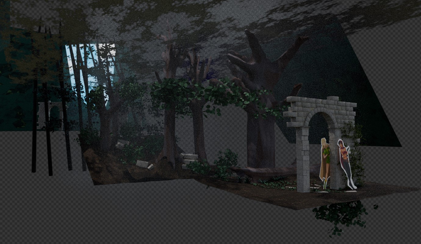
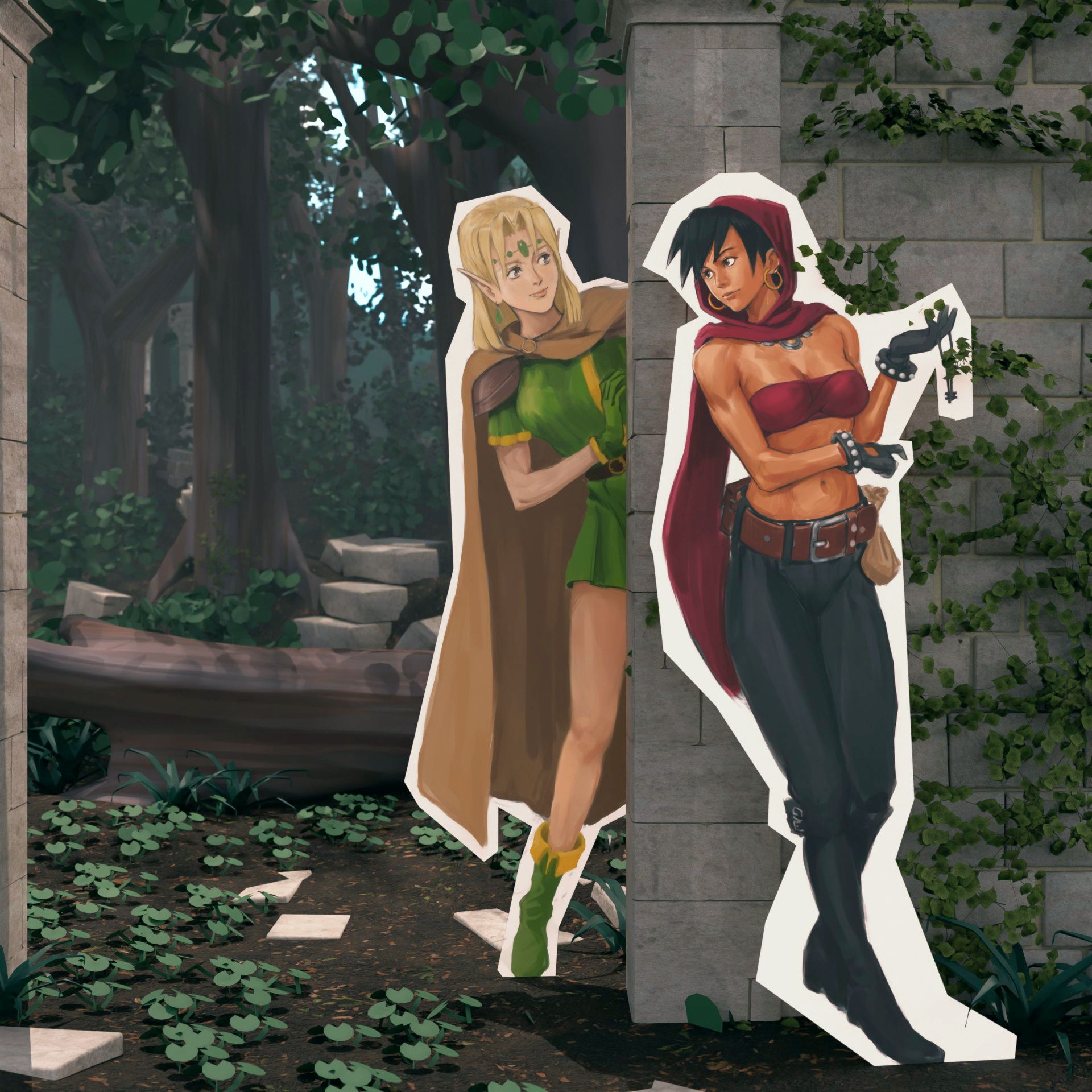
This is from a Kill Bill project recreating the rear projection sequence in limited animation. same problem as before… so I dont know if I bite the bullet and go back to redo things or push a head or just leave it unfinished ¯_(ツ)_/¯
This took longer than planed, an animation in the mode of a eye-catch, with audio pulled from and old eye-catch. background and animation done in Blender.