Photo realism - modern building

Hi all.-
A quick test I made these 3 last days.
We often found tutorials and trials showing us how to achieve photo-realistic renders, but rarely based on real photos. We can have a feeling of what is realistic, but when we compare to a real photographed object, we see many other things. Subtle color variations, shadows running darker in some spaces, reflections of light.
I thing Blender do a good job making basic environment lightning, but we need to adjust things to really get closer to real lightning.

Being photorealistic means often being flat, or common like. Reality is not so amazing sometimes. In cinema we often see CGI that pops out the screen, make itself really beautiful and shiny, but its not like reality. The artist and filmakers needs to make something that’s stands out. Some rare exception occurs, like the effects in Neil Blomkamp’s movies, like “District 9”. They are incredible. The aliens not seems CGI. The same in “Elysium”. The robots looks real props on set. That is being photo realistic, because it don’t try to be more that reality. It don’t try to be self aware, like: “Hey look at me I’m a great effect, many people works hard on it, we want to be seen”. Beautiful yes, but it feels not real, so we don’t rely on it.

Last tries I add realism by adding area lights where more reflections (radiosity) needed. But now I try the compositing option.
It can be painstakingly long to adjust it all inside Blender, and takes hours of rendering when we have multiple lights and so on. Compositing gives more freedom to finetune the result, and the difference between an good (or even spectacular) rendering and a realistic one is by finetuning. I’m sure many of you knows that. But to get that, we must observe real pictures of similar object in similar surroundings.

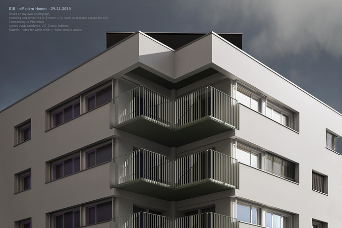
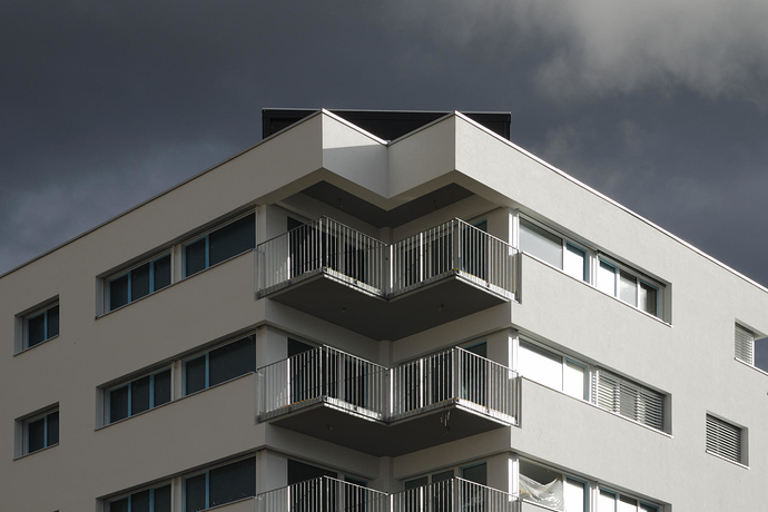
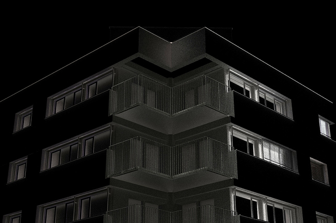
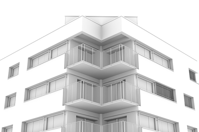
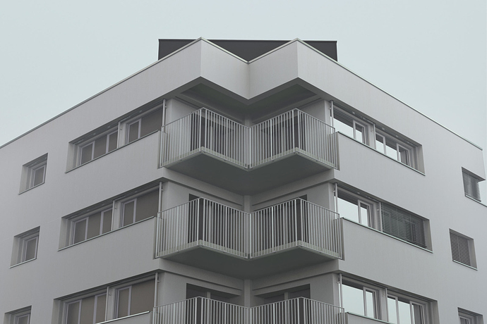
Here I replicate a photo I took some years ago.
Hours of job: around 3 hrs modeling, 6 hrs finetuning, 1 h compositing. No texturing, except for the sky, I avoid this to be focused on light and shadows. I add a small amount of noise in the white walls in compositing.
The modelling is not accurate, I didn’t wanted to spend too much time on this.


1 Like

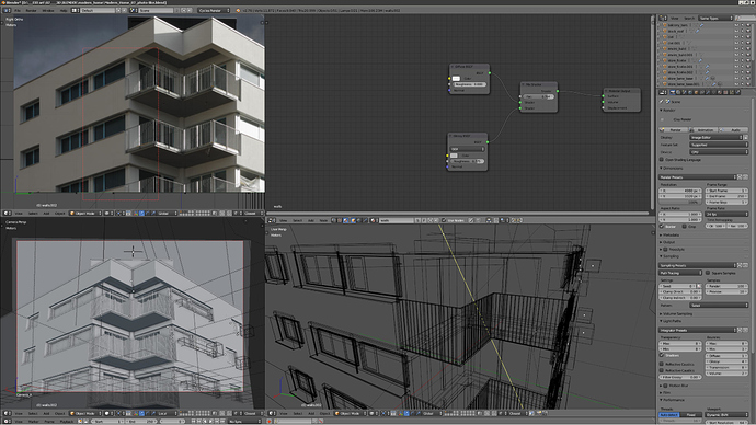
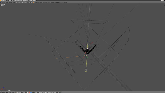
The scene setup:


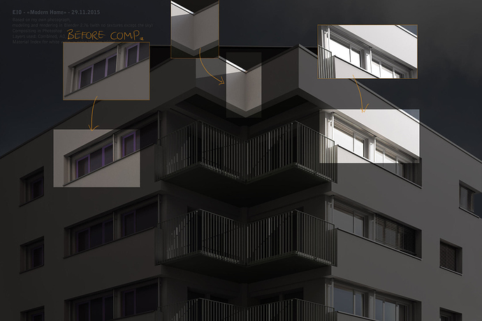
In this case I still added some area lamps where the render lack some bouncing light, near surface receiving direct sun.
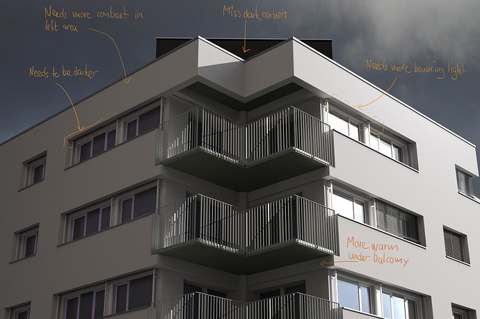
But the main real-like effect comes with compositing. There is many areas where a color temperature change, some parts are darker or lighter in many ways. Without looking closely to a photo, I cannot imagine or invent where to change thses details.
The render passes that helps me the most: Ambient Occlusion (to darken concave areas) and Glossy Indirect (to lighten where light is bouncing). The walls are a mix of diffuse but mostly glossy material, with large roughness. Glossy materials looks better that diffuse one, but render longer and makes some fireflies.


And some details to focus on:


In photography, we enhance contrasts in different parts of the image. That’s make the picture looks closer to reality. Means selecting some shadow parts, some others bright parts and adjust curves. It’s almost the same job here.

2 Likes

Hi Edwhard,

nice topic, the holy grail of photorealistic rendering :wink: I think you have a great eye for detail and your approach to recreate an actual photo is really good way to go for learning!
The path you took to finetune your initial render will probably lead to a very close match up to the original photo, which is fine, but working with area lights, ambient occlusion and the need for large® compositing tree for this simple exterior scene is highly questionable from actual production perspective in 2015.

Regarding lighting, your scene could be effectively rendered with either high-res hdri (probably most accurate choice), low-res hdri+sun or even sun+sky model. Avoid AO in the world panel, this is most simple diffuse lighting model from last century, which would be added on top of accurate GI path tracing and lead to unnatural result.

Modelling: Think about occluders/reflectors for your scene, for example ground plane (do not shade/texture white:)) and facades facing your building. Some context modelling, simple planes, cubes etc. will give you more realistic light distribution.

Materials/Shading: Cycles shaders do not need to be too complex for photoreal archviz output, but the shader you posted above is a little bit too simple. Check out chocofur or cynicat tutorials to get a deeper knowledge about fresnel term and shading components of most common materials. Always avoid pure rgb 255 white for diffuse shaders and have a look at the values of your texture maps, in general people tend to create too bright materials, which results in hard to clean (caustic) noise and problems when processing the image afterwards. Think about a studio setup with nice lighting, where you create all your shaders, this may be great for comparability and consistency.

Processing: If the above mentioned stages modelling/shading/lighting were done correctly, compositing should be a matter of few minutes. Contrary to the low dynamic range 8-bit reference picture with exactly one described light situation, the rendering output is high dynamic range 32-bit float and contains way more possible light intensities. So we need to “extract” and compress data to get the desired result. Linear Workflow, Tonemapping and Highlight compression are the keywords to get the right intensity values, White balance (and blackbody temperature input at lighting stage) to get the right color values.

Compositing: What is left are camera/lens artifacts like distorion, chromatic abberation, vignette etc., optical phenomena like glows/flares and environment effects like fog. Some of these things are possible in render engine, some of them only realizable with high sample rate und therefore unpractical in production, so this could be part of compositor. For some effects it makes sense to pull data from the raw render result.

May be have a look at other forums with strong focus on photorealism like vray, maxwell or corona forum to gather further ideas and techniques. Very interested to see this progessing, cheers!

1 Like

Hi Polygonsoul.
Thanks for the infos. You seems to work in the CG business, am I right? Nice to have your attention.

- Production perspective:
I’m just an artist who made a short film recently, have some CG effect to do but now I do other stuff like this test to “change my mind”. Still hours on the computer, what a life. =) I’m more like an artisan, I like to spend time on details, as you saw. But that’s right here I didn’t get all the way down to the best possible.

- Lightning:
Actually I used a 8 bit spherical background image (for global lightning), a plane for the background image and a sun.
For a previous test I tried a 32 and 16 bits image for global illum. and compared to a 8 bit and I didn’t get a difference at all. Maybe I done something wrong?
For AO it was not activated in world prop., I just activate the AO render pass for further photoshop comp. I used only 20 % of AO opacity, just to darken corners. I don’t change a big deal on the overall result.

- Modelling:
Yep right I thought about occluders, like in studio photography! I only place 2 textured planes in the front of each building’s faces. No white materials, right, I read it in the manual.


I did forgot to place a ground plane then, shame on me. Added here.

  • The Chocofur tutos are good, I discovered it a few week ago. But didn’t know Cynicat.
    I didn’t use fresnel because of almost all faces are flat and 90°. Will be any improvement with this simple model?

- Processing:
I saved the main render in TIF 16 bits. But you mentioned the Blackbody parameter, useful maybe for all color inputs or not?.
About colors: I think we need to use very slightly colored tones in our materials to get away from the all-grey image. In real light, we have all color combined but in CG we have only 1 value. Is it a key element to have a good render? Having a lot of colors to work with in processing, tone an color temp. like in Camera Raw after a photo shoot. I will think about that. Is that’s why a Sun source for light is not so good? It’s only 1 color, opposed to an HDRI light who contains already many shades of colors.

- Compositing:
I avoid using fog during render if it’s not necessary (light beams, glows around a distant light and so on), its amazingly long. But for sure in production thinking, we can let the machines work and do another job.
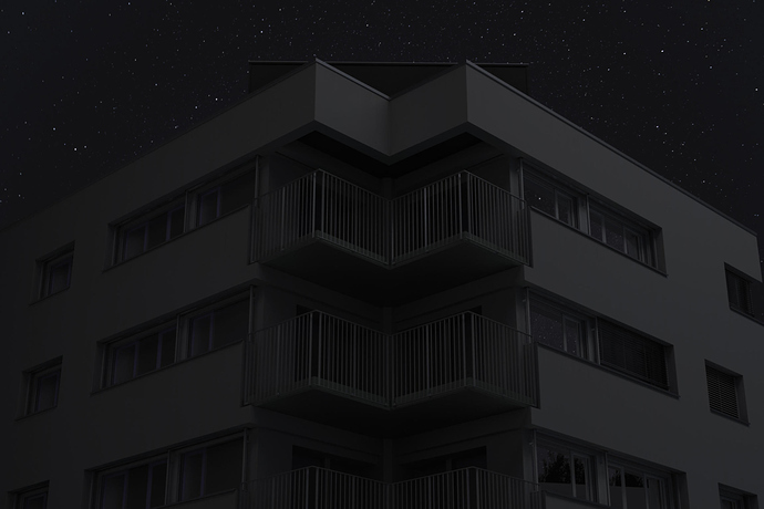
I spend some time to make another mood with the model (pics under, no photo model for these, I go with the guts). I thought suddenly that my goal is maybe not to be PHOTO realistic, but only realistic, from an human eye perspective. There’s huge fiference between photographs a the source.

Anyway thanks for your comments.


Looks great so far lighting almost nailed, very impressive.

Note the inconsistencies in the reflections from the railings compared to the reflections in the reference photo. They indicate a more uneven surface / surface glossyness.

The shutters in the reference are completely different to yours. There are less, thicker, more reflective slats at slightly different angles on first glance, than in your render.

Overall your lighting is slightly too warm in comparison to the reference image, is your sun tinted warm? If so this is probably the issue.

The angle in the photo reference is juust slightly more “looking up”, maybe this isn’t an issue, it doesn’t matter for photo realism only if you want to replicate the photo exactly.

Focal length seems very similar so maybe this isn’t so much of an issue either.

I hope you don’t mind me nitpicking, it’s quite fun :P. The image is probably still better than I could achieve in the same time frame.

… and thanks for the Cynicat tip. This guys makes really good things.

Yep thanks Nearleyg.
The railings are really too clean in the render, part due to digital vertical pixels perfection. And without textures, I can’t get to the “real” feeling.
But in all your points you’re right. More perfectionist than me, jeeze, we are so self-punishing =)

OK, I spend hours and days gathering informations. If Polygonsoul read this, you can correct me if I’m wrong.

Before any test of my own, here is the theory. A list of 10 things to do for a good rendering by Jeremy Birn, technical director at Pixar since 2002 (I think he knows his job), with my own comments:

1 - Use linear workflow (linear or 1.0 gamma curve)
I didn’t knew that crucial thing.
Some infos tells that Blender linearize images textures coming into it, which means that we already work linear.
It seems that “linear” is a short term to say scene-referred (vs display-referred) workflow. Many details in the PDF from the cinematic color page. Since version 2.64 Blender uses the ColorIO system for the color management, that is the system used in cinema industry since 2003.

2 - Solo the lights
Test every light source independently to see what the effect of each light. Sometimes we end up adding more light that is necessary. Every light has a purpose, a color, an intensity. Just observe and anticipates what every light does.

3 - Beware of light/objects’ names
Just stay practical, name thing to retrieve them later.

4 - Nail the character’s eyes
Very specific to the object. A good eyes make an alive character.

5 - Use extra bounce colors/lights
Place where necessary area or point light that add indirect lighting in specific places. Raise saturation in some cases when the shadows areas becomes too neutral.

6 - Divide scene in different color spaces
It’s about composition an creating mood in the scene.

7 - Add spill light
Very important and complementary to adding local bouncing lights. Example: duplicate main sun lamp; move it a little bit towards its target to make it visible in the interface; make it dimmer, warmer and with larger shadows. It creates spill light around main light areas. Simple efficient trick.

8 - Use natural colors
Very important. 3 ways to do it:

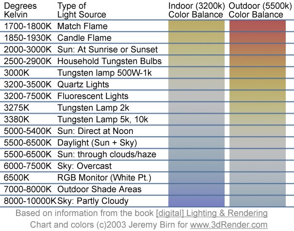
  • Use data of lights. But where find the right colors of things? A blue sky, a fluorescent bulb? In kelvin temperature with the Blackbody node? No!
    Kelvins are not the human eye percieved colors, so it’s useless. Maybe if Blender team make add to it a translation to human perception someday, but today, no. Use this: a color chart by Jeremy Birn.


    There are the values that can be used in Blender.
  • Use photographic references, or the picture inside wich you compose your 3D scene or object. Pick the color with the color picker, that’s it. To make it real, use real colors. You like this green foliage? Pick. You like this grey-blue overcast sky, pick. Simple as “Say hello to my little friend”, a well known phrase in all bedrooms… Or in a famous Pacino movie.
  • Use your own taste, observation and sensibility. More risky for a look that match real world, but remember that a picture IS AND WILL NEVER BE the reality. Professional photographers teach that. A photo is a representation of the reality, so forget the real thing, don’t try to replicate exactly. A picture, painting and 3D render will feel real in a certain way of its own. What’s real for an RGB picture is not exactly what’s real for what you see looking on the real scenery. So we have to trick a little, to push here and there many small details that brings a flat image to a feeling of reality.

9 - Optimize objects

  • Bevel all objects, even if its only 1 flat face segment appearing 1 1/2 pixel in the render. Almost nothing is sharp in the real world. Use the Bevel Modifier, make this small rounded edges to catch a slim light line on corners. Small detail make big picture.
  • Group objects together
  • Make thick enough walls. Too thick is often better than too thin.

10 - Collect references
Seems obvious but if you forget it, you don’t have anything to backup your perception. I often see tutorials of “realistic renders” without any real photographic material. It’s true that we can have a feeling of what’s real or not, but without photography, we cannot think of all subtle things that makes reality. And once again, to build up reality, mimic reality.

Mister Birn didn’t mention one key aspect:
11 - Build good shaders

I don’t have time now to detail this but just learn from Cynicat pro. It’s a major step to get closer to real materials. Watch all the videos and you get smarter than before.
Blender Physically Based Shading by Cynicat Pro.

Here this article on my blog. https://310blender.wordpress.com/2016/01/25/practical-workflow-for-realistic-renders

1 Like

So, what’s the situation in 2022? Any big changes?
I mainly find too-perfect surfaces irritating. Even if a building is brand new, it has some imperfections - in the paint, plaster, sometimes even in the window glass.

I’ll try to dirty up a facade I just made, put some grain on and manually paint in slight texture, maybe that works.

I’ll also have to tackle composing art some point, and since Blender sees transparency different than Photoshop does I can’t even resort to software I use since the mid 90ies :sob:

Hello Corniger.
Thanks for that message. I’m not in 3D anymore. More on photography and now on videography, film making. You can watch ma demo reel here: https://eddyjuillerat.wordpress.com/2021/06/24/demo-reel-2021/ or my many pictural works here: https://e10art.wordpress.com/

But I still love have fun with Blender, just to play. Maybe I will get back to for some inserts in fiction films or to create image to sell as NFTs.

“Too perfect surfaces”: I agree totally. Here my goal was to make something looking real in term of lightning, without textures. For a true final rendering I would add a little amount of texture with corners a little worned. But this building in real was pretty new, so it was really that clean at that time.
I hope all is good for you.
Cheers from Switzerland.
Eddy