Hi
I’m trying to create a photo realistic scene of an ancient street, and I just can"t seem to get it to look real. I’ve tried using HDRI lighting, texturing with diffusion mapping, normal mapping, reflection mapping and displacement. I added randomness to all the objects. I made sure each texture mapping is different, as to avoid repetitions. I’ve done some post work.
I’ve pulled out all of the stops, and I don’t know what else to do. Yet as soon as I composite an actor into the scene, the render falls flat, and looks computer generated.
Can someone please, please give me some advice? I’d appreciate any help.
Yes, I created all of the objects. Most of it are cubes, spheres and cylinders.
I’ve been working on the file for some time now. I work on it for a few days-weeks, then I leave it for a few months and then pick it up again, and so on… So unfortunately I can’t recall if I got all the image files from CG Textures, and links. But What I can do is send you some of the textures’ file names, and you can search for them on CG Textures. Will that help?
looks quite nice the only thing that seems wring to me, is the rug/carpet thingy he is standing on. it doesn’t seem like a style they would have back then if you get what I’m saying.
The lighting doesn’t match the sky. What I mean by this is there is a bright light coming down the street to the right and the sky is very dingy overcast with red and orange hues in it. Change your light occordingly to match the sky.
Edit: forgot to say that with an overcast sky like what you have there wouldnt be sharp shadows. They would be very soft. If you are using cycles increase the size of the sun lamp same goes for if you are using a plane with an emitter material.
I really really like the potential and many aspects of this scene. And although I am fairly new to Blender, (two years) here are my sticking points, IMO.
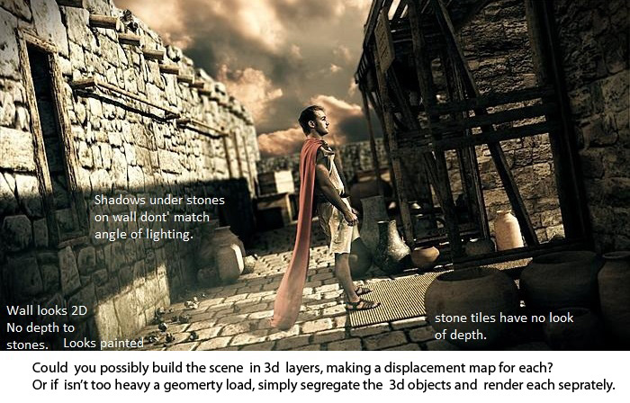
Nice image, but the compositing of the human does indeed show some problems. Some suggestions of problematic areas (refer to this image):
Like Loonatik503 said: the lighting is off. Besides the colour of the lighting, the positioning is also strange. The very long shadow of the gate suggests that the sun is very low, whereas the shadows in the clouds suggest differently.
The quality and intensity of the shadows differ. 2A is a very sharp dark shadow, whereas 2B is much fuzzier and lighter.
The quality of the wall textures seems quit different. 3A is very crisp and shows depth, whereas 3B seems flat and vague. Based on the focus point (the person) and the associated DOF, the opposite could be expected, if there were to be any difference visible at all.
There is no possibility for the cape to be lit on the back as it is. The main source of light is in front of the person and any light bouncing off the wall would never result in such a bright (rim?)lighting.
The person seems to be much more crisp than the grainy look of the rest of the scene. It might help to add some artificial grain to him, or up the samples in your render.
I have the feeling the scale is slightly off or conflicting within your scene, but I can’t really point out anything in specific.
Please don’t take my comment as a negative thing. The image is already nice, and beyond my own capabilities; I’m just trying to give you a fresh perspective.
Edit: one thing I’ve only just noticed: I can see the edge of your texture on the wall on the left. It starts between the small rocks and the vase, and goes vertically to the top.
The depth of field seems to be a bit much for a scene that large, try increasing the F-Stop a little.
The pottery is a bit over-sized, the bowls especially should be a bit smaller.
I can tell you are going for a “300” look, but even so, the lighting is a bit overpowered.
The scene needs more overall detail. The small rocks / rubbish on the ground are a good start; a particle system on the pavement with lots of tiny pebbles in the cracks between the paving stones would also add a lot. The wall, too, needs something–some subdivision and physical displacement (that would help with the street too), and maybe some subtle color variation (noise map + color overlay) or some areas of different-sized/shaped stones.
A few general tips I have found to be very useful when making realistic scenes:
Find some reference photos of the different types of architecture in your scene. I often think I can model something from memory or imagination-- but when I find reference images, I am amazed at everything I would have missed had I not used them. Study the objects, textures, and lighting in the photo, and try to figure out what makes it look more realistic than your render. Google is generally a good place to start for reference photos (but be aware of potential licensing issues). Here are a fewimagesearches that should get you started.
Spend some time (as long as your patience can endure) refining and detailing the modeling in your scene, rather than just using primitives. (this one held me back for an embarrassingly long time) Sometimes this means completely redoing a section of the set. Modeling is the core of any realistic render, so spend some quality time getting the modeling right; it really can make a difference. (If you post a solid/clay render, I could give some more specific pointers if you like)
I can’t tell whether this is Cycles or Internal, but Cycles is much better for realistic scenes, so I would highly recommend using it, especially if you have a decent machine.
Analyze the material you are trying to create, build the shader to be as physically accurate as possible. For example, a realistic stone material might have a diffuse shader with color and normal maps, and a glossy shader (with the same normal map, and likely a roughness map). The two would be mixed with a fresnel input, to get a glossy coat on the rocks.
And finally, a few useful resources for improving overall render quality.
Thank you AnthonyB for the great tips and advice. It was really useful. And after the great comments from the community, I’m so inspired to redo the image.
There is a lot of awesome advice in this thread. Il throw my 2 cents on top of it.
Il second that the cape should be darker in the back the lighting looks quite off on it if its there at all the bounce light should be much weaker and maybe drop the saturation on it a bit more.
The rocks on the left could use stronger displacement and your spec might be set to high they look blown out on the left which is a good part of why they look flat. Also the objects in your scene don’t look as crisp as your actor. Add some fine grain textures to the pots of interest and maybe the floor and the walls try to high pass your diffuse and spec if you’re feeling lazy.
And il second that depth of feel could be toned down.
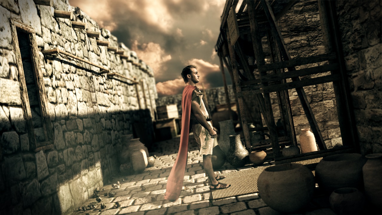
 the only thing that seems wring to me, is the rug/carpet thingy he is standing on. it doesn’t seem like a style they would have back then if you get what I’m saying.