I need any of you Photoshop gurus (5OnIt?) to tell me what I did wrong on this fire tutorial. I know I’m a PS noob and the tutorial is advanced, but I only have PS for a month, so…
My results:

I need any of you Photoshop gurus (5OnIt?) to tell me what I did wrong on this fire tutorial. I know I’m a PS noob and the tutorial is advanced, but I only have PS for a month, so…
My results:


I guess we can’t know for sure without the actual PSD file for cross referencing with the tutorial.
Anybody? .
I don’t have Photoshop, so I can’t give program details, but from what I can see, I’d offer a few suggestions.
Increase the randomness of the fire, make it different lengths and thicknesses, too similar and it looks odd.
Maybe create the same effect in a lower layer, with less opacity, maybe put a little bit of soot from the end of the smoke and simulate heat waves.
Make the reflection a little wavy also, increase contrast a tad to show superheated ground?
I’m not a fire guru, or a photoshop guru, so these are just laymans comments, feel free to disregard them.
Contagion
Thanks, I know how it SHOULD look, it’s just a matter of getting it that way… Take a look at the awesome results of the person who made the tutorial!:eek:
Well I took a glance at the tutorial (Didn’t really notice the link at first, sorry), and most of my points still stand. The real issue is the small height of your flames and the lack of randomness. Look at his fire and see how it doesn’t repeat,
Also, look at your color intensities. If you notice, your image is a mild orange most of the image through, his varies from intense orange to blinding white, which adds to the fires intensity.
So if you change the strokes of the fire to be a little larger, and more random, and increase the contrast, your image shouldn’t be too far off.
Edit: Sorry I can’t be much help in terms of “Do this, then do this etc.”, but hopefully if you apply the techniques used in the original creation of the image, you should be able to implement my suggestions
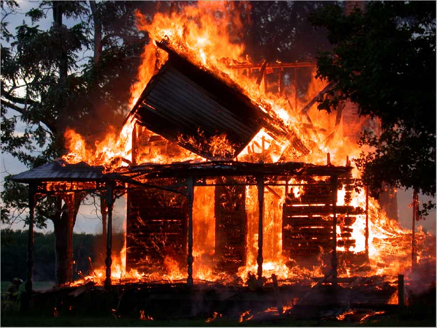
Edit2: http://www.cs-music.com/features/photos/house-on-fire.jpeg
That’s what I mean by the randomness and look of the flames, try and copy those shapes a bit more, not just a little wiggle like you have. Make the frames branch out. I’d love to do a quick diagram, but I don’t have my tablet right now, sorry.