Welcome ![]() …
…
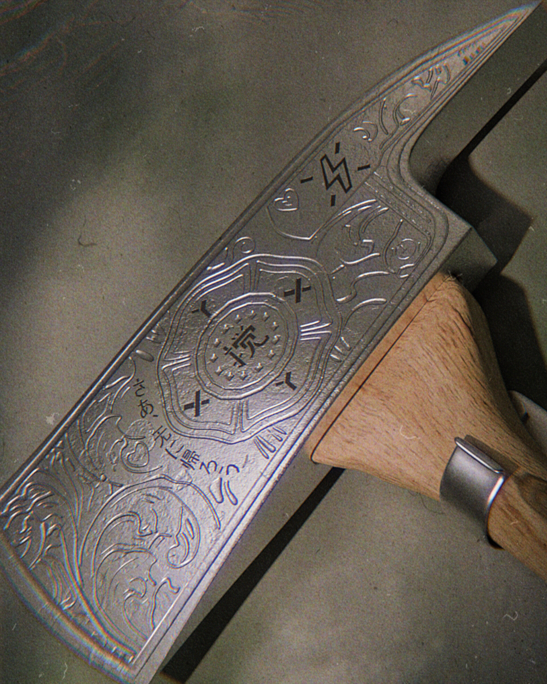
The only thing i can think of because the axe head seems to be rather heavy like for a wood splitting axe the axe head seems to be little small…
…but then it looks more like a representative trinket (??) than a weapon ?
…or…
…just ignore me my two cents ![]()
Thank u very much
Glad to get your advice:grin:![]()
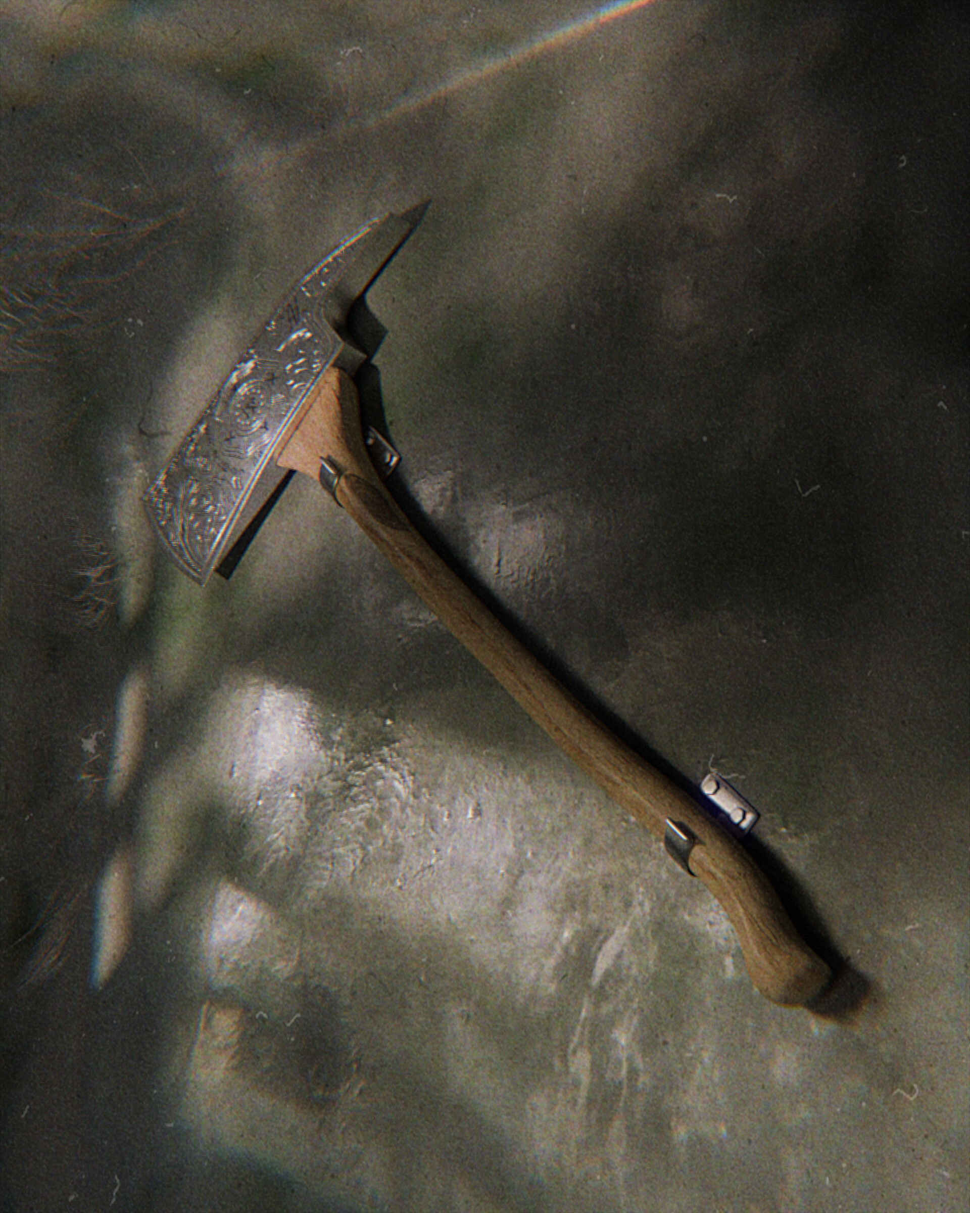
The first thing I notice is that the wall looks very aged, as if in a room that’s never been cleaned. The ax and the wall clips (but not the clip brackets) look like they’ve just been purchased from the shop.
Here’s what I’d suggest: "dramatic, theatrical, framing and lighting."
The first shot “frames” the subject maybe a little too tightly, because it cuts parts of it off – and, if we’ve never seen it before, that becomes a problem. The second shot simply exposes it. Neither of them "tells a story."
“Lighting” is where you develop drama.
Wow!It’s a good suggestion,thk u very much ![]()
I should change the lighting to make the scene more story-telling, right?
And adjust the composition? ![]()
For instance: “the Hero, having just inched his way into the cave passage, suddenly sees the object of his Quest.” There it is!!! “The long-lost Axe of Glonin!!” (or, whatever …)
Now, how might you present that? Camera angle, tight cropping, maybe a nice beam of sunlight from somewhere. But, it would be dramatic. And it would continue the “story” that you have told.
(What? You need “a story?” Just take the legendary acting advice: “Fake It.”)
And he wondered… could this be ?? This treasure put here on the wall by some cramps from the mystic “building supply store with vast parking lot”… noone in this realm could imagine what this really meant…
![]()
![]()
![]()
I feel like the axe should have some sort of story, as opposed to looking like, as @thorn said, I think wear would be really helpful, but the wall also seems out of place with the axe, because I imagine it belonging to a biking or person who lives in a little cabin in the woods as a lumberjack, so maybe a wood background? But this is entirely up to you, because this is what the axe makes me imagine, but you probably think of the story of the axe, and it is probably different from my idea, so just follow your gut, and bring life to the axe, not just something right out of a factory from china, selling for extra because of the cool design.
You’re completely right, I think there should be more story backgrounds to better let readers know what to express.
It is really necessary for me to let readers know what I want to express.
The difference between the old and new axe and the wall is a fatal problem. I should make the axe look more old and shabby.
1 Like
Let me just suggest this: “Your model is just fine, right now.” Now, put on your Cinematographer’s and your Director’s hat, and think about how you want to present it. It is quite clear from your second original image that “the detail is there” to enable you to do anything you want.
2 Likes
Great answer, thank you very much!
My first impression looking at the axe is that the handle is weird. The widening at the axe end seems unusual and it seems as if it has no purpose since it would not really provide any strength to the handle, but it makes me direct my attention to how thin the whole handle is and it looks like it has a week point that could break just before it widens. So for me it forms sort of unbalanced feeling. This is based more on feeling that I get looking at it and the explanation follows, not the other way around.
Camera angle looks like it was photographed by someone walking by - it has sort of quick snapshot kind of vibe. This could be something that might be desirable - I mean I don’t know the context and this might add some sort of realism, but the format is not really in line with that - it could be narrower like it was taken with a phone camera maybe. Or maybe this is not something you want at all and it would be better to form another kind of feeling about the circumstances and reasons an image like that could be made. It’s worth considering why a photograph like that would exist and how it would be taken.
There could be more color contrast and there could be more tone contrast - so that the subject differs from the background a bit more. I don’t mean contrast like in “open Photoshop and add more contrast” way, but in a sense that the subject should differ from the background more. At the moment the shadows make the background more visually active than the subject in my view. The shadows are nice and add realism, so I don’t mean to say they should not be there, but there is a problem with just how they are distributed in the composition of the image. I think attempt should be made to make the subject more visually active and distinguished from background that should draw less attention.
Also, what to be improved is to change your title from “Please ask the great god to point out the areas that need to be improveto make the rendering result” To something like: Please ask the great god to point out the areas that need to be improved to make the rendering result great.
I’m sorry about that,There were some problems when I entered the title at that time. I may really need to change it.
1 Like
Wow dude,amazing suggestion,thk u soooo much!