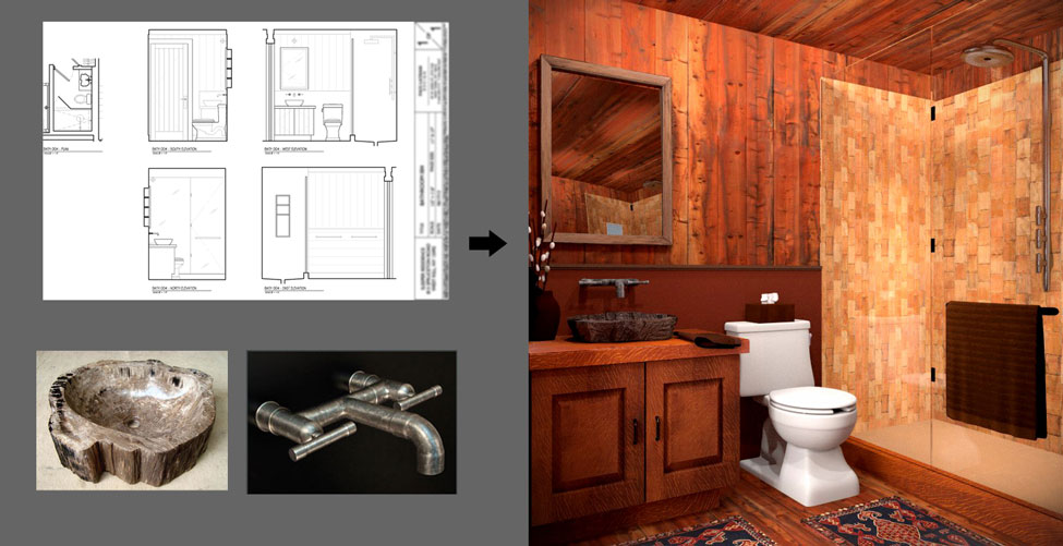
Below is a bathroom project I just completed. I was given the design with the custom faucet and sink they wanted. They wanted a “country cabin” feel. I learned a lot putting this together but still have a lot to learn about best lighting practices and materials/shaders but am happy with the result so far since it was my first blender project. Please critique if you can, thanks for your time! (I forgot to mention earlier that I modeled everything in this scene except for the toilet, which is a stock model I found.)
Ps. I used Blender Cycles for this

First in blender but you had previous experience with 3d? Right now is looking very good to be a first render! I don’t like the cabinet texture, seems like low res compared to the other woods. About lighting (i assume you are using cycles) you can try using spot lamps instead of point lamps. To let the scene be more “believable” i would model those spot lamps, from the mirror you can notice they are missing  Probably you can also try to shorten (or extend) the shower glass a bit, from this view is overlapping the wall angle.
Thanks for the feedback mik1190, I really appreciate it. This is actually my first render with materials and lighting (I played with sketchup and Maya earlier this year but nothing to this extent… I am a web developer/designer by trait but love the visual element of arch viz and am trying to get into it.) You’re right about the cabinet texture and I will try what you mentioned about the lighting. (I wasn’t sure which lamps to use and didn’t really notice much of a difference during pre-render.)
Regarding the shower glass… are you saying that the dividing line between both pieces of glass is almost lining up with the back corner of the shower? (If so that makes sense)
thx again!
Gorgeous! My first render was…okay yeah I’m not gonna go there.
My only advice is to add a tiny amount (like 0.002) of roughness to your mirror and glass textures. It’s not enough to muck up the reflections, but just enough that you can see that the mirror is really a mirror and not a hole into another room.
Wow. I remember my first render, when I was tearing my hair to get a good normal map… 
Looks good for a first project! What render engine is this?
Very quickly,
- Where walls meet ceiling, it’s painfully obvious that it is 3d. Probably has something to do with the lighting. Shading makes it really stand out.
- Are there any hinges and such for the glass shower wall? Usually there would be some to fix it to the floor part and the wall. Could just be me though. (ex: http://www.mcmahonglass.com/uploads/product_image_images/3657b67a9046b08a0e2b63d7942b9cf6_frameless-glass-shower-doors.jpg)
- The bottom part of the picture looks really good. However, maybe some of the bump mapping and such may be a little overdone at times.
- Wood panels on the floor, ceiling, and wall look really flat. Something seems off. Maybe needs better spec maps or something? Make the cracks darker? Not sure what to do here but I’m just going to say it looks “off”. :o
- Tissues out of the tissue box look unnatural.
- Weird square object in the mirror reflecting from the shower. Looks strange.
- In the mirror we should be able to see a light source (i.e. light bulb) but instead there is just a spot where the light should be.
- Pot looks a little plain. Could use some details or bump mapping on it or something. (minor)
- Towel is a bit stiff. Also looks a bit flat. Maybe add some dimension via particle system or something?
- Under the towel it is VERY dark. The towel hanger is also pitch black.
- Towel on the sink is folded awkwardly.
- Materials on the sink could be better. Should still be shiny and such, but just with scratches. Maybe try a brushed metal material or something? There is thread on some procedural textures in the material section in this forum that might be helpful, but I don’t know what render engine you’re using.
Modeling looks really good. Impressive for first blender render. Lighting could have improvement and the materials as well. Some of the bump mapping and such on the materials are strong. Some things like the toilet and the handles of the sink cabinet look great.
Not very helpful critique I have here but I just pointed out things that looked wrong. Sorry if I sound a little harsh and such. Haha.
Yeah add some normal mapping and ambient occlusion set to multiply if ur using blender render as I’m sure you are. Environment lighting set to ray trace with lots of samples will always make a render look better. Though for this being ur first render in blender, that render is extremely impressive.
Cool, thanks for the advice danbowkley! ![]()
Wow patdngo,
I really appreciate you taking the time to give me this feedback… it’s great!
You pretty much nailed the things I need to learn better like bump mapping, particles and lighting… I hope to get some time and incorporate all this feedback you guys have been kindly giving me… thx again! ![]()
ps. this was done using the cycles engine
Thanks BrentNewton, I am using cycles for this.
Can anyone recommend any good normal/bump mapping tutorials? I tried to google some but didn’t really come across anything that went into detail.
My recommendation:
Andrew Price has two texture tutorials (bump mapping and such in cycles):
http://www.blenderguru.com/videos/the-secrets-of-realistic-texturing/
http://www.blenderguru.com/videos/create-realistic-materials-with-cycles/
However, as to regards to a video tutorial that goes “into detail” I’m not too sure my recommendations are good.
Andrew Price typically uses a program called Crazybump to generate maps based on a texture. Most of the texturing is simple (i.e. placing a bunch of image nodes into mix nodes, bump into math node into displacement, etc.) so I think it’s more of a basics video (I’m also not quite sure what more else is there to cover in bump mapping/specular mapping/occ… etc). I haven’t seen any crazy “advanced” texturing tutorials (excluding those fun procedural stuff in the forums).
I personally think getting it to look right is more of just tweaking around with the map generation and application in cycles ; or just having a good image texture to start out with.
A lot of your textures look fine but they need to have the strength lowered (via math node or other method).
So in essence I can give you a half-hearted recommendation that might be to easy for you, and I think you’re fine just experimenting around with blender more. Good luck with your piece. I would like to see where it goes.
I also just do this for fun because people make interesting things on blender (whilst I’m a bit busy or lazy), so glad to be of some help at least.
To get a good looking wood you will have to use something like Crazybump to generate normal maps, spec. maps etc. I use ShaderMap 2 myself just because it is way cheaper. Blenderguru tutorials will teach you how to use these maps if you don’t already know. The tweaks you’ll need is to desaturate your wood (you can do it in Blender by using the hue/saturation node) and add some glossiness to it. Even if you don’t want your wood to be glossy, just a tiny amount of glossiness (like 0.1 or 0.05) mixed with diffuse will give you much more realistic results as it will bounce the light a bit better.
Also, I would add a plank or something to hide the wall/ceiling connection.
These 2 renders are exactly the same using exactly the same textures. Same lighting and everything. Only I copied the image used as the diffuse texture and its coordinates and added a contrast node to make the blacks and white more contrasty and plugged them into the displace socket. This is the easiest way to make a bump map. It doesn’t always work, but it almost always beats no bump map at all.
http://brentnewton.deviantart.com/art/Untitled-1-405133305?ga_submit_new=10%3A1380921747
Thanks again for your time patdngo, I appreciate it! I will look into these links ![]()
Thanks tlukman1, good suggestions… I’ll take a look at Crazybump and ShaderMap 2. I was thinking about adding some type of molding to the wall/ceiling… I hoping to have an update soon, thx again! ![]()
Thx for the tip BrentNewton, I appreciate your help ![]()
Lots have been said about the render/lighting. That can really go along way. I’m new to Blender so I couldn’t tell you how to do it.
In my experience, a little imperfections cna add to believability. Making some wood planks longer than others, different sized gaps between planks, shower tiles slightly offset, protruding or scaled differently. The towel is a great example of something that can use some more imperfections.
The wood texture on the cabinet looks like the scale is too high, like it’s zoomed in. I think that’s what’s giving it that low-res look. Try scaling it so the texels are smaller. If it starts to tile, you may need to do some work on the texture or blend it wiht another texture so you can see any repeating patterns.
Some molding between the wall and ceiling would help, as mentioned earlier.
You’ll need some more contrasting shadows in the corners. Lighting looks very flat.
Overall, very nice, especially considering your limited experience.
Your rendering is cool,but I personally feel those textures of the furniture are a bit complex,especially the colors.
Ok everyone, thanks for all your help so far… here’s the latest.
It still needs some work and I’m still stuck on a few areas…
Here’s what I did… please keep the comments coming, I appreciate them! 
- added a tiny amount of roughness 0.002 to the mirror and glass textures
- modeled the spot lamps and light bulbs… eh… not sure if they look right.
- added hinges and such for the glass shower
- added molding
- tweaked cabinet textures
- tweaked tissue
- I played with the towels a little.
- now that I look at it again… seems like some of my shadows may be a little to harsh around the shower glass.
I couldn’t get the spot lamps to show up in cycles so I have the point lamps still in?
Wall textures… this was tough for me… I think it looks better now but I still have to learn how to do this better… I couldn’t really get the normal map to make a difference after downloading crazy bump.
FYI… I didn’t model the toilet… that was something I found online so I can’t take credit for that… everything else I modeled.
thx!
Jammin
(see side by side image of old and new)

Thanks for the advice mrleemrlee I appreciate it. I should probably divide the wall into different planks to make it more believable like you said… see my latest… I just posted a few upgrades… well I hope they are upgrades ![]()