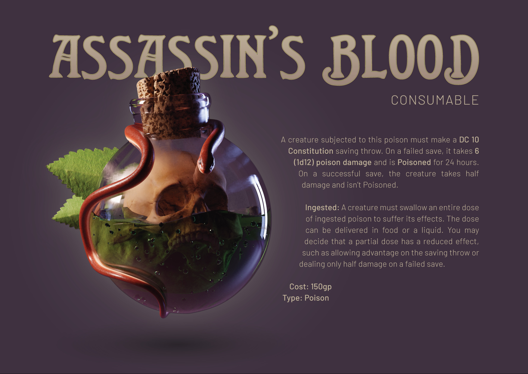
Original Post:
Inspired by some 2d artworks, I wanted to make my own take on it and give it some extra life in 3d. Want to really improve the way I present objects. My lighting and composition has always been my weakness. I think the highlight on the right maybe doesn’t suit it. Maybe it need to be less sharp?
I’m developing a portfolio to hand to some game/animation studios. Any tips on the best way to present artworks too would be greatly appreciated!
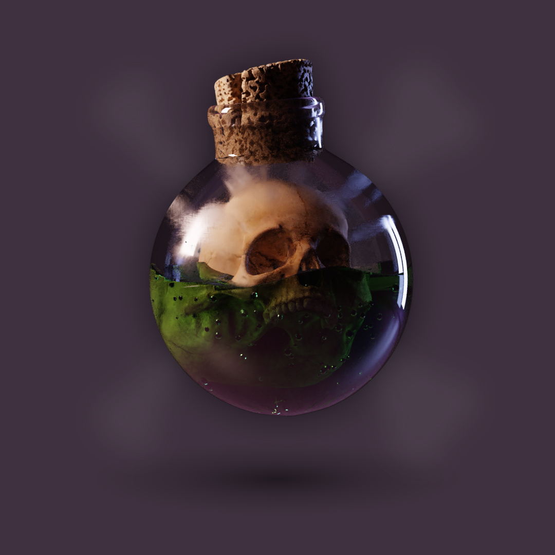
While I am very intrigued by what you seem to be doing here, I don’t yet visualize it as a 3D object that is cleanly separated from its background. I’m left with the feeling that “this is still 2D.” (Also, the upper teeth … I only see half a set … and the general area immediately below the jawline … seems to right now suffer from “student murk.” Also: there needs to be a sharp line of separation below the cork.)
Definitely “very promising” here. Keep working it …
I, for one, really like the 2d feel you have going! What I would recommend is adding some DOF effect and make the bottle edges turning away from the camera softer. A classic painting technique for making an object appear rounder.
Also, the glass material could probably need some more volume absorption. It looks extremely clear and light weight now and would most likely look good with a slight bit more weight.
Thanks for your feedback guys, this is really useful stuff.
Rhen you’re totally right about the composition. I’ve since decided the portfolio will be formatted like a game booklet, so now I have an idea of how I actually want to present it. Let me know what you think. Fair call about the scaling. Even though it’s an absurd concept to begin with, it’s always nice to ground details in reality before deviating for art’s sake. I’ll test it out.
Sundialsvc4 I totally get what you mean. Part of the problem was using a different shade of purple when I took the image into illustrator. I think it’s slightly improved now. I’ve never heard this term “student murk” before, but you’re totally right. Lots of my work suffers from that. Poetically I think we fear what’s in the dark (because it means more work and uncertainty). I’ve since brightened up the render and rendered in higher resolution so the denoise hasn’t crushed the detail so much. Might still suffer slightly from this though. I’ll try to bring those details out a bit more.
Insoitus DoF is an interesting idea. I’m cautious to add DoF for this object, because it is an isolated object. Clarity is priority in this composition. I didn’t even consider volume absorption on the glass. I’m fairly new to that feature actually. I’ll play with that, thanks!
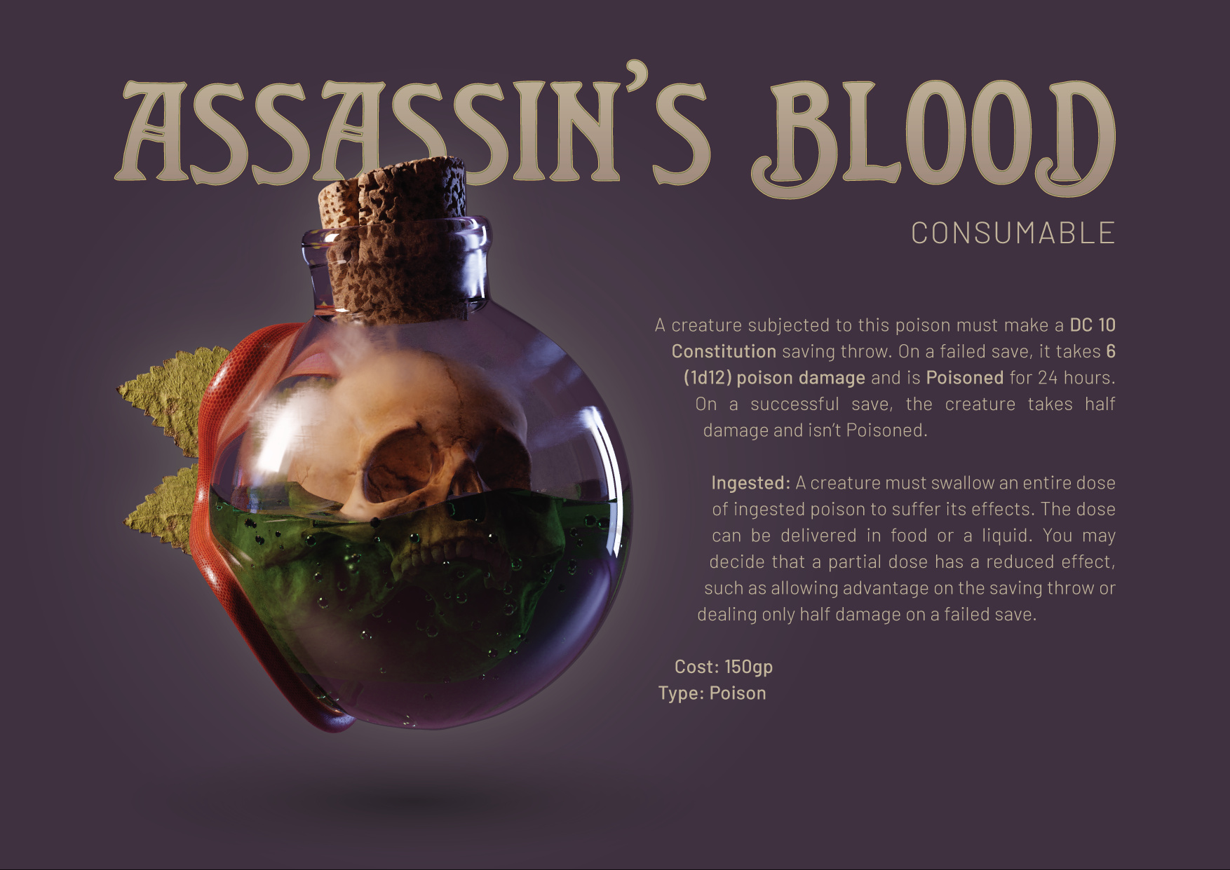
Here’s where I’m at right now. I’ll try to finalize this tomorrow before this project gets stale for me.
I improved the leaves and made the snake less crappy. I think the scales might need to be “scaled” up. And the leaves still aren’t looking great I think. Flowers and fauna have never been my strong suit.