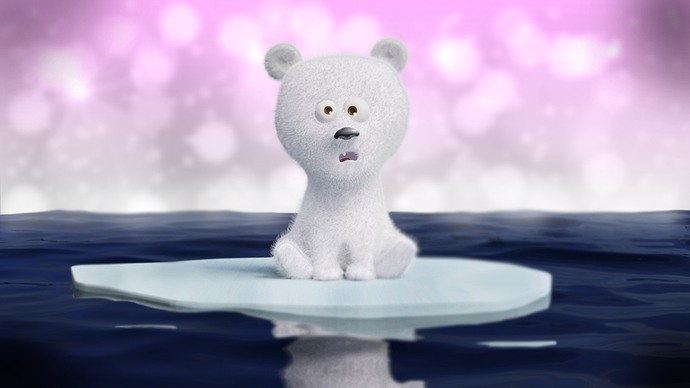
Hi there, I posted this guy in the Finished Projects section and couldn’t gain a single like. Which is fine by me as it was a quick project. But I thought it would be appealing enough to get some recognition. That said, I would love to hear from you guys what makes this scene terrible ![]()
It’s pretty common for finished projects to receive no kinds of accolades. There are thousands of topics in there with no replies and no likes- I have a couple myself, actually. Don’t let it discourage you! The value or appeal of your work doesn’t come from what anyone here thinks of it. If it makes you or someone else happy, that’s what matters. No need to assume it’s “terrible” because there’s no reactions. I’d say, given the prevalence of finished works with no likes or comments, that no reaction would be average. Average might not be “outstanding”, but it’s also not “terrible.” 
I agree, nowadays because of a certain social media feature, people will just click the ‘like’ button (that little heart on every post) and not bother to write anything.
This so-called ‘social’ feature can, at times in my opinion, ironically take away from actual communication and actual social behavior.
I was going to express agreement by clicking “Like”, but the irony compels me to use words 
I was going to photoshop it to show what i meant, but it didnt turn out well so ill just explain instead.
The reason you didnt get any likes, is because you’re not telling a story.
Its just a baffled polarbear cup sitting on a floating ice sheet.
There are technical things too that you need to get down, such as lighting and composition. Andrew has a good series on colour theory, take a look at them, i think you’ll get a lot out of it.
The polar bear is completely flat in terms of lighting, making it hard to read. Hes also completely white, if you had some color to complement it then you’d get very far with it.
Then there is the fact that purple and blue dont go very well together, if you would have tried a more yellow/red/orange background then i think it’d work a lot better.
Look up “Complementary colours” for more info on this subject.
The reason you didnt get any likes was not because the bear was bad, if i break it down to its individual components and analyse them for what they’re good for, then you got a pretty solid piece of art in front of you. The fur is decent, the proportions of the bear is decent, you didnt hit uncanny with it.
And you made it in a way look cute.
Where you failed, was in the presentation. For an image to stand out, you need to tell a story, through the environment, characters, and lighting.
You completely failed the lighting, and arguably failed the composition, as there is not much to look at in the image. The viewer frankly get “bored” after 1 second of looking at it, because there is not much to look at.
Dont take anything personally, you’re on a good track, and you will see what im telling you now when you look back at this in the future.
Dont bother fixing it, do some research on complementary colours, colour theory, lighting, and composition.
Andrew Price has a lot of good videos on these subjects, i recommend those.
And start a new project where you try to apply the new knowledge that you gained.
You will look back at this polarbear with pride in the future, its not bad, at all. But when the goal is to gain eyeballs, then you have to compete with whats out there.
I remember being upset when i didnt get any votes in old #contests:weekend-challenge entries, but it just makes me giggle now when i look back at it 
Words can not describe how much grateful I am for this thorough critique and pointing out the fundamentals in art showcasing. Sir, this comment is a true gem.
Have a wonderful day.
