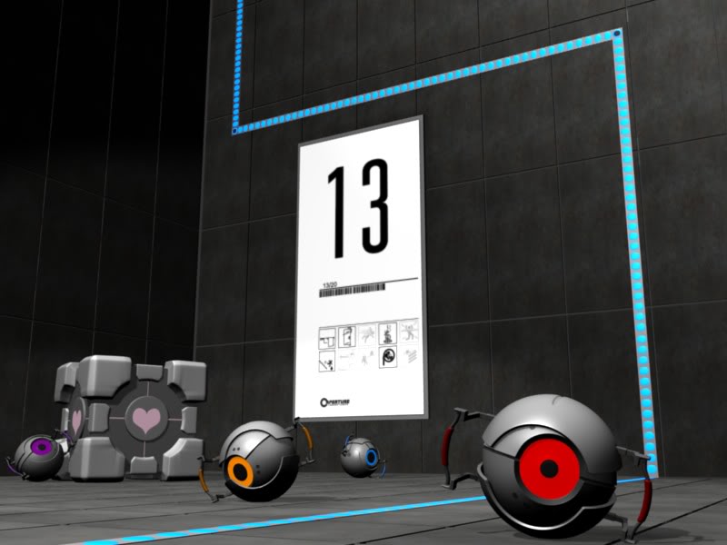
Im looking for a critique for this render. Is there anything that you dont like? Something you think could be better? Any tips on how to improve? Please don’t be afraid to be harsh. :yes:
Thank you in advance =)
Im looking for a critique for this render. Is there anything that you dont like? Something you think could be better? Any tips on how to improve? Please don’t be afraid to be harsh. :yes:
Thank you in advance =)
Looks good. The thing I would so is change the focal point of the image from the ‘13’ sign.
I actually tried that already. i uploaded this image just because it gives a clear view of the scene and I don’t think I did the distortion right.
Well I think you should make the robots eyes glow or cast some light. And I believe the majority of tiles were white. I suppose it doesn’t matter but you might try it with the white tiles instead of dark ones. But the robots and cube are very well modeled. I love seeing tributes to one of my favorite games!
oh, I was going to say I didn’t get the concept, so this is a game huh.
I agree to adding more lights, is the blue line a light? maybe that could have some glow in the compositor.
Do you want to make it look exactly like the game or it’s a recreation?
The modeling is good. If it was me, I’d make the irises of the robots’ eyes a bit more like those of a human (Radial lines, for instance) so that you can tell that they are sentient or at least active.
This might be stupid, but I recently started messing with AO (ambient occlusion) and found it makes a scene look a little better. Then again, I’ve been modeling for a month.
I love Portal 
BEST GAME EVER! Very nice looking scene. One thing that definitely needs improvement is the cores’ irises, just look ate a pic on google to see what needs to be done. Other than that it’s great. I’ve just started working on a model of the blue robot from Portal 2.
You are right about the tiles. Most of them were white and im sure this might look better with proper tiles but I couldn’t find any texture and I certainly have no clue where to start painting my own textures. I set the emit value all the way up but I don’t know to make them emit light. I knew that radiosity in 2.49 would make it emit light but I couldn’t never get it to work and I’m not even sure it is in 2.55 so I don’t know how to implement your suggestions. I’ll try my best though and thank you for your suggestions.
Yes it is a game called “Portal”. They are a series of blue lights. As you can see from my poor attempt at DOF in the picture in reply to dler, I’m not very good at using the compositer but I do that that adding some glow would help enhance the scene so Ill try my best.
I suppose that I was trying to copy the models exactly just to see how my modeling skills compare to that of the professionals over a Valve. It was just a way to test my skills.
Thanks for the suggestion =)
That is a very good idea. I tried to do that when I was originally modeling them but I just couldn’t get the texture right so I just sized the pupils according to how it was in the game and turned on emit. In the actual game they do have radial lines so that was a very sharp observation and a great suggestion. Thank you.
caseymw10: That isn’t stupid at all. AO is a great tool. Blender may not have the best at Global Illumination but AO gets the job done. Thank you for suggesting it. I can’t remember if I had that on in this scene or not. I usually will apply AO to help get rid of any harsh shadows and help darken creases. Thank you for the reply =D
It was a good game. I cant wait for Portal 2. I’ll try to redo the iris. Originally I had trouble with the texture so I decided not to use any. Thank you for the reply and I’ll make sure to keep an eye out for your post if you decide to post a render. Im really curious about how you go about the design. Good luck =D
nice, love that game. maybe add some indirect lighting to those bots?
about the focus - make the wall tiles white (well, like they were in the game) - this will help remove focus from the 13. Then make the companion cube lighter to increase the contrast (the cube was a little lighter and less metalic if i remember… which i do since i played it only last sunday)
Also, take the focal blur WAY down. maybe even turn it off.
The reason I didn’t use white tiles and make the companion cube white was because I couldnt find a decent white texture that resembled the kind in the chamber. There dark ones were the only ones I could find that resembled the tiles from the game (of course it was the darker ones). I do agree with you about the white taking focus away from the 13 sign. Thank you for your suggestion =)
Ah well I think the easiest and best way to make the eyes glow is to use indirect lighting. It’s very easy to set up and gives great results when you add a small halo. Just search for “indirect lighting tutorial” and that will show you the process. ![]()
Good work…I like it.
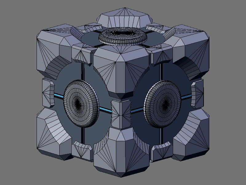
Maybe the cube could be modeled just a little better. Here is a wire of one I did a long time ago.
Great game btw.
Thank you so much =D I really had a lot of trouble with the cube and your model helps a lot. I wanted to bevel the corners to get the shape I needed but it just wouldn’t work for some reason. How did you do yours?
You could just change the colouring of the tiles on the wall in gimp. If you dont know how you cant send me the texture and I’ll do it for you