The original Artwork from Matt Dixon: https://www.mattdixon.co.uk/transmissions/portal
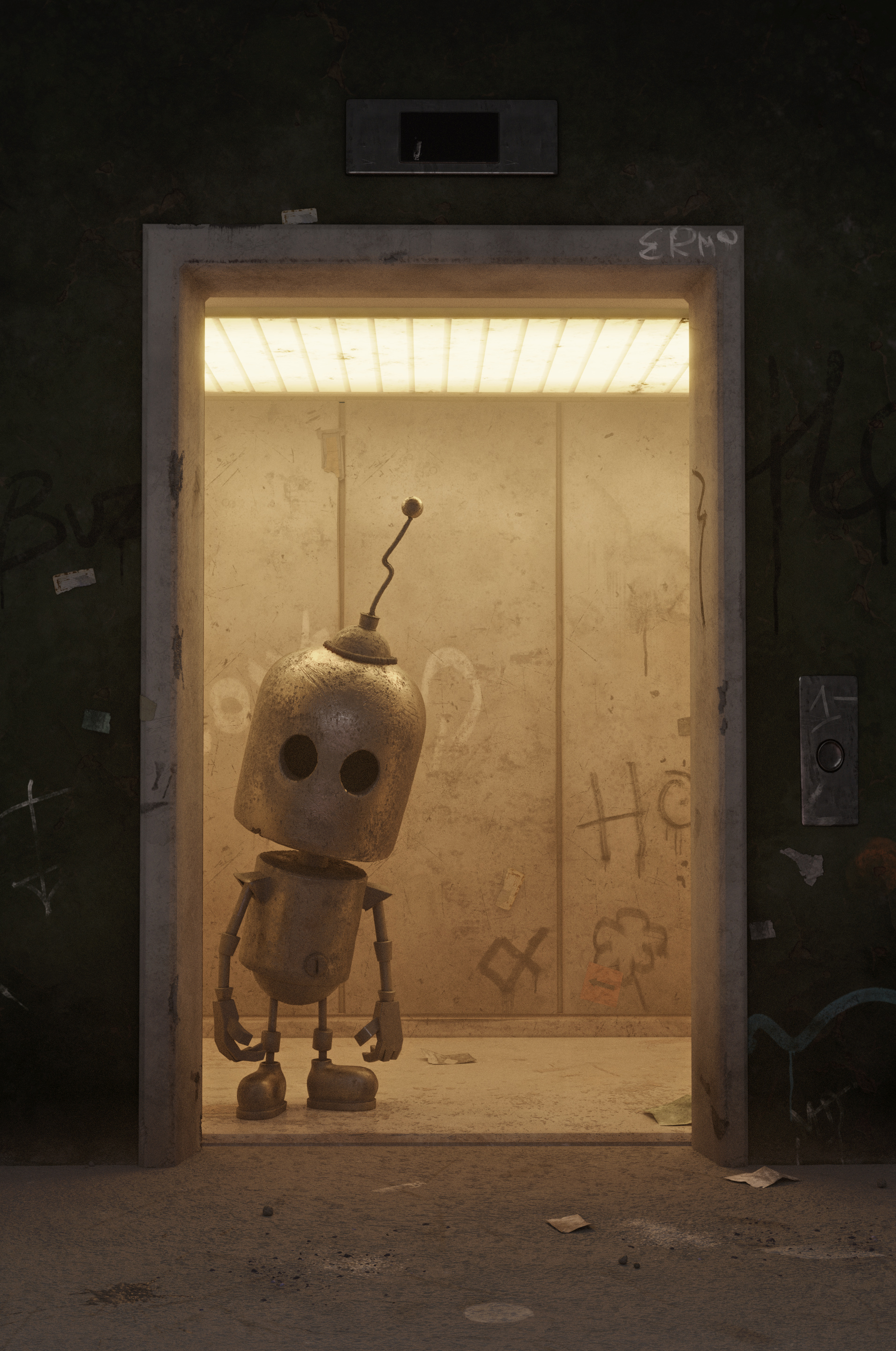
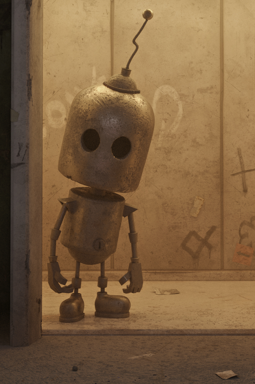
Creating this scene was really fun, I wanted to be faithful as much as i could to the original concept art.
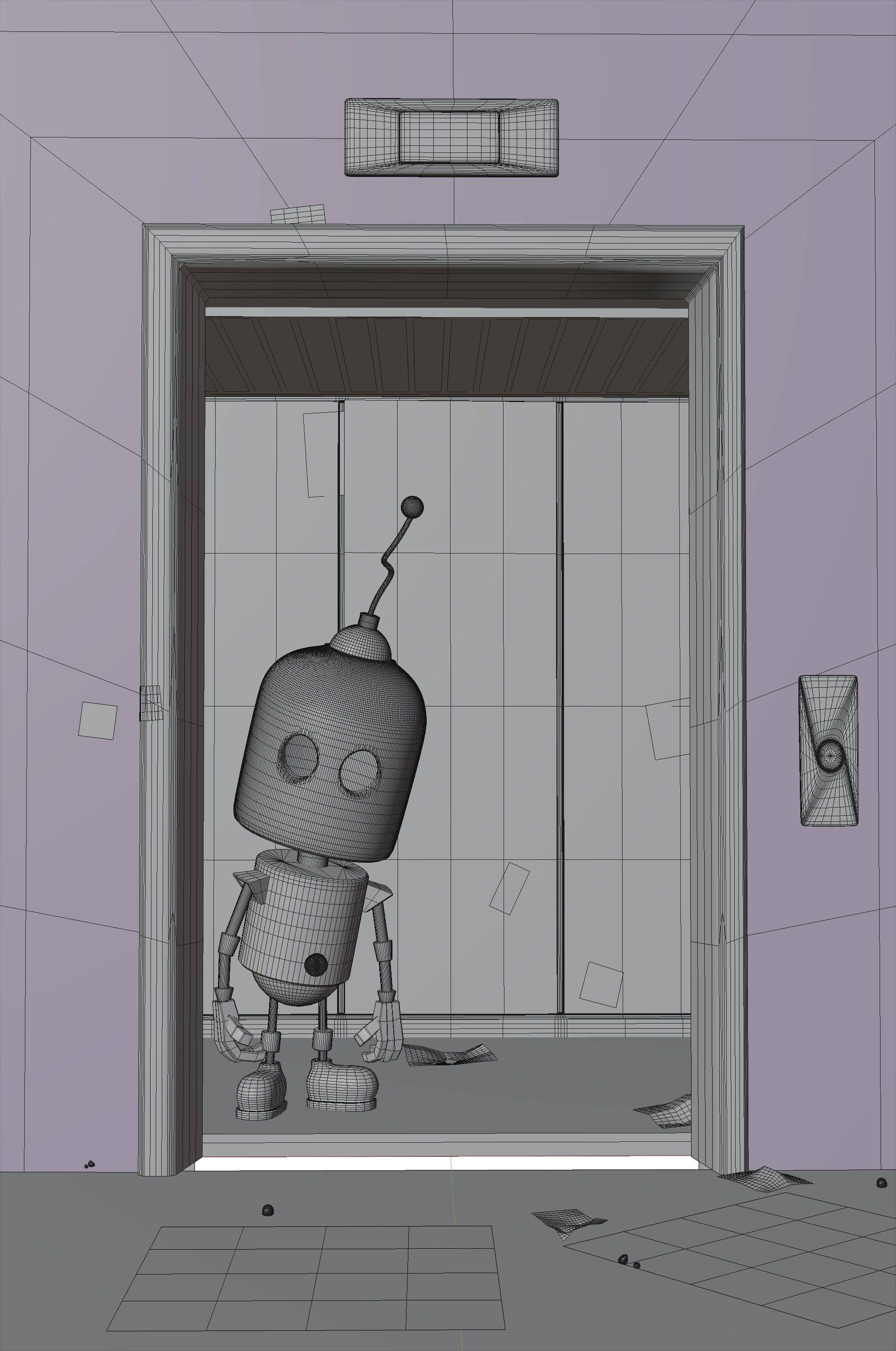
Lighting the Scene was the hardest challenge here, I went with a cinematic look and feel, to try to keep the same mood as the original piece.
(the picture is slightly color corrected). I also spent a lot of time in substance painter trying to get the textures as close to the original as possible.
Artstation link: tony_frutti.artstation.com
60 Likes
Very cool. I’d personally try to break up the warm color palette, but I see where you are going with this so it’s just me ;).
Hey, Thank you!
Indeed I tried to be faithful to the concept art, but I could have gone many ways with it for sure.
Very nice  !
!
I featured you on BlenderNation, have a great weekend!
Looks great!
Seems a lot of people are doing Matt Dixon’s stuff  . I just found someone else the other day, and I’ve done three of them…
Nice job;)
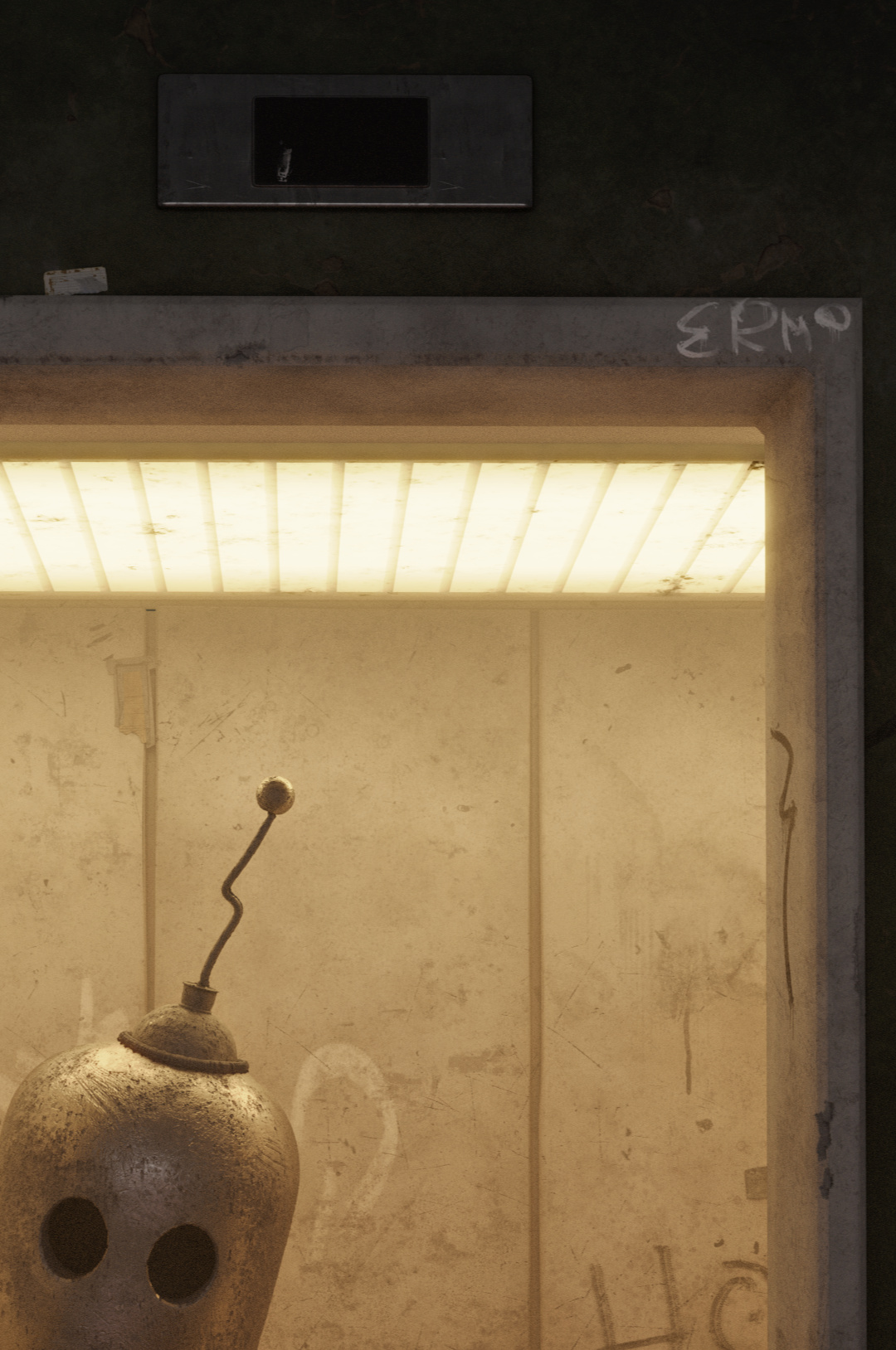
There is one small thing that doesn’t fit the original - they Eyes on yours are exactly same size, while the original has them a bit different - this element of asymmetry is relatively important when bringing emotion into characters.
Nice work.
The rendering is very close to the original in tone and feel.
Couple of things which I noticed:
- As pointed out by vduha the eyes of the robot aren’t symmetrical and are more and less oval shaped. And also note that in the original there’s bevel highlight on the eyes which is missing from the rendering.
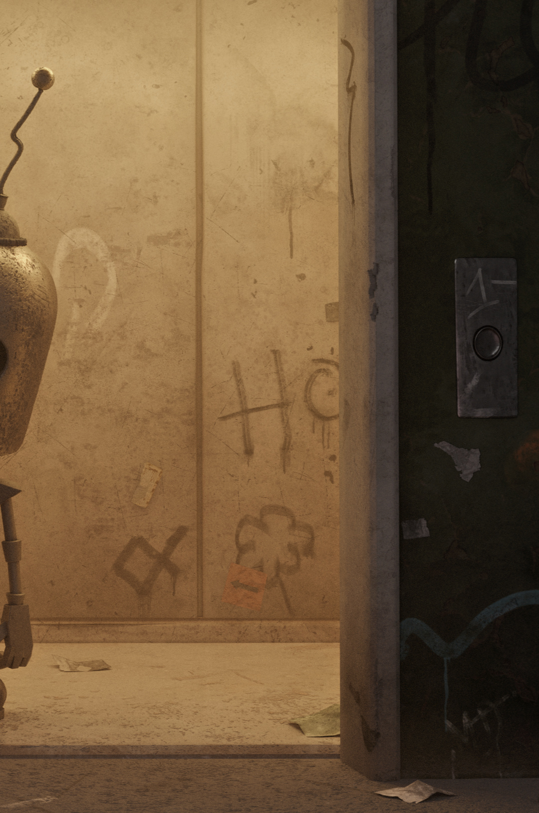
- In the original rendering the elevator floor and back wall floor trims have also bevel highlights suggesting for more prominent geometry.
- In original the robot is in the middle of the elevator which lights the body and brings out details. In the rendering the same could be achieved by adding more light from above and/or moving the robot bit back.
Hey Bart! Thank you for the feature !
It’s awesome to be among such great company.
1 Like
Thank you for your feedback!
I am sure it would have made a difference and made the character more alive, but I didn’t catch it during the modeling phase!
@Xard You’re right placing the robot in the middle would have made it catch the light much better, as to the highlights on the bevel, I really struggled to get that perfectly right. Positioning the robot in the middle might have helped with that as well!
So simple and so cute! A very characteristic example of what an inspired view of things can do with simple forms!