t3d: You’re welcome I too will follow this closely because I know there are things I still don’t know or understand and need to improve on Thank you for posting some examples. Nothing beats seeing these concepts in action. The addition of smoke is well done! For a static image, this is perfect. If you were going to animate this, then it would be necessary to work on particle effects, either in Blender or composited in an external video editing application. Definitely keep trying with the particles. Right away I see the pp’d image has a crisper contrast. What sticks out just a bit is the noise. Sometimes jpeg artifacts overaccentuate noise, and I do see some artifacts in there, so maybe it’s okay as is. One solution might be to resave the image with lesser compression. The other would be to use less noise. I find between 1 and 2 percent regular noise in Adobe Photoshop to be quite sufficient in most cases. Your image is photorealistic. Nice work!
This is exactly the kind of stuff I hope to see here, so keep it coming everyone
Images can look different from monitor to monitor. An image that looks “just right” on an LCD flat panel might look horrible on a CRT monitor, and vice versa. Why? Because not every monitor projects the same exact image at the same exact intensity, contrast, resolution, and so on.
Not only that, but people can and do customize their monitors at various levels of brightness, contrast, and color intensity. There are many reasons people do this, to compensate for vision difficulties, or to compensate for local lighting conditions.
The physical variety of displays and graphics cards also affect how your image looks on any user’s system. Some users will have backlit laptops, while others may be viewing your work through old glassy monitors or on older computers set to low color settings. Or they might be in an office under flourescent lights or by a window, the ambient light from which can indirectly alter a monitor’s ability to deliver an image as you intended it to be seen. Some laptop/LCD flatpanel users may also experience varied image qualities simply by looking at their screen from different angles.
More things like monitor refresh rates, dot pitch, and graphics cards will also factor into the situation. Your images will look differently on a 256 color configured card or a 32-bit true color card. Some users will have their displays configured to 640x480, or 800x600, or 1024x768, or 1280x1024, or 1600x1080. Also consider the newer wide screen systems out there, and other users such as those on WebTV (NTSC).
How can you possibly prepare for all these varied outputs and situations? You cannot. There will always be things beyond your control once your digital artwork is “out there” for the world to see. You might do certain things to limit problems in certain areas, but none of them are complete solutions.
First, you want to make sure your monitor is not causing you to make your images too dark or too bright. Some monitors come with calibration tools or may claim to be factory calibrated. “Calibrating a monitor” might be as simple as making slight adjustments in its brightness and/or contrast. How you might further investigate the issue of calibration is covered at certain websites below.
Conceivably, you could use an image program to “optimize” your image down to use fewer unique colors, even to what are considered “web safe” colors. Doing so will cause your image to be “dithered,” where many unique colors are reduced into adjacent pixels of fewer approximate hues. Sometimes this is a desirable route if you’re developing graphics for web use, especially things like animated GIFs. Otherwise, this is likely not to be your preferred route for presenting your images online.
You might try to “gamma correct” images in advance, so they are not as problem prone on certain displays. This requires a little understanding of gamma. Adjusting gamma affects the contrast of an image, but it can a little more involved than that.
There is in fact a Gamma slider in Blender located in the Render panels. It used to be that you needed to use the Unified Renderer to use it, in the latest Blender releases you can use Gamma to tweak the contrast of an image.
If you take your render into an image editing program, you can tweak the gamma of the image. You can also alter the saturation and “levels” of an image, which relate to the intensity of an image’s unique values of lightness and darkness, either over all the colors in the image or specific parts of an image’s spectrum (e.g. red, green, blue).
To learn more about gamma correction, color management, and monitor calibration, check out these sites:
Also, you might consider reducing your image size before posting it to the web so that people can see it without having to scroll. One possible incentive is, that if you don’t do this, many web browsers are configured to scrunch up your image, causing it to look very strange or reduced quality.
One drawback is that if you have a really detailed scene, such detail will be minimized. Alternately, you can post several image sizes or select details from the overall image.
Well, that’s a few things to think about before you post another image online
Great thread. I’m very curious about other methods people are (or will be) using.
Some of my renders need quite some postpro, because I have a hard time lighting my scenes and getting the right materials (colors).
The functions I use most in Photoshop would be contrast, saturation and hue. By using levels (I believe RobertT mentioned it in his last post) you can sort of control all 3 of them, giving your work a much deeper and richer color pallet (which also may result in more depth). So levels is really a function to play around with.
An old example (not great, but you get my point):
Bottom one is after postpro.
Played with levels a bit - brightened the highlights, but left the shadows where they were.
Duplicated the main image, blurred it a bit (5px), then Screen composited back onto original at 20%.
Readjusted levels (image was much lighter after #2)
Did the color trick described as above.
New trick: blur whole image slightly (0.5px or less), then applied Sharpen filter twice. Then applied Unsharp Masking (which is kind of a science in and of itself). This step is an attempt to mimic what happens when a digital camera’s CCD interpolates the incoming light, and the internal software does its own version of unsharp masking automatically.
Resized image up, just a teeny bit. Sometimes, I’ll put a 1-2% rotation on the image, and recrop it.
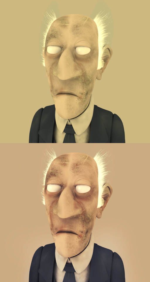
Is the post-pro’d image that much better? I’m not sure that looks better, but I think it looks more like a photograph, which is what I was going for. Thoughts?
t3d, here’s a little different treatment of the image:
Besides total desaturation then slight colorization, I adjusted the levels, applied some manual DOF, applied an unsharp mask, and then used a little burning and dodging to scratch up the table a bit and then to wash out/equalize the horizon and distant part a bit more.
I think your image and harkyman’s are way better and more appropriately handled, but I thought it might be interesting for you to see it this way
Increased Brightness+Contrast
Duplicated original layer, blurred
Set layer mode to “Multiply”
Duplicated blurred layer
Set new layer mode to “Soft Light”
Intense:
Same as above, except there is only one blurred layer, and it is set to “Hard Light”
This technique (blurring the layer and changing layer mode) can make some REALLY cool effects if done properly, and it adds a lot to any scene.
Great versions of my image! I like your treatment of the image Robertt, kind of made for a non-smoke, drink, snuff campaign in a weekly paper. Really like it
harkyman - your attempt at a photo style ended up pretty good. You used some tricks I never would have thaught of - thanks for your tips Now with some more “flesh on my bones”, I could try making the picture even better than you guys
About the gamma setting: I downloaded QuickGamma from the page Alvar linked to. But when I had finnished the gamma corection on my monitor, I’ve got a headache and my eyes went wet because of the high brightness . Now have I turned down the brightness so I could look at my monitor.
Should the monitor be really bright or did I screwed up the settings totally? I haven’t read all the links sent in the thread yet, but maybe my crt-monitor is too old (its like 7 years I think).
WOAAAAAA!!!
Thank you very much Robertt and Alvaro for such interesting links about gamma and monitor calibration. It’s a milestone that drives me mad when I take a picture from my computer to anyone else’s and I see it terribly dark. I will try to adjust my monitor as well as I can.
Here’s a quick guide to how I composited that I just threw together:
Took photo of desk
In Blender I then loaded it into the backbuffer and created a plane just under the model (so he was standing on it). I rotated these (could just parent one to the other to make it easier) until they lined up with the desk image.
I gave the plane a material that only received shadows and gave it an alpha of about .5
Then I setup my lights, I had one hemisphere light with a subtle blue tinge, one spot light with an obvious yellow tinge and set this one up to mimic light coming from the lamp on my desk (which is just outside the photo to the right). Some quick test renders were done to make sure the shadow angles were decent (could have been done better than I actually did though).lamp on my desk (which is just outside the photo to the right). Some quick test renders were done to make sure the shadow angles were decent (could have been done better than I actually did though).
Then I setup AO and did renders (render as a file type that supports transparency, I used PNG);
Sub
Add
Both
Then in GIMP I created a new document and created 4 layers. I played the model renders in the top 3 layers then I opened the photo and put that in the last layer. I did it this way because the renders were all the same size but the photo was larger, so adding the renders to the photo meant they weren’t lined up. Putting the 3 renders in means they are all lined up so you just need to move the photo layer around to where you want.
I altered the opacity of the top renders (I had Sub at the bottom of the 3 and left that at zero transparency) until I found a balance I felt looked good. Most of the rest is just playing around, I copied different render layers and altered hue, saturation, contrast etc. then altered opacity to just keep tweaking.
Because the model is supposed to be close to the lamp (which is coming from the top right corner), I wanted a bit more brightness on the top of the model and less saturation, like when a bright light hits a coloured surface and sort of dulls it.
So I made 3 copies of a layer (might have been the Both layer, or possibly from several layers I’d merged together). One I bumped up the brightness and the other I lowered slightly, some tweaks to contrast etc. were also done.
I then selected black and white and made a gradient from top right to bottom left and used this as an alpha channel for the bright layer (which was on top of the dark layer).
On the 3rd copy I gave a heavy yellow hue and placed it on top then altered opacity (tried different things too like overlay, screen etc. to see what worked best). I ended up with this:
I merged these 3 together and played around more with opacity settings for this layer and the render layers until I got what I used as my final image:
I basically rendered the picture in blender with alpha.
Then I added flat noise in gimp, coloured that noise, dilated it and so on, and finally modified it’s perspective to match that of the walls. Every group of coplanar walls was processed this way.
Then I started painting all the dirt and the features in the wood.
The roof is awful! I had very very little time for that one, ugh… could be much better… and well, the background is… simplistic?
The good thing is that this image can be used to create a camera mapping: I select the house object in blender and view the scene through the camera. Then, I create sticky coordinates and assign the postprocessed picture as a texture using the sticky coordinates.
I use wha most people would consider to be a very “slow” computer. And I’m usually building rather intricately detailed scenes. (I’m doing museum kiosk videos.) It would be prohibitive for me to try to render everything that will appear on the final image, “all at once.” So I never do that. Instead, I render the scene in layers and composite them together, using Final Cut Pro or Blender’s own Sequence Editor.
This technique can make a tremendous difference. You look at the shot as you want it to be, maybe rendering one frame with everything in place, and then you start breaking it down from back-to-front. For example, in one scene I had a figure who walks into the frame holding a piece of hot iron which he thrusts into a furnace, while a wooden shaft driven by a water-wheel rotates behind him. The layers in this six-second shot were: - Building interior. (One frame.) - Rotating shaft. (One second’s worth.) - Sparks in furnace. - Suggestion of water-wheel outside, rendering only enough to mask behind the window. - Tongs and iron. - Shadows cast by tongs and iron. (On floor, and separately on furnace.) - Character walking. - Shadows cast by character walking. All of these layers are built separately, and the last step composites them. I have a Unix makefile that allows me to rebuild only the parts that have changed by means of make shot11.
In designing the overall sequence, I first establish the set and determine all of the camera setups that will be required. The moving and non-moving objects that will be visible from each camera angle are separately rendered. Repetitive motions (e.g. of machinery) are modeled only for one complete cycle. The entire sequence is planned out, using rough animatics, so that the exact amount of material required for each shot can be known before any of it is produced.
Dani - nice work. Photoshop CS2 is coming via FedEx for me tomorrow, and I’ve seen that it includes a 3D paint feature wherein you define a rectangle, stretch it to match the perspective of something like a wall, etc. Then, when you paint or cut and paste or apply filters in that area, it applies them in the proper 3D perspective. It’s un-freaking-believable. I can’t wait to try it out.
there’s a problem - converted it to indexed, and some shades stick out really bad. I really should’ve used the epic’s bright converter …
btw. - any fireworks users here? I also downloaded deep paint when it was released as free - any tips for that one?
one more question: anybody use project dogwaffle free edition here? afaik it’s licence allows install on unlimited number of machines, right? Same with Deep Paint, right?
BgDM: Thank you BgDM. That might be a good move! I might consider other focused workshops as well, such as lighting and modeling. I think @ndy mentioned a while back about doing a shader workshop, which would be great. I think it would be helpful to have a designated area for these serious and important studies so they can stay visible and people can get highly concentrated help on key topics light post-processing or lighting. Wherever this ultimately lands, maybe a sticky post would help. I know all of us look forward to your contributions to this thread!
lemmy: Nice! Some dramatic examples there in terms of lighting. Since this discussion is open to beginners as well as advanced users who might not be aware of certain techniques, even basic ones in post-processing, there will be no need to apologize ever for any good contribution like yours in this thread
t3d: Glad you like it! Seven years old… that could pose a problem. You have brightness or contrast up too high maybe? Maybe time to consider investing in a new monitor, especially if you’re working with graphics a lot. CRTs are cheap these days, and even 17"+ LCD flat panels are now becoming more affordable.
elGordo: Cool. I know in my experience there have been monitors that, due to the way they were designed, or due to the quality of their construction, cannot be made to look as bright and crisp and colorful as we would prefer, so if you don’t have any luck you might also want to consider getting a newer monitor.
=KH=Lupus: Great contribution to this thread! I remember that project well
Dani: Very interesting with the sticky coordinates and all! Excellent work on the textures btw.
sundialsvc4: Great techniques, time-saving ones too! Thanks for posting.
tedi: I tried Project Dogwaffle. Nice capable program. I don’t know about the licensing. Deep Paint is also great! And they’re even better if you have a tablet.
Update: I checked your post in Traditional. If BgDM does move this thread, maybe we’ll be able to have it somewhere where images can be attached. I tried in the Focused Critique forum early on, but it didn’t allow it at the time.
regarding sticky coord stuff - you could either make (pre)painted decals and use the shift-V-1 command in blender (uv-map from window), and in material use uv coords. it’s fast. you could make all sort of prefabs this way. and bye-bye to projection-painting. btw. this is a method used and tested on promo material for a local stihl distributor some year and a half ago.
then do the dani-process and use prerendered as sticky. (blender should get prelight rendering soonish … hint, hint …)
Here we will look at how the Levels and Curves functions can give you control over the distributions of brightness and darkness of your render.
Levels and Curves controls can be found in image editing programs such as Adobe Photoshop or GIMP.
Unlike simple Brightness and Contrast controls, Levels enable you to work directly on the dark, light, and middle levels of light in your image.
For example, you can decrease the darker regions of an image without affecting its medium to lighter portions.
You can adjust the “middle” portion, causing medium values of an image to be darker or brighter.
You can also tone done highlights in an image by adjusting downward the brighter levels.
Level controls can also allow you to alter specific color ranges in an image, and the dark/light/middle portions of those colors.
For example, if your image had “too much bright red” in it, you could selectively isolate that part of your image through Levels controls. The same goes for green and blue portions as well.
A similar but more capable control yet is the Curves function. Curves, like Levels, give you more say over the distribution of lightness and darkness in your image.
Unlike Levels, Curves enable you to tweak your image using curves, which you can define by setting points along a curve. Each new point becomes adjustable and gives you control over a more specific region of your image’s levels, in the red, green, blue, or all channels.
We were talking earlier about how your image may look on other monitors. If you’re creating an especially dark image, you may have cause for concern, especially if you don’t know if you’re monitor is correctly set. Your image could be “too dark.”
Next we will look at two examples I quickly prepared for this discussion.
The first was slightly exaggerated on my system to make the point, but it can be representative of what might happen if you do not make some slight adjustments to your image’s levels before posting it on the web.
Image #1:
Notice how dark this image is. It is intended to be a “dark” image, but in this case you should see it is in fact too dark.
Say now you created such a dark image and posted it in Finished Projects. On your system it might look great. Maybe you checked it on another monitor and it still looks great. Now someone elsewhere looks at your image and replies to your post and says, “I can hardly see it.”
This happens all the time. The user replying may actually be at fault: her or his monitor/flat panel may be set too dark.
The same can be true if someone says your image is too bright.
This is why it can be important to show people your images, to post your images in a forum like Elysiun, so you can hear back on potential problems.
Once you have what is decidedly a “good image” of a dark nature, save it for future reference so you can compare other works with similar lighting to it.
Back to the “Dark Lady of the Sonnets” image. Here is the same image with simulated raising of the darker levels and tweaking downward of the higher levels.
Image #2 - Final Image:
Regardless of what monitor you have, Image # 2 should appear better lit than Image # 1 (aside from higher compression jpeg artifacts in image # 1).
In addition to web publishing purposes, Levels and Curves can also help you obtain optimal results when printing your images.
If your image editor does not offer Levels or Curves control, consider getting GIMP so these essential tools are always available to you.
OK, I have moved this to the Traditional forum, as I feel this is the best place for it. This thread leans more towards traditional art work in the sense of using an image manipulating app rather than a CG type of application.
I have also stickied it.
If there are any objections or concerns with the thread being here, please PM me instead of posting in the thread.
 I too will follow this closely because I know there are things I still don’t know or understand and need to improve on
  Thank you for posting some examples. Nothing beats seeing these concepts in action. The addition of smoke is well done! For a static image, this is perfect. If you were going to animate this, then it would be necessary to work on particle effects, either in Blender or composited in an external video editing application. Definitely keep trying with the particles. Right away I see the pp’d image has a crisper contrast. What sticks out just a bit is the noise. Sometimes jpeg artifacts overaccentuate noise, and I do see some artifacts in there, so maybe it’s okay as is. One solution might be to resave the image with lesser compression. The other would be to use less noise. I find between 1 and 2 percent regular noise in Adobe Photoshop to be quite sufficient in most cases. Your image is photorealistic. Nice work!


 . Now have I turned down the brightness so I could look at my monitor.


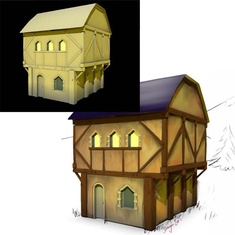
 … gimped over the lovely house. posted here:
