Re-designing Blender's UI

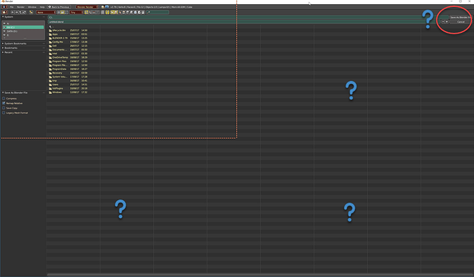
I was happy to find I could dock File Manager editor to browse and import files. Just to find it’s only possible to load/import but can’t save files without being overwhelmed by the auto-maximize super-size circa-2002 “spacious” Save/Export screen. The first time I encounter the godzilla save screen I couldn’t find the “Save” button - lol because it is so far right to the screen! :eek::smiley:


It’s not the end of the world of course… I promise to learn some basic python to kill this godzilla haha. Mean time, if there’s a more sensible floating save/export addon please let me know. Thanks!

(somehow double post happened and deleted)

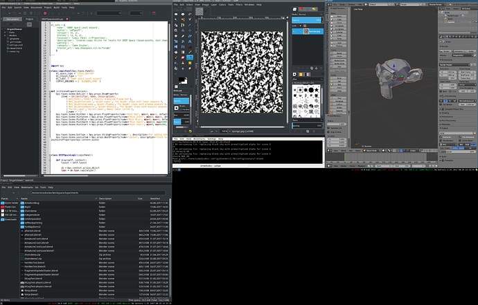
What we are discussing here mostly is not only UI, it’s … window management. In most normal window managers, you have little boxes that you drag around and resize. Imagine if blender’s UI was like that? Every panel a different window. (remind anyone of old versions of gimp before the single window button?). The other option is a tiling window, such as i3wm (which I use). An example screen looks like this:


(one of my monitors is rotated vertically, hence the large black area), everything visible on my screen is covered.

Tiling window managers have the following advantages:

  • Few things overlap
  • Layout is mostly static - you don’t spend time shuffling to look at things ‘below’

And they have the following disadvantages:

  • Shortcut to maximize a window gets used lots (win+space in i3wm, ctrl+uparow in blender) to avoid working in small areas
  • Lack the flexibility of draggable windows.

There are several other methods, but the major four are:

  • Floating (such as the windows desktop, popups etc)
  • Tiling (everything next to each other, like blender’s main UI, such as i3wm above)
  • Tabbing (icons across top of properties panel, such as android switching between apps)
  • Stacking (arrow rollups on properties panel, rarely used in desktop OS’)

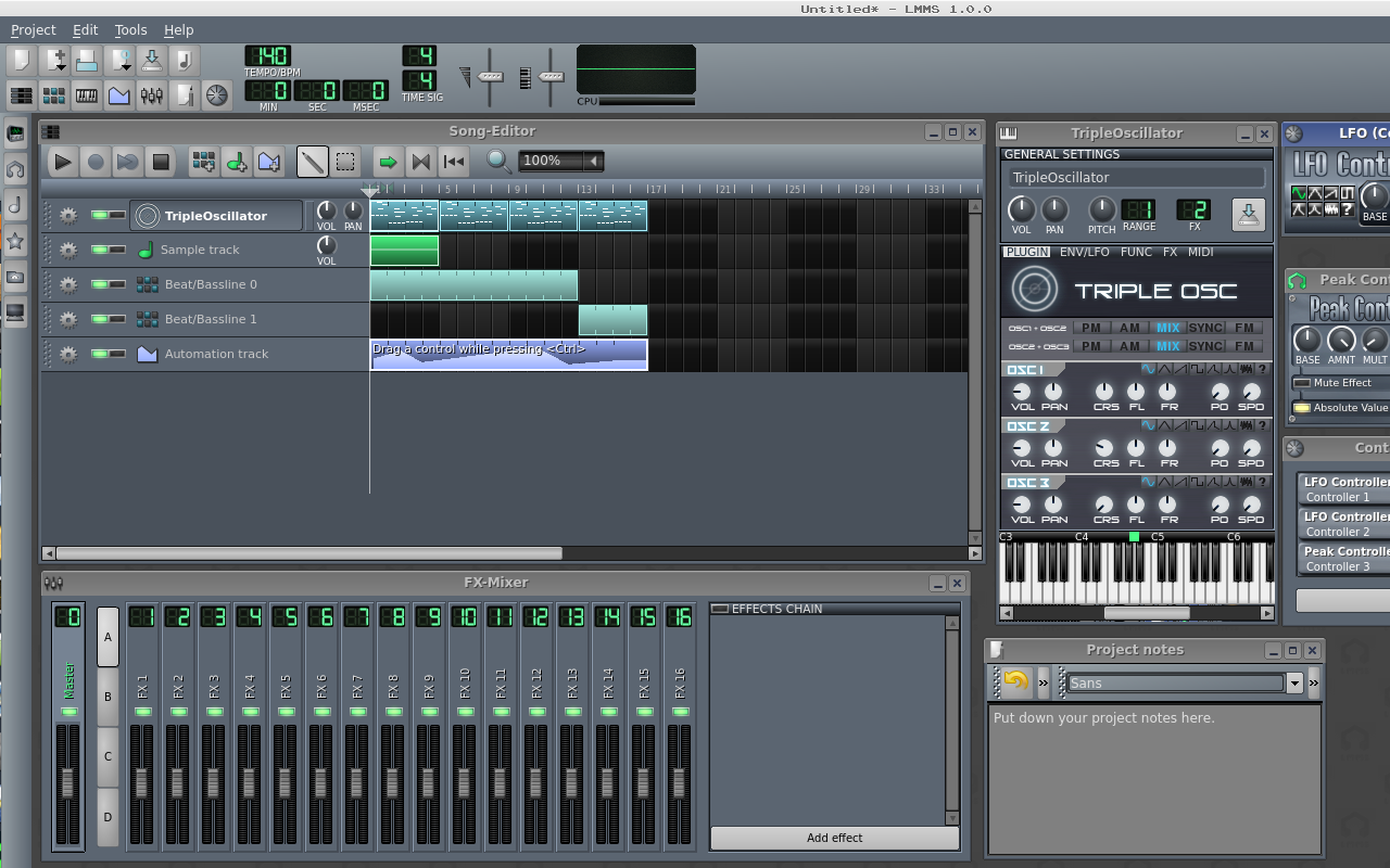
Currently blender uses only tiling, tabbing and stacking. Should we introduce floating? I don’t think so. Floating windows only work when there are a few of them. As soon as you have more than two or three at one time, they are a right pain and you spend time shuffling them. Some programs do implement floating window managers inside themselves such as LMMS:

But most users manually create a tiled layout and work with that instead:

I’m very very used to the tiling and tabbed systems, and using a ‘normal’ pc interface is incredibly frustrating. You have no idea how akward it is to manage floating windows when there is a system when you don’t have to. Thus, my suggestion for blender’s UI is:

  • Find better ways to categorize tools and options
  • Have more useful default layouts
  • More use of tabbed interfaces (eg object mode, edit mode, sculpt mode should be tabs rather than select from a menu)
  • Better use of stacking interfaces (eg the add primitive panel is way to tall - it could be stacked)

my guess to why most create there own tabs is so the addon could be found easily. Look at your screenshot with all the addons under create tab. If all those were expanded you wouldn’t even know what was there. You then run into the problem of so many tabs you can’t read em, lol.

AFWS, yes, my test is rather extreme, I have identified many issues, in solving some you create others too.

Test design:
to enable as many addons as practical all at the one time and try to make them fit the ui so they are easily accessible.
this is extreme yes, but i want to set up blender 2.79 and not enable/disable addons when i might like to use them, but have them all there in case i might need them :wink:
to use addons as ui testers by using and identifying different ui methods to reduce the ‘ui noise’
to identify alternative methods to reducing ui clutter whilst retaining ease of access.

Tabs:
when reducing tabs you increase panel per tab count which leads to needing panels closed by default in my test.
this is not too bad if you open close panels on a per need basis but does require the operators panel to be resized with long addons ui’s.
again not too bad, but not optimal. using cat hide addon can help here.
also dealing with such a large volume of addons and tools/panels i needed to add extra tabs to the properties shelf or it was unusable.
and merge the grease pencil tabs into 1 in properties shelf, rename the toolshelf tabs slightly to gain every letter space i could.
some stats: 18 tabs with 200 panels, so that’s around average 10 panels per tab, but some have much more than that.

Panels:
panels generally show up based on addons activation order and easily mess up with new screens and scenes.
pressing ctrl/u saves panel order and open or closed state and also location if you move things around to better group panel types. downside here is you need to stick with the same screen and change editors rather than change screens. In 2.8 templates should help here greatly.
already in Blender 2.79 we have panel reduction concepts in individual addons.
the two methods i will mention are:
mesh edit tools:
panel reduction is achieved here by the use of sub panels.
the sub panels contain icons in the sub panel header for quick tool use and are also expandable for extended tool use. it looks good, saves space greatly, but time consuming to set up such a script. it works very well as a container for many similar or co-related functions with fast access and minimal scroll.
oscurart tools:
the method here is somewhat different where the addon supply’s a single panel containing several buttons. each button will add a new panel that you can use then turn off or turn on multiple panels. again this reduces panel clutter, giving user more control over what is visible.

Menus:
menus suffer similar issues, personally i like shorter menus with better submenus. simply, some menus are very long, so much time is spent scrolling up and down to find menu items and often menus are so long they vanish off screen.
in mesh edit tools we introduce in the w key menu a double width menu and also v/e/f sensitive double right click in edit mode for the corresponding menus.

I’ve also been working on some shorter menus designs where accessibility and minimum movement principals are applied together with ‘keeping it blender’ so impact on long term users is reduced. you can see that here: https://developer.blender.org/T46853

keep in mind, vertical and horizontal menus and tabs all can have these same issues, better organization and use of space is not easy.
too much ui content displayed at once, always leads to more scrolling in some direction.

I look forward to some of the new designs in 2.8 to how it responds to these situations, but for now, I’m still working on 2.79 with the hope some of the things we identify get solved in a practical way.

I should say this too, people often complain about breaking muscle memory, what if the muscle memory is involving a longer thought process to be able to pinpint a single item in a list of 20 quickly? i think this could be improved and less work for muscle memory over all once adjusted to change.

thanks, just some thoughts

IMHO, what makes difficult to exert muscle memory is that items are always sorted differently, either because you split a new area, or because you open a previous scene, and panels are a sort of “place where to search for something”; otherwise, once you get accustomed to a certain configuration, even in a list of 20 or more items your memory knows where to find what you are aimed for.

Decisively the possibility to save your own configuration of the panels as default once and for all would be the best improvement, and the most urgent.

paolo

Currently blender uses only tiling, tabbing and stacking. Should we introduce floating windows outside the interface ?

Has been semi-annoying that windows must stay inside the workspace.
A simple but new feature that allows you to drag windows outside the workspace will be a very welcome addition.

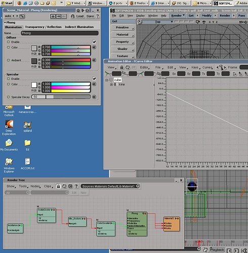
Softimage -as example- had very fast navigation with floating windows outside the interface.


I dislike floating windows outside the interface. For exampl, the very old GIMP

Only reason why Gimp is horrible. At least the latest builds of it is ´looking good, they just need to make it without floating windows.

Edit: I take it back. They have done a single window solution in gimp 2.

I too dislike floating windows. They either don’t take up the whole screen space, or cover each other and have to be moved out of the way constantly. Blender without floating windows is fine as it is.

Blender could use some more/brighter icons in addition to text though. Let’s see what interface changes 2.8 brings.

Hey Meta, I got your PM. Site seems to be acting up now and trying to do anything with PMs gives a redirect https://blenderartists.org/forum/showthread.php?436812-Redirecting-Issues

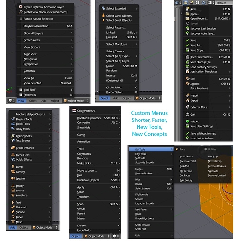
hi, here’s some custom menus I’ve been working on, note that they contain addons.


I’m quite happy with the Object mode menus, the file menu needs work and i do struggle with the edit menus somewhat as they are so big and untidy, trying to organize them is difficult. but i will persevere.

AFWS, hi, couldn’t get it to work ;(

I don’t understand why some many people are against floating windows. They have evolved with the time.

Now you can have a single interface with docked panels that can hide/unhide with a shortcut key. As an example, I would have the outliner floating around hidden as I don’t need it most of the time, saving me screen space for more important tools or options, and simply call it in with a key and have it right where I left it previously.

because it is so cool that nobody uses and nobody make it works. And because you have now a gui that works for all people

I’m for an interface like maya, docking panels could be great.

Many programs uses docking panels for their versatility, I’m not talking about 90’ style floating windows. I agree that Blender’s gui works but that doesn’t mean it can’t be improved and make it more attractive to new user (experienced or not)

@pitiwazou got my point, that is a great example.

Exactly ! docking panels could be great.
In Maya -or Gimp- you can dock and undock any panel or window.
And there is an option: Disable Docking/Undocking can be turned off or on.

If it can be done, this option would make everyone happy :slight_smile:

What is the different betweeen docking panels and the panel grid? Do You want a panel in the air, you can have it. Do You want a panel near to other? You can make it. The way to configure is different but the result is the same.

Docking panels can be called by a keyboard shortcut on and off independently of them being docked or floating thus not changing your viewport configuration, that cannot be done with the panel grid.

They can be minimized individually giving you extra space without having to merge them with other panels making them less destructive to your main setup.

They can be detached and minimized to a tab in the middle of the viewport always on top if you need it to. Once you detach a grid panel it becomes it’s own program instance making it impossible to stay on top and cumbersome to interact with it.

There are many other reasons I can think of in favor docking panels and the most important is that it wouldn’t affect the current UI configuration but expand on it.

Another great addition could be detachable menus with pinning options.

This is all doable with Qt but I believe they don’t want to introduce it in Blender due to the program size.

This is just outright beautiful I would love to have this kinda ui for blender