The render settings work great as a popup, since they change mostly things that you see during render (editor properties sidebar could be moved to such a popup). The other Properties Editor tabs - not so much, for the reasons zeauro mentioned.
I like the general idea of this proposal, the approach of hidding stuff is the way to go and much needed. Popups would solve the problem of losing important stuff in menus. Does anybody know the general plan for the UI regarding the 2.8 project?
Sorry but thats just wrong! There are people who spend a lot of time thinking and working on Blenders UI and you just tell them to go away. Not very nice. That said, the UI is the only the part EVERYONE profits if something is improved.
I don’t get though why users are so 3d viewport hungry, i mean so much space for models, but so many clicks and popups on the way…Blender is not Krita (focused on one single task)…every package has quite a lot of panels to tweaks parameters and if you want more space you go for a secondary monitor…IMHO.
Blender needs a bit of cleanup and some overlapping windows, for secondary stuff which you don’t need always exposed.
My 2c…i’d move some property on top and however don’t get rid of properties editor on the side + outliner (perhaps with tabs for Layers, Textures, Material lister etc…)
Example UI i did for fun moths ago…Icons are just placeholders…
Actually while the idea looks tempting at first you’ll notice one thing it doesn’t solve one of the biggest UI problems - the scroll bonanza. On the 18th second of the video, opening the scene properties you’ll notice the down arrow which means that even though the whole vertical height of the screen is used it couldn’t display all the containing items.
Also zeauro’s remarks are on the point.
Concerning the scrolling issues, there was some work by Antonioya on hiding panels which also can have benefits of mitigating the problem, however it can confusing new users by missing UI elements hidden before and making tutorials hard to follow. So it needs some visual clue about it.
A way of looking at it, is making custom tabs that can be easily added by the user and act like layer groups. You just drop the tabs in them that are not really needed for the current workflow or rarely used. Those custom group tabs can then easily moved up and down the stack, expanded and closed.
While closing/opening of tabs can be done relatively easily by left clicking and dragging up and down still the closed tabs occupy vertical space resulting in additional scrolling.
The problem with this solution is that it also leads to scrolling when the group is expanded depending on the number of it’s members and individual panel height and other open panels outside the group.
Also i think that a general solution is better. I don’t want properties occupying space in all the possible screen presets. The better way is collapsible editors. So having a predefined area where you can click between states. Fully open, collapsed with icons representing panels and fully collapsed where there is only an narrow bar without icons for panels and only a switcher as a representation of editor’s type.
This of course has the take into in account the location of the editor by comparing the width and height of the screen area occupied of the fully expanded editor and place the collapsed bar accordingly (vertical or horizontal).
However depending on the screen layout this feature would produce bad results ie collapsing one editor would make the expanded new area of others non rectangular which is obvious in the default layout of outliner above the properties editor. The 3d view would look like a tetris block.
So for collapsing editors to work you’ll need to:
Limit the possible customization of the screens so they can be placed in such a way that doesn’t produce those results: for instance in the case of the properties and outliner they can be only placed side by side vertically occupying the whole screen height (it keeps the current split/join area Blender way of doing things)
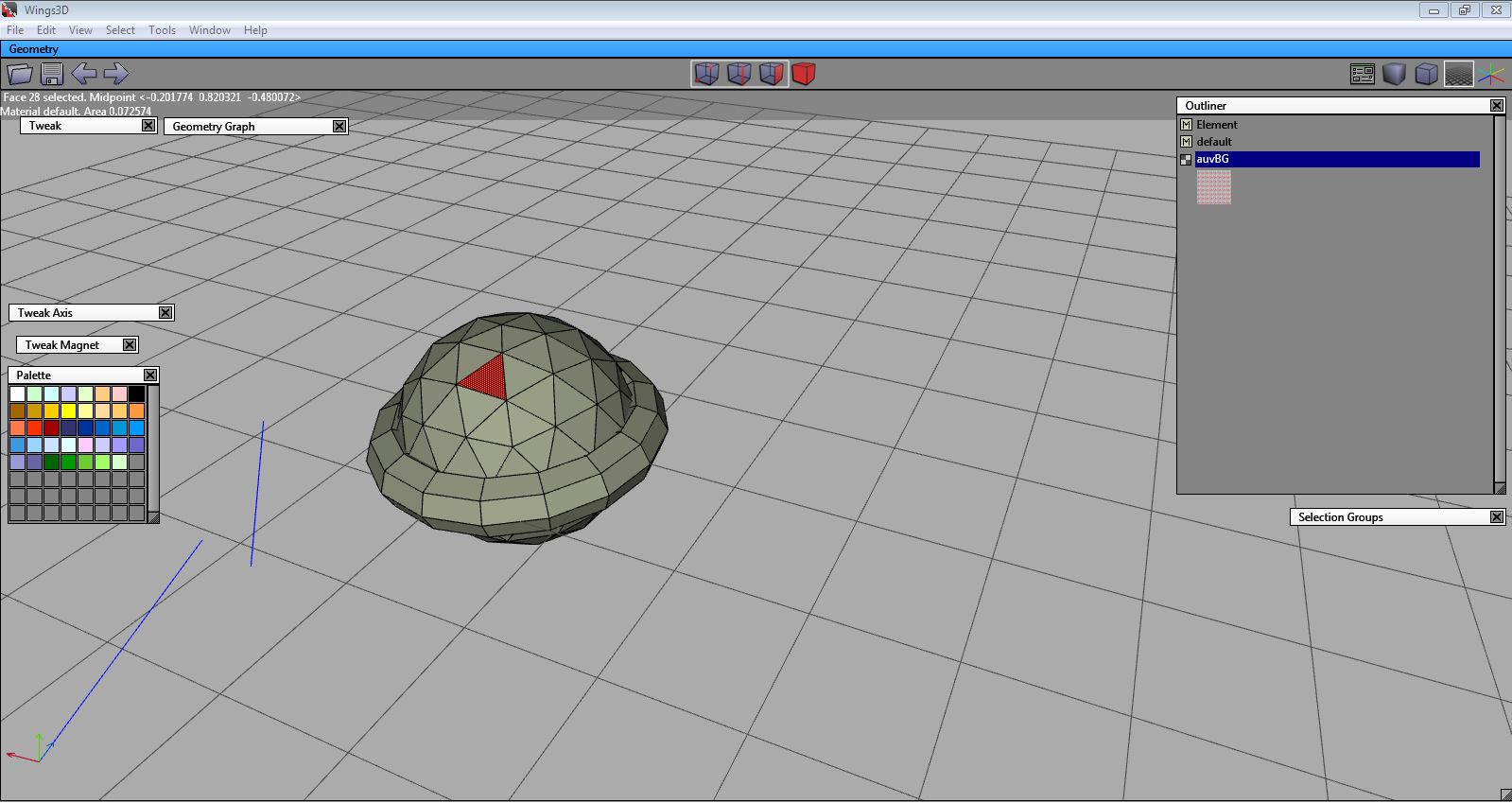
Introduce the concept of floating windows like editors (overlapping areas) which is something that we have elsewhere like Wings3D (floating windows that can be easily collapsed by clicking on the their header).
Of course there are downsides to it. In the first case limits the possible layouts of the screen and even though is easily collapsible it covers the 3dview.
So do I have answers?
No
However one way around the everlasting UI issues is make all the widgets and blender UI in general fully customizable through scripts with sensible defaults. So if anyone wants to make whatever ui within reason it can be done.
Sorry, but that’s just wrong! There are people who are okay with the current UI and who are voicing that opinion, and you just tell them to go away. Not very nice.
In all seriousness, this is not about being nice. Being nice doesn’t improve software. Playing around with UI concepts is fun, but it’s not an improvement by itself. There’s a huge cost behind changing the UI, so the payoff better be fantastic. Here are some facts:
We have had an estimated 5000 threads (p > 0.05) discussing the UI and no consensus has ever come from it. Everybody has a slightly different idea about what a good or better UI is.
Depending on the extent of changes, almost every piece of documentation either breaks completely or becomes harder to use. A very large amount of community work becomes invalid or depreciated, including the official documentation (starved for contributors, btw!) and thousands of hours of video tutorials.
Depending on the extent of changes, lots of workflows that have been ingrained into the users (muscle memory!) becomes worthless, hampering productivity.
Somebody has to actually implement this. As a result of the great Andrew Price UI kerfuffle, a UI team has been formed and there were efforts to seriously do something about the UI. The actual result was horizontal tabs, after a lot of discussion. Imagine how much effort would have to go into more dramatic UI changes.
Judging from your forum account age (may not be representative), you have been using Blender for three years, versus eight years for easydream. This could mean that your investment into Blender represents less than half of his. Note that he was only asking for you to not change his workflow. He’s not saying an a new UI couldn’t be implement as an alternative instead of a replacement (I am not saying that either, though cost vs. benefit is questionable either way). In my experience, those who cry the loudest for a UI revamp tend to have the least amount of experience with Blender (and CG in general).
To everyone who enjoys playing around with UI mockups: Have fun, but be aware that’s there’s an overwhelming chance of your proposal never getting implemented.
I think that the ‘Fix’ for the ui, is to remake it, exactly how it is now, but each window module, can be flipped into ‘edit mode’ bringing up a editible logic node panel that drives that window…
So one could extend/change/replace things in the viewport/Ui without compiling anything*
using event nodes and those events linking to node chains, that call C ++ functions… this could be quite fast right?
That might be true what u said, but in all seriousness at this point, the UI has ALOT of major flaws which slows down specific workflows and trust me, there are enough professionals here on blenderartists who can confirm that. And as someone already mentioned above, the scrolling issue with all the functions is a real problem, and people are giving quite some ideas how to overcome those. Maybe not in the best way, but there should be atleast some noise going out from those threads onto the developers to overthink the UI. I mean jeez, why isn’t there a poll for asking the blender community what they simply hate about the UI in basic examples (tabs, scrolling, hotkeys, #whatever) so the developers get an idea what they could work on next ?
We have the internet, we have the blender conference, we have quadrillion billion threads about these serious flaws, yet I haven’t seen one little survey, asking for improvements on this topic … What would jesus do ?
This one is the best. Considering that Blender is the biggest breaker of muscle memory in town and that it sometimes is not even consistent with itself, this is the best argument. Can’t count the times the same argument has been used to try to campaign for changes in UI.
CTRL SHIFT ALT C wins my award for probably the longest hotkey ever xD
But really, there has to be a change, people hate change (even I do) but considering that it could speed up tasks by relearning some stuff for a couple of days is quite worth the effort. Really.
Every 3d creation soft (MAX/Maya/houdini etc) has its own interface that is not changing for ages, yes MAX 2015 has almost the same interface that was in 3D StudioMAX R3.0 in 1999-th, and if you worked with MAX you know that you can look on a modeling and other tutorials that are made in 2005 and almost all stuff that you will see in this tutorials will work in MAX 2015. So that is why MAX&Maya are so popular because there are tonns of tutorials and articles that are made for these years by thousands of peoples, and all this stuff is works. And when student learns MAX in his college or high school, for example this student is learning MAX 9 - he will work fine on MAX 2015. When a 3d artist works on MAYA 5.0 and his boss bought a MAYA 2015 - 3d artist will work fine. Why? Because the workflow is the same.
I switched from MAX&Maya to Blender in 2008 (it was Blender 2.42) and it was a big trouble for me to learn new interface when 2.5 came out. I spent about 2 weeks to adopt my team and myself to new workflow - it was not good we did not worked full time on projects and we had to spend time on learning new interface - that was expensive and frustrating.
So since 2.5x Blender really grew up. Now it really can stand on one line with MAX/Maya/Cinema4d/etc and my opinion that blender will only win if it will grow up on its real functionality - but not its wrapping.
Blender has its individuality that makes it unique - just like no other, this individuality makes a workflow of a thousands of artists. And it will be really great if people who can change Blender will work on Blender’s real functionality but not its wrapper - because all tutorials that are made since 2.5x will work and new users will learn faster and faster. All stuff that worked in 2.5xx/2.6xx/2.7xx - will work and if Blender’s workflow will be stable - all basic stuff will be the same for ages - Blender will be the most popular 3d soft in the world - because it is the same for all platforms (not like Maya that looks different on Windows and Linux), it has a very good stuff for making gamedev/archviz/advertising just out of the box. If Blender’s workflow will be STABLE - Blender community will be bigger and bigger. And Blender will get into mainstream.
My opinion that instead of spending time on new interface we need new features - new exporters, NURBS like in SiemensNX, GPU biased renderer (like Redshift), cloth similator (like in marvelous designer), etc, etc, etc - there too many other things that Blender needs to be the best.
UX as it is, is great… UI only needs full visual editing/customization…
so everyone can make it’s own and we can share or sell flavors
that’s the main point of blender and will beat all other DCC packs
I think that who can code UI stuff, or better - an hypothetic coder that might give its time to code UI stuff - probably is not the same person that would code complex render stuff, or physics simulations or advanced modeling, etc. So working on UI (that imho is needed) is not automatically taking away the same amount of time on other areas of the software.
back on topic:
I think that the properties panel, together with the n-panel in 3d view are the most cluttered parts of the UI. The first 3 tabs in property panel are scene specific, and therefore could go in a top menu (close to scene popup-menu) as in the mockup. The remaining tabs are mainly object-specific, and should be available in the 3d-view, so that if you hit shift+space to maximize the viewport you’ll always have access to materials, constraints, modifiers, particles etc…
for n-panel the lowest hanging fruit would be vertical tabs as on t-panel
my 2c
@albertofx
is the blender you use in the video a custom build? or did you just edited the UI py scripts?
This is me being curious will this UI overhaul be part of the blender main branch or will it be separate?
I am showing this to some of my colleagues and they are impressed to say the least. We use applications such as Maya, 3DS Max, C4D and Modo with Unreal Engine.
Popups can actually be manipulated, you can drag them wherever you want. Right now I’m working on having modal popups, so you can open and close them while floating in the 3d view(optional), this is possible by returning the modal operator as PASS_THROUGH, some handler hacks can also make it possible, but becomes a bit slow, so im sticking to modal.
Here is video showing that, I also put the outliner on the right side as requested, but planning on having the outliner be a popup that can be quickly accessed on the 3d view(floating popup, open/close when needed):
It’s nice that you want to solve Blender’s UI issues, but my opinion is that we can do so much more yet with the current concept already in place (if only the developers would make more effort in doing that).
For instance…
The UI code should allow the user to rip panels out of the properties window, N-panels, and T-panels (outside of the toolbar) and connect them to the edge of the viewport as floating panels (this solves the issue of having certain functionality always in reach while keeping maximum viewport space).
The tabs in the toolbar should have icons rather than text (each icon emitting a tooltip that tells you what it means on mouse-over)
The toolbar should have multiple tool-related tabs instead of just the one (such as (for editmode) add geometry, remove geometry, tweak geometry, advanced tools, grease pencil, and extra functionality). The tools listed would change based on what selection mode you are in. This would solve the issue of not discovering certain tools at all.
Right-click context menus, Blender could be made to analyze the situation you have based on what is selected and give you a short list of suggested tools (selected groups of faces facing each other could incur the suggestion of the bridge tool for example).
The new hotkey map should be completed and presented as an option in the splash screen (I do respect Johnathon W and his contributions, but I think he should open the task to someone else if he’s just too busy with things like the Blendermarket).
Even then, there’s probably still other ways to improve things, I just don’t think we’re even close to maxing out the usability potential with the current scheme (so I don’t think there’s any need to throw it out completely).