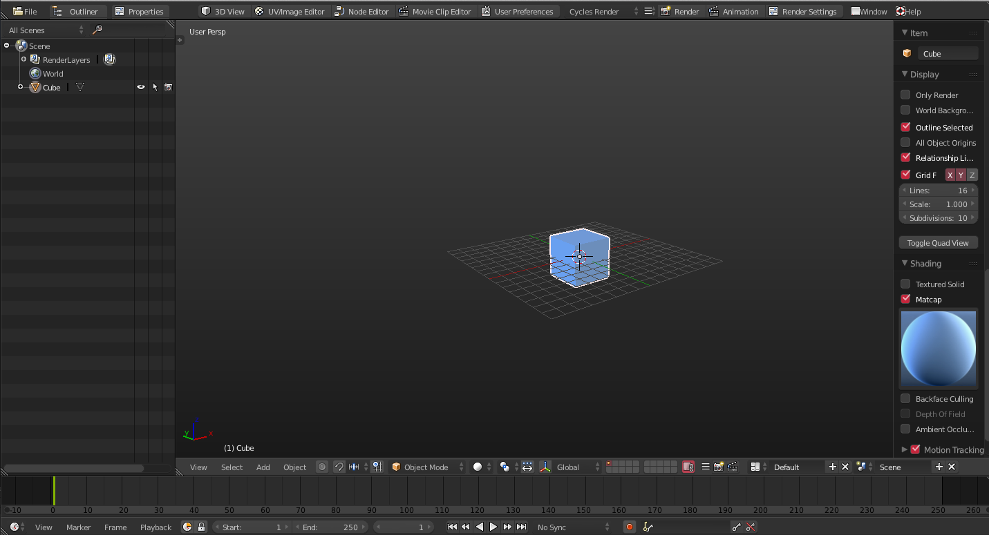
Here is a test for editor tabs at the top header. It also fits the second screen(outliner) to the editor type.
I don’t like that you click on a button and the popup open elsewhere in the screen. It also resembles the behaviour of overlapping windows from other softwares, which is in contrast with non-overlapping paradigm of Blender itself.
Also why not porting the object-specific properties buttons on the right with the outliner? The outliner itself could a tab then.
Last, having three space-consuming buttons to go in 3d view, uvedit, nodes mode seems useles when we have already the “screens” menu which is less space hungry a way more configurable
and again please, are you tweaking the python UI files? or somethin more in depth?
These are python tweaks from what i can see. Such tweaks can definitely be done without touching C for the very most parts.
Yes I agree with you that a heck of a lot discussion have being going on here since the days of Andrew Price’s critique & proposals about Blender’s UI. All the back & forward discussion could for sure power a small city. 
I think though it was a very good thing that the UI team was formed. But yes - the resulting changes of the UI have slowed down after a very good start from the team.
But now we have the 2.8 workflow development project coming up, and as it looks right now the most activity (proposal wise) are for UI projects. PLyczkowski’s Blender UI and Functionality Proposals gives a really great overview IMO of proposals from the UI team - on a side note I can also recommend his chapter concerning general UI theory (also really interesting reading).
I would guess that the Blender Conference in October will be the big coming out party for 2.8, and what the specific goals will be for this project. This will then be followed by a crowdfunding campaign (again my guess).
But, as I have mentioned before, I really hope that BF makes a official Blender user survey before a eventual crowdfundig campaign. To get a good insight into how the users are using the program. So BF can hone in on what should be the main development targets - and extended - for a successful crowdfunding campaign …getting quantified feedback from the userbase to mix with the insight from the developers.
@ Albertofx
Vertical tabs to switch to another screen is an improvement compared to a list. It is a quick/understandable button.
There is already a consensus on it.
But your proposal to change properties editor into popups is still not convincing at all.
In the video, you have to place popup at each call.
We don’t see if you can resize them or zoom in it. And more important if you can display several at same time.
Creating a second blender window made of a Properties Editor and switching between them through OS Window Manager shortcuts seems to do same thing and more.
If you want to make a video demonstrating a valid animation case : don’t render default scene.
Delete cube, add plane, add particles, launch playback and play with normal setting of their initial velocity.
Then add a turbulence force field and play with its strength.
As lsscpp said Blender is loved for its non-overlapping UI.
The way, you did a button to call a screen could be used to replace actual Shift F7/Shift F9 switch between outliner and properties.
Users want their custom screens to be more flexible.
Pitiwazou have already shown Guerilla UI demos in previous UI threads.
When he is talking about an hideable sidebar, he is expressing a desire to have editor’s areas mimicing editor’s region.
To temporarily collapse/reveal an area of an editor with dimensions and position defined by user.
It is far from converting editors into popups.
Popups are only an advantage when they are small, for quick operations that speed-up workflow by being processed under mouse cursor.
+1 with Zeauro, big popups are not usefull, we have to move them like in the video, so it’s not really great.
If we think about docking outliner and properties, we could make a little script to switch between several layout, with or without those menus.
The issue is that will change the other part of the layout, so having 2 icons lik I did in my proposal would help to keep the current layout and hide properties and/or outliner.
I would love to have tabs for views, this is really usefull to make custome layout like in XSI or Guerilla indeed.
And for now, the only thing I would change is to close T & N panel when spliting views.
I think I can edit my pie menu for that, I will search.
Edit, this is possible.

very nice work.
the only problem with tabs menu’s is … that if you got a lot of addons, you get to many tabs making it cluttered again.
perhaps maybe though its an idea to organize them by a background color?
Still pretty lovely UI mod.
considering the proposed UI changes I am not sure however how long this will be valid.
doesnt Ton and his gang for 2.8 or such plan a major UI improvement?
since popups seem to not work for many of you, how about this?
very nice work.
Here is a .blend that emulates my custom UI design.

All you have to do is run both scripts located underneath the timeline:

download link: https://www.dropbox.com/s/26ym49t7lvzh3b4/BLENDER_AFX_UI.blend?dl=1
Please let me know what you think. I will be glad to make any other changes, or start working on any ui purposal. I am currently done with InstantRetopo(release until august), so I have time for anything else.
In this case you should remix both tabs and popups windows, so it wont be as noisy again with a Tab overkill. Besides that, I think you should let most used functions stay up as Tabs (Like the Material tab in the video) and other more unecessary or less used functions as a popup window, so they don’t take up screen space while are not being used at all.
To be honest, the popup windows also need some rework, most of the functions are lined strictly downward, which makes it again impossible to see everything at once, bringing back the scroll-hell everyone pretty much hates in the UI T_T
Maybe try to string those for better visibility. Or packing different function in sub tabs, so scrolling is being less/eliminated
Cheers!
As you said it is your custom UI design, it does not fit needs of people interested in VSE or BGE.
Buttons are relative to a specific area.
I switched outliner and 3DVIew to have outliner on the right.
Then, I pressed Properties button and Properties replaced 3DView.
For such switch, it will make the set-up more generic to place one button in header of each editor instead of the info editor.
I saw on the video of your pop-up menus that they did not contain scrollbars.
It is not opinion of the UI team.
But IMO, scrollbars are useless where they are not used with units.
They make sense to resize a graph editor according certain coordinates or anim editors according a frame range.
But they are useless for panning that can be done with middle mouse button.
It is horrible to have to deal with these things when you create multiple properties editors.
An image with animation screen to sum-up.
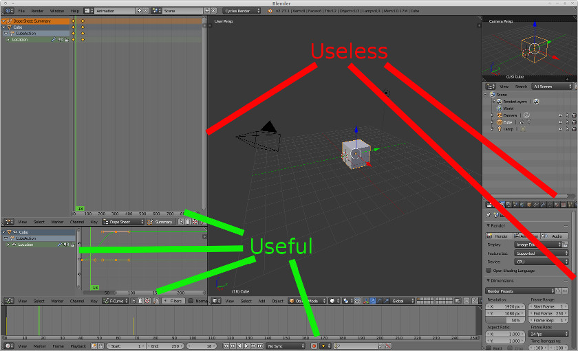
If you absolutely want to play with UI, this summer, it would be great to add a user preference to remove them where they are just used for panning.
What if I want the properties/outliner on the right side of the monitor? Do those tab buttons stay in the top left corner? Why dont you put the tabs inside the properties/outliner editor?
The idea with topbar tabs is for them to be task-focused. So instead of 3D View, Image Editor etc -> General, Modeling, Texturing, Materials, Animation, Video Editing etc.
The idea of the outliner/properties selector just doesn’t seem to be thought through.
The selector is separate from the window so if you have properties panel on the right is the selector also on the right and if the properties panel is on the left the selector is on the left ? What if you have multiple property windows, what happens then ? And how does multi monitors work ?
Is it a outliner/properties only option ? What if you want both
It seems to me a bad solution to a problem I’m not convinced exists