Hello friends! I want to start this thread by thanking everyone who made this contest a thing. It has been very fun from start to finish and I learned a lot in a very short time.
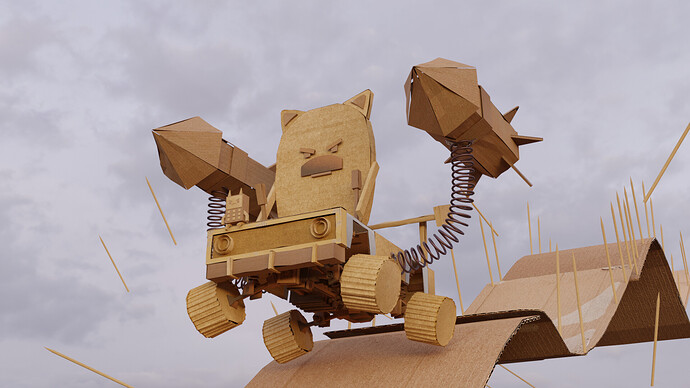
I initially wanted to work on Blender 2.83’s splash screen and turn it into a parade that is also inspired by Mad Max Fury. But I quickly changed my mind after I downloaded the 2.77 splash screen and took a look around the project. Most of my recent work has been inspired by Ian Hubert in one way or another, so it was nice to explore a different style/genre and re-imagine the amazing splash screen by Poked Studio.
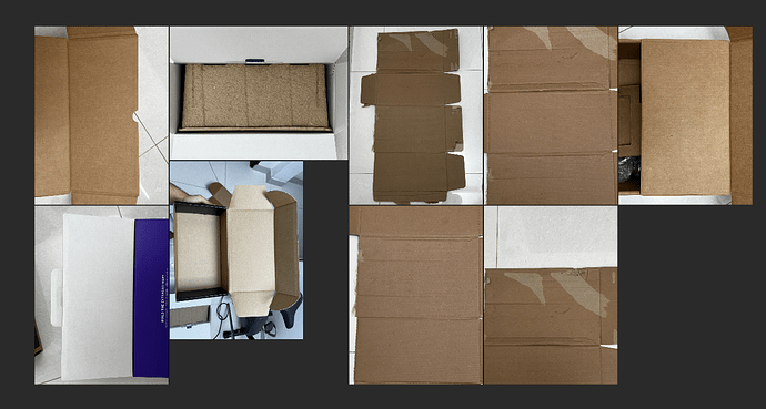
My first thought was to turn the whole scene into a low-poly world. But I felt like the idea needed more depth, so I decided to re-imagine the scene as if it was built using cardboard and give it a “DIY” feel. I always wanted to make characters who look cute and angry, so remixing the characters made by Poked Studio to make them angry made a lot of sense to me! My whole process was pretty much straightforward. I started to gather every box I saw in front of me and UV unwrap it IRL. I then took pictures of the cardboards to use them as image textures.
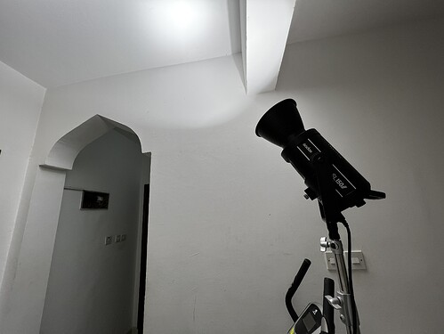
Here is my modest lighting set up
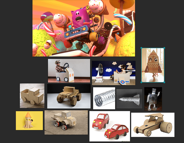
I also gathered some references that I found on google images.
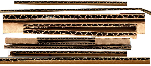
After testing the textures, I couldn’t help but think that something was missing/something looked off, then I realized that adding the corrugated siding will help, so I went ahead and took more photos and cropped the siding in photoshop so that I could use 1 image for some edges, to make the material look more like cardboard.
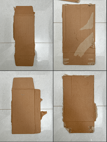
For the slide I used different parts of a dusty cardboard box that I found laying around in my room, Here is the photos that I used as textures after light retouches in Adobe Lightroom.
I also added a displace modifier with a cloud texture to all the objects to give them a more organic look and make them look less perfect. I decided to use Carboard 003 from ambientcg.com on the front of the car to add some variation to the materials. Uploading to Sketchfab was very straightforward and fun. After adding an annotation as a camera that is similar to Poked Studio’s camera, I added animated grain and color corrected the scene to make it look more filmic. The theme of the contest + having the original blend file made everything straight forward and fun.
Here is the link to my sketchfab entry https://skfb.ly/oxWRu
Thanks again everyone, have a great weekend!
