Hello, everyone. I just tried to create realistic corridor or smth like this. I think I achieved the level of luminary space (lost , but I want to make it photorealistic. I’m new, so can smn help pls. What’s wrong and why is this pic still look like CGI?
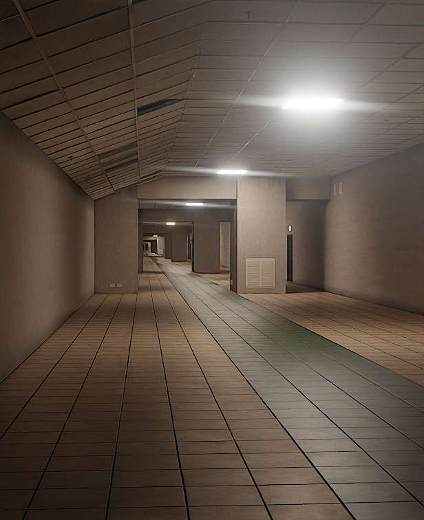
This is a solid start.
I think the first thing that looks a bit strange to me is the contradiction of having fancy cinematic lens flares on a low quality photo taken in portrait mode. That would be unlikely on a real photo.
Apart from this, I would like to ask what kind of corridor is this supposed to be? Is it an underground corridor? An empty shopping mall? A corridor leading to a parking lot? Do you have real references to compare with? This place doesn’t serve any purpose that can be identified and that makes it look strange and unreal.
I have trouble telling what kind of walls those are supposed to be. Are they raw concrete walls? Then I would expect more texture. Are they painted interior walls? Then they would likely have some kind of trim at the bottom.
The whole place is completely empty. Is this place heavily used? I would guess it is considering the level of dirt and wear, except that I would also expect some debris, pieces of dust and trash on the ground if it was. If the ceiling has damaged tiles, maybe the floor would have too? An old ceramic tile floor would likely have some cracked or chipped tiles.
wow that almost look real. thing stand out to me is the light color. maybe use real world temperture like blackbody node to emisson color. i dont think there is nothing to do more. its actualy look very realistic. maybe add more roughness variation to the floor
Good point about the roughness variation.
Something else that could help on that floor would be to use roughness that changes by angle. A large ceramic floor like this would most likely look rough when looking straight at it but glossier at glancing angles. This is something that happens in real life that the Principled BSDF doesn’t do for you, you have to know about it and add it yourself.
Here is the explanation.

And here is part 2, explaining how to add a roughness texture on top of the effect.

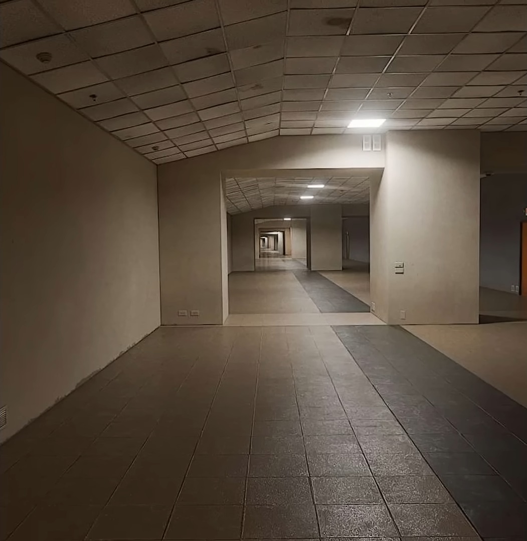
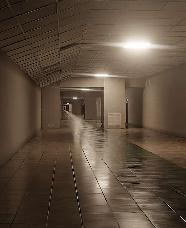
If the current look is the final version, I am not sure if there are any areas that need improvement.
The floor seems to need some improvement, and the walls look too clean considering they are meant to look worn. (The ceiling is the same.)
I would say the overall impression is somewhat ambiguous (neither old nor new).
I am not sure if you are using reference images, but I believe you will see areas for improvement once you understand the difference.
Also, the lighting effect looks too strong.
In reality, it probably isn’t that strong.
This effect is amplified to the extent of the image shown when there are fingerprint marks on the lens.
The first image you attached below seems appropriate.

Thank you. I’ll try to add some imperfections to my materials then, and yes, it’s the exact photo that I used as reference
Use color management. Standard expresses colors close to the original, but the artificial colors of CG can be strong.
AGX or Filmic, on the other hand, can help create naturalness, but it can also be difficult to balance.

※ I didn’t review the entire content to see if the video was a good example of this problem.