Just wanting tips on how to make this image look more realistic…
I like this image! I can almost smell the wood polish 
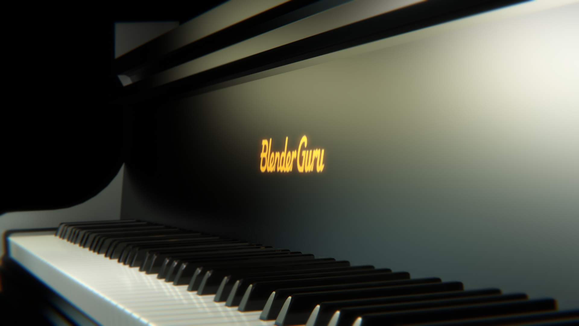
A couple of ideas to take it a step further –
> Is the text supposed to be done in gold leaf paint? If so, you could try using the text texture as a displacement texture with a very low strength to raise it slightly. I find that on some pianos, the fact that the wood beneath is so smooth means that you can see from the side that the text is raised slightly.
> Pianos I’ve seen have a bit more gloss to the wood surface, but it’s possible you’re thinking of a different type than I am.
> Did you try a wood image as a displacement texture with a very very low strength? The manufacturer polishes the wood pretty smooth, but it can’t be perfect.
> Putting a tall, thin object in front of one of the light sources might throw a soft, slight shadow across the keys and give a sense of place.
Now I feel like rendering a piano! I really love how you’ve set up the DOF.
Height of the piano keys seem to be high for me.
Having good measurements and proportions is the basement of a realistic image.
Don’t be shy to search for images references on internet of a real piano.
Nice modeling! As a piano teacher I have seen quite a few grand pianos and every one of them had a high gloss finish, almost like a mirror. Of course they are made of wood, but the varnish is opaque, so there would not be any wood grain visible. Also, the curvy part in the background is a little blocky. You might want to add a little more subsurf, the edges are not that sharp in reality.