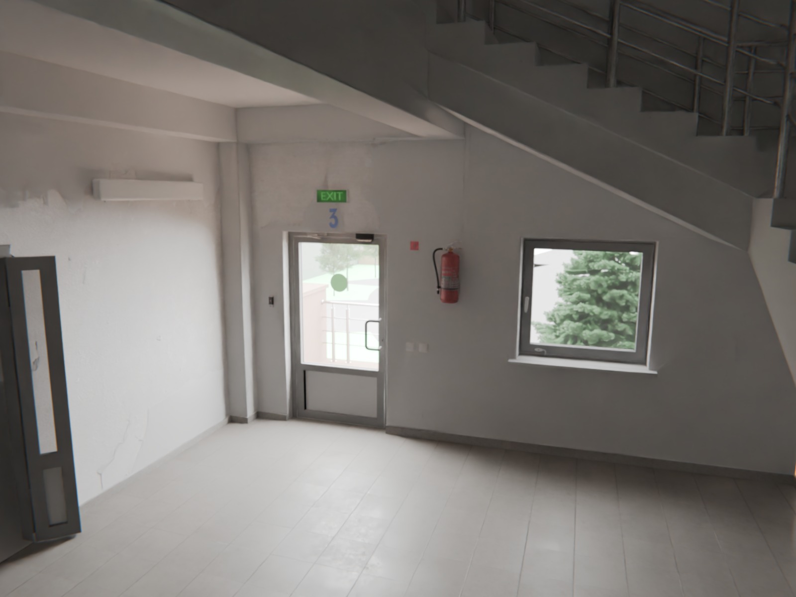
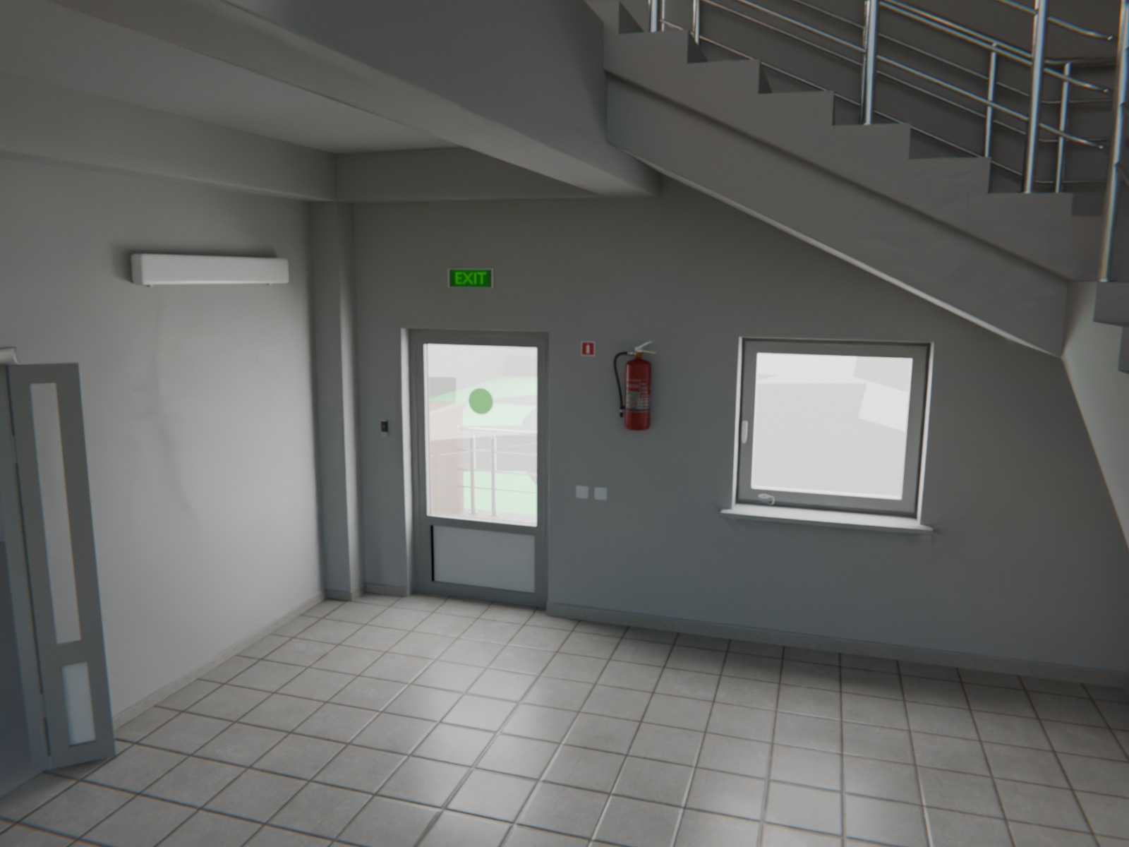
(Don’t pay attention to the background, it’s just sketch for future). What’re the mismatches and how to solve them? I see, that they are not identical, but can’t find out where. Is the problem in textures only? I’d be grateful for any advice:)
Your door lacks the handle and the mechanisms at the top.
The main walls are whiter in the reference, yours are more gray. This completely changes the lighting. Also, the border at the bottom of the wall is much darker than what you did.
Try increasing the number of diffuse bounces in the render settings, it might matter in a white interior scene like this. Or maybe it will have little effect, but it’s easy to try.
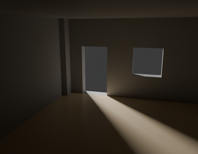
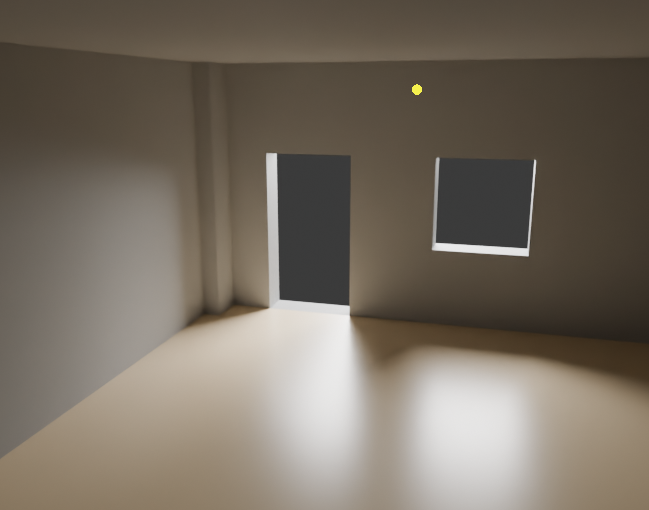
The light entering from outdoor is a bit different. It’s directed a bit more downward in the original (you can see how it goes only halfway up the wall on the left). It looks like the light is a bit uneven and coming from multiple directions through the windows. Did you use a single area light in the door, lighting the interior evenly? You could get closer to the source by using more than one light source and putting them outdoor and coming slightly from above.
I would use a first light source coming from the left, with a smaller light radius, making that sharp shadow on the floor.
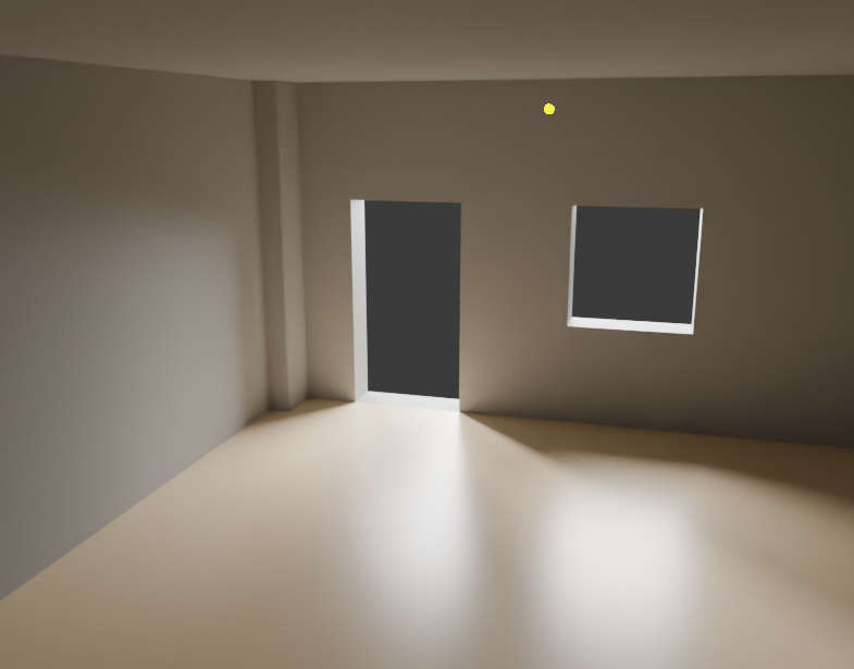
Now together. This light has a sense of direction to it that’s a bit more like the reference. It’s not perfectly accurate, because I would need the exact world background from the real location for that, as well as the accurate room model. I think yours will look closer than what I got, as you have the more accurate model.
The scene has a very slight warm yellowish orange hue to it that yours lack, this might be because the floor material needs to be a bit more saturated in color. Much of the light in the scene bounces off it, so it affects the color of the walls too.
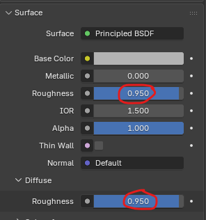
The main wall material seems to be plaster in the original photo (I say that because of the way it’s stained and damaged and because of how it just keeps going on the stairs too). This means it will be extremely rough and matte, yours seems a bit too glossy. Try setting the roughness to something very high, close to the max. Also, set the “diffuse roughness” to the same value to really get the rough diffuse look. That’s going to change the way the light reacts to the whole scene.
The metal parts on the stairs have extra reflections in your version. Do you have a source of light behind the camera or something bright that reflects? The original doesn’t have that.
The most significant difference, however, is that the walls and floor of the original have far more unevenness, dirt, and grime - in other words, varying degrees of roughness.
I would also suggest rendering the whole thing with pathguiding; this distributes the light better and directs more of it into the room, reflecting it diffusely.
That should not be your conceren.. you got the general form pretty well. So the question would be: is this for some architectural presentation or some other usecase where “proper dimensions” are essential or even if this is for some game. I guess the later is not the case but i mentioned it because for a first person shouter sometimes doors are bigger than in th ereal world and floors a broader.
So i think details are the way to “improve” this… and “of course” @etn249 gave some very worthful insights..
Well, you are able to look at the images and find differences. It’s not hard. Look at them and and ask yourself: what’s different? That’s really all there is to it.
So I see:
wall materials are different - original is lighter, there is some sort of damage on the walls
models are slightly different like top of the stairs
door handle and some other parts on the door are missing
floor reflection is clean in the render while you can very clearly see how specular reflections are dirty in the original
stair handrails are completely different, dirty and darker in the original
Skirting boards are different size and color
other materials are slightly different
lighting is slightly different
gaps between floor tiles are smaller and the material in them more irregular in the original
First of all, thank you for your recommendation. But I have a question: is it possible to make the height of tiles randomized, if it is pbr material, or I have to switch to the procedural tiling? And also the second one, how to add imperfections properly? I’ve noticed that those footprints and imperfections on the floor are hidden (?) in darkness; like they are visible in the lighter parts of the tile, but when I try to add them through mix shader, they are applied evenly. Thank you for your reply again!:]
I wanna learn how to set up realistic scenes for movies, but this one is just practice on how to create realistic materials, light and composition. Actually, I aim to achieve hyperrealism, but these are more my pipe dreams now, I guess
Ohhh then you wanna be almost perfect.. but then it’s mabye not only important what lenses are used for the shot and also some more data about the camera, but also to “rebuild” some things about the actual used camera ???
Like this one i just recently discovered:
But some other VFX artist may answer this differently..
( In fact i tried myself a bit on that photo with fspy… also using the third point.. but not a perfect match..
Thank you for your effort and detailed answer, and sorry for the delayed response (i had sat). I tried to apply your tips, and i wanna say that your miniguide changed the scene drastically:
There were some nuances, since I had glass and not empty holes, but I caught the general idea. Also your comment encouraged me to dig dipper into this topic of lighting, so I started watching a lot of guides on youtube. Thank you for your tips again, and if you notice anything else, I’d really appreciate hearing more of them.
Thank you for your guidance (and sorry for delayed response, I had sat exam this Saturday and didn’t want to bother you before I applied any of your tips). I’m a beginner, so your instructions were very helpful. Now, if you’re interested in, the scene looks like this:
I couldn’t find a guide on how to make position of tiles more random (it’s pbr texture), but i think it is okay now. I’m more concerned about the damage: it’s like not so bright and is more yellowish in the reference photo. Anyway, I’m really grateful for your tips and would be happy to see more of them in the future!
Nice, this render looks very realistic! It’s not exactly identical, but it now comes close to passing for a real photo.
The main lighting difference now is that the area at the top of the stairs is dark, it looks like there must be a window on the upper floor in the original, and it’s probably lined up with the one that’s visible, judging from the light direction.
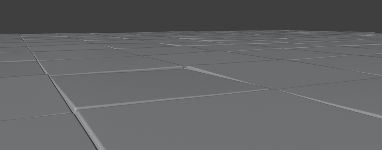
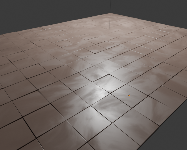
For the modeling, the floor isn’t quite like the original yet. In the reference, you can tell the tiles are a bit uneven, their edges look very slightly mismatched in height. To replicate this, my thought would be to model the tiles with actual objects instead of using a texture.
If they are all individual objects, this can easily be done with the “randomize transform” tool. Here is an image, where I made a grid of beveled tiles and applied a random rotation of 1 degree in the x and y axes to all of them.
The floor texture’s pattern looks more like low frequency swirls and smears than what you have, probably the result of some mud stains that got wiped. I would do that with a noise texture with distortion.
 ). My another attempt to create realistic scene.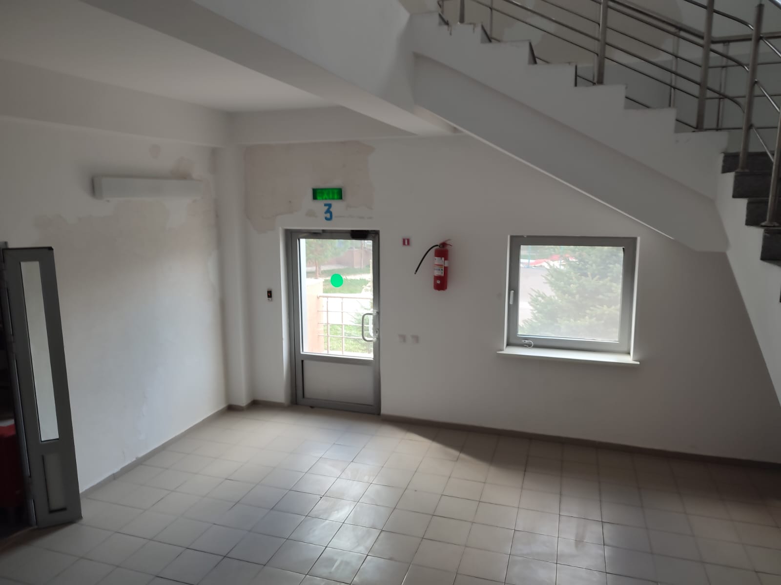



 )
)