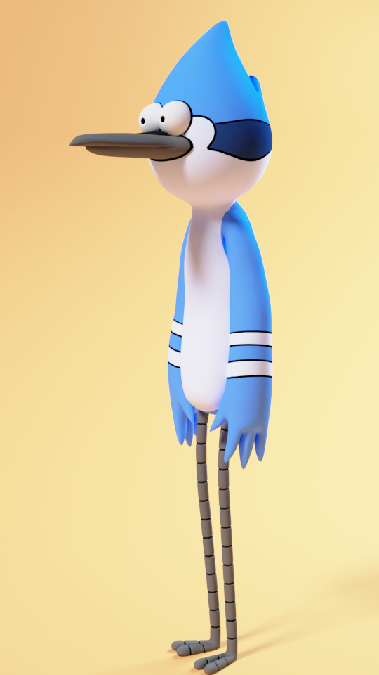
I want to start off by saying no, i’m not a hardcore Regular Show fan. I’ve only watched a couple seasons. However, it might be neat to remake a cartoon character/scene in 3D, and seeing as this is the first show I thought about, I might as well give it a try. Here’s what I have so far:
Very cool. Even thought I’m more of a Rigby fan myself. Textures are vector I’m guessing? Also, do you plan on trying different rendering styles with this model at some point like maybe cel shading?
Thanks! The textures are just normal image textures. Never heard of vector. Is that a 2.8 thing? But yeah, I do plan on experimenting with different shading styles when I get the scene set up. It really just depends on whether or not cell shading looks good with the lighting I have in mind.
Vector meaning like you used a vector illustration software like Inkscape or Illustrator to create the image texture as opposed to using GIMP or painting a bitmap texture directly in Blender. The lines looked really clean is all.
Oh okay. Yeah, that probably would have been easier . I do like being able to paint directly on the model though, so I really have to decide on which method to use on this next model. I appreciate the compliment!
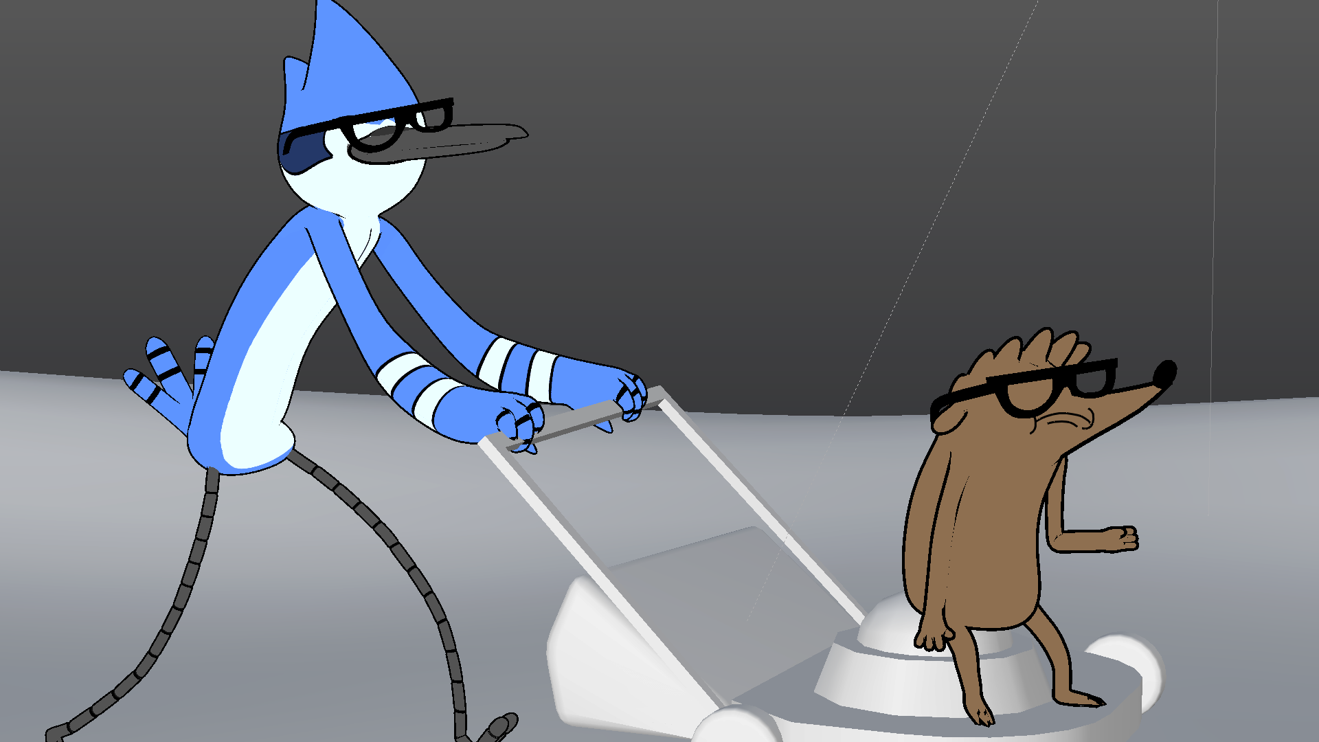
Okay so I needed to cut a lot of corners to get Rigby to look right, seeing as his most prominent features don’t entirely work in three dimensions. Basically what I had to do was follow the reference image to a T, making sure the silhouettes matched as closely as possible. Naturally, in order to have the characters mesh well with the environment I had to start blocking out the scene. Here’s what i’ve got so far:
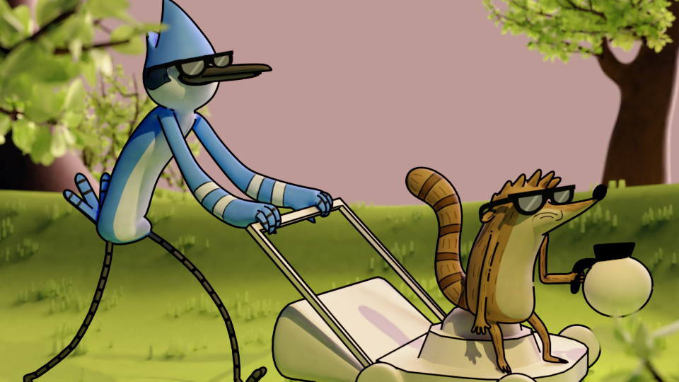
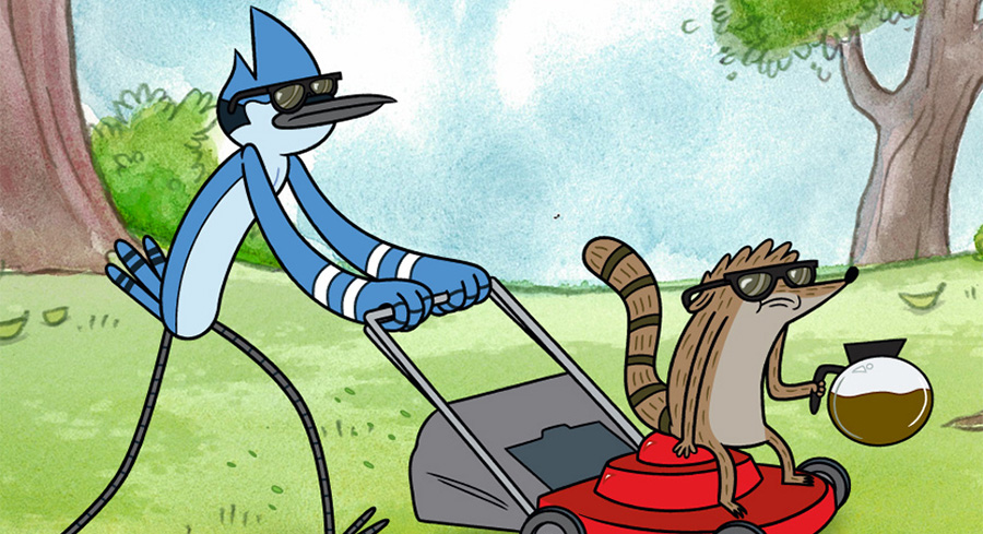
Translating super stylized, graphic 2D cartoons into 3D can be super tricky. Maybe see how they did the characters for the Peanuts movie -
I think you’ve already found the answer, which is modeling them only according to the specific camera angle.
Can’t wait to see how this is going to turn out! Keep us posted!
Thanks! yeah I ran into that exact problem lol. I could not, no matter how hard I tried, get Rigby to look recognizable from every direction. If I were making an animation though, I’m sure I could’ve used shape keys & drivers to try and replicate what they did in Peanuts.
I finished blocking out the scene. The background is pretty much finished, but I still need to work on the lawnmower. I’m still experimenting with the lighting, and i’m still not sure what style i’m going for.
Looks great so far! Would you mind sharing a version without outlines? Just want to compare.
Also, I know you said lighting is not final, but I’ll give my 2 cents anyway - See if you can reduce the green bounce light
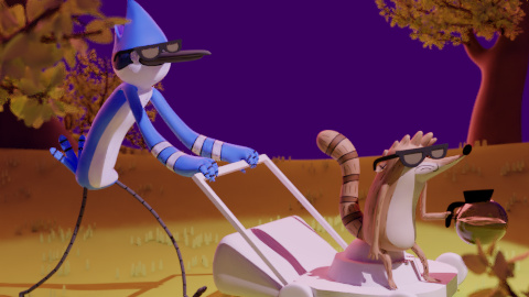
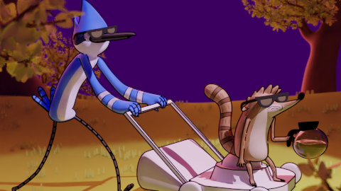
Okay, so I experimented a little more with the lighting. What do you think? I’m going for a ‘sunset’ kind of look. I attached two images below, one with outlines & one without.
Thank you! Not sure if it helps, but I added more purple to try and mitigate it’s contribution.
Thanks @GadgetronGreg!
Ooooh~~ The colour scheme looks really nice with the sunset.
I vote no lines! Lines look neat, but I feel like they emphasize the 2D-ness, and so the point of this 3D translation would get diluted. However, they do help separate the characters from the rest, so maybe you could add some ambient occlusion to compensate? Especially on Rigby. But maybe it’s too early to say that since the lawnmower doesn’t have a material yet.
It was very close, but the council (my family) has decided that the one with outlines looks better than the one without. I personally prefer the one without outlines, but it’s more about what looks good to most people than what looks good to me. I posted both in the finished projects thread, but I had to prioritize the one with outlines. I learned a lot from this project and plan to do more like it in the future. Here’s the link the finished project:
Thank you both for your critiques and encouragement!

 Textures are vector I’m guessing? Also, do you plan on trying different rendering styles with this model at some point like maybe cel shading?
 . I do like being able to paint directly on the model though, so I really have to decide on which method to use on this next model. I appreciate the compliment!